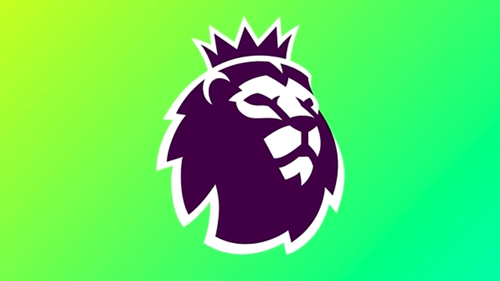
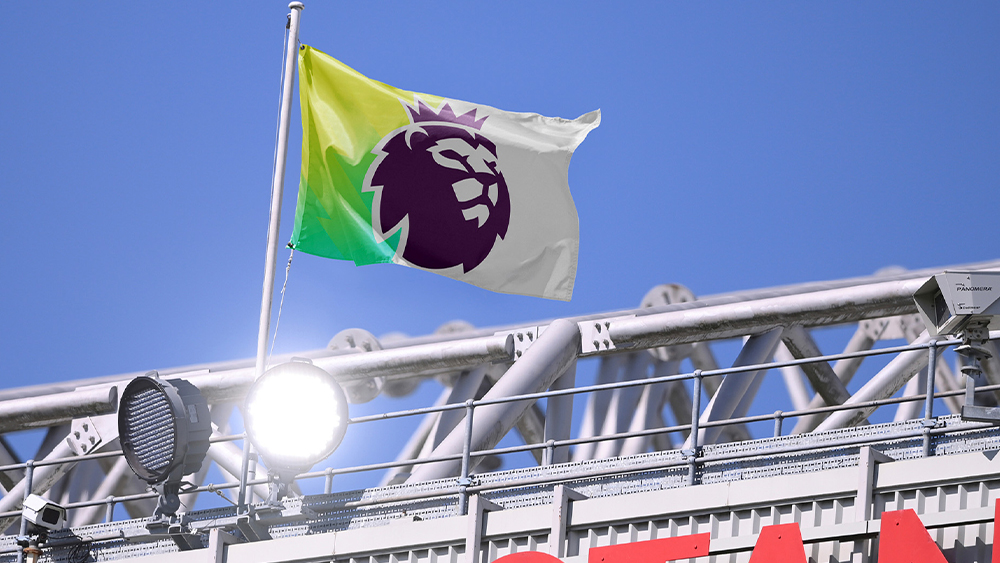
Some rebrands craft a sharp new look from minimal changes, and this is one of those cases. Many people might not even notice it, but there's a new Premier League logo for the 2023/24 English football season, and it's bigger and bolder.
The changes to the form of the lion icon itself are so slight as to be almost undetectable. The colours are a different story, introducing vibrant gradients for a bright new identity for a design that has long been in our pick of the best sports logos. But the biggest change is what's left out.
The branding agency Nomad Studio describes the new Premier League logo as a "radical simplification". At first glance, that might sound like agency hyperbole. The centre of the identity is still the Premier League lion in much the same form as that created by DesignStudio and Robin Brand Consultants back in 2016. Nomad says it combined two previous lion designs into one, but the only really notable difference is that the lion now has an outline that almost but not quite surrounds it.
The radical part is that this stroke is all about making the lion more noticeable because it will now be used alone without a wordmark to accompany it. Thus, the Primer League seeks to join that select group of heavyweight brands like Nike and Apple for whom a graphic symbol is enough to carry their identity without the need for text. As one of the world's best-known sports leagues, the Premier League can probably pull that off, but you just know that someone somewhere is going to think it has something to do with The Lion King.
The wordmark isn't disappearing altogether. The Premier League will still appear named in some uses. In terms of palette, the league's previous six solid colours have been combined into three gradients. That's intended to leave enough options to play with but to make the palette more immediately recognisable. The approach seems to go against the recent direction of simplification, but the bright hues are very much on trend. We'll have to see if they work in all applications.
Other than the potential for confusion with a certain animated musical, the Premier League rebrand seems to hit the back of the net. It makes sense to enhance an existing mark rather than start again when the logo was popular and widely known. Change things too much and you can end up with a "video game logo" like Spain's La Liga.