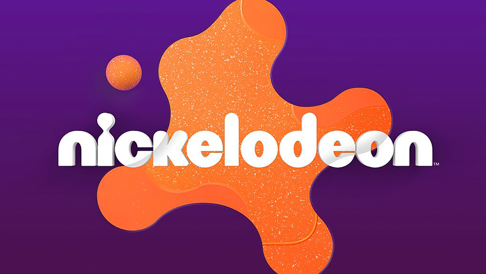
Fans of SpongeBob, Paw Patrol or Baby Shark may have noticed that the kids' TV channel Nickelodeon teasing some new branding in recent months. It's now officially unveiled the new look, and it's the perfect retro tribute to the channel's history.
It's the channel's first new look in 14 years, but it will feel familiar to many, bringing back its orange 'splat' but softer, more rounded and textured for a warm modern look. It's close enough to the 1980s design to be immediately recognisable while still feeling fresh (see the best branding books for more inspiration).
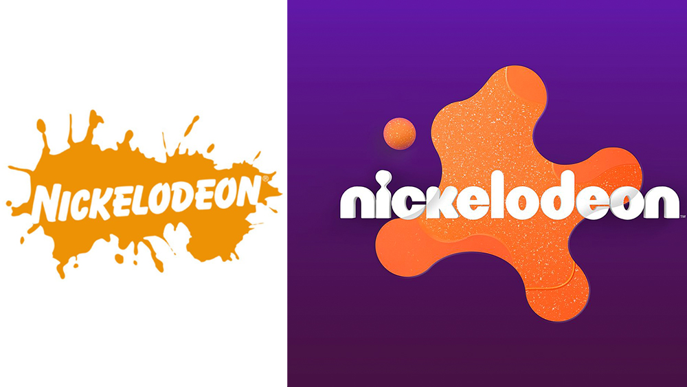
"The SPLAT is back! And so is the irreverent and unexpected humor that created a generation of "Nick Kids" - including myself!", says executive vice president of global kids and family marketing Sabrina Caluori.
She says the decision to bring back the splat was taken after research identified the strength of Nickelodeon's legacy identity. Part of rebranding involves a series of spots that aim to depict the brand as a 'Portal to Fun'. The first, named Quartet shows a bored kid at dinner notice an orange splat on the ceiling. More splats... sorry spots... will follow, each featuring a kid transported through the splat portal.
The campaign involved an incredible six agencies, including Roger and CALLEN. We'd love to have been a fly on the wall in the meetings to see how that was coordinated. The new identity features some fun animations too, including a very inflated version of the logo (see below).
"Nick has always celebrated the best and the mess of being a kid. Our kids need this portal to outrageous fun more than ever," Caluori says. And we have to agree. It's been pointed out by several agencies that Gen Z has an affinity with nostalgic brands, which they see as having authenticity, and they're likely to pass that on as they start having kids of their own, so it makes sense to tap into Nick's past identity while freshening things up.
Fans seem to be enjoying the results. "The two spots released so far really invoke the classic Nick feel and I can't wait to see what else comes from this rebrand," one person wrote on Twitter. "I love the splat. So glad to see it back," someone wrote on Instagram.
Looking for more brand inspiration? See our favourite car logo rebrands.