While the most classic of neutral colors — think off-whites, nuanced grays, and beige tones — are well-loved, interior designers are stepping away from the expected for the year ahead.
From soothing sage greens to scumptious dark browns, designers are turning to more colorful tones to form the base of their schemes, while managing to maintain an overall calming look that feels just as livable.
Below, we've rounded up the four shades to use for neutral color schemes if you're looking to create a design-forward space that steps away from tradition.
1. Soft Greens
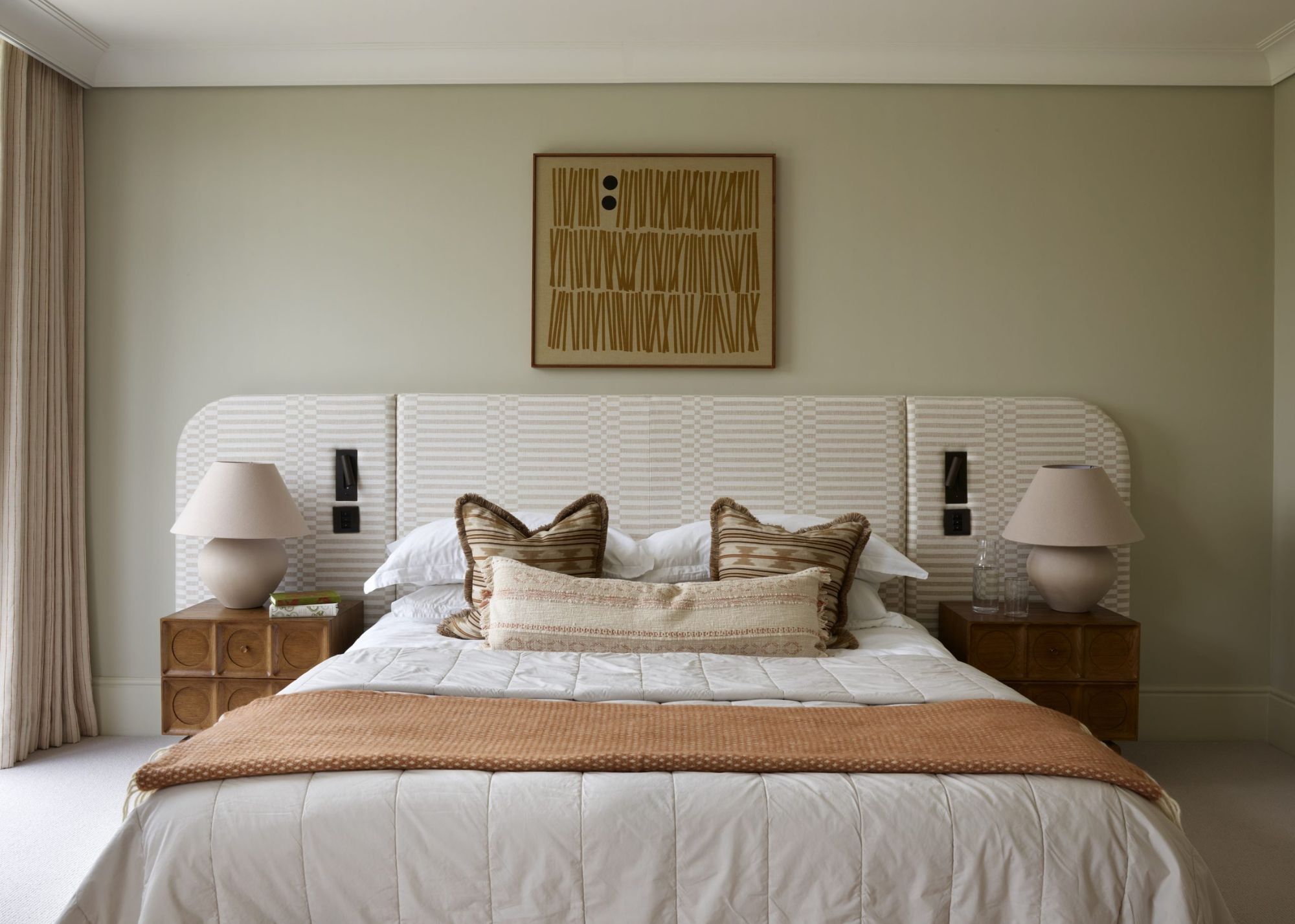
While there may be debate surrounding whether green is a neutral color, designers indeed see it as a comfortable shade to incorporate into schemes. “For me, the ‘new neutral’ for the year ahead is soft green – from gentle sage to fresher mint shades," observes interior designer Simone Gordon, co-founder of Owl Design.
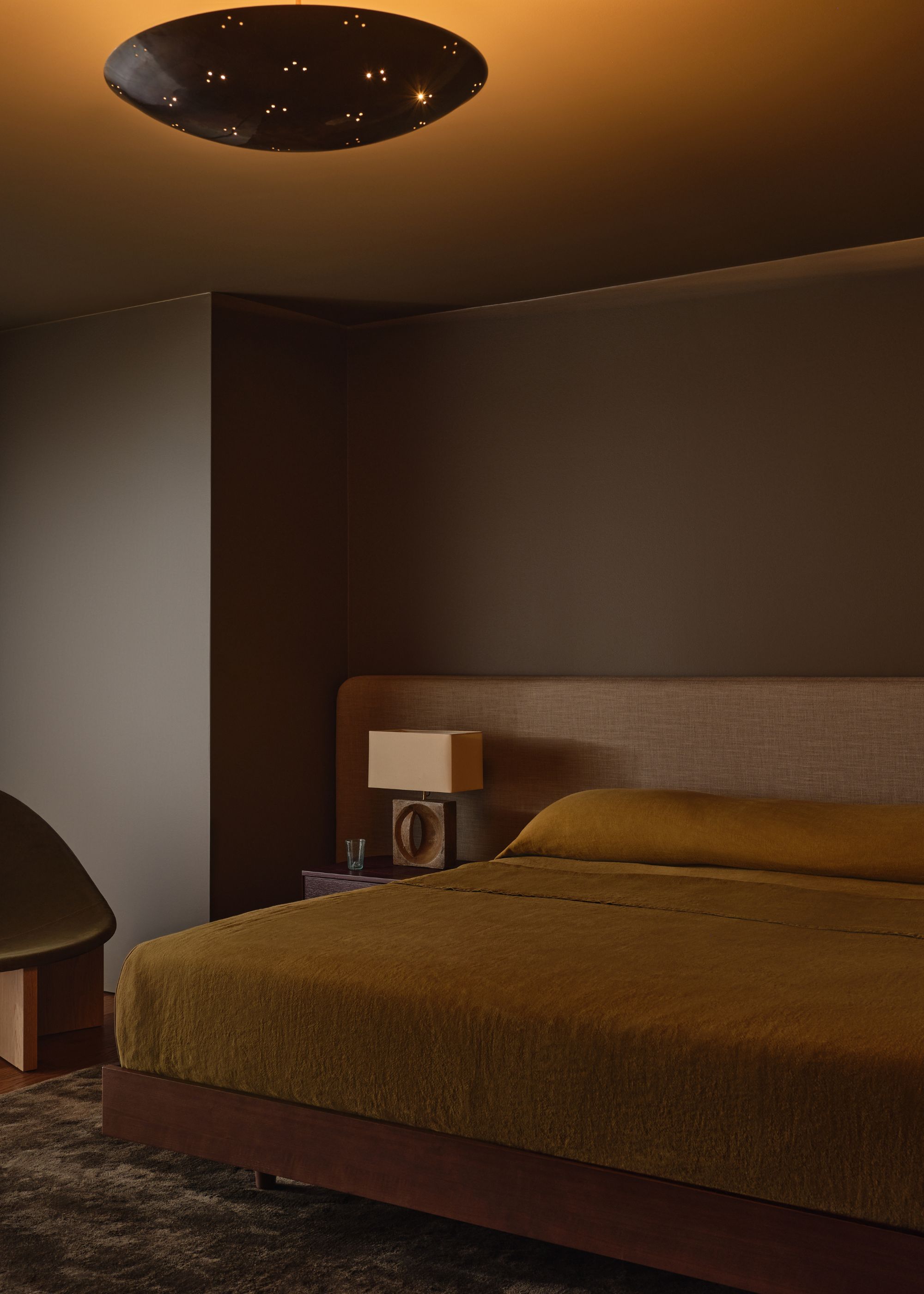
Demonstrated beautifully in this green bedroom, the delicate sage that wraps the walls makes a more interesting alternative to typical neutrals such as white or cream, while maintaining a pared-back look.
It's for its livability and versatility that Simone enjoys decorating with green as a neutral, who adds: "These tones pair beautifully with natural textures and warm timbers, offering subtle color without overwhelming the design. They also work in harmony with brighter accents, creating a layered backdrop with greater depth than whiter neutral tones alone can provide."
"For a hint of color while staying neutral, muted sage greens like Benjamin Moore’s October Mist add a soft, nature-inspired warmth," shares the interior designer Jessica Whitley.
2. Delicate Blues
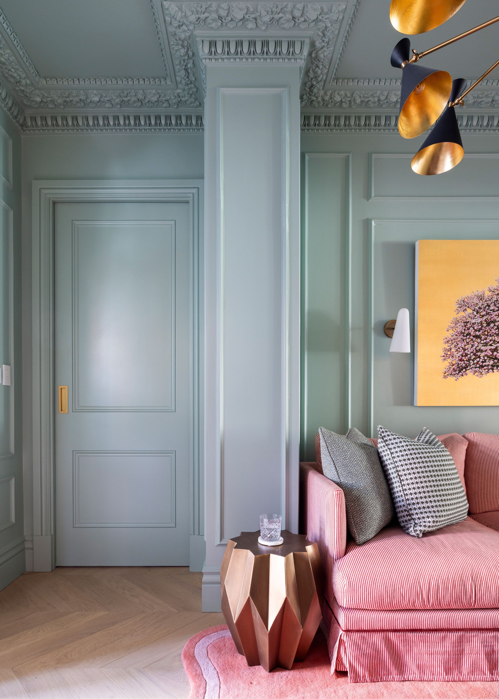
If decorating with blue is a favorite, then consider using muted variations of this tranquil hue as a neutral color. Much like soft greens, designers say that the right shade of blue paint offers a restful yet elevated backdrop, and the trick is to embrace color-drenching.
"When decorating with soft blues, I like to experiment with color-drenching schemes, layering different shades to create a truly stunning, deep effect," says Marcelina Janiszewska, interior designer at Project London.
To keep blue walls interesting, Marcelina recommends adding warmer shades for contrast. "Pops of color, such as red or pink, add energy and warmth. Don’t be afraid to use these contrasting tones, as they create a scheme full of depth and character."
Complete the scheme with metallic finish trends, suggests Marcelina. "From stainless steel and chrome to brass, antique brass, bronze, or even black, they help to elevate the scheme and add visual interest.”
If you're new to decorating with colors in place of typical neutrals, look no further than Farrow & Ball's Borrowed Light, an incredibly delicate blue that feels light and airy.
3. Pale Pinks
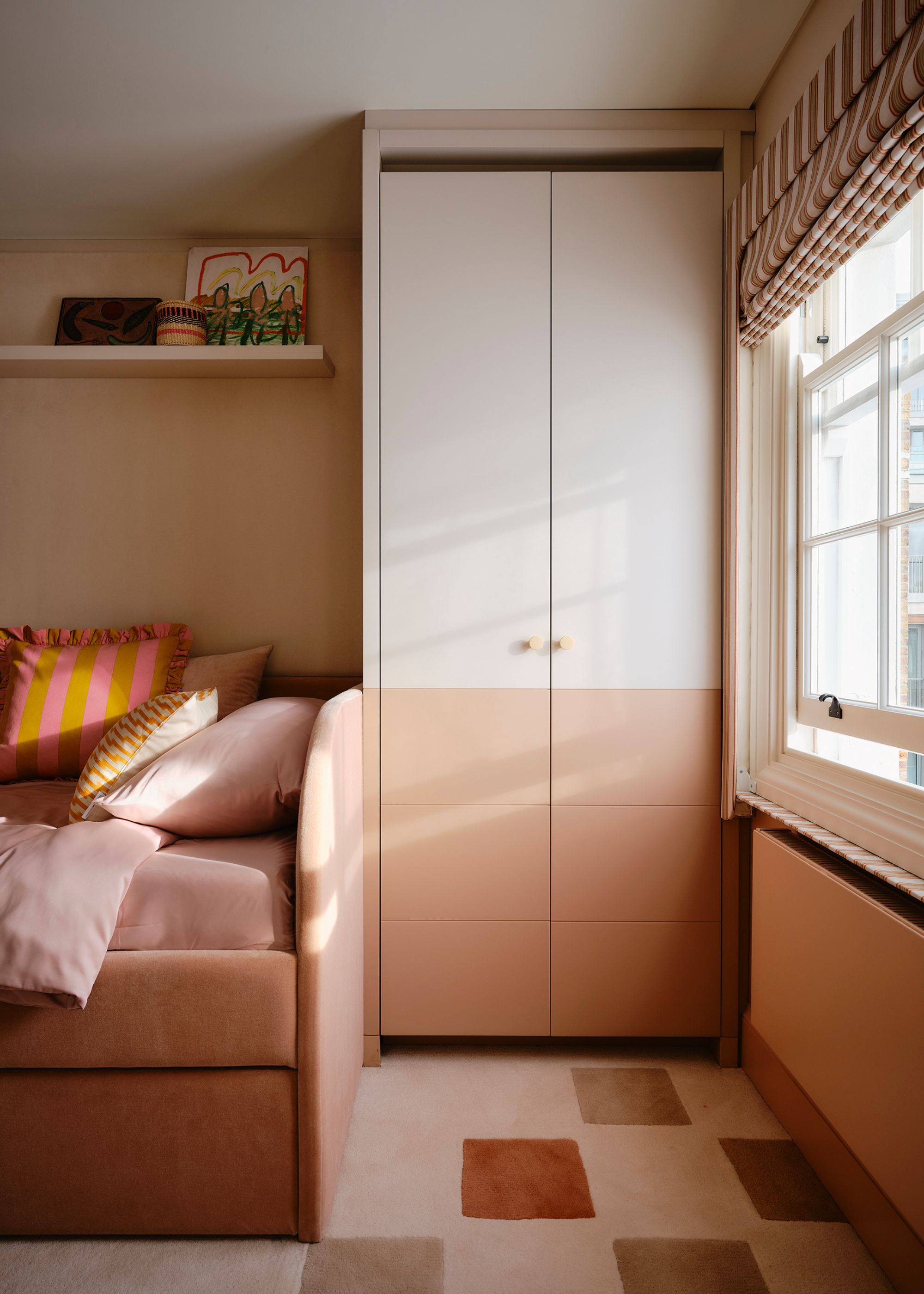
If you're looking for a fresh neutral hue that's fitting for warm color schemes, take inspiration from designers who are channeling pale pink. "It’s essentially the latest take on a warm white," observes interior designer Kristina Khersonsky, the founder and principal designer at STUDIO KEETA. "It takes the neutrality a step forward and not only provides warmth to the room, but also visual interest."
Decorating with pink is also being enjoyed as a new neutral by the designer Birdie Fortescue, who says: “Pale pink has a gentle quality that brings softness without feeling overly sweet. I often use it as a grounding color, which works particularly well when layered with natural textures like linen or jute."
Lick's Pink 01 is a safe way to incorporate pink into your scheme with its grounding and mellow gray tones.
4. Rich Browns
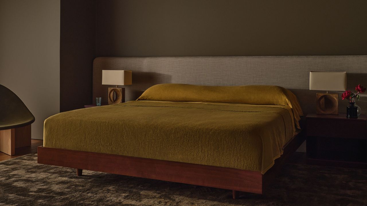
Neutrals aren't just about light tones, but much richer dark color trends, too. For the year ahead, designers are drawn to moody and warm browns that offer depth and a nod to modern retro decor.
"There’s a quiet depth to warm brown tones that people find comforting, and I think it speaks to a deeper desire for interiors that feel authentic, timeless, and grounded," explains interior designer Alicia Meireles of OWN LONDON.
"When decorating with warm brown tones, focus on incorporating rich textures like raw linen, clay, or natural wood to enhance their earthy warmth," Alicia recommends. "For contrast and balance, pair them with cooler hues like sage green, dusty blue, or charcoal."
This muddy brown hue makes a statement while offering a cozy and inviting feel. Use it on all four walls in small rooms for maximum impact.
These shades, from mellow blue to earthy pink, are a simple but effective way to make a room feel more interesting. Once you have your neutrals sorted, consider adding bolder accents with the latest color trends for a more exciting scheme.