The Game Awards 2025 are coming up in December, and founder Geoff Keighley and his team will be hoping to replicate the success of last year's 10th anniversary, which saw a record 154 million live streams. The event was graced by Snoop Dogg and Twenty One Pilots, but another big star was the new branding.
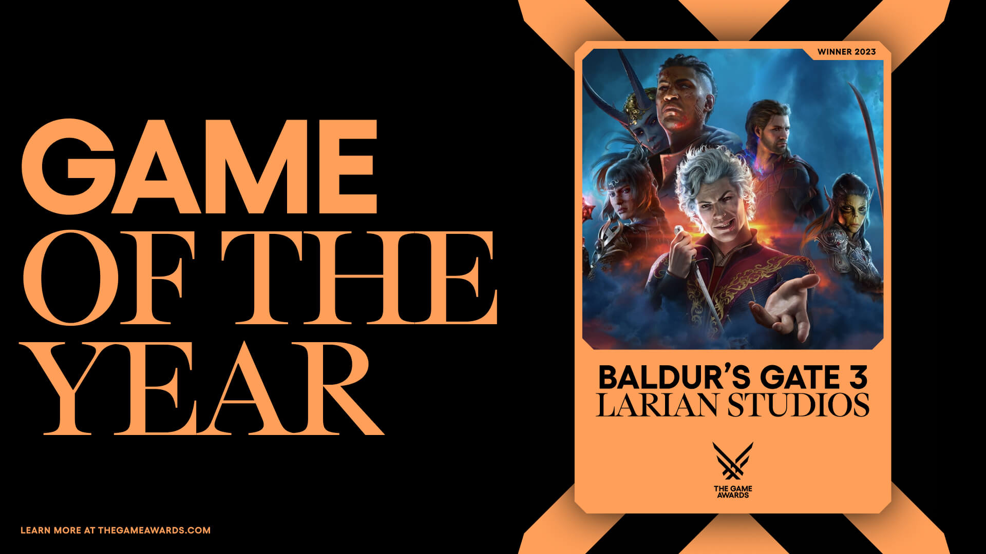
The new Game Awards logo is one of those redesigns that shows how a relatively subtle simplification can make an identity more versatile. It's still inspired by the wings of the iconic angel trophy, but it's even even more abstract, reduced to its essential form. That makes it cleaner and bolder, but also allowed the creation of a wide range of dynamic graphic elements (if you're working on making your own game, see our pick of the best laptops for game development).
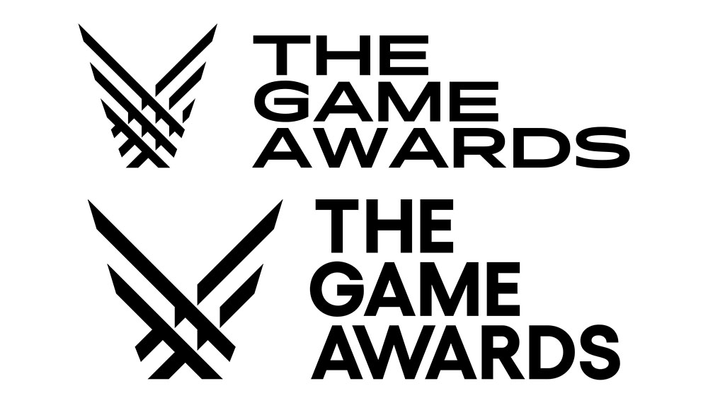
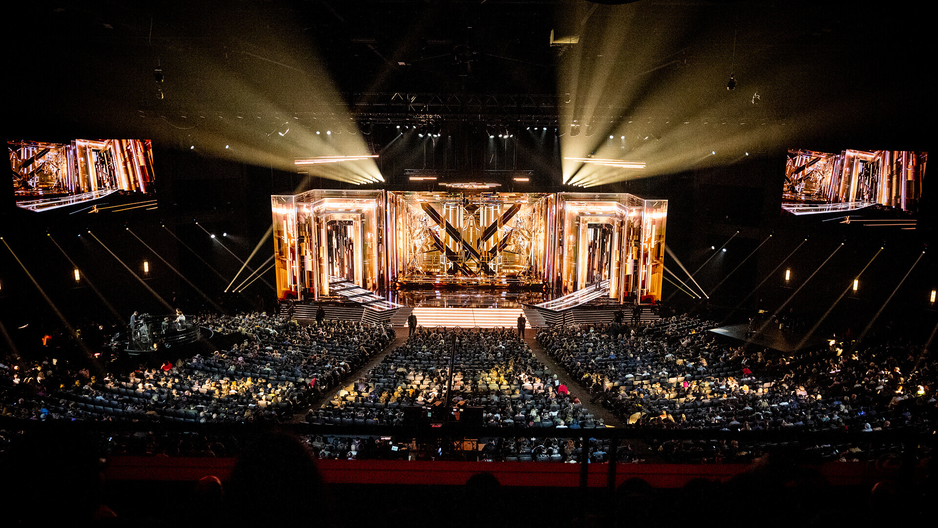
The Game Awards logo was redesigned by Vienna-based STUDIO HERRSTRÖM. They devised a more minimalist interpretation of the original Pentagram-designed logo by simplifying it in a bold, monolinear mark. The new design pops but retains a dignified gravitas. befitting of a major awards ceremony, and it works across a wide range of applications, from digital to stage sets.
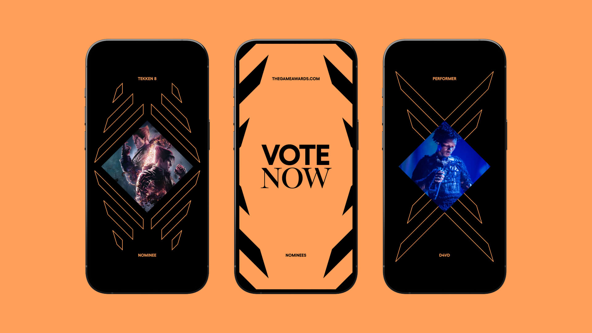
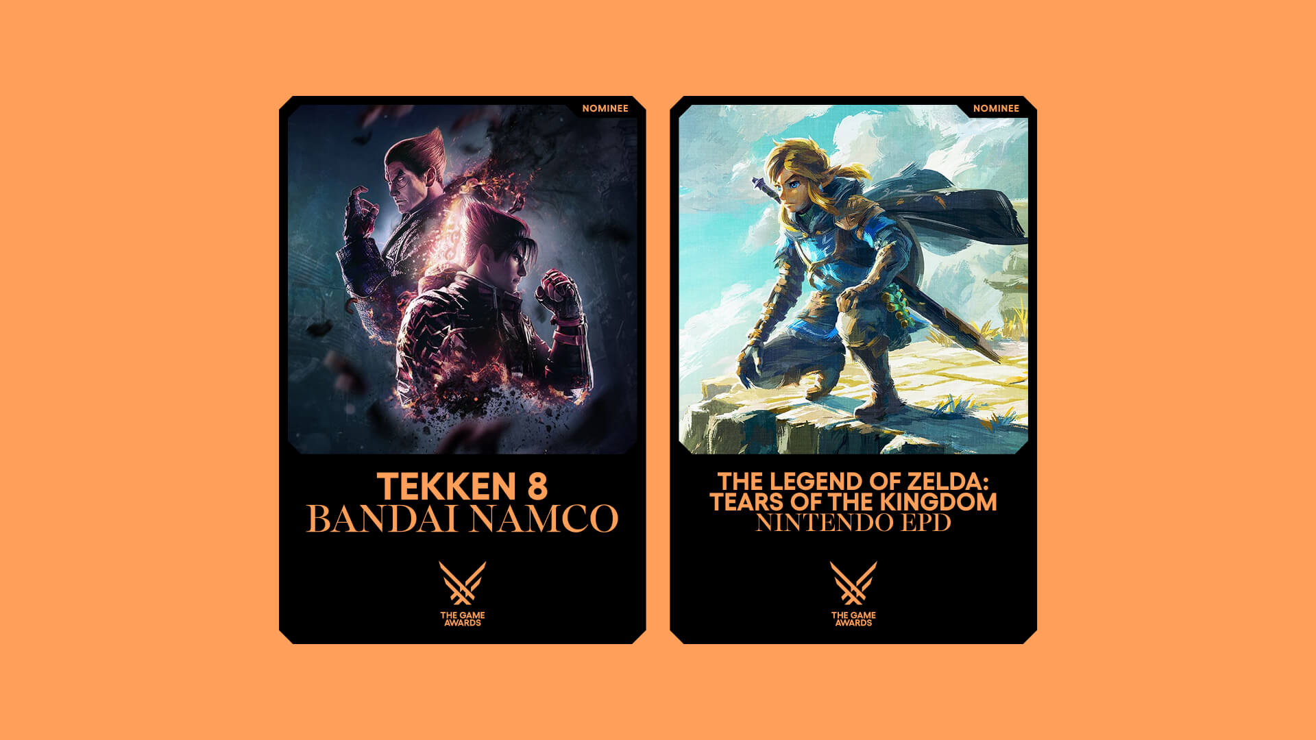
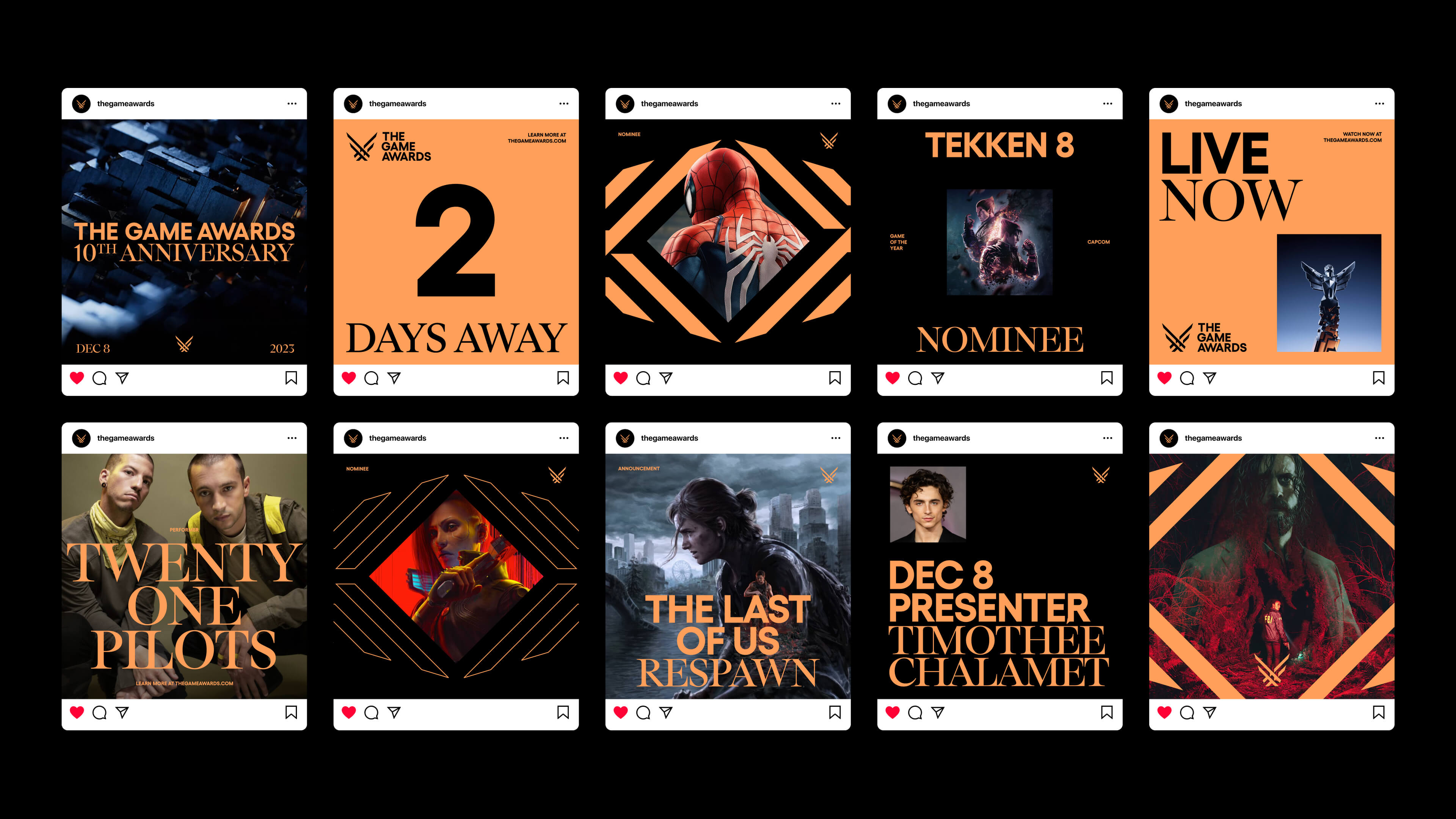
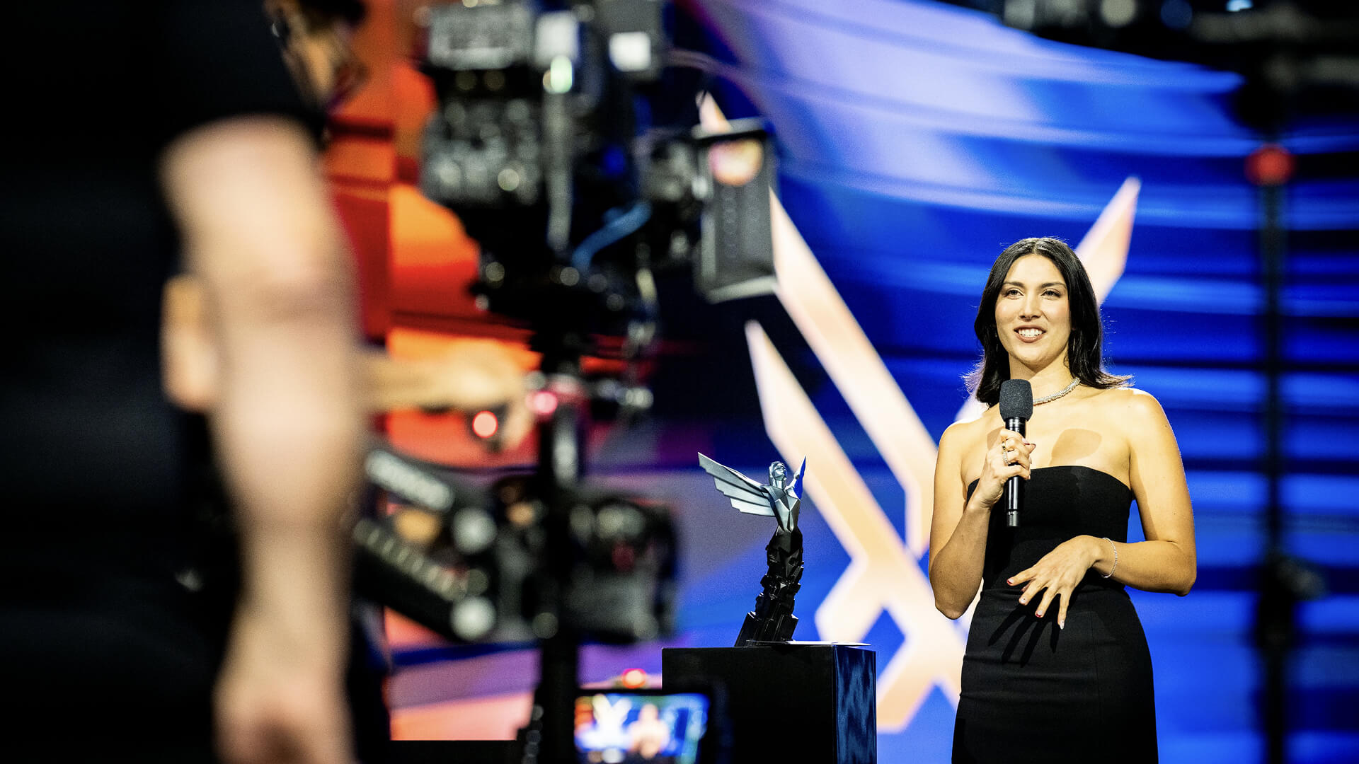
The simplified design also allowed an extensive library of frames and patterns to derived from the logo’s symmetrical geometry. These serve for everything from on-screen overlays to stage backdrops. A system of dynamic linear and nonlinear elements inspired by the sweep of angel wings directs focus to key moments like a winner announcement or a nominee highlight.
The myriad motion patterns allow The Game Awards to feature any artist, presenter, or game in a variety of framing and layering options within the graphic system, ensuring flexibility and consistency.
The new brand colour palette uses a baroque gold with crisp black and white, again amplifying the mix of modern minimalism and prestige. This contrast is also apparent in the choice of typography, with the clean and clear geometric sans-serif Gellix complemented by the pointy and more classical ABC Arizona Serif.
The resulting identity feels sharp and edgy, fitting a gaming aesthetic, but also noble and sophisticated.
For more inspiration, see our pick of the best gaming logos. As for potential award winners, see our piece on the best indie game devs.


