Wear OS Tiles have always focused on one app at a time. It's convenient to scroll through relevant information, such as your Samsung Health goals, current weather, or calendar reminders, without opening each app individually. But it can also feel tedious to scroll through a dozen tiles to find the one bit of information you need.
With One UI 8 Watch on the Galaxy Watch 8 series, Samsung has made themed Tile groupings that take better advantage of the watch display space; they feel so natural that I can't believe it hasn't been tried before now.
Samsung's new take on Wear OS Tiles
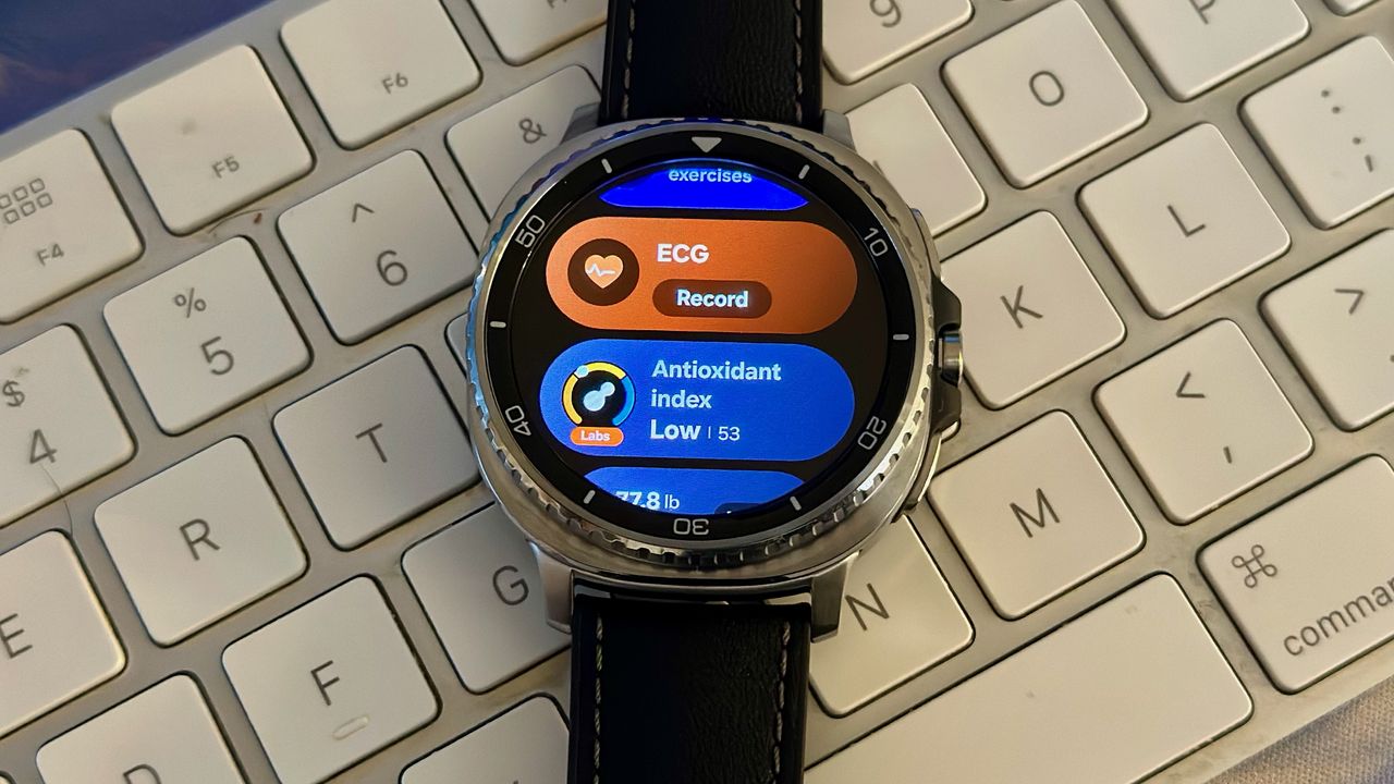
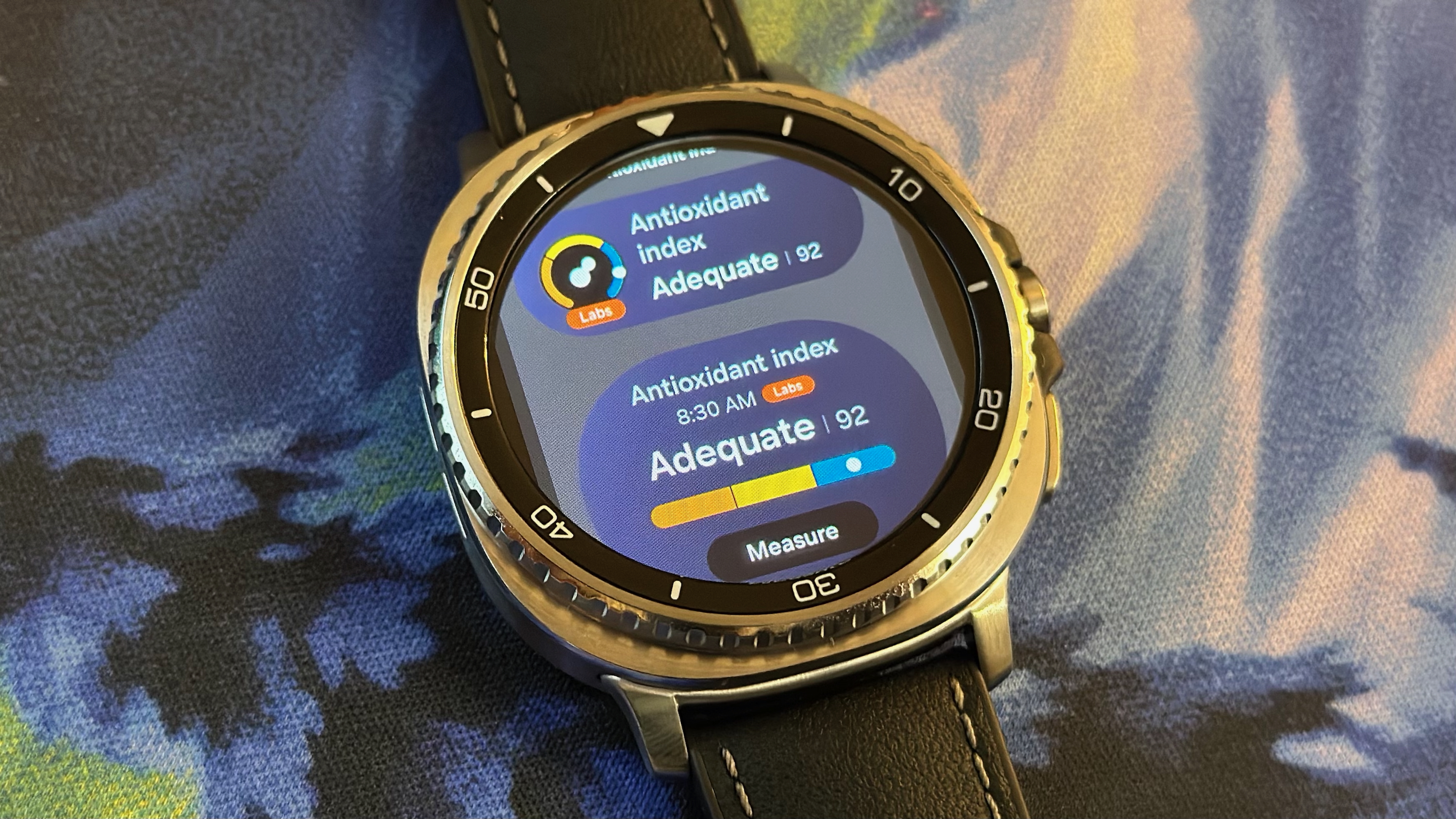
I rotate my Classic bezel once, and I see a "Health" Tile with my daily goals, Energy score, Sleep, Breathing exercises, and ECGs. I later added my antioxidant index and blood oxygen data, while you could add cycle tracking, medications, or any other metric you find relevant!
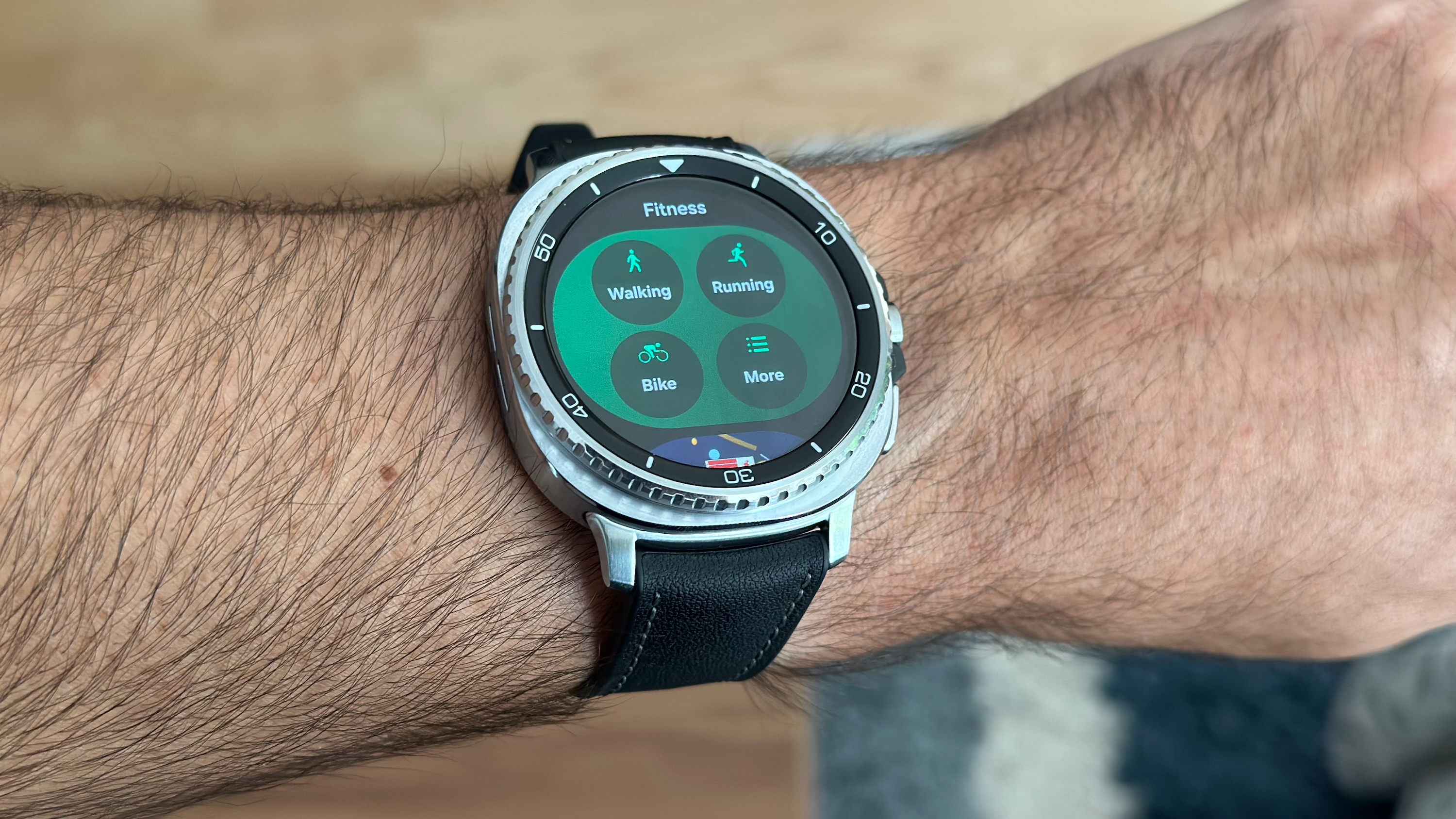
The next "Fitness" Tile has my top activities for a quick workout start, the Running Coach, body composition data, and Together friend challenges. And then the "Basic" Tile has my weather, calendar, battery status, and music playback controls.
In some ways, these Tiles feel like a remake of the Apple Watch smart stack, except with Android's trademark customization and the ability to group them into smaller, themed categories instead of all the widgets appearing in one pile.
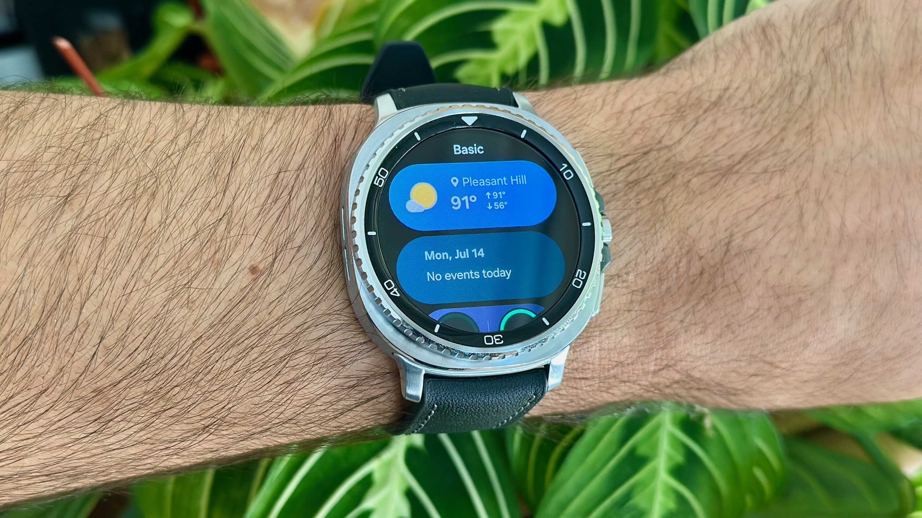
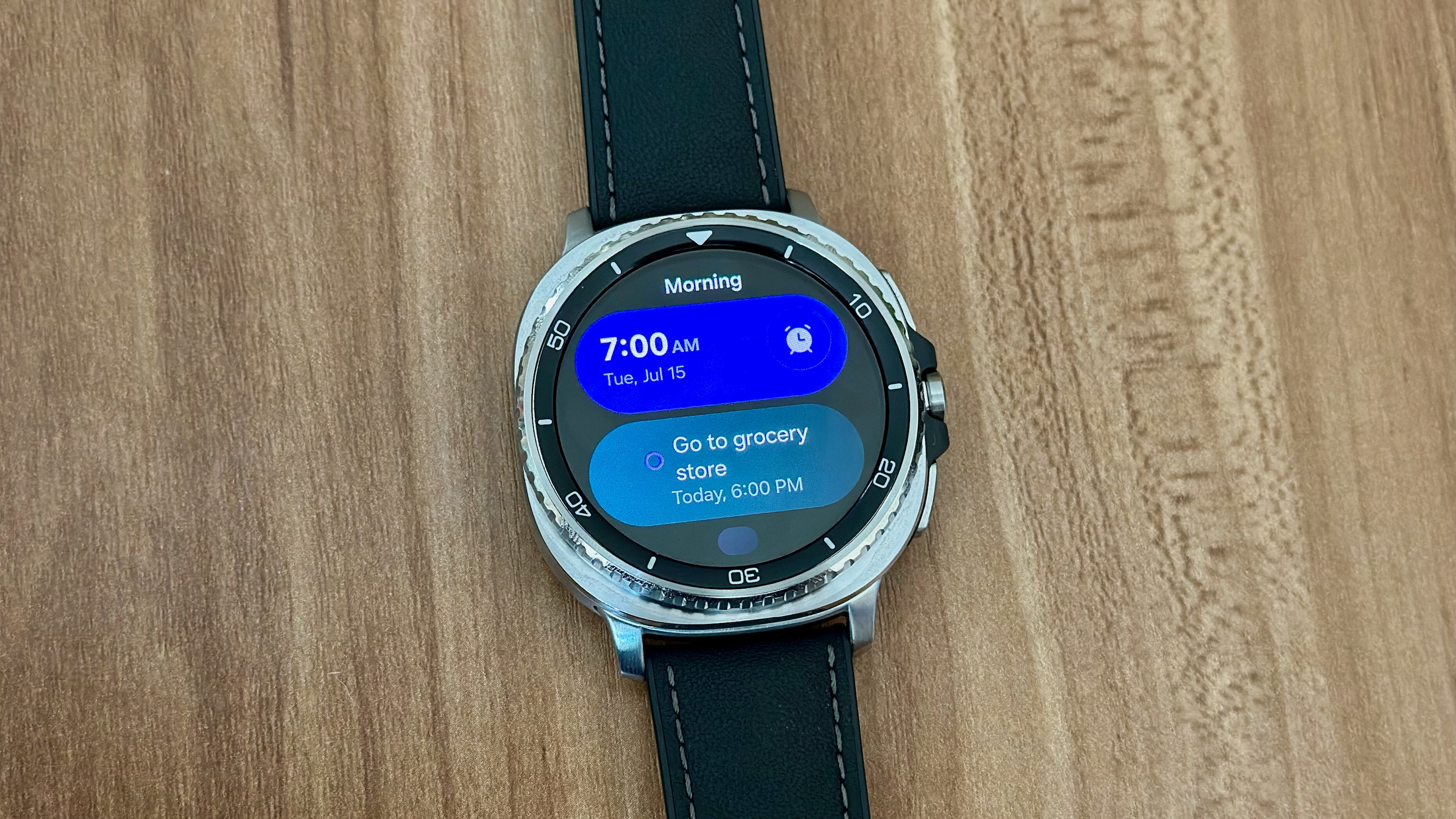
For each Samsung app, you have two Tile options: a narrower oblong designed to fit two per display space, or a taller squircle that uses most of the space but leaves enough room to show a hint of more data below. So you can still give an important app a "full" Tile space, but group other apps below it, if you prefer.
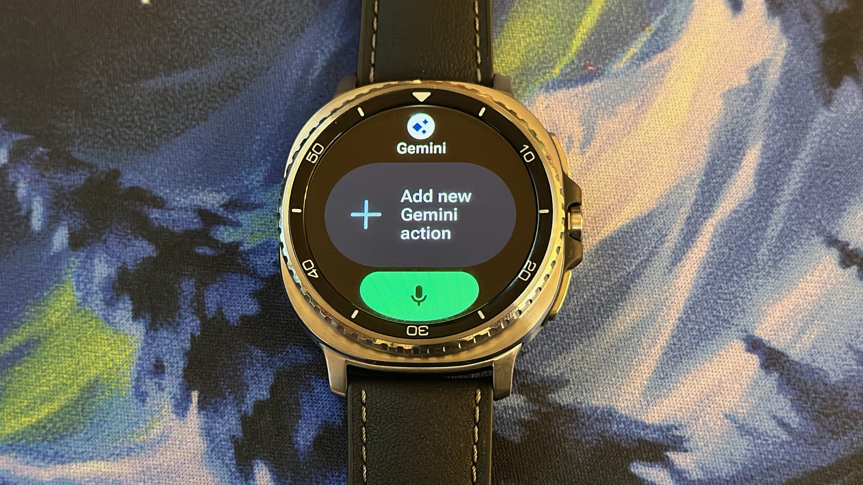
Unfortunately, Google and third-party apps only have traditional, full-Tile layouts; they don't appear as an option when you edit multi-app Tiles. The Gemini tile, for example, already has the Wear OS 6 look, with rounded edges and finite space for two saved commands.
I assume (or at least hope) Samsung will let other Wear OS app developers make their own mini-Tile views. Because they've become an instant favorite, allowing me to fit more apps into my routine without having to commit an entire Tile to something I won't use every day.
The Galaxy Watch 8 and Pixel Watch 4 took two different Tile paths
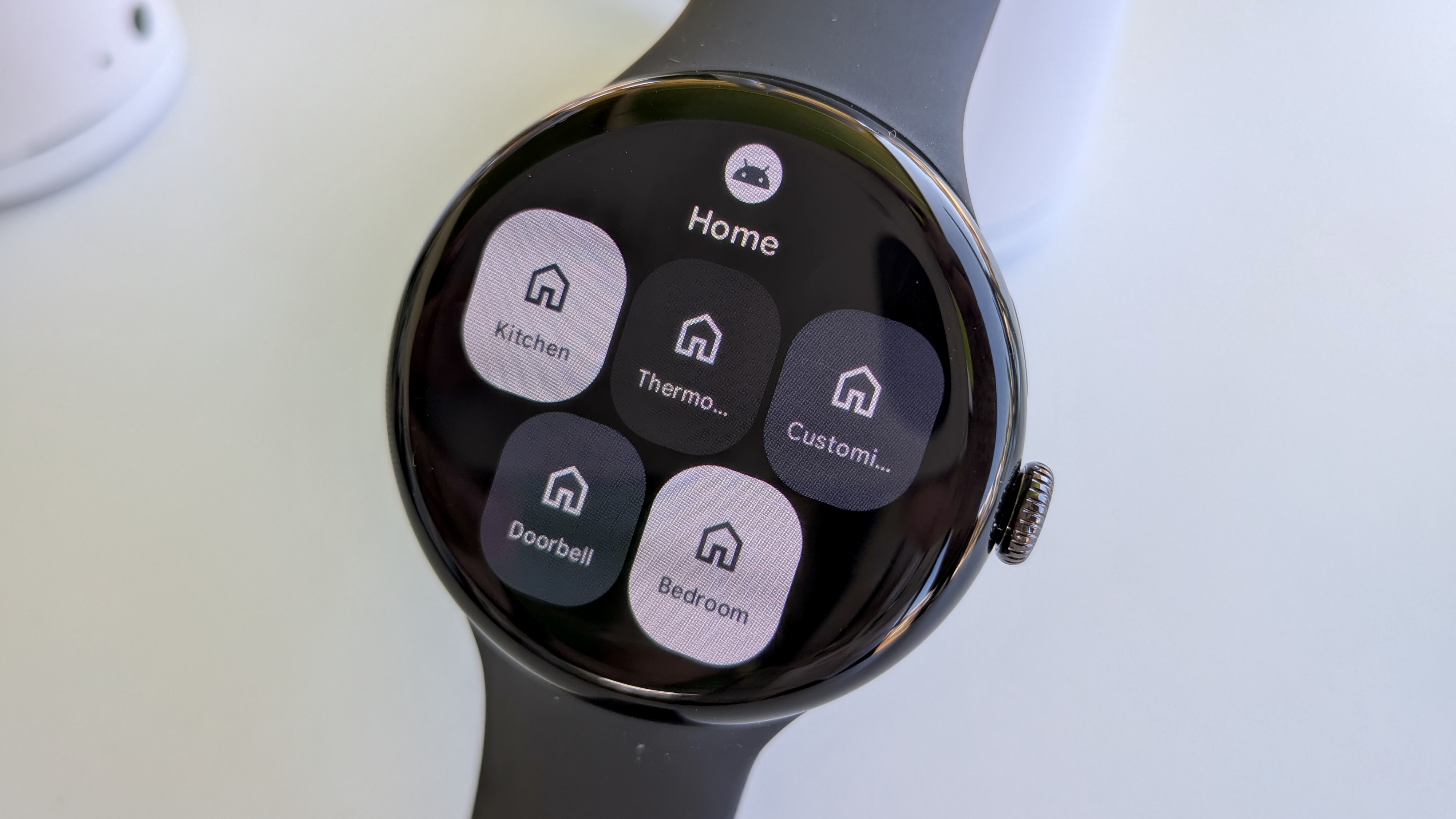
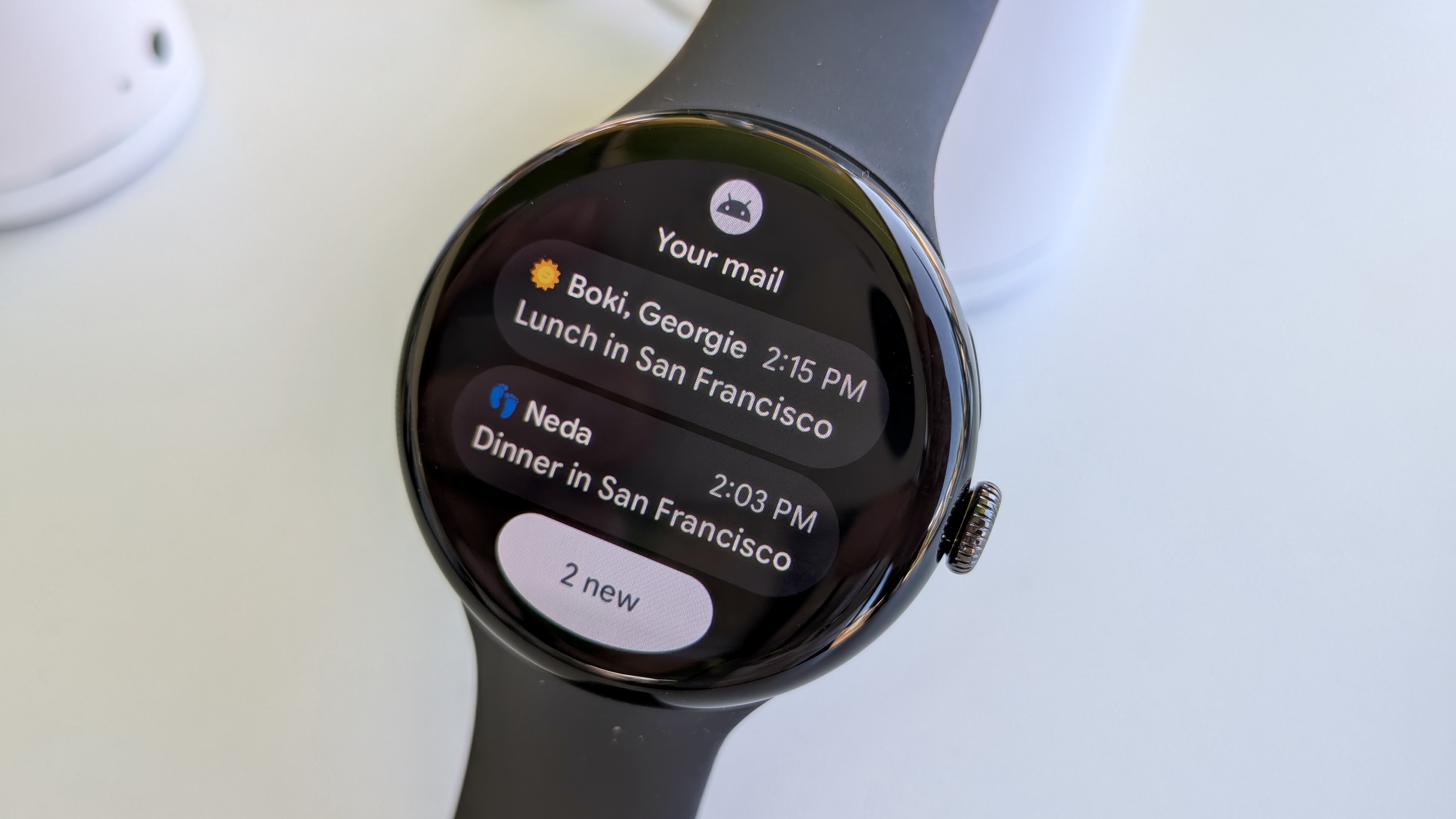
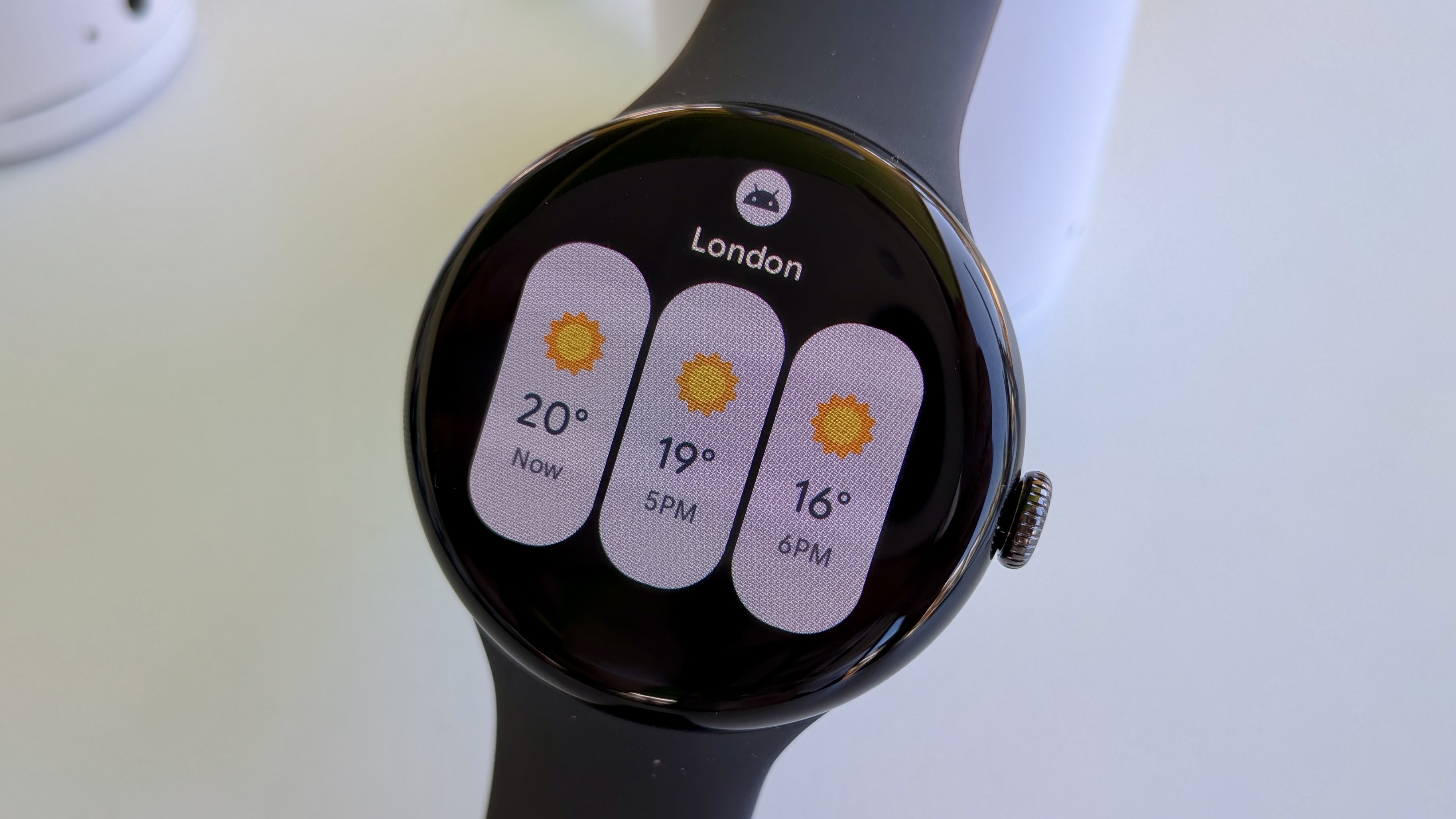
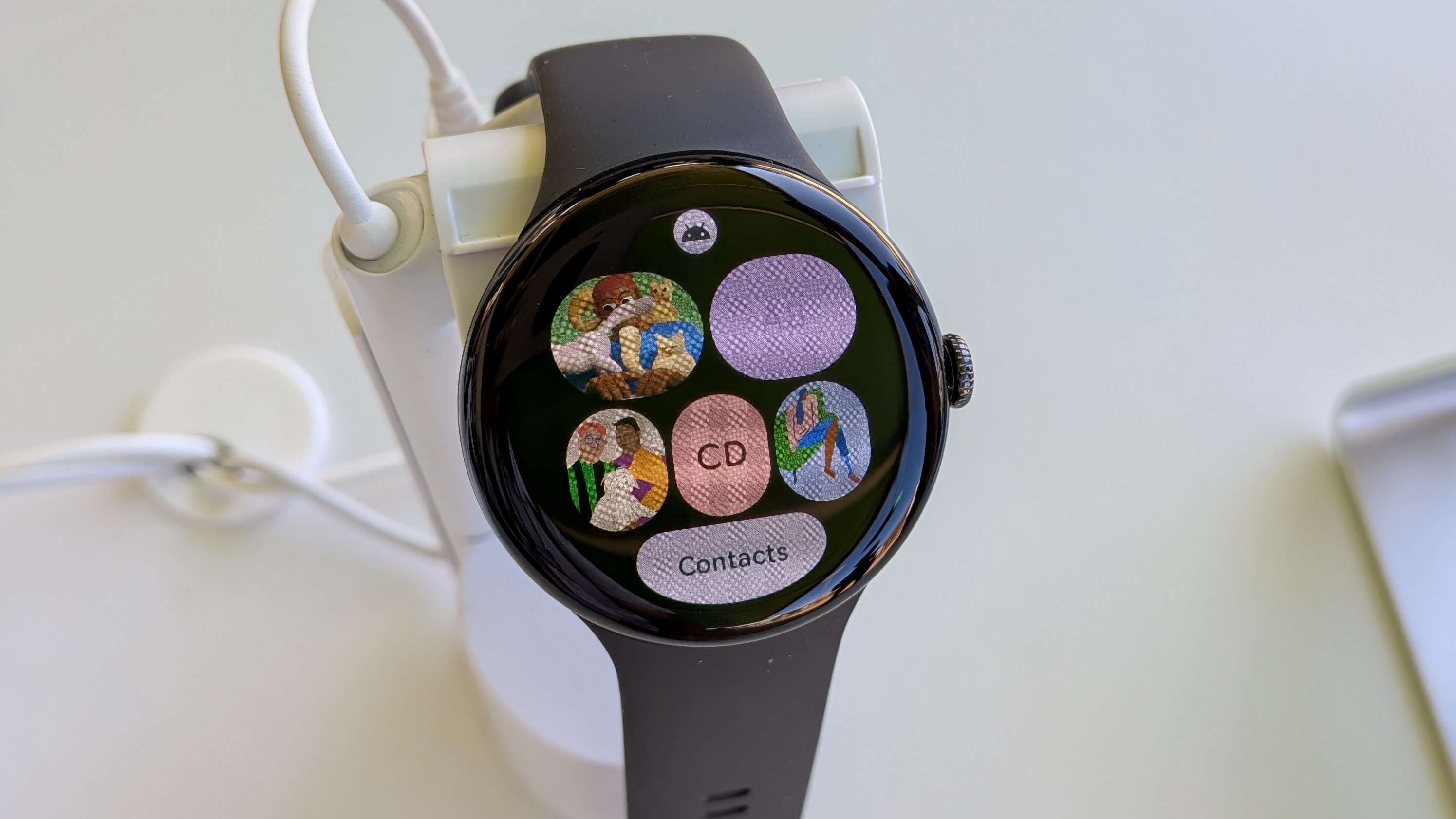
When I tried out Wear OS 6 at Google I/O, I was impressed by Google's redesigned Tiles because they took full advantage of the display space. You can avoid opening individual apps because the Tile will jump-start your search for the most relevant information or shortcuts.
Now that I've seen Samsung's take on Wear OS 6, I find this fundamental difference fascinating. Samsung's Tiles system feels much more like customizing your Galaxy S25 home screen so that you can swipe left to your organized apps and widgets. Google's UI is more self-contained, designed for watches with the Material 3 Expressive aesthetic as inspiration.
This may just be recency bias talking, but my preference has shifted to Samsung's Tiles. For one, I prefer seeing more information at once, even if it's smaller. For another, I find it easier to scroll down through one themed Health tile and decide which option to tap, rather than have to memorize my Tile order and settle on one thing at a time.
I'm not writing off the Pixel Watch 4 UI until I thoroughly test it. However, I feel that Google's Wear OS 6 Tiles optimize the old way of doing things, while the One UI 8 Watch Tiles transform the experience, making me more likely to use apps that I previously ignored on my Galaxy Watch Ultra because I had run out of Tile slots and my app drawer was too overwhelming.
Thankfully, this aspect of One UI 8 Watch will come to other Galaxy Watches later this year, though the Watch 8/7's Exynos W1000 chip makes scrolling especially smooth. I won't blame you for feeling impatient until then, though, because these new Tiles are just that cool!
The Samsung Galaxy Watch 8 Classic takes the Ultra template and adds the rotating bezel you know and love. It's a totally new look that you may not consider "classic," but it's surprisingly attractive in person and has all the upside of the new Exynos chip, upgraded health sensors and GPS, and a new shortcut button to make Watch 6 Classic fans happy.


