Legendary hockey team the Detroit Red Wings have unveiled their new centenary logo, and it's safe to say the design is a soaring success with fans. Putting a stylish spin on the team's iconic logo, the new 100th anniversary design is a prime example of simple design executed to perfection.
It's no mean feat to mess with one of the best sports logos of all time, but thankfully, the Red Wings absolutely nailed the brief. When sports logo redesigns go south, fans can be savagely opinionated, so it's refreshing to see a design that's taken off among supporters.
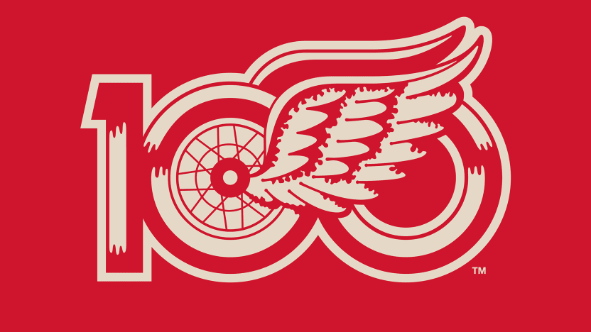
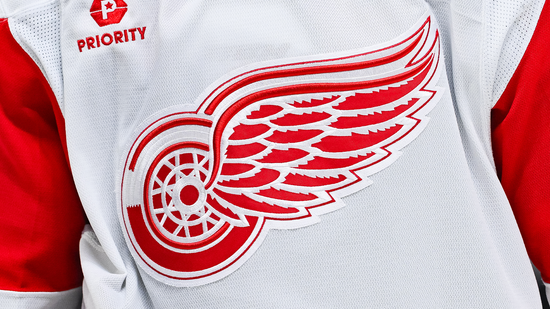
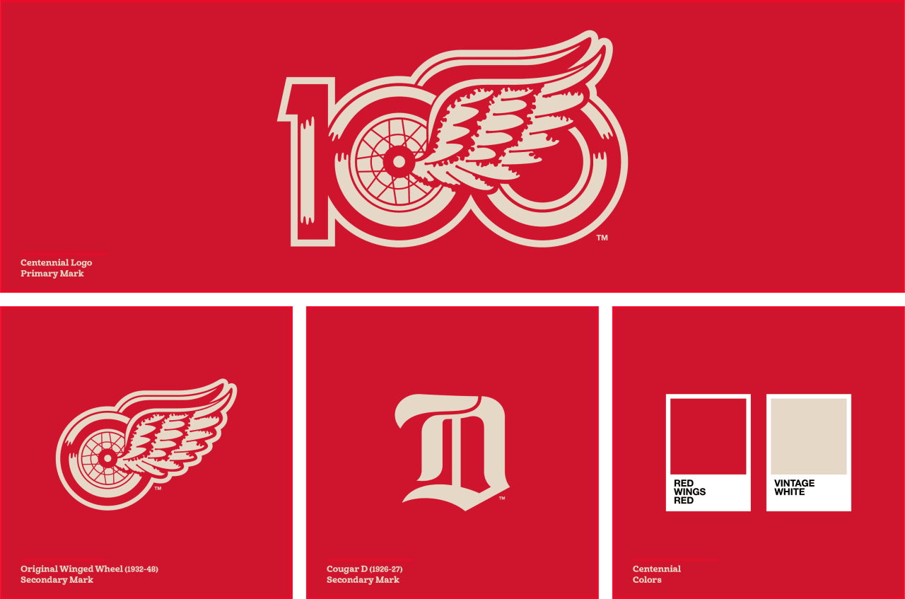
Founded in 1926, the Red Wings are considered one of the original six NHL teams. The new logo features the iconic Red Wings 'Winged Wheel' design nesting in the middle of a stylised '100', rocking the team's signature red and white colour palette. With a subtle retro look, the design has a heritage design feel, perfectly encapsulating the team's rich sporting history.
Over on X, fans were delighted by the tasteful design. "Beautiful. Classic. Clean. A+ work," one X user wrote. Others chimed in, calling the new design "gorgeous", "slick", and "fire", while over on Reddit, one fan praised the logo, commenting, "It doesn't look tacky or corporate like a lot of these kinds of things do in recent years. Nicely done."
The Red Wings' centenary logo proves that reworking an iconic design doesn't have to be an extreme reinvention – sometimes, clean design can be a winner. For more sports logo news, check out the Utah Mammoth's recent design dispute or take a look at the best NHL logos.