An affordable eyecare and eyewear brand might not seem the most exciting subject for a rebrand, but the new America's Best logo shows some sharp vision an absolute hoot.
With a fun 'hidden' reference for those with strigiforme eyesight, the surprisingly memorable new identity is a dramatic departure from the brand's previous staid logotype (see our piece on Logo Easter eggs for more inspiration, and don't miss our pick of the best monitors for graphic artists).
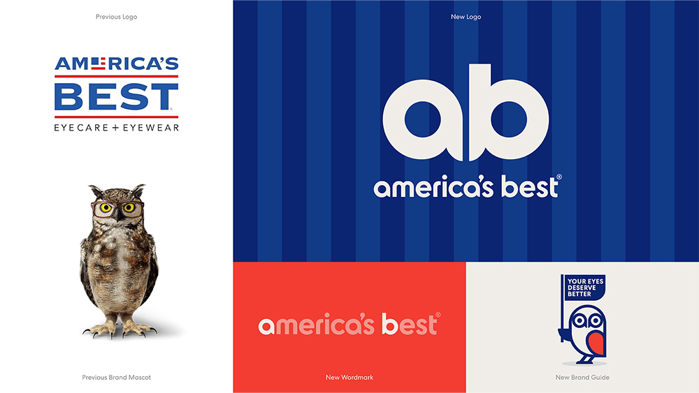
America's Best is owned by National Vision and has around 1,000 stores across the US. Its old US flag logo looked dated and generic and didn't seem to say anything about what the brand does (unless it was supposed to look like an inverted Snellen chart for testing eyesight).
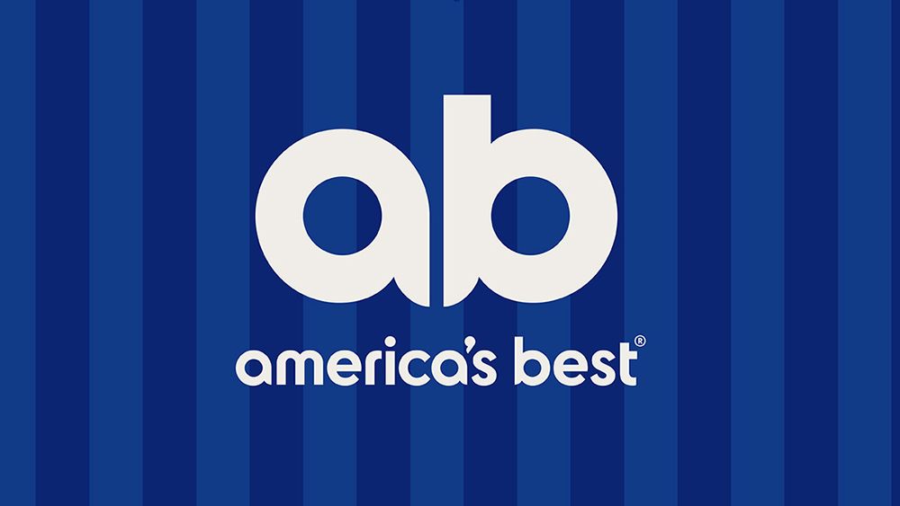
But that's all changed. The new logo design strips things down to just the brand initials, AB, and uses the letters in a clever way to form the eyes and beak of an owl –a reference to the brand's long-time mascot and to owls' famed excellent eyesight.
The mascot has also had a makeover. The previous 3D realistic character has been replaced with a stripped down flat design that;s simpler to use across different types of assets but also has a lot of personality. The owl's eyes closely match the shape of the new logo.
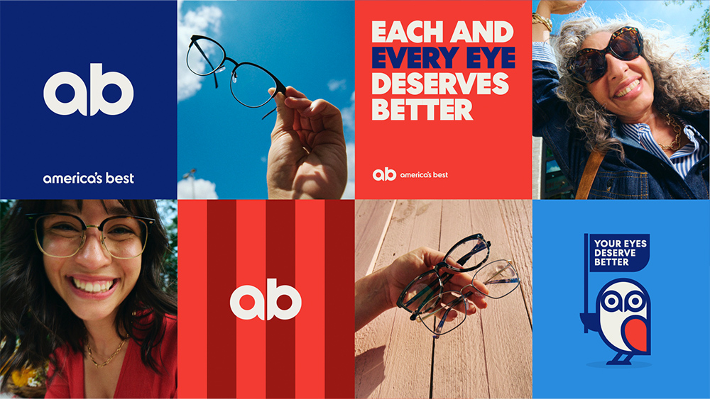
The US colours haven't disappeared completely. Red and blue are still part of the brand colour system but in more modern, vibrant hues, and other visual assets use stripes as another reference to the US flag.
The rebrand was carried out with VML and also includes a social media and website refresh with photography and video capturing everyday experiences of customers. A new tagline, 'Every Eye Deserves Better' is intended to reflect the brand's focus on quality but affordable eyecare for all.
Tom Murphy, chief creative officer at VML US, says the agency wanted “to make people think for a moment, on a very human level, about all the ways their eyes deliver for them.”
The new identity shows that even a fairly radical rebrand can still retain a homage to a brand's heritage (perhaps Cracker Barrel could learn from that).