Interior designer Tineke Triggs is one of Homes & Gardens' new Editors-At-Large for By Design, sharing her thoughts on decor. See the rest of her articles here.
If there’s one principle that truly separates how designers see a room from how most homeowners experience it, it’s this: designers pay as much attention to what isn’t there as to what is. Negative space – the quiet pockets around furniture, the open stretches of wall, the breathing room between objects – is one of the most overlooked tools in interior design. Yet it’s often the very element that makes a space feel intentional, elegant, and genuinely livable.
Where most people take in a room by clocking its individual pieces – the couch, the artwork, the rug, the room color ideas – designers focus on the relationships between them. They notice the pauses, the tension, the places where the eye can rest. Negative space is what prevents a room from feeling visually crowded or emotionally overwhelming. It’s the difference between a space that simply contains beautiful things and one that actually feels right.
You can see this at work in any well-balanced interior. In a layered living room, the eye needs somewhere to travel, somewhere to pause, and moments of visual clarity. Allowing generous space around a sculptural console, or resisting the impulse to fill every surface, immediately elevates the composition. The room shifts from feeling collected to feeling considered – curated rather than accumulated.
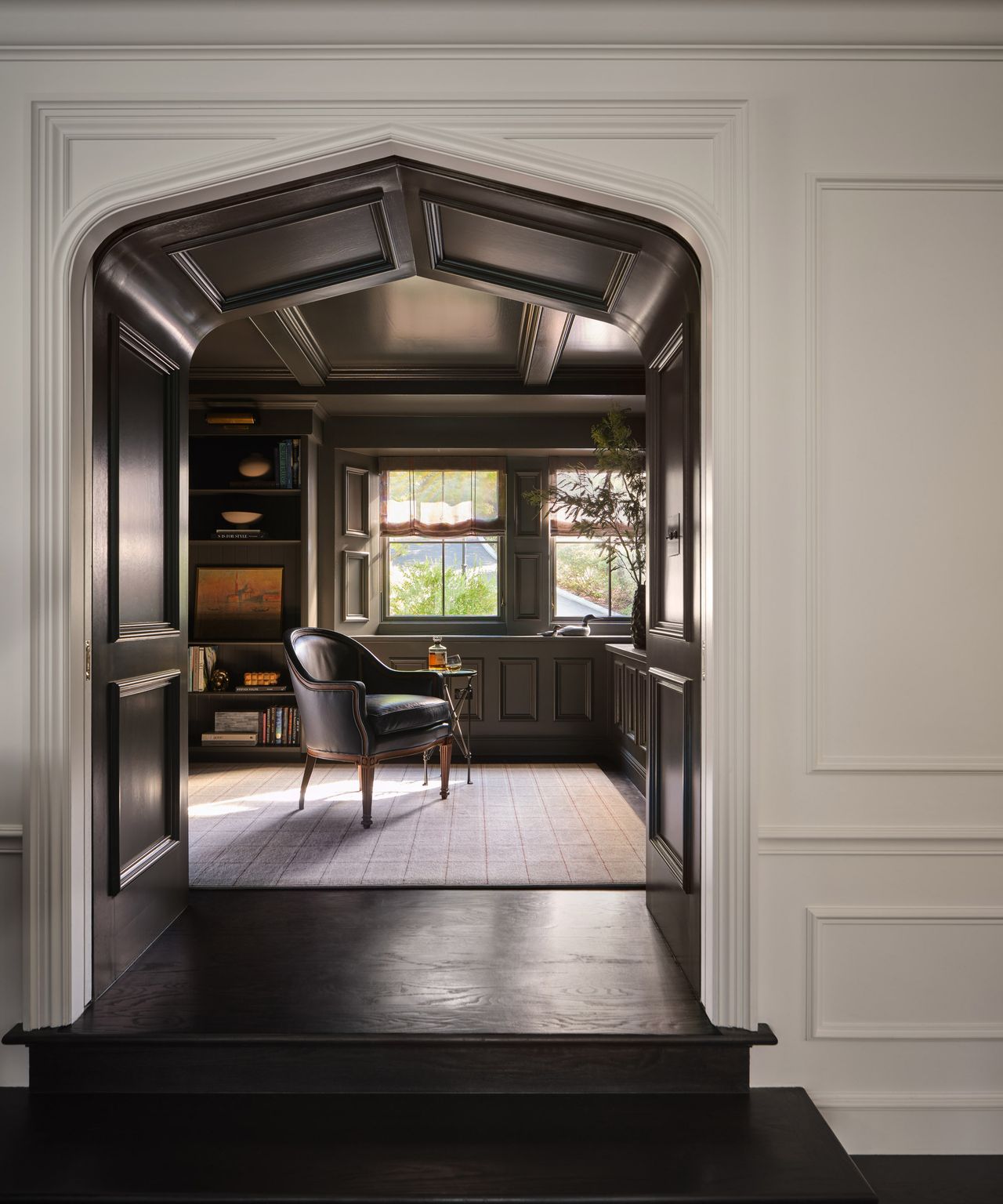
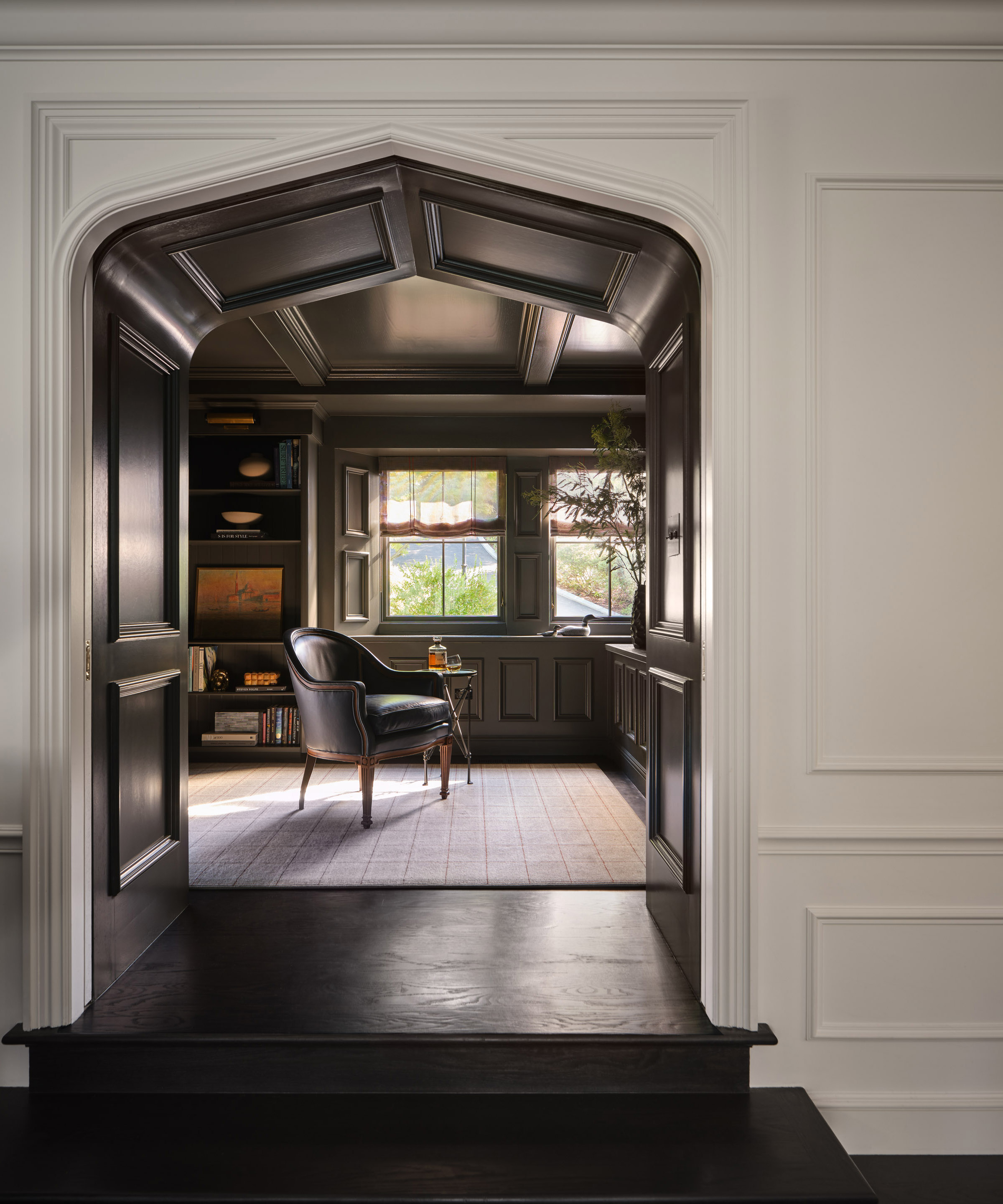
Negative space also has a quiet power to spotlight craftsmanship and detail. An uncluttered archway, for instance, allows architectural lines to take center stage. When a chair sits just far enough from a console, or a piece of art is given room to breathe, you begin to notice the silhouette, the texture, the subtle gestures – the curve of a branch in a vase, the patina on a metal fireplace surround. Space makes objects legible. It slows the eye and draws attention to nuance.
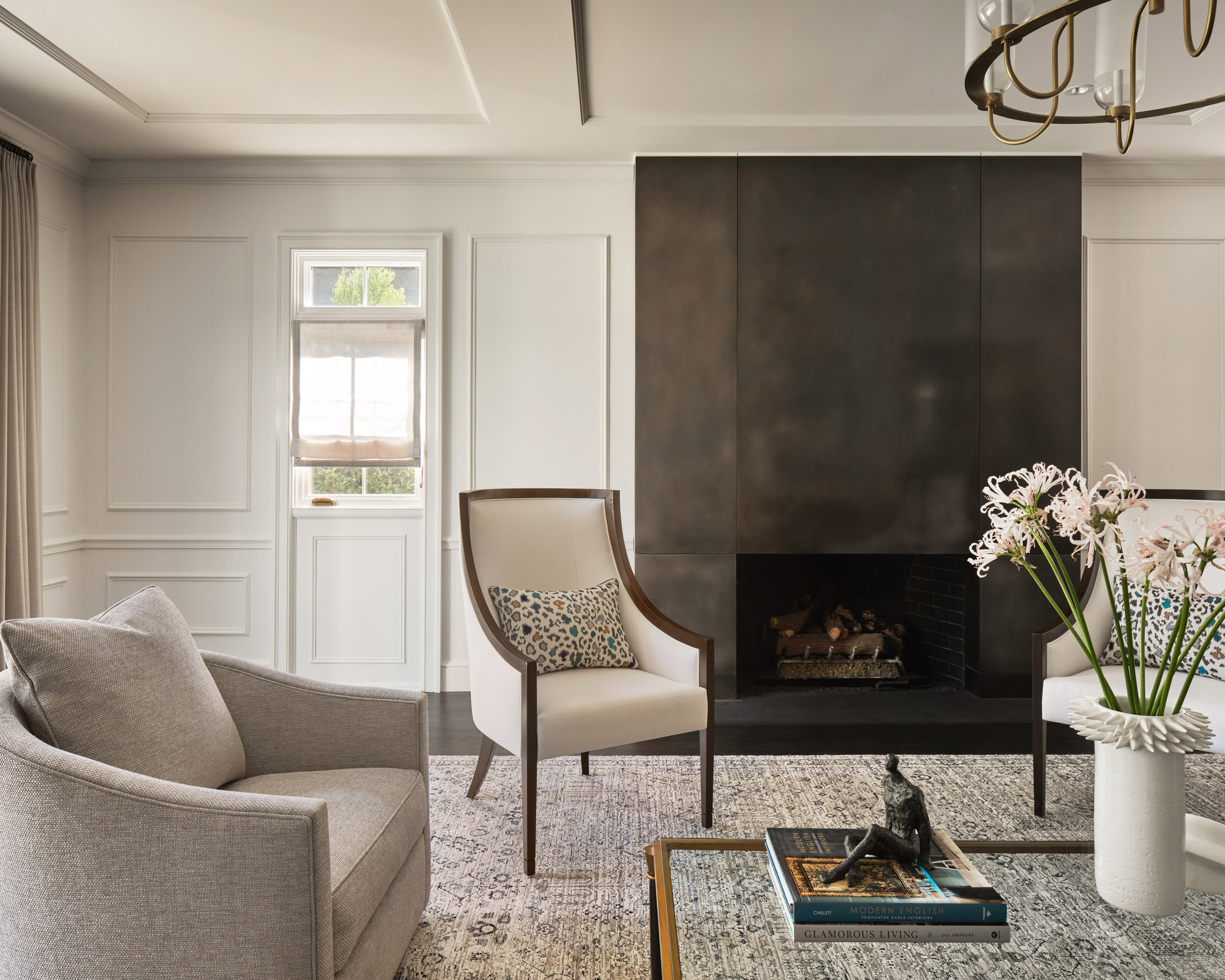
One of the most common design mistakes I see is pushing furniture tight against the walls in an attempt to ‘maximize’ space. Ironically, this often has the opposite effect. Pulling a pair of chairs slightly inward introduces intentional negative space, clearly defining the seating area and making the room feel more grounded and inviting. It’s the difference between a layout that feels scattered and one that feels thoughtfully anchored.
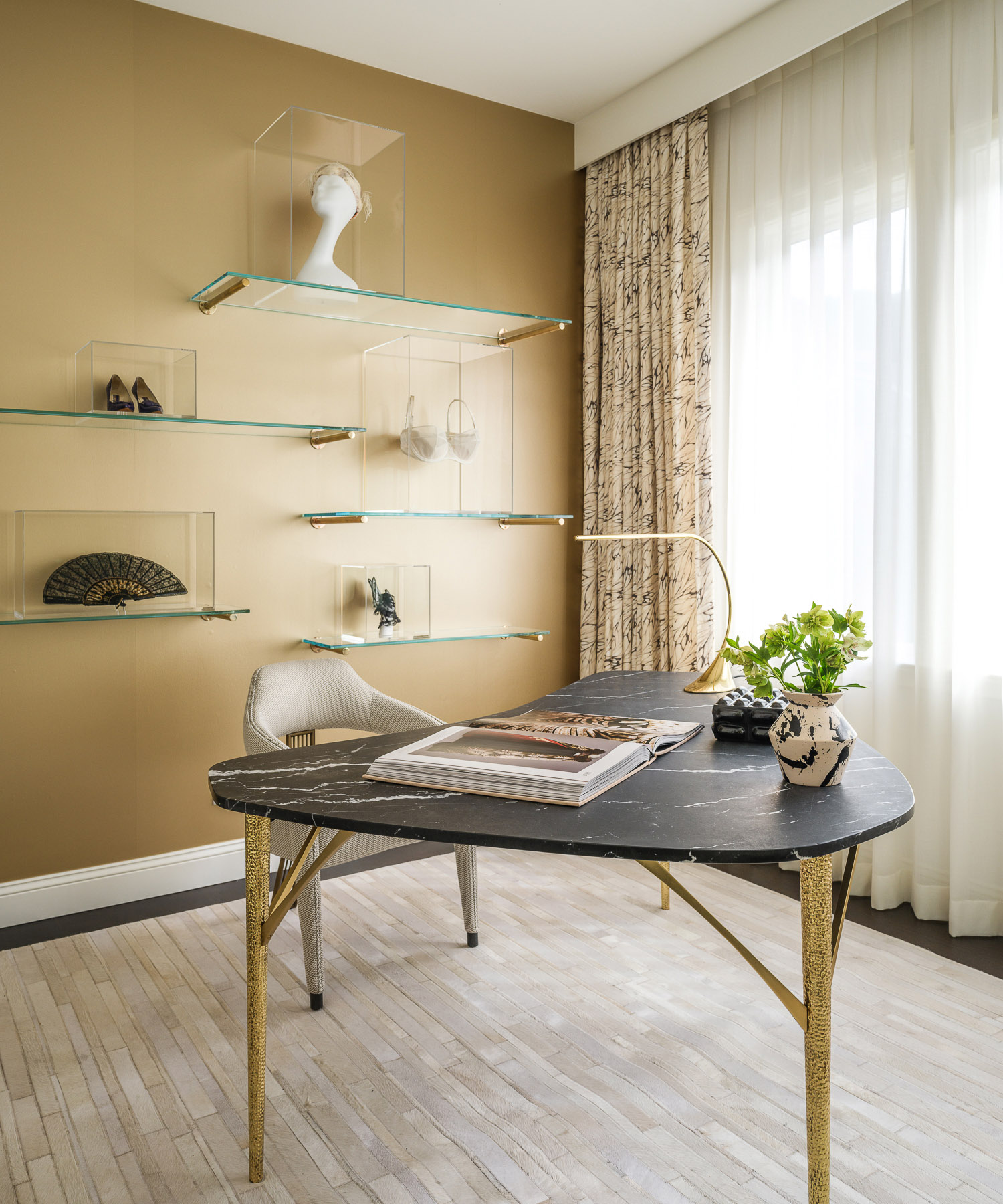
Negative space isn’t about emptiness; it’s about contrast. In a bright, crisp room with graphic lines, the margin of the wall around a piece of art becomes a frame. In a richly paneled study, open floor space allows the depth of the millwork to feel atmospheric rather than oppressive. Even display areas benefit from restraint: a single sculptural object, given room to stand alone, becomes a moment of pure focus instead of visual noise.
Light plays an equally important role. Negative space gives light somewhere to land. When sunlight moves across an uncluttered wall, floor, or tabletop, it creates shifting shadows that add depth and dimension. In rooms crowded with competing elements, that movement is lost. In spaces with intentional openness, the room feels dynamic, alive, and ever-changing throughout the day.
The truth is, negative space requires discipline. It takes confidence to leave areas unfilled and to resist the instinct to decorate every surface. But the payoff is significant: a calmer home, a more refined aesthetic, and a sense of visual generosity that can’t be achieved any other way.
My advice? Edit more than you accessorize. Build in intentional pauses. Pull back on styling until each piece has room to assert itself. And above all, let your home breathe. The silence between notes is what makes music sing – and in design, it’s the space between objects that makes a room truly work.