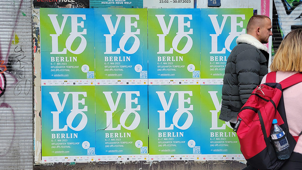
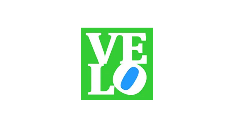
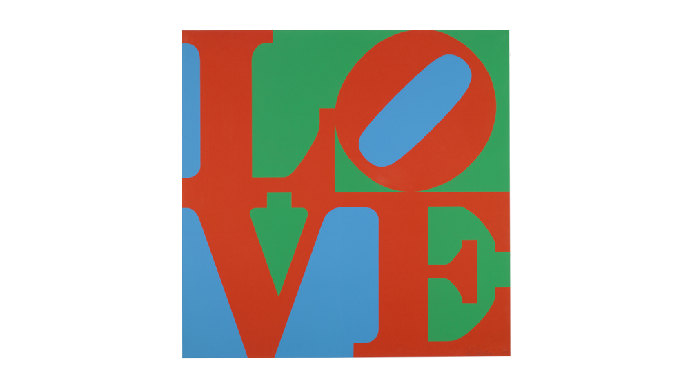
What did you read first in the logo design above? The identity is for a German bicycle trade fair called Velo, but chances are that if you're familiar with Robert Indiana's classic 1967 screenprint, you'll have read it as 'love', and that's exactly the intention.
The logo design uses the wide recognition of Indiana's work to create a kind of visual pun expressing the event's love of all things bicycle-related (see our pro tips on how to design a logo for more inspiration).
LOVE this poster for a bicycling event from r/DesignPorn
The logo design is getting a lot of LOVE (sorry) on Reddit at the moment, where one person notes that Indiana's work is "so ingrained in some people’s memories that we will automatically read it as LOVE. It took me a second to realize that it actually says VELO." "I was looking at this for a solid 5 minutes trying to figure out why this is familiar to me," someone else wrote.
Even people who haven't seen Indiana's original work are probably familiar with the design from other reworkings, such as the cover of Rage Against the Machine's covers album, for which it was changed to read 'Rage'.
For more logo inspiration, see our pick of the best logos of all time. We've also rounded up the best car rebrands.