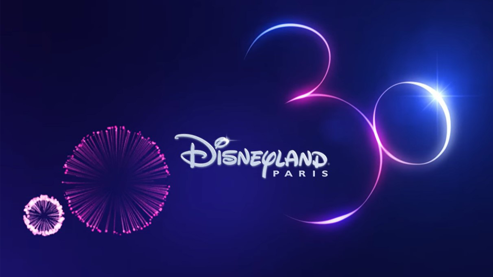
Disneyland Paris celebrated its 30th anniversary last year (making it officially a millennial), and used the occasion as an opportunity to drop one of the most delightful logos we've seen in the last few years. And once again it's doing the rounds online.
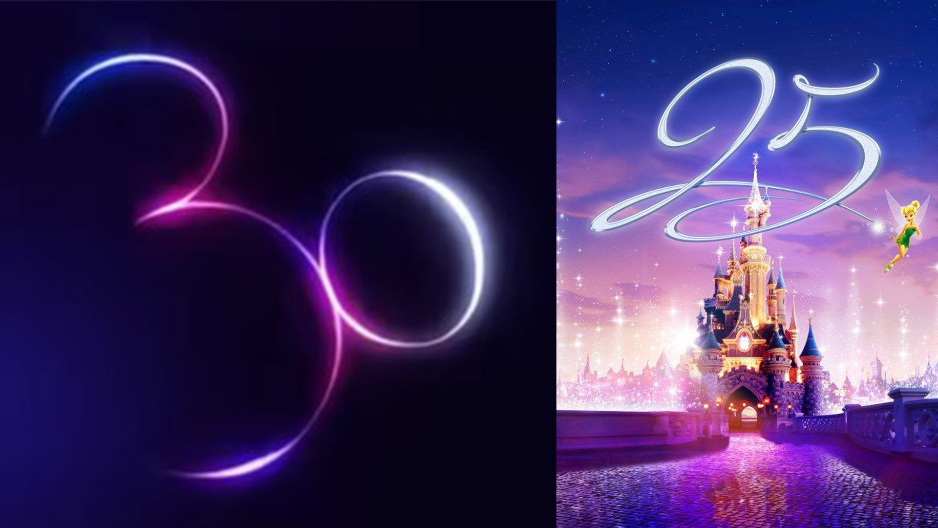
At first glance the logo simply looks like a stylised '30'. But look a little closer and you'll soon realise you're looking at the outline of a certain cartoon mouse's head. Like all of the best logos of all time it's deceptively simple, and guaranteed to raise a smile.
The logo for Disney Paris’s 30th anniversary from r/DesignPorn
Once again the design is sitting at the top of Reddit's r/DesignPorn page, with users going wild for the clever optical illusion. "It's really very good," one user comments "It's both perfectly a 30, and the Mickey mouse logo. The tilt is perfect, where the left out the logo outline is perfect." Another, speaking for all of us, adds, "Me: “It’s just the number thir-OH.”
We love a good Easter egg here at Creative Bloq and Disney knows how to produce the goods. It was only recently that eagle-eyed fans spotted an Easter egg in Toy Story 4 that almost caused an absolute disaster.