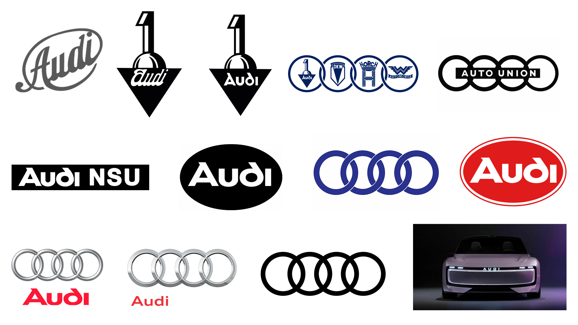
The four interlocking rings of the Audi logo is one of the most recognisable symbols of the car world. It represents the brand's heritage and cultural history, but it's gone through some controversy in recent years, with its monographic rebrand in 2016, its move to flat design, which irked many drivers, and its Jaguar-esque concept car unveiling in China at the end of 2024, that appeared to drop the rings altogether.
It's only recently that people seem to have discovered that the hidden meaning behind Audi's four famous rings originates from the Great Depression, when Audi had to merge with three other companies to offset the financial struggles of the time. The union represents the strength and resilience of the automotive industry, especially as its four rings remain iconic today.
The Audi logo has undergone many redesigns since its launch in 1909, but what we see today is still a similar iteration of what the company's identity has been for the last one hundred years, which says a lot about the logo's impact.
Its recognisability comes from its simplicity and consistency – despite going through different ownerships (maybe this even makes it one of the best logos of all time?).
This is a brand history that we – as designers – can all learn from. That's why we're going to take a look at the full history of the logo's evolution; how it got to where it is now, as well as any detours it's taken along the way.
01. Audi logo history: 1909
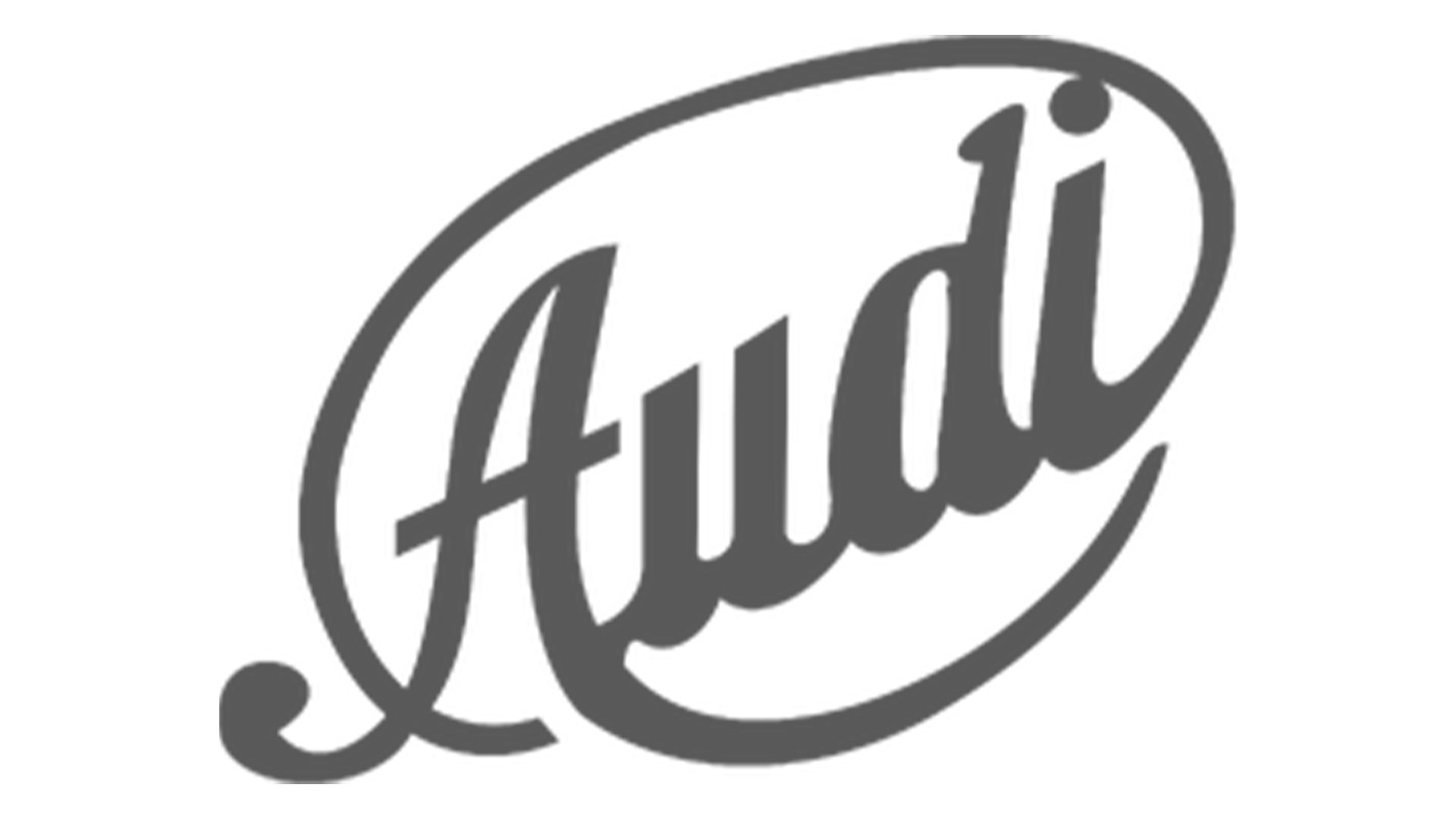
The first ever iteration of Audi's brand identity was this art-deco inspired logo. Reflecting emerging design styles of the time in 1909, the serif-based script font focuses on stylising the text rather than building in any motor-based connotations. The tone of grey chosen clearly intends to create a professional, sleek finish, but the neutral tone of grey leaves a little to be desired, and risks blending into the background.
Information on the usage of this logo is sketchy, but it seems to have been used in initial designs as well as potentially in the company's launch. It had a short life-span, as two more iterations were unveiled in the same year.
02. Audi logo history: 1909 (again)
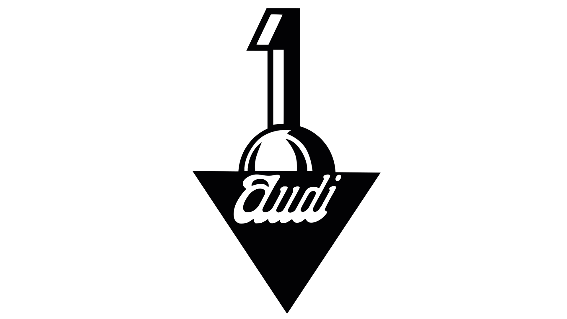
Audi had already opted for a redesign in the first year of its launch, ditching the script logo for this geometric shape with the number '1' as the centrepiece. This was the company's first established logo. The formation of shapes don't immediately appear to make a great deal of sense – they don't create a definable object or shape.
However the design does imply imagery of a trophy, therefore bringing connotations to driving as a sport, and also for fun. In this way the logo is clever in its subtle approach, and is certainly something I could see on a car in the 1910s or 1920s – although it wouldn't hold up in modern day car logo design that focuses on the stripped back and future-focused.
03. Audi logo history: 1909-1932
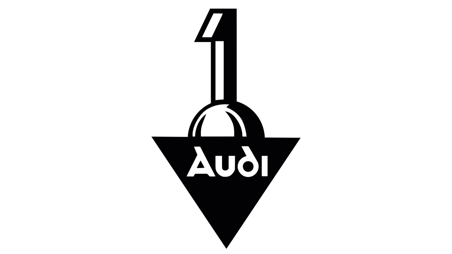
You might assume that a company (especially a new one) wouldn't change its logo more than twice in one year, but Audi's branding department was still not done! Later on in 1909, a third iteration of the logo was revealed – this time similar to the previous version, but instead featuring a geometric sans serif font to replace the script previously adorning the trophy-like emblem.
With industry rapidly progressing at this point in history, it was likely thought that the sans serif font would better stand the test of time. From the perspective of cultural history, it's also important to note that the geometric lines combined with the perfectly rounded circle of the 'd' almost foreshadow the upcoming Bauhaus movement in design.
04. Audi logo history: 1932-1949
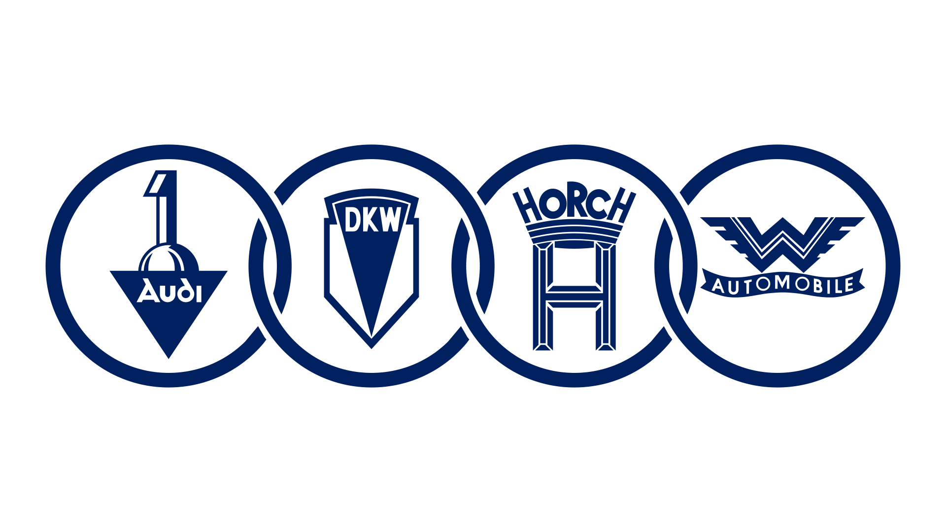
1932 started Audi's evolution into what we know its logo as today, with the emergence of its four iconic rings. In this first iteration of the logo, each ring houses a different company's logo.
This was to represent the merger of Audi with Auto Union, which meant that the logo now represented the four companies that came under this ownership: Audi, Horch, DKW and Automobile.
The merger was a strategic move to help keep all four companies afloat in the time of financial difficulty following the Great Depression.
As logo design goes, this was not a feasible long term option. The incorporation of four different logos into one design makes it too intricate and detailed to be practical option for a car company that needs to build this into the design of a car, before we even get into recognisability and ease of visual processing.
However, it had an important message it needed to get across at the time to consumers, which was that these car companies have unified and are now one. The rings symbolise strength in this union, aiding a positive response, and the blue is the first injection of colour into Audi's logo, representing modernity and progression.
It's possible this logo was only ever intended to sport all four logos temporarily to represent the time period of the merger.
05. Audi logo history: 1949-1969
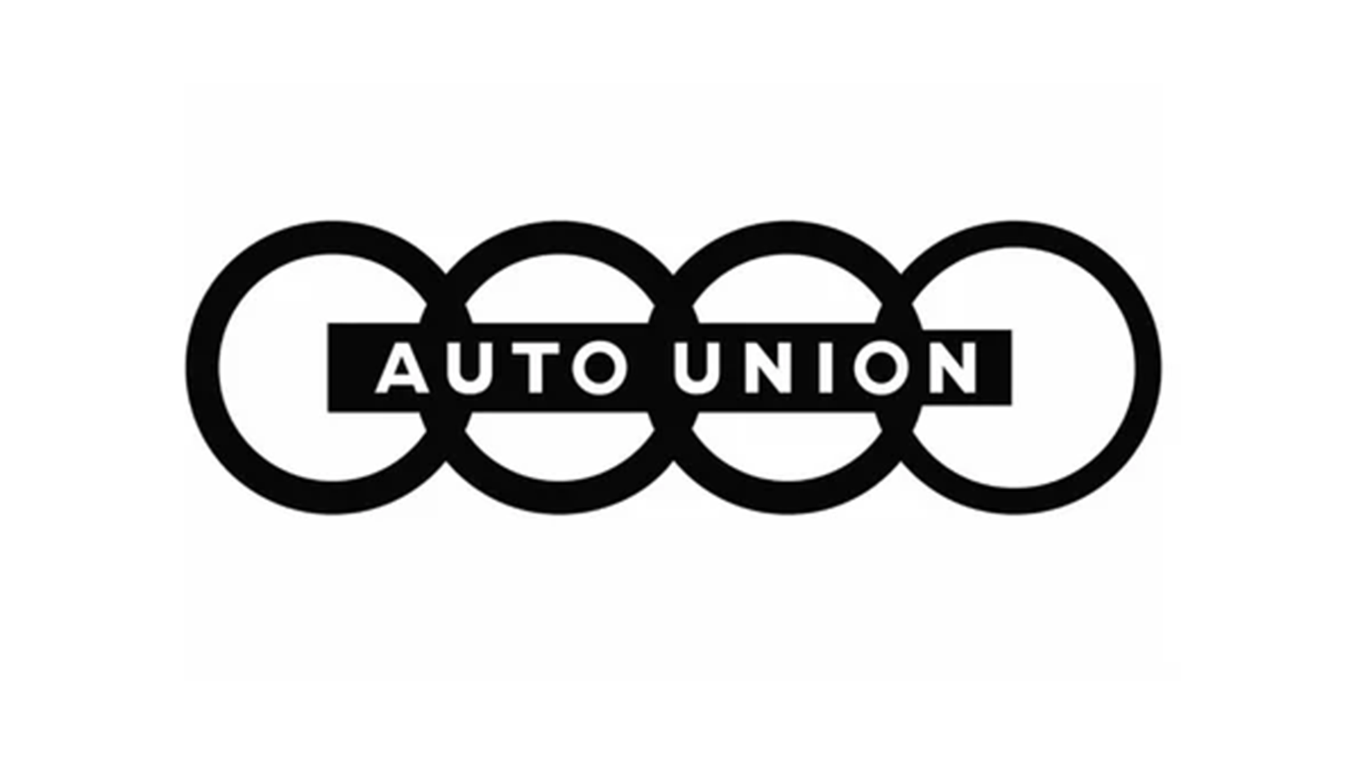
In the wake of the end of the Second World War, a fresh new identity was needed. Audi streamlined its branding with the dispensing of the four individual brand logos, while maintaining the four rings that represent the brand's unity.
This logo was easily digestible and it was cleaner, in line with design trends at the time. The four rings were adorned with a centralised rectangle displaying the company name 'Auto Union' in a sans serif with widely spaced text.
This simplicity was easy to build into any automotive design while keeping the overall company's name visible. It also ensured that the merging of the four companies was now sealed in the mind of consumers: with the new management of Auto Union now established.
06. Audi logo history: 1969
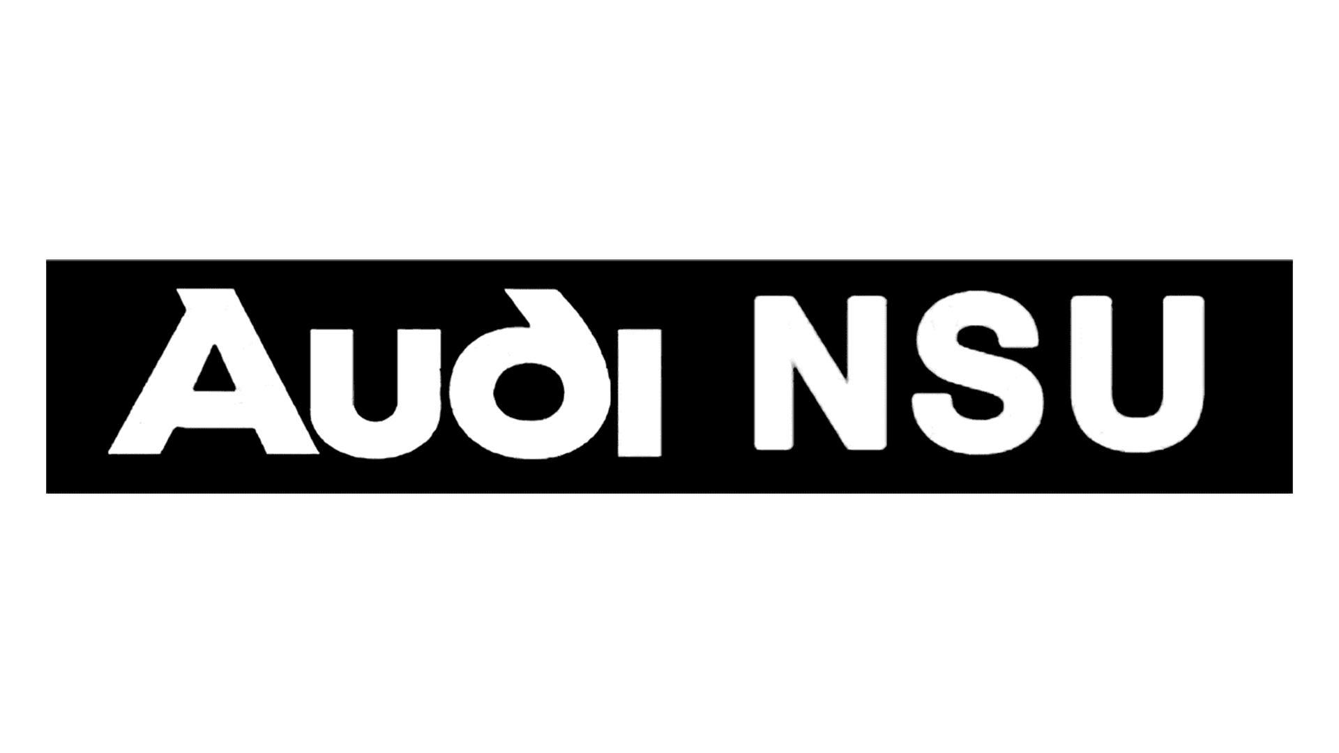
And here comes another challenging year for Audi's branding department. 1969 brought three new iterations of the logo, kicking off with this major rebrand. Although it maintained the stark black and white for the robust, professional look, the four rings that had started to become recognisable were ditched.
NSU Motorenwerke AG had merged with Auto Union, explaining the addition of the 'NSU', and the sudden urge to redesign the well-known rings into something new. It's possible Audi wanted to create a fresh identity that displayed the recent company acquisition.
07. Audi logo history: 1969-1995
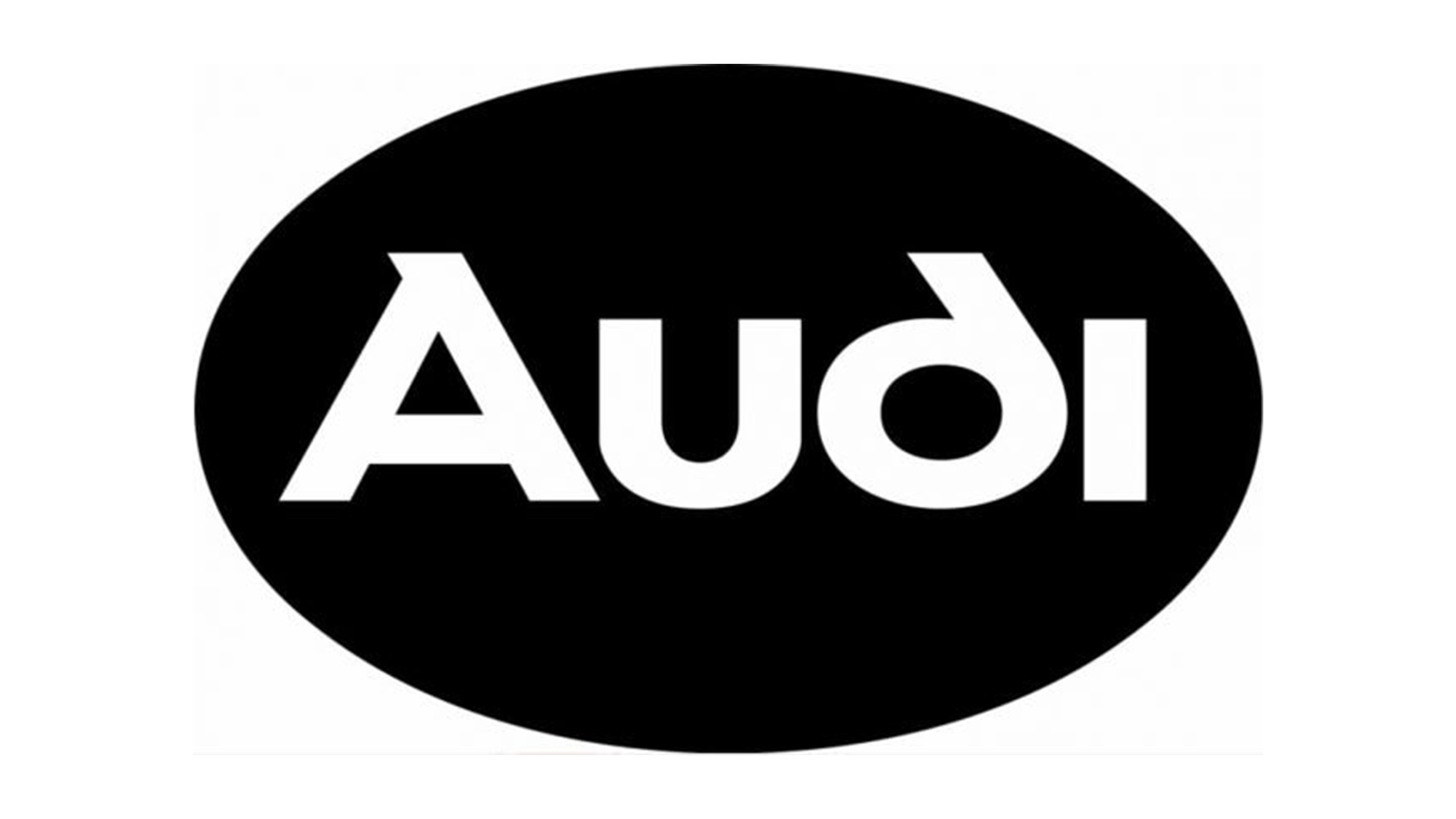
Audi's logo was brought another change in 1969. It had now become a similar black and white, sans serif wordmark – only this time it was in a circle rather than a rectangle. The circle incorporates the much-needed geometric recognisability that car brands need, and it highlights the return of Audi's typography from the third 1909 logo. Within the rectangle, this important addition was less noticeable.
This is an understandable change with clear strategy involved. In 1969 the company became simply 'Audi' again, meaning that incorporating a nod to Audi's original heritage signified this change. It also created familiarity for those who remembered its first logo, as well as important brand consistency.
08. Audi logo history: 1969-1995 (again)
Car logos and symbols go hand in hand. A wordmark with minimal recognisable shapes cannot be relied on alone to achieve the highest level of recognisability, so Audi's branding was not left there.
The four rings were brought back, only this time in a blue similar to the original colour of the four rings when the logo was brought in to represent the merger. This bright blue represents movement and energy, while its muted tone maintains a sense of reliability and professionalism.
Now that the point had been made with its recent iterations that the company was now just 'Audi' again, the wordmark was scrapped to let the four rings speak for themselves. Over the odd thirty years the rings had been in use for the logo, they had gained familiarity for the brand, making the this version of its identity recognisable to all.
The rings also give a respectful acknowledgement to the brands Audi merged with; establishing their importance in the company's history despite Audi now taking over as the company's title.
09. Audi logo history: 1978-1995
The rings proved a strong choice, however in 1978 another change was brought forward in the shape of a red circle holding the wordmark. Audi retained its four rings for use on its cars, while utilising this form of the logo for marketing and advertising assets. Its brightness definitely ensured that an advert wouldn't be missed.
The red symbolises power and speed, as well as creating a more striking look set to stand out from the crowd. It's clear this logo was designed with the intention of grabbing more attention, with the thin white outline surrounding the text at the edge of the circle emphasising both the typography and the logo, as well as adding to more connotations of speed and agility.
10. Audi logo history: 1995-2009
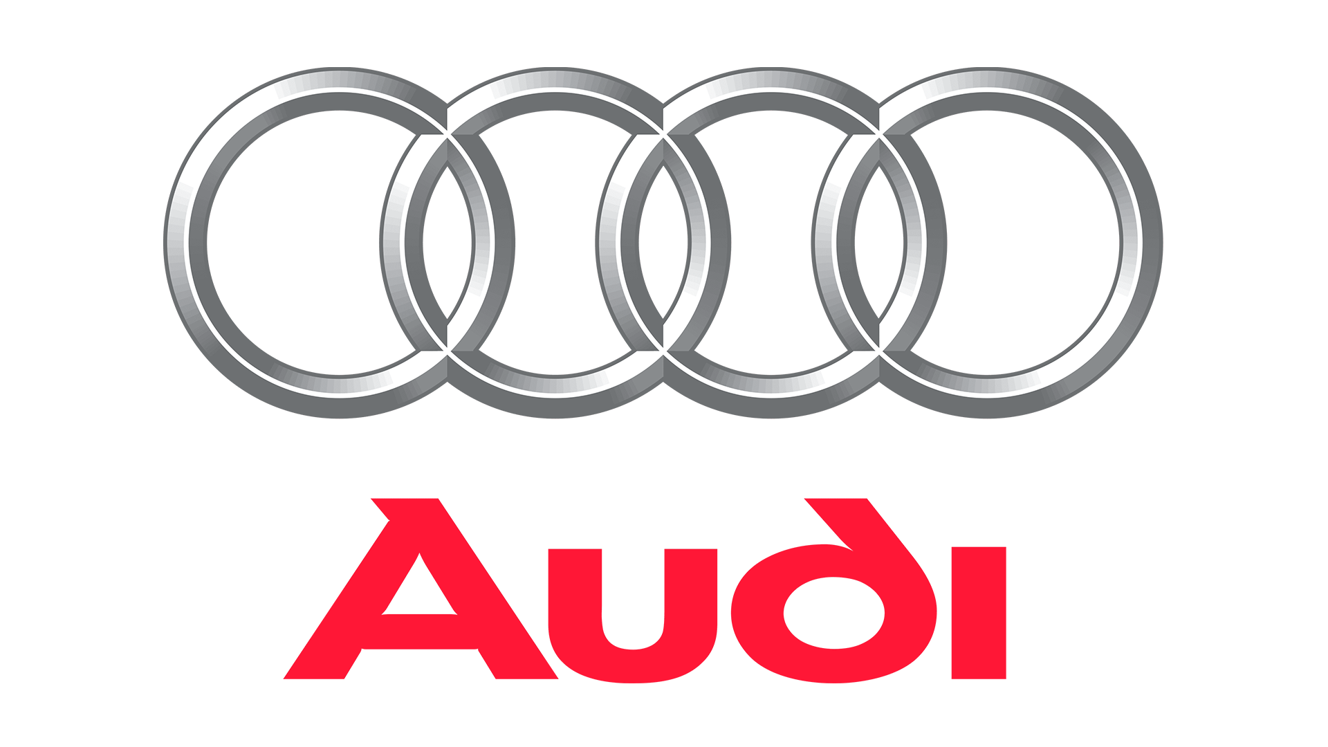
In 1995 the Audi logo started to take form into what we recognise it as today. Some less engaged in the industry might not even know that the Audi logo has changed since this iteration. At this point Audi decided to ditch the red circle and create one universal logo that would be used everywhere: certainly a more sensible branding decision.
A bevelled edge and contouring had been added to the rings which were now silver, and the red that the brand was so eager to incorporate for its energetic, striking nature, now featured on the wordmark underneath.
Note: the spaces between the rings had now been dropped. This was partly to create a more succinct, unanimous shape that's easier on the eyes for the added bevelling and contouring, but it also signifies a lot more strength.
With the bevelling suddenly turning the logo into the metal of a car, combining this with dropping the gaps in between the interlocking of the rings creates a definable object. Four thick, metal rings locked together are the picture of strength and resilience.
11. Audi logo history: 2009-2016
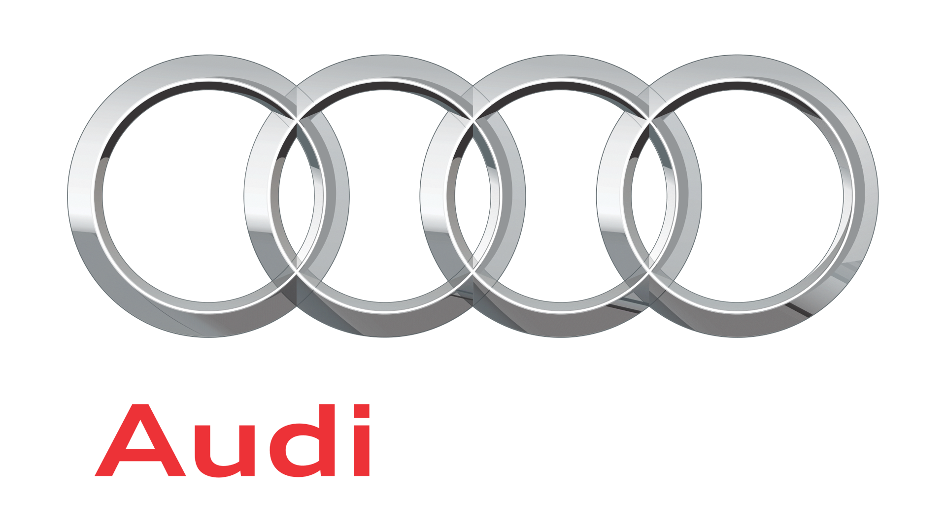
A refinement to the logo came in 2009. All the essential elements remained, but now that technology had advanced significantly in the past few years, a more advanced, realistic shine was added to the rings.
The wordmark was realigned to the left instead of the centre, helping to add more movement. Its original typography – dating back to its second logo iteration in 1909 – was replaced with a sans serif font of a much lighter weight with larger spacing, reflecting the minimalist designs that were dominating the most successful companies during this era-defining time of the digital revolution.
The opacity of the rings was also lowered, giving them an almost ethereal look. This complemented the modernised shine. It also created a softer look that toned down the message of strength in favour of the implication of ease and advancement, with this design style drawing on connotations of CGI styles which were becoming fashionable at the time and represented technological progression.
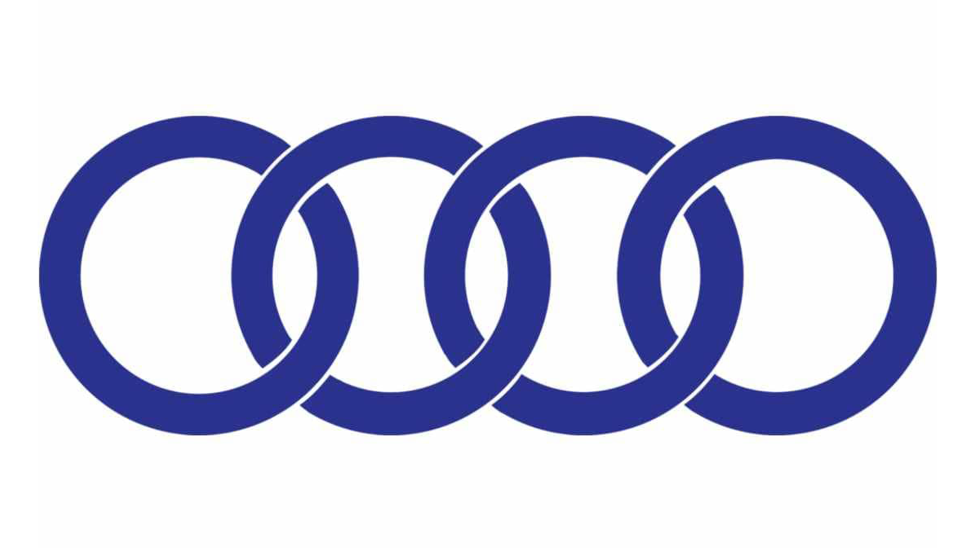
12. Audi logo history: 2016-now
In 2016 Audi simplified its logo to the extreme. It hopped on the bandwagon of minimising its logo to the flat, 2D style that's been gaining popularity (Lamborghini has done the same), and slightly self-consciously dropped the bevelled edges and contours car companies loved so much in the 2010s. Now it's simply a black monogram of its well-known design.
The positive of the simplification is that it makes it more easily recognisable and stronger in the mind. The downside is the backlash it received, due to the fact that its flatness meant the logo was no longer 3D on its cars.
It's now just a flat shape printed onto the cars, not a badge-like emblem that some drivers liked. While it's an improvement in appearance in digital and print formats, in execution on its cars it appears more wishy-washy.
However, online contention aside, there's a clear strategy behind this adjustment that has the company's long term future in mind. Audi said, "we want the four rings to look the same everywhere in the future: whether in a magazine, on your smartphone, or a billboard – and on or inside the car".
Audi has an awareness that flat designs are currently the most agile in format, and nowadays the importance of enhancing to format extends far beyond the cars it makes; logos must be as universal as possible, and the fact is that on a screen, a flat design is more appealing than a bevelled edge.
Additionally, an increasing number of car companies are dropping clear typography for geometric shapes (I don't need to remind you of the Kia rebrand) in the light of hybrid and electric cars leading a new era in motor design, with brands starting to compete to become as futuristic as is scientifically possible.
13. Audi's controversial China concept car

Although Audi's 2024 concept design wasn't an official rebrand, it was a drastic shift in a different direction for both its logo and its car design. Unveiled in China – where the new car will be available – Audi has made it clear that it wants to become a major player in the Chinese car industry.
The design involves an extreme level of futurism and gets rid of the rings altogether in favour of a wordmark. Audi say that this redesign is exclusively for its Chinese cars, but this demand for futurist design is almost as popular in the US and the UK too, meaning that with the direction SUVs are going at the moment, Audi may well be considering doing an international rebrand to better slot into the quickly evolving market of space-esque car designs.
Although the company's heritage branding remains in place for now, it wouldn't be the most drastic car rebrand of recent years, with Jaguar rejecting their heritage and world-renowned branding at the end of 2024 for something a little more space-inspired (the 2020s seem to be regurgitating the fixations of the '60s). This might be the sign of things to come.