Many band logos are hugely famous – everyone recognises The Rolling Stones' tongue and Nirvana's smiley face. They're on T-shirts, merch, and if you see them on a news story, you'll know which band the story is about before you even read the headline.
Band logos have evolved over time, and differ greatly from genre to genre. Generally speaking, the heavier a band's sound, and the darker their image, the more indecipherable their logo will be – and there will probably be a lot of black and white. If you've ever seen a poster for a metal festival, you'll know what I mean.
Not all bands follow the design trends you might expect, however. For example, we recently reported on one heavy metal band brilliantly bucking logo design trends with a bright, colourful design.
To understand these trends, let's take a look at the history of rock band logos.
The start of the rock era: 1960s
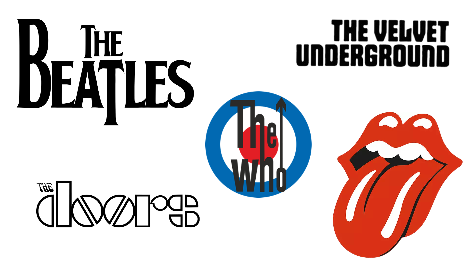
Many of the logos of early rock bands, like The Beatles, The Doors, and The Velvet Underground were fairly simple, and consisted of the band's name in black. They do what they say on the tin – they let you know who the band are and are some of the best logos of the 1960s – but they aren't particularly exciting.
Interestingly, however, The Beatles' iconic logo with the drop-T didn't feature on any album covers while the band were active, and it only became trademarked by Apple Records in 1994. For a while, it mostly just appeared on Ringo Starr's drum kit.
The logo was drawn on the spot by the owner of Ludwig drums, who supplied the kit, and the larger 'B' and 'T' were deliberate, to emphasise the word 'Beat'.
However, towards the end of the decade, some logos started to diversity. Consider The Rolling Stones' logo, which art student Jon Pasche designed in 1970. The bright red lips and tongue were inspired by the Hindu goddess Kali, but they also had sexual connotations, which would have been considered rebellious over five decades ago.
The Who's logo has the best of both worlds. It had the band's name, with the two h's being joined together to symbolise unity and the arrow on the 'o' representing masculinity. But it also had the colours of the Union Flag creating a bullseye in the background, and this image is so iconic it's become the logo of the mod subculture as a whole.
The birth of metal and punk: 1970s
Logos began to get a little more experimental in the 1970s, perhaps reflecting the way in which rock was diversifying into various subgenres.
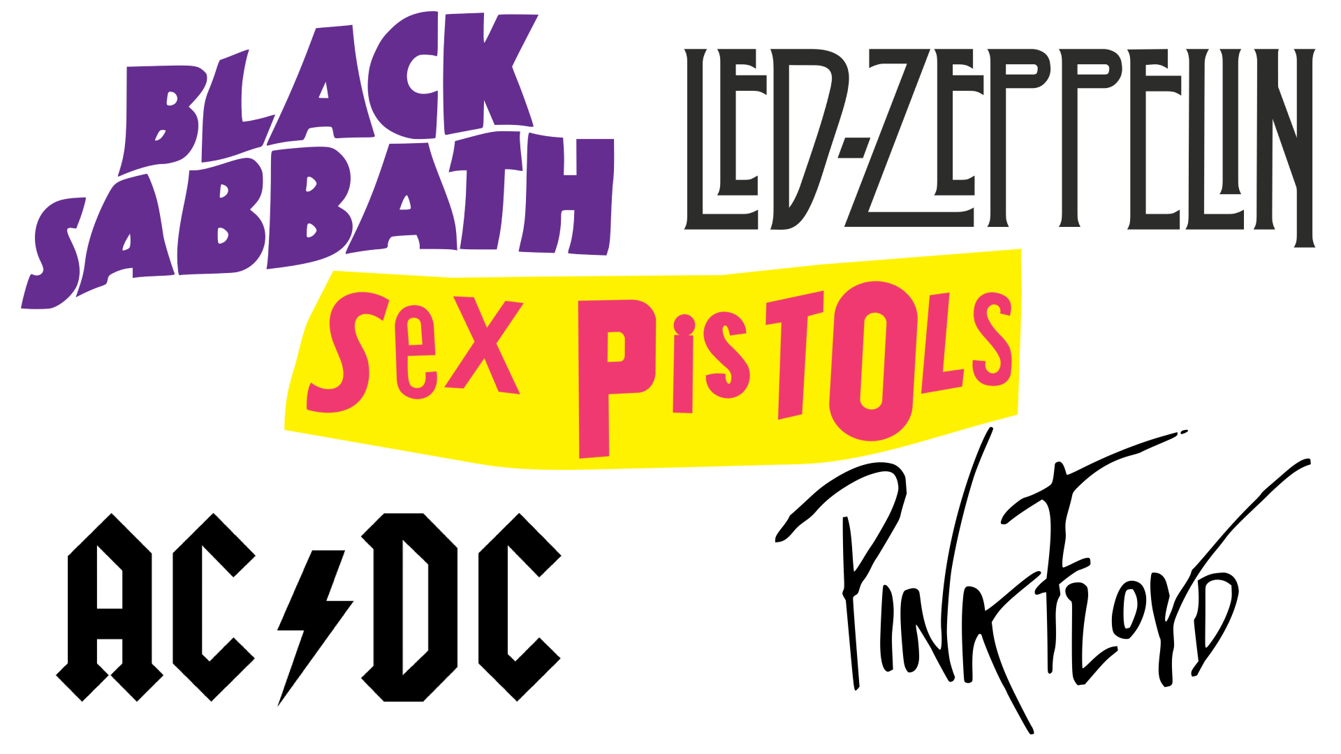
Bands like Led Zeppelin and AC/DC played blues-influenced hard rock, and were big influences on heavy metal. Meanwhile, Black Sabbath are generally considered to be the first metal band.
While all of their logos use the band's name, the typefaces used in AC/DC's and Led Zeppelin's logos are a little more gothic-looking and almost intimidating compared to those used by bands in the previous decade.
The Sex Pistols' logo, in comparison, looks quite haphazard and roughly put together, emphasising the raw, DIY nature of the punk scene they belonged to. The logo looks as though it's made from newspaper clippings, and there's not as much of a consistency to it.
However, some logos in the 1970s, like that of Pink Floyd, are a little more simple and in line with the logos of the previous decade – perhaps reflecting that Pink Floyd's style of rock was less rebellious.
Hard rock and thrash metal: 1980s
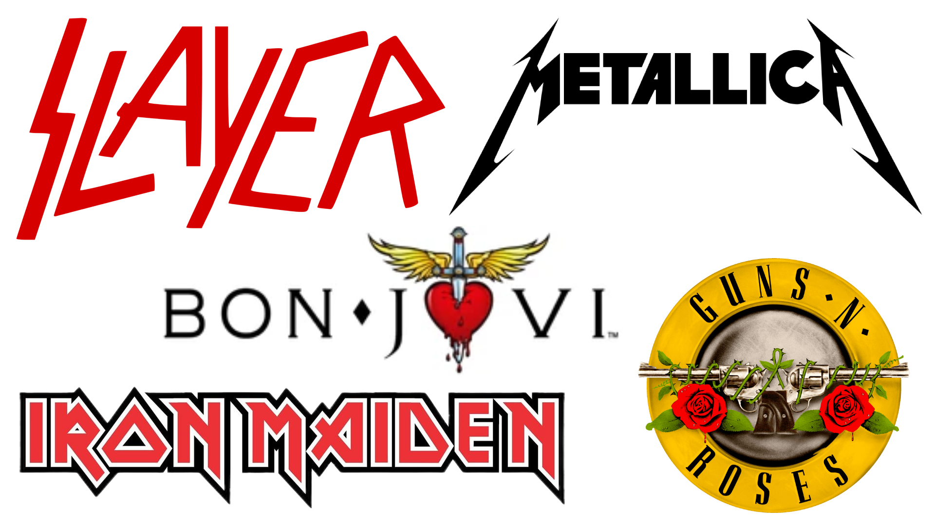
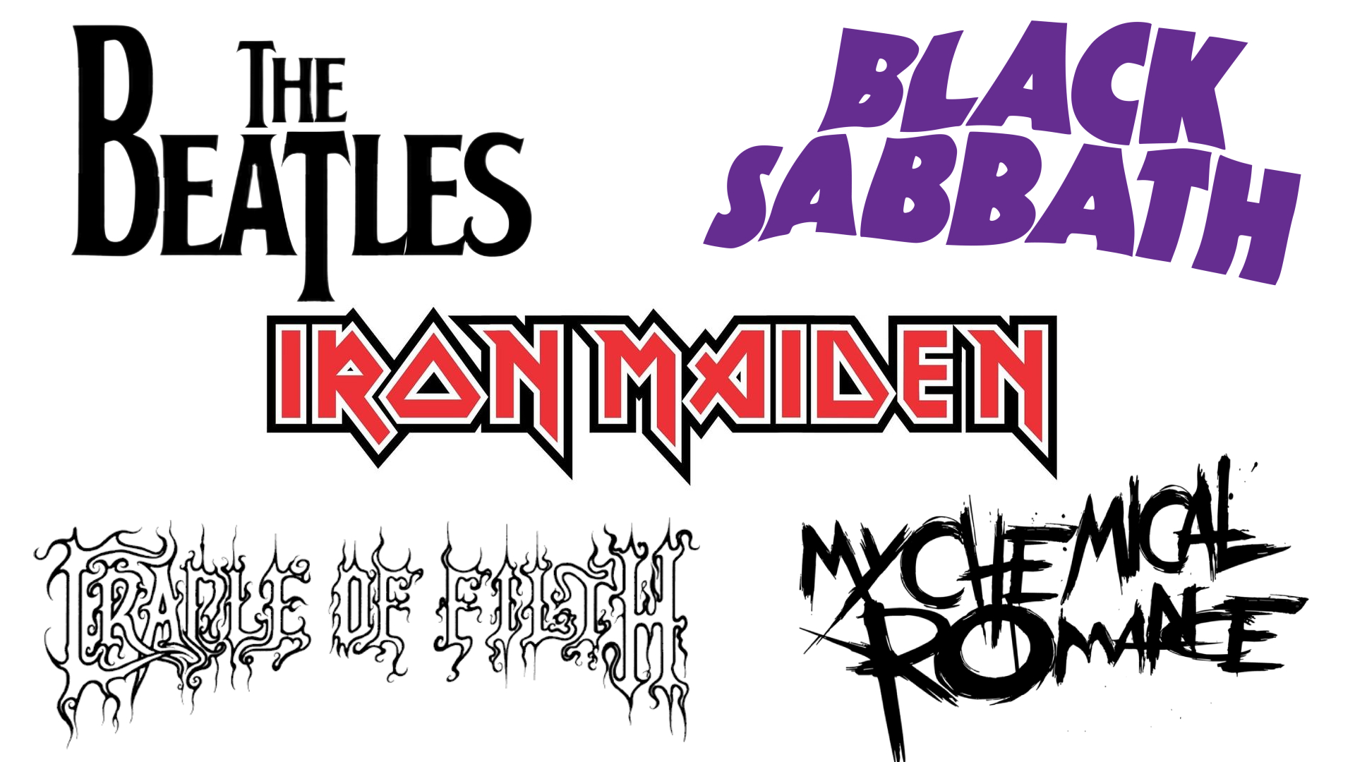
By the 1980s, there was a mix of simple, easy-to-read text-based band logos, and those that were a bit more experimental. Heavy metal was in full swing, with British bands like Iron Maiden and Judas Priest seeing plenty of success, and thrash metal bands like Metallica and Slayer in the US making it big.
Black was still be a popular colour for heavier bands in their 1980s logos, but there's more use of red, too, which can symbolise anger, passion, and danger. There are a lot of sharp edges and straight lines on these logos, too, rather than softer, more rounded letters.
Bands like Bon Jovi and Guns N' Roses, considered hair metal or simply hard rock, used less intense typefaces, but also made heavier use of imagery. With Guns N' Roses, the logo simply reflects the guns and roses in the name, but there's also a juxtaposition between violence and love here. Likewise, Bon Jovi's logo pictured, which they used frequently in the mid-1980s, offers a contrast between violence (the sword) and love (the heart).
Grunge, Britpop, and more extreme metal: 1990s
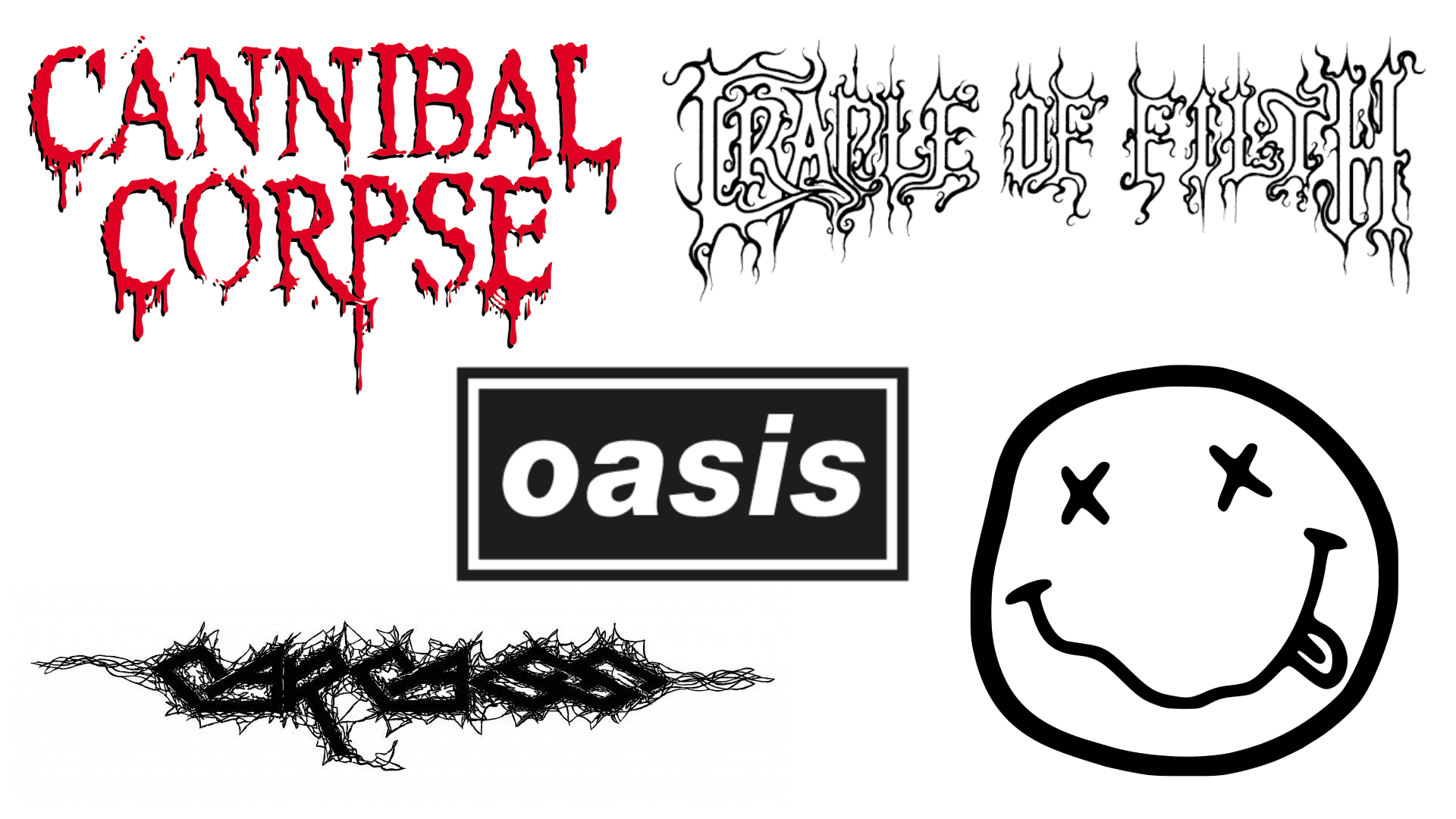
Many logos began to get more extreme as the 21st century approached. Controversial death metal band Cannibal Corpse have been heavily influenced by horror, and this is clear to see even just by looking at the logo.
The all-caps red letters which look like dripping blood wouldn't be out of place on a horror movie poster – you know even without listening that Cannibal Corpse probably aren't going to be a clean-cut boy band.
Extreme metal band Carcass have a logo which is barely decipherable, and very much a sign of things to come within the genre. Likewise, Cradle of Filth's logo is a little difficult to read.
But, of course, not every band logo from the 1990s followed suit. Grunge icons Nirvana are well-known for their smiley face logo, which has an effortlessly cool, imperfect feel, while Britpop legends Oasis have a cleaner black-and-white logo that, unsurprisingly given their influences, harks back to the logos of the 1960s.
Varied music and varied logos: 2000s-
Post-millennium, it feels as though bands have taken influence from every decade before them when it comes to the designs of their logos. See our best logos of the 2000s and 2010s to see what else was happening in design at that time.
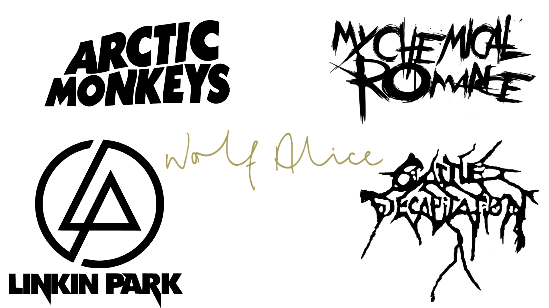
Contemporary extreme metal bands like Cattle Decapitation – who play a genre of music known as deathgrind – have taken influence from the logo designs of earlier bands playing similar music.
Meanwhile, My Chemical Romance, one of the biggest emo bands of the 21st century, have had many logos over the years. Perhaps their most famous takes are influenced by both the roughly-sketched punk aesthetic and the black upper-case band names seen in hard rock and heavy metal logos.
Linkin Park's logo consists of both a symbol and the band's name – the symbol represents the 'L' and the 'P' of the band's initials, while their name is written in thick, strong black capitals, representing the quite heavy rock they were originally known for.
In 2013, Arctic Monkeys released an album inspired in part by Black Sabbath, and their logo at the time was in a very similar font to the Black Sabbath logo highlighted earlier, as if to represent a change in the band's sound and highlight their new influences.
British indie band Wolf Alice went for a simpler design for one of their logos, which looks handwritten – it could almost be a signature – and harks back to the simpler designs of the 1960s.
While there are certainly key design trends to pick out over the years, many bands seem happy to put their own spin on things when it comes to their logos – while the genre of music they play also seems to have an impact.
While some bands are happy to go for simple logos, others are becoming increasingly creative. It's something that comes down to a matter of opinion. Not everyone will love a death metal logo, but for fans of that genre, a logo in that style indicates a band that they might like to check out.
For more on logos, see our logo history explainer and the best logos by decade.