To most people, the word 'logo' has very modern associations. It makes us think of things like the golden arches, or the word 'Coca-Cola' in a florid script, or a chrome apple with a concentric bite taken out of it. An image, perhaps even just a shape, that is indelibly associated with a product, a brand or an idea.
However, while the word 'logo' itself was probably first used in that way in roughly the 1930s, the idea of a logo is considerably older. Seals, heralds, crests, sigils and more – all these things have been used throughout history, and all of them have contributed to the ways that logos are understood, used and (sometimes) abused today.
If you’re interested in how the best logos work, how they have evolved and why they continue to be such a dominant facet of visual culture today, then a good place to start is to look back in history. Join us as we take a trip back through the history of the logo, from its most ancient origins to its recent past, its present and its possible future. If it gets you inspired to design your own, don’t forget to check out our indispensable guide to the best free logo design tools.
Ancient origins
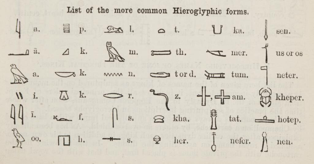
It’s impossible to talk about the idea of a picture standing in for an idea without someone bringing up Ancient Egyptian hieroglyphs, so that’s as good a place as any to start. A system of writing dating to around 3200BC, hieroglyphs used pictures to denote objects, concepts, people – just about everything.
You know, I have a theory that hieroglyphics are just an ancient comic strip about a character named Sphinxy.
Harry Burns, When Harry Met Sally
Egyptian writers also used a grid system to standardise hieroglyphs and ensure they were drawn to consistent proportions. Just like a brand and its logo, the Egyptians wanted the hieroglyph looking exactly the same, every time.
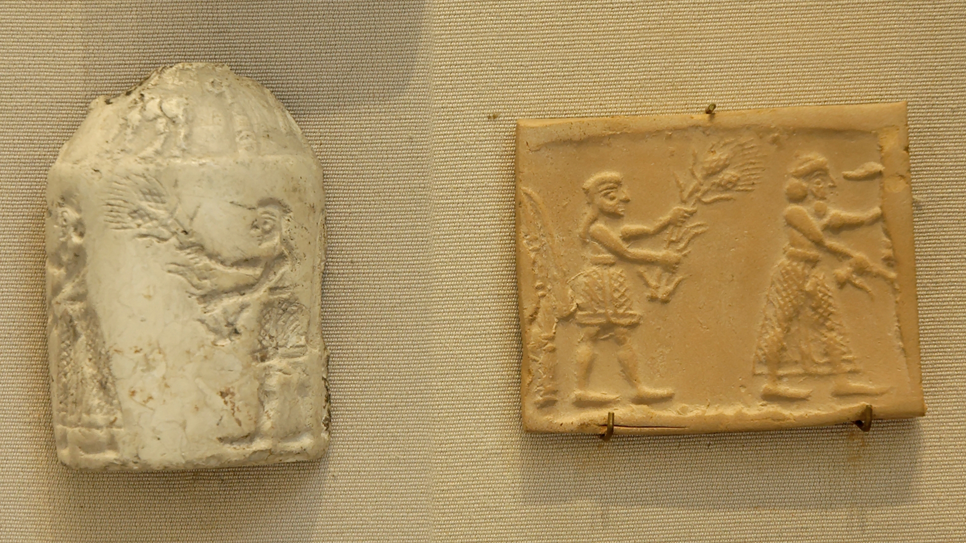
So, are hieroglyphs the oldest things we could consider to be logos? Probably not. Cylinder seals – cylindrical blocks engraved with pictures or writings that could be rolled onto a soft surface and used as a signature marking – also bear resemblance to logos as we know them. These have been dated back to anywhere from 3500BC to 7600BC!
Regardless of where it started, ancient history is replete with examples of things that could be considered as precursors to logos. Roman coins, for instance, were engraved first with the faces of Emperors, then later in the age of the republic with the insignia of the Ramo Secco, or 'dry branch'. Early Chinese calligraphy also incorporated pictorial elements.
Heralds and signs
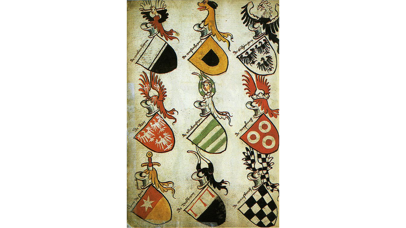
If we look towards the medieval era, we can see an interesting example of something more closely akin to the logos of today – heraldry. Across medieval Europe, families of varying levels of nobility began to develop their own heralds, crests and coats of arms – distinctive designs that incorporated familiar elements like dragons, lions and swords.
Whosoever shall brew ale in the town with intention of selling it must hang out a sign, otherwise he shall forfeit his ale.
King Richard II
As well as signifying a family’s status, these were also useful for denoting who was on whose side in a battle. It’s unclear precisely when this practice started – individual herald-like designs are included on the Bayeux tapestry, which depicts the Battle of Hastings in 1066.
Meanwhile, away from the many battles and wars of Europe, another use for logos was being discovered – commerce. From around 1000 CE, societies were becoming less wholly agrarian. Shops were springing up, and if you’re going to run a shop in a society where most people cannot read, you need something more than words to tell them what you’re trying to sell.
Retail signage took an early foothold in China. A highly developed brand that dates back the Song Dynasty of 960-1127 CE is White Rabbit, a seller of sewing needles, that was signified by – well, take a guess.
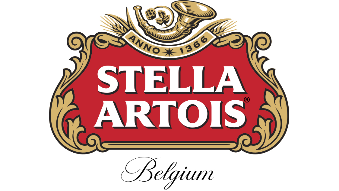
In 1366, a Dutch brewery named Den Hoorn established itself in Leuven, Belgium, and took to using an image of a horn to guide thirsty travellers towards its beer. Though the brewery would subsequently change hands, being sold to brewer Sebastian Artois, the image of the horn endured. In fact, it’s probably an image you’re still familiar with today, though you likely know the beer by its current name.
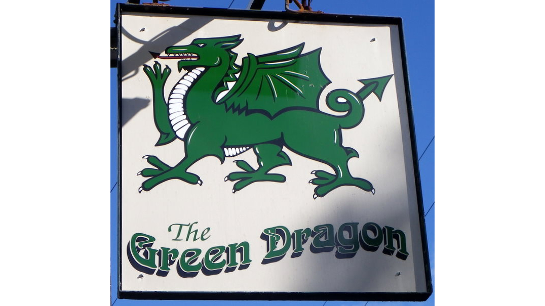
What’s another form of logo we still encounter today? The good old pub sign, of course. In 1389, English King Richard II decreed that any establishment that brewed beer would need to hang a sign outside its premises stating that it did so, or else risk confiscation of its beer. Public houses started to distinguish themselves with heraldic images of things like a Red Lion, or a Green Dragon – the kinds of things you’ll be familiar with if you’ve spent any time in British drinking establishments (though as far as we know, there’s no medieval heraldic symbol for a Slug and Lettuce). This practice spread throughout Europe, with similar legislation being enacted in France in the 1500s.
The Printing Press
In 1440, Johannes Gutenberg invented the printing press. While paper had been around in various forms for centuries, suddenly printed material was distributable on a much larger scale. Authors and printers quickly discovered they had one thing in common – they wanted people to know in no uncertain terms that it was their work on the page.
Festina lente [Make haste, slowly]
Motto of printer Aldus Manutius
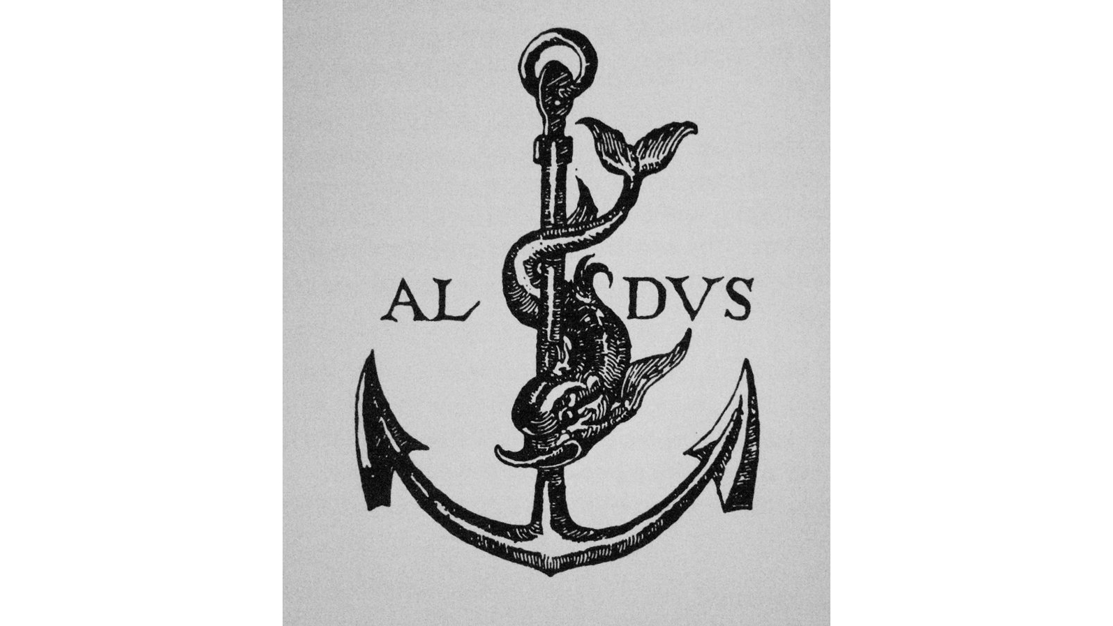
And so, throughout the 15th century we start to see the emergence of printer’s marks. One of the most famous is that of Aldus Manutius. A printer who lived and worked in 15th Century Venice, he identified his work with a distinctive spin on an ancient Roman symbol of a dolphin wrapped around an anchor.
Printed newspapers became commonplace from the 1600s, and with them came a rise in advertisements. Once again, businesses wanted people to make sure the punters knew which shop was theirs, and would frequently use distinctive drawing in order to do so.
The first trademarked logos
The 1800s saw a torrent of advancements in printed materials. The industrial revolution gave rise to steam powered presses that enabled mass-printing on an unprecedented scale. Several methods of colour printing arose, such as chromolithography, and making a memorable image became about colour as well as shape.
The two Cs would look well in advertising
Frank M. Robinson
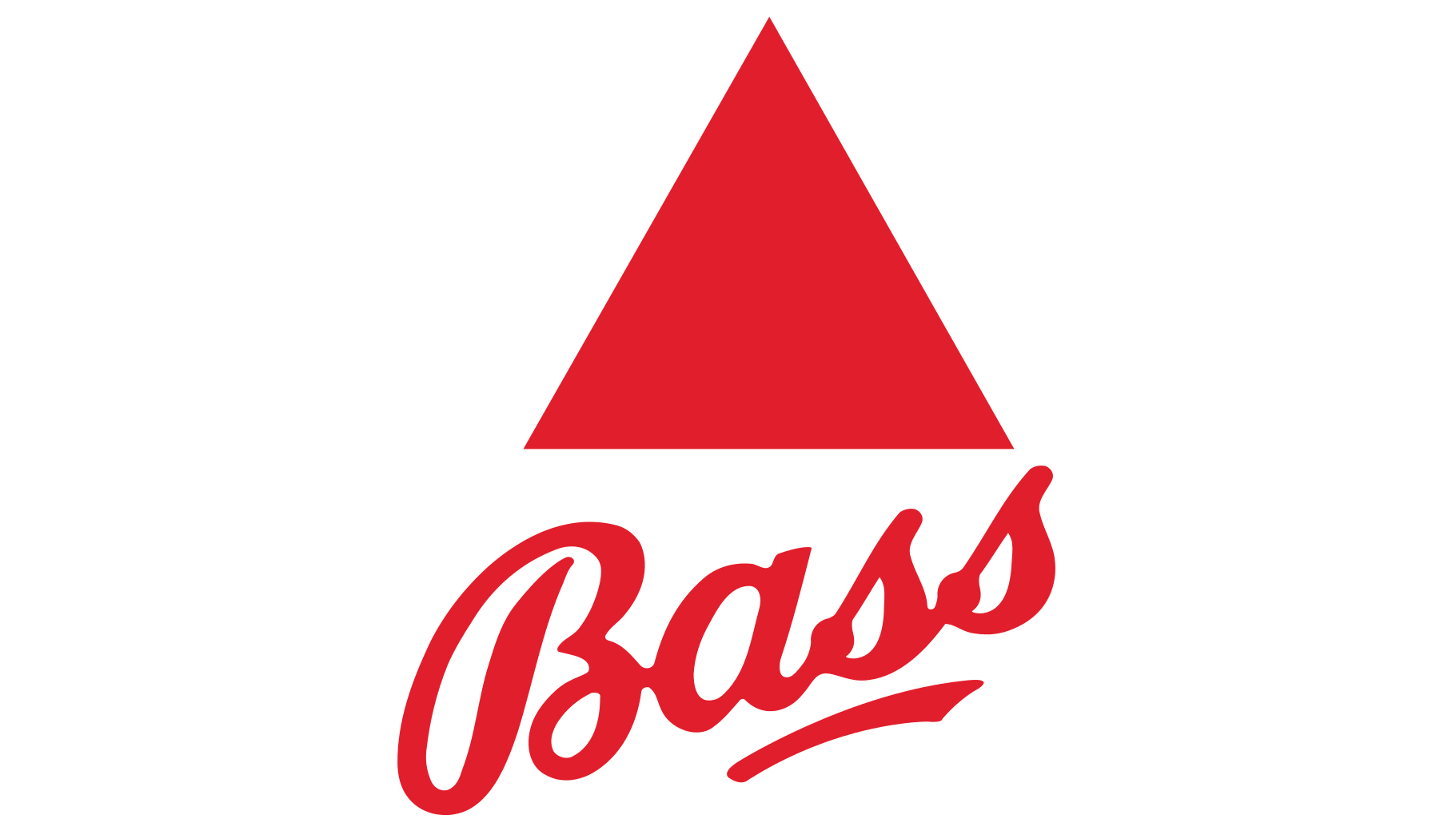
While logos (and things that behaved like logos) had been in use for centuries, even by the 1870s, no one had thought to trademark one. In 1876, Bass Brewery of Staffordshire, UK, made history when it registered both its name and its distinctive red triangle under the U.K.’s Trade Mark Registration Act of 1875.
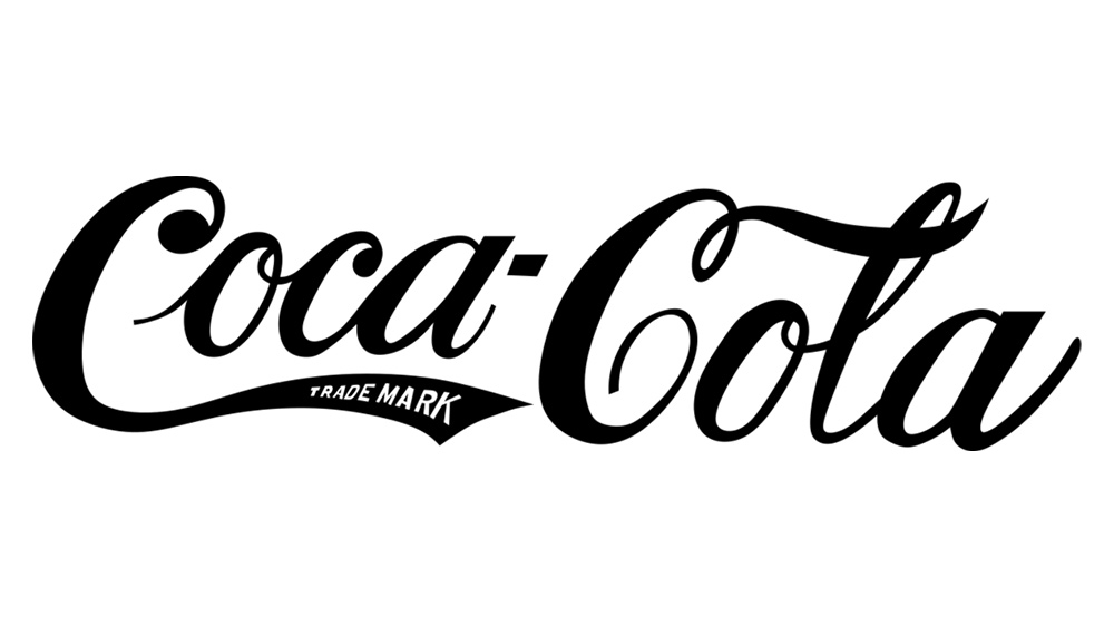
Others swiftly followed suit. In the 1880s, pharmacist John S Pemberton had just perfected the formula for a refreshing healthful drink he was calling Coca-Cola, but it was his bookkeeper Frank M. Robinson who would come up with the first draft of the florid, Spencerian script that is still instantly identifiable today (read our Coca-Cola logo history for more on how it's changed).
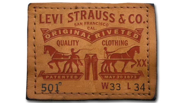
Meanwhile, in 1886, a company called Levi Strauss & Co. settled on an image of two horses as a distinctive image for its popular line of hard-wearing denim.
By the dawn of the 20th Century, logos were a common sight. They also weren’t purely a commercial endeavour – in 1913, Pierre de Coubertin created an indelible piece of history when he came up with a five-ringed symbol for the Olympic Games.
Modernism and the abstract logo
The rapidly increasing sophistication of printing technology had encouraged designers to embrace florid complexity in their logos. However, from the 1950s onwards, graphic designers began to take their cues from the rise of modernism, and embraced both visual simplicity and conceptual clarity.
Less is more
Ludwig Mies van der Rohe
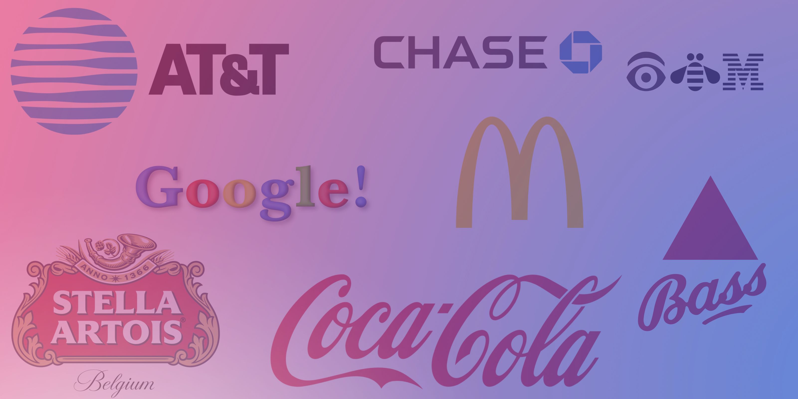
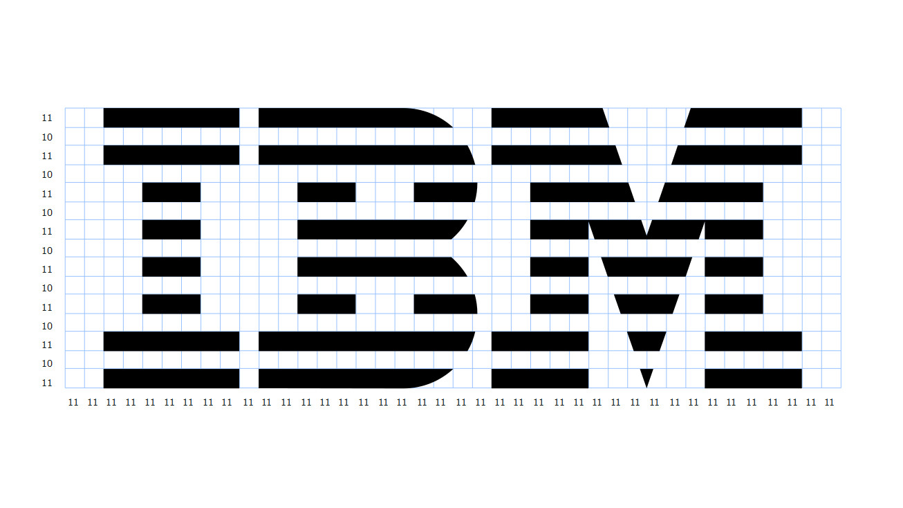
Notable logo designers from the period include Paul Rand, who created a number of iconic simple logos for the computing company IBM. He first updated the company’s logo with the typeface City Medium, but would go on to create the striped version that would become globally iconic, evolving into a version known as the “8-Bar”.
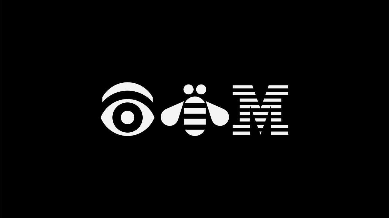
In 1981, Rand followed it up by designing the devilishly clever 'Eye Bee Em' rebus logo, in support of IBM’s ubiquitous 'THINK' motto. He also designed logos for ABC, UPS, Enron and many other famous names.
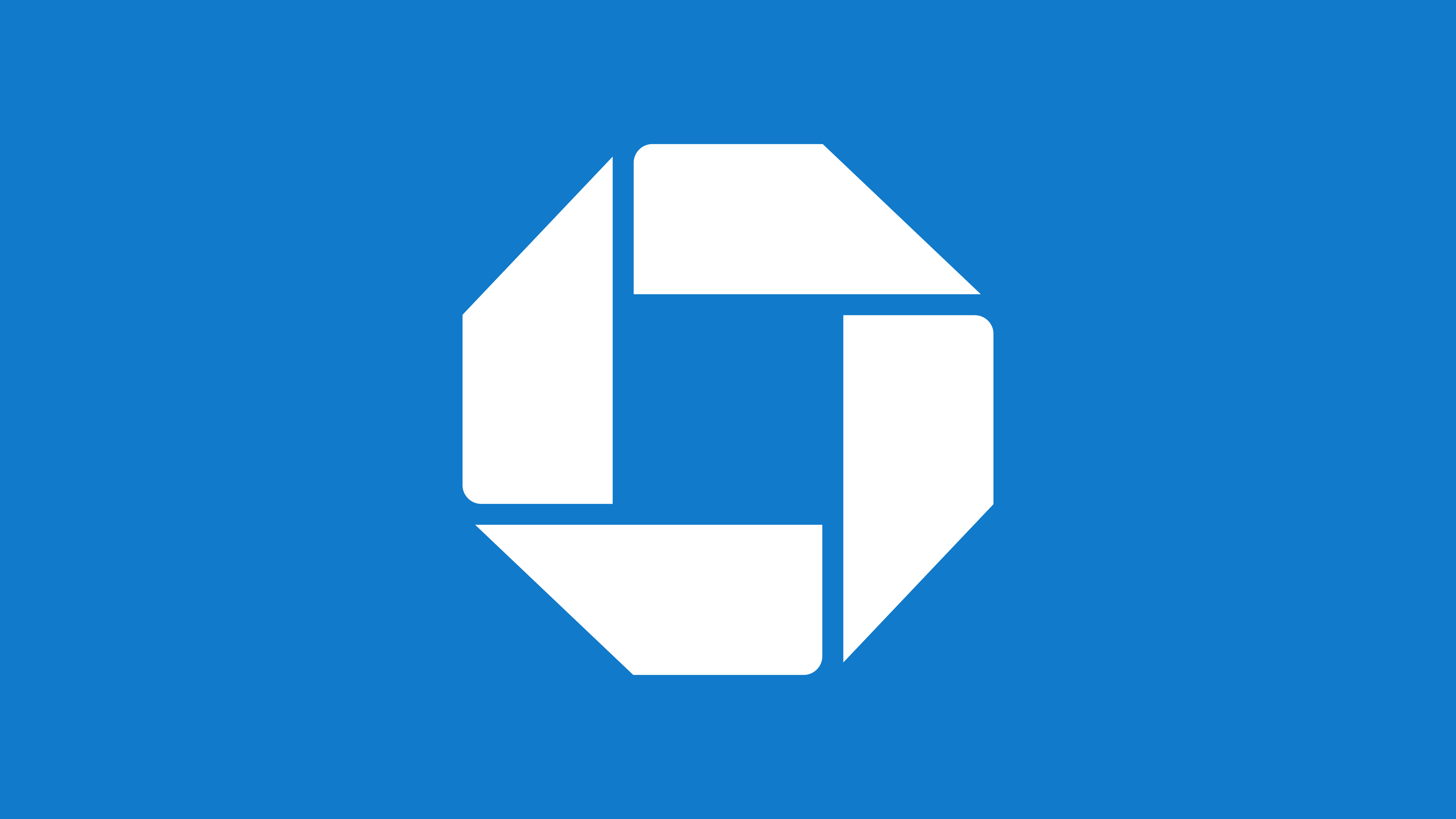
Thomas Geismar was also an influential visual voice of the period, with his 1961 octagonal symbol for Chase Bank providing an important milestone for the era of the abstract logo.
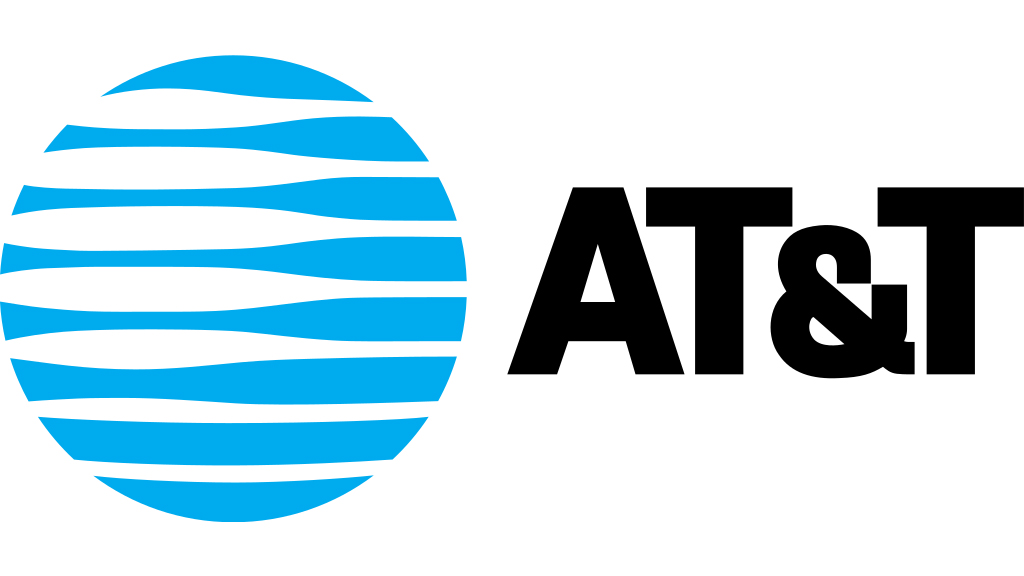
Another was Saul Bass, who bestowed communications company AT&T with a striated sphere that would become incredibly well-known across the globe.
The dawn of the screen
Through the 1970s and 80s, two key things happened to shape the direction of logo history. One was the arrival of computer-aided drawing tech. The other was a shift in the way people consumed most of their media. Print began a long slow decline from which it would never recover, and we entered the age of the screen.
I want my MTV
Dire Straits, “Money for Nothing”
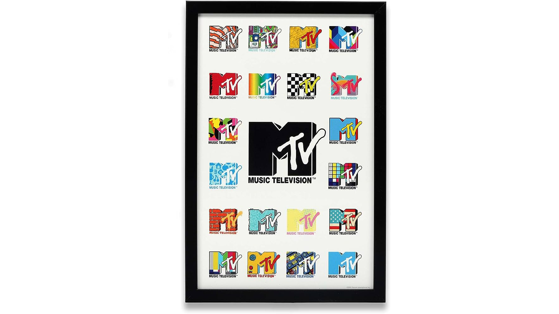
Logos no longer needed to be static – they could be moving, malleable, alive. MTV, which launched in 1981, responded by taking a basic logo with eminently recognisable elements – a large 'M' with a smaller 'TV' in front on the right-hand side – and making it constantly change, reflecting the dynamism and anarchy of the brand. With modern animation, the MTV logo changed colour, blew up, disintegrated – effectively did whatever it wanted. Changeable logos became the order of the day.
Web 2.0 and the rise of the Brands
The 1990s and 2000s could be described as a long, slow process of getting everyone online, and this affected the evolution of logos in a number of ways.
So, if consumers are like roaches, then marketers must forever be dreaming up new concoctions for industrial-strength Raid
Naomi Klein
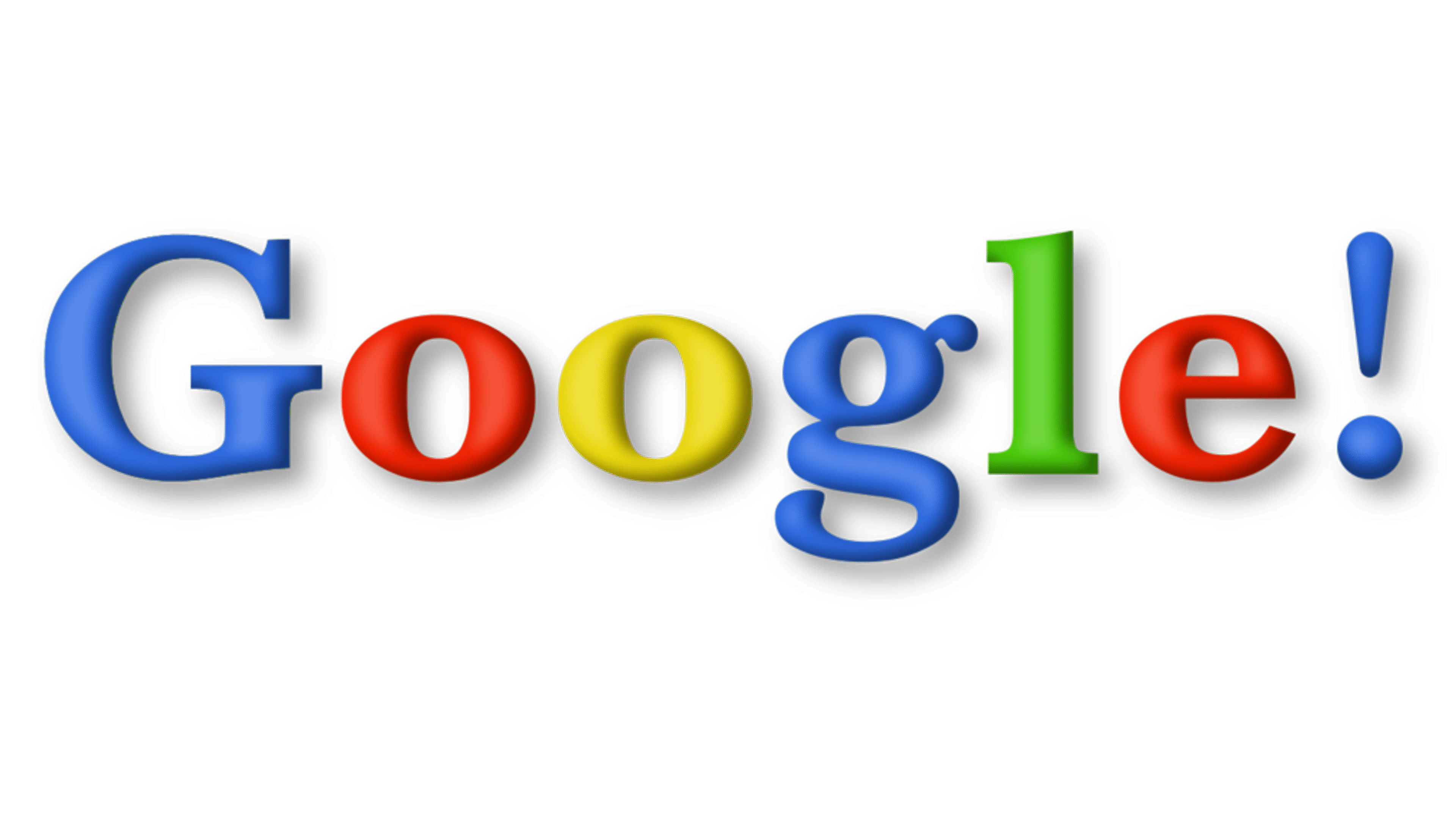
Initially, the thinking was that if people were going to be viewing logos on a computer screen, the logos should jump out of that screen in some way. This explains the otherwise inexplicable widespread proliferation of drop shadow, which we can see in early designs of the Google logo.
It was a time of bright colours and rounded letters, designed to lift out of the screen and poke the viewer in the eye, figuratively. This is a form of skeuomorphism – attempting to create a sense of familiarity for the viewer by emulating known materials.
As time has gone on though, we’ve all gotten used to living our lives on screens. The popularity of Adobe’s InDesign and Photoshop since the early 2000s has done much to demystify digital graphic design, and there is no longer a perceived need to make us feel comfortable on the computer.
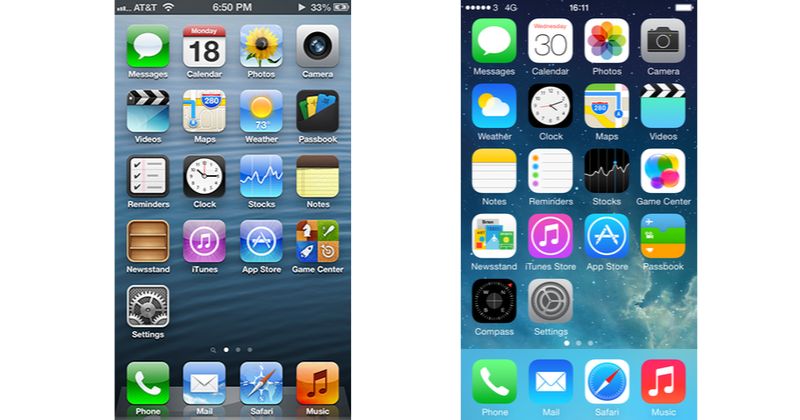
As such, the desire to simulate 3D spaces has ebbed, and flat design is 'in'. This doesn’t just mean literally flat (though it often does mean that), but also emphasising utilitarianism and efficient use of space. Everything feels more crisp, more clean, much more, for want of a better word, modern. The modernists of the 1950s would approve. When Apple released its iOS 7 update, it was notable for its move from skeumorphism to flat design.
Logos in the 21st Century are less representative of products than they are of brands, and the way brands present themselves has changed significantly. Brands aren’t just interested in your sales nowadays (though they are still very interested in that); they’re also interested in your eyeballs, your interactions, that nebulous thing known as 'brand engagement'. Naomi Klein called attention to the increased pervasiveness of brands in our everyday lives in her 1999 book No Logo, and this tendency has not exactly abated in the decades that have followed.
In the ever-escalating arms race for our attention, a brand will now style itself not just as a seller of a product, but as an entire lifestyle, as a vital component of the global conversation. Ask yourself – does the Nike swoosh really just signify well-made sportswear? Or is it now indelibly entwined with the political protests of NFL star Colin Kaepernick against police brutality and racism?
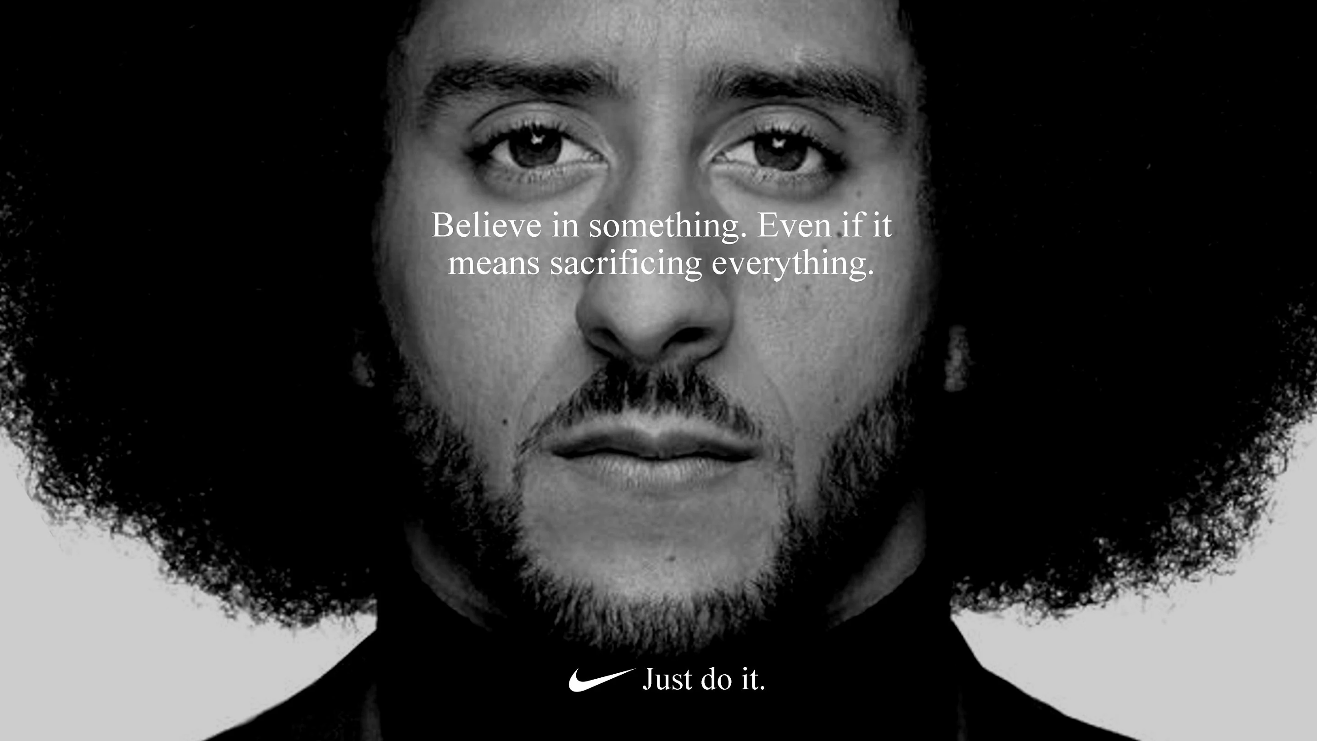
You could call it crass on Nike's part to insert themselves into a political moment in such a way – it is crass. But it happened anyway, and it is going to keep happening,
In this age of brand engagement, branded design environments, experiential marketing and other such buzzwords, the future of how we will relate logos is uncertain. But one look at Times Square or Piccadilly Circus is enough to remind us that logos are a more indelible part of our daily lives than they ever have been.
For more on logo history, see our roundups of the best logos from the 80s and 90s, as well as the best 20th century logos and our favourite simple logos.