In the past when ex-CEO of Apple, Steve Jobs would head up its keynotes, there would be an ongoing joke of celebrating the success of one of its products and then deciding to get rid of the design with something completely different.
For the majority of these redesigns, it would work, and it wouldn’t just work but would be one of its biggest successes. From an iPhone redesign to the iMacs over the years, many of us have our own favorite models because of the way they look.
With this in mind, we asked ourselves which were the biggest Apple design changes over the years, and so here are some of our favorites.
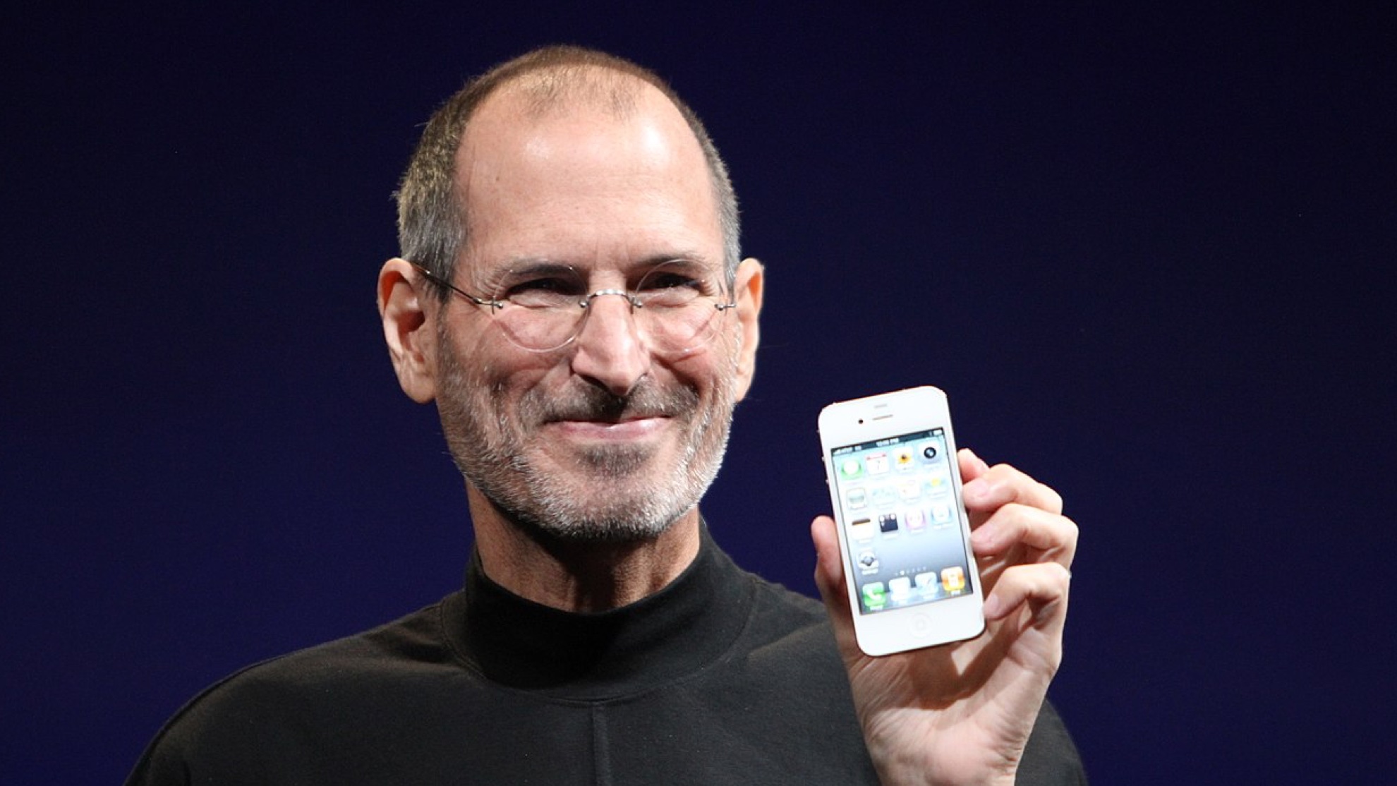
iPhone 3GS to iPhone 4 - 2010
John-Anthony Disotto — How-To Editor
The iPhone 3GS continued on from the historic iPhone 3G launch that brought the App Store into our lives. It was twice as fast as the 3G and finally brought video recording to the iPhone but had the same design. So when WWDC 2010 came around, everyone was excited to see what Apple would do next with the iPhone - and Apple did not disappoint.
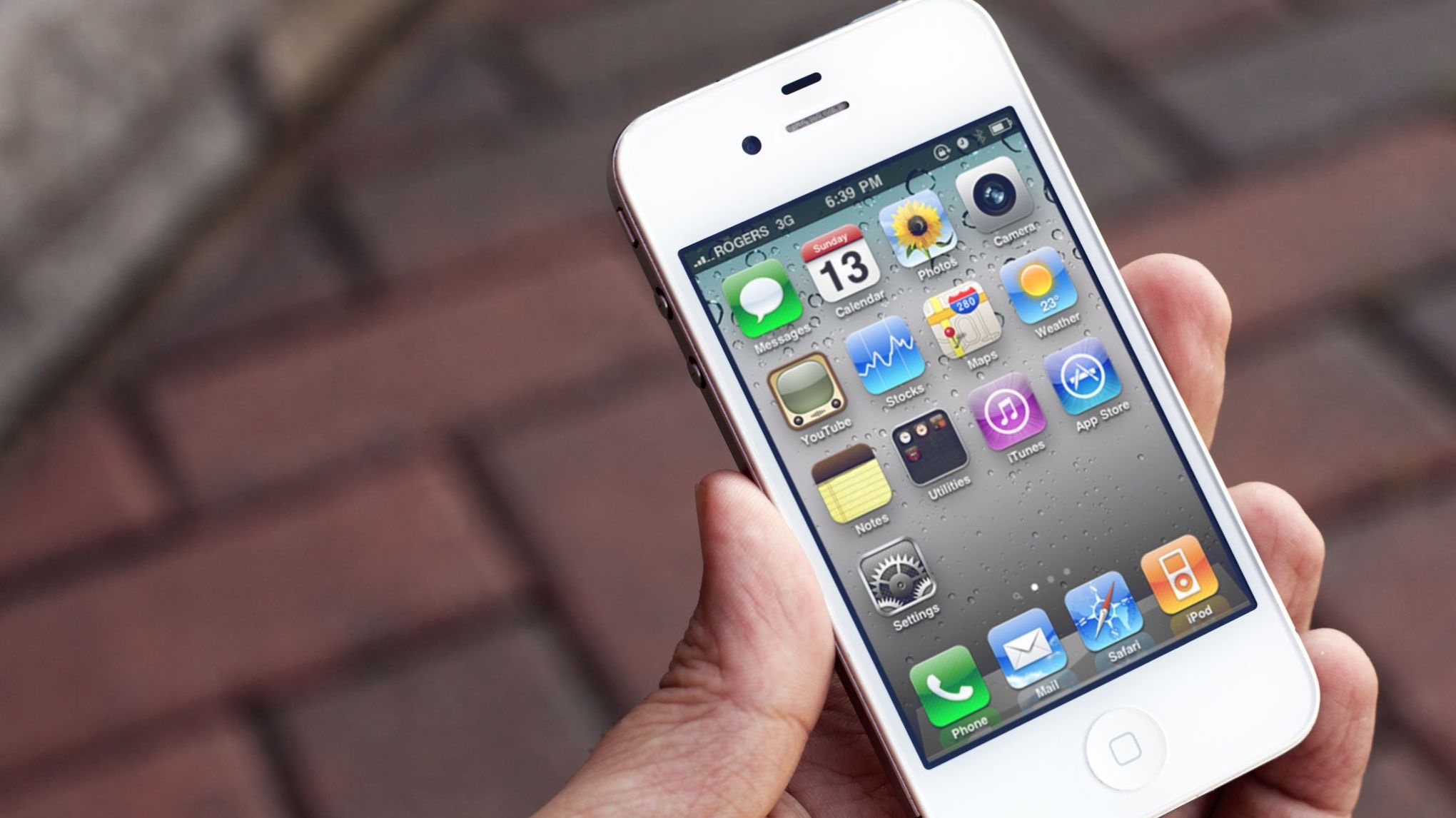
The iPhone 4 is arguably the most iconic iPhone design of all time, sandwiching glass and aluminum to create a modern and stylish smartphone design. It’s the ancestor to the iPhone 12, 13, and 14 making its presence felt to this day, over a decade later, with its squared-off edges and camera system that looks like an evolution of the iPhone 4’s.
Introducing the Retina Display and FaceTime, the iPhone 4 could be called the pinnacle of Apple’s smartphone design and I would agree. It’s beautiful and everything we love about Apple.
To this day, no redesign has ever hit the heights of the move to the iPhone 4, although the iPhone X probably has something to say about that.
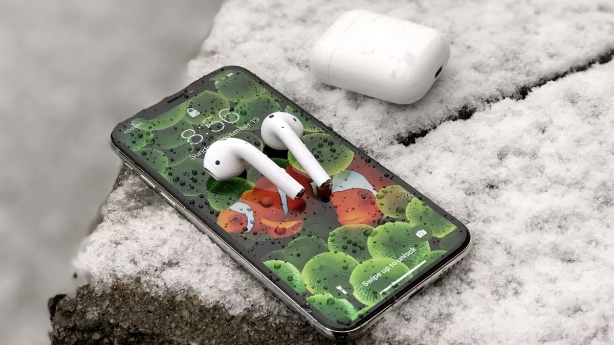
From EarPods to AirPods - 2017
Tammy Rogers — Staff Writer
EarPods – those things that you used to get in your iPhone box. Small, white, and wired, they are in many cases the first pair of headphones that lots of people will ever have used. The EarPods themselves went through a couple of design iterations; there were the truly abysmal pairs that came with early iPod models, that looked like flying saucers with stems and a cable, and sounded like someone was scooping out the internal structure of your ear with a small spoon. They were bad. So bad.
The next version of the EarPods is the one that you can still buy now – and they’re much better. Smoother, smaller, more comfortable, and more impressive sonically, the current model of EarPods debuted in 2012 with the iPhone 5. With their weird, alien-looking organic design, the EarPods shook up the Apple headphone lineup in shape; but not in number. Apple still only made one kind of head-worn audio product.
Until the advent of the AirPods. The first model AirPods came out in September 2016 and brought wireless connectivity to the EarPods. Did they look that much different from the EarPods, beyond missing a cable? No, not really. But they did kickstart the world's obsession with true-wireless earbuds, with their tiny white case and super small form factor. They sounded like EarPods, looked like them, and cost 7 times the price on launch. Mental.
The bigger design revolution was the AirPods Pro of 2019. Featuring a new design, the AirPods Pro looked different, sounded better and blocked out the outside world – they were the wireless earbud of the future and a far cry from the EarPods of old.
There is one thing those little EarPods do better even now than both the AirPods Pro and AirPods, and that’s their microphone. No matter how many bits of tech and clever algorithms you put in them, you can never beat a good wired microphone – wires simply carry more data and a better audio signal than a wireless connection could ever hope to touch.
From aluminum to colored iMacs - 2020
Karen Freeman — Contributor
The original Bondi Blue iMac in 1998 might have been the product that took Apple to the next level. The cool and colorful all-in-one design made tech exciting, fun, and consumer-friendly. The following year, Apple expanded the iMac lineup to include grape, tangerine, lime, blueberry, and strawberry. In 2000, Apple introduced the slightly more sedated lineup of indigo, ruby, sage, graphite, and snow. Later that year, Apple also offered two limited edition colorful patterns: blue Dalmatian and flower power. Since then, the Mac lineup has been pretty simple, basically just varying shades of gray.
But in 2021, more than two decades since Bondi Blue, the iMac went back to its colorful roots. The all-new design came out in not one or two but seven colors: orange, yellow, green, blue, purple, pink, and silver. These stunning colors made quite a splash, each shade more gorgeous than the next. Of course, the new iMacs were more than just colorful, they were powered by Apple’s own silicon, the M1 chip.
The striking new design was just 11.5 millimeters thick and featured a 4.5K Retina display. The new iMacs also had a 1080p FaceTime HD camera, studio-quality mics, a six-speaker sound system, and Touch ID. The 2020 iMac lineup was one to remember.
iPad Pro to iPad Pro with FaceID - 2018
Daryl Baxter — Features Editor
When the iPad Pro first debuted in 2015 with the first-generation Apple Pencil, it was one product where size meant everything. When you saw it in person, you were taken aback by just how big its 12.9-inch display was, especially as the biggest size up to then was a 9.7-inch iPad Air.
Fast forward to 2018, and the iPad Pro gets a redesign but makes another big impression, this time in a different way. FaceID finally expands to the tablet, after first debuting in the iPhone X in the previous year, and the design is almost all-screen, with the bezel shaved off.
It’s a beautiful design that’s now across the whole iPad line in 2023, from the iPad mini to the M2 iPad Pro.
Whatever your thoughts are on the software, it’s hard to fault a design this good and one that’s clearly able to last another few years for the iPad.
iOS 7 kills off skeuomorphic design - 2013
Gerald Lynch — Editor-in-Chief
Apple is an influential company. Its design language can turn the whole tech industry on its head, with competitors racing to ensure its products match the cool factor of the latest iPhone or iPad — if not creating entire cottage industries for some companies. How many phone case brands would exist without Apple?
But arguably Apple’s most influential move of the last ten years has been on whose reach has been far more subtle. And that’s the introduction of iOS 7 back at WWDC 2013. Let’s put iOS 7’s feature set to the side, and talk about how it looked. Flatter, sleeker, sharper — it was a million miles removed from the ‘skeuomorphic’ design of the majority of Apple’s software efforts that preceded it, which invariably tried to match applications with tactile, real-world analogs. For instance, we had the lined ring binder for the Notes app, the bookstore-like shelving of the Newsstand app, and the card-table felt stylings of the Game Center app.
iOS 7 washed all this away with a minimalist, glass-like approach to app presentation that better fitted not only Apple’s products of the day but the medium of a touch-based interface, too. Apple had initially been right to lean on familiar real-world items in its early OS design — users around the world needed the comfort of the familiar to lure them into these then-nascent computing experiences. But as familiarity and ease built around touchscreen devices, the skeuomorphic approach felt increasingly anachronistic. iOS 7 paved a confident path for a cleaner software suite to come, and its user base was now ready for it.
There’s been no looking back since. Though it didn’t happen overnight, you’ll be hard-pressed to find any piece of software or application, or operating system now that leans into the skeuomorphic design. Apple planted the flag with iOS 7, and the industry followed.
Change is always good
There has most likely been a time when you've started something completely different from what you used to do before, and while it was scary to begin with, it made sense in the long run.
The same applies here for all of the above - change is needed, and you sometimes wonder how you ever managed before with these previous designs. The iPad Pro and iPhone are great examples of this - can you imagine using Control Center or multiple widgets in an iPhone 3GS?
Apple knows that in order to move forward, big redesigns like these are needed, and they have enough faith to just go for it.
We may be set for another big redesign at WWDC on June 5 in the form of watchOS 10 however. Rumors allege that there's going to be a whole new look and feel for the operating system for Apple Watch.
So once again, change could be coming, and once more, we're here for it.