
If we were to define Diane Keaton's Californian home with one design quirk, it would be her black and white palette, a classic color combination that begins with one of the most transitional spaces in her home: Her staircase.
Designed by the acclaimed Stephen Shadley, the stairs foreshadow what we can expect for the rest of the home, with its stark black and white scheme, brought to life with antiques. In this case, it's her pendant lighting. This piece commands attention in the space, introducing an intricate pattern, and tapping into the Spanish Revival aesthetic that we assocaite with Diane's property.
The best entryway lighting ideas are those that make an impression from the first second. Even though the time spent in an entryway, or, more specifically, on the staircase, is fleeting, it's the first place any guest will see, and is, therefore, the perfect stage for statement pieces, just like Diane's.
While decorating with neutrals, especially a black and white palette, your space can risk feeling dull or even clinical, but antique lighting changes everything. They're distinct, historical, and impossible to replicate, making them all the more special.
However, while each piece is unique, the lesson itself is so easy to copy. Invest in a statement pendant or chandelier that complements your style, then hang it in the centre of your staircase, as she has done.
Shop the look
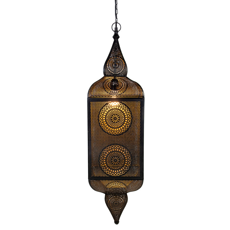
This Moroccan-style lantern pendant light, with its matte black exterior and rich gold interior, has a warm glow through its intricate cut-out designs – perfect for greeting guests in an entryway. Made of durable iron, it comes with hardware and instructions for easy installation, so you can get Diane's look quickly.
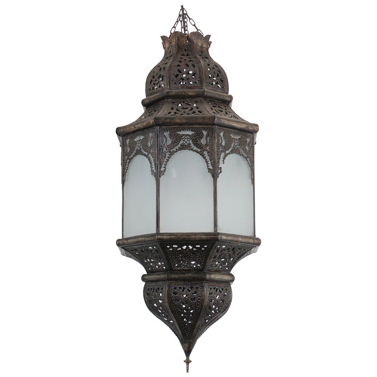
This vintage Moroccan Moorish pendant, handcrafted with milky-white sandblasted glass and a dark bronze frame, is the ultimate entryway statement piece. Its soft glow and artisan detailing create a welcome that everyone will remember long after they leave your home.
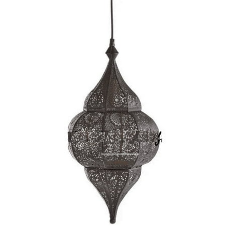
This light looks beautiful above a staircase in a black and white entryway, but its intricate design is stunning enough to make a statement beyond the first room of your home. If you love its look, why not buy two and pair them together in your dining room, where guests will love its style.
I am not alone in my observations. Real estate agents, including Rachel Stringer from Raleigh Realty, emphasize the beauty and versatility of this entryway color combination, but remind us of the importance of styling.
'A black and white entryway does something few other palettes can manage. It greets anyone who walks in with a sense of order, yet leaves room for every personal accent you might add later. The eye registers the high contrast instantly, so the space feels structured even before one piece of furniture is in place. That first impression matters when a home goes on the market because clear lines and calm colors help visitors picture their own belongings without effort,' she says.
Styling this space, to prevent it from feeling flat, unsurprisingly begins with statement lighting.
'Lighting deserves extra attention. An overhead lantern with clear glass panels, a black frame, and warm filament bulbs lets the scheme glow at dusk instead of turning gray,' Rachel says.
Alongside the Diane-inspired pendant, she suggests giving special attention to table lamps on our side console or table.
'Table on dimmers soften the effect for evening gatherings, while a narrow skylight or transom window amplifies morning light to keep white walls from looking flat.'
With this combination, it's impossible to go wrong. You can enjoy the versatility of a black and white combination while making a design statement in the process. It's the ultimate recipe for the perfect first impression.