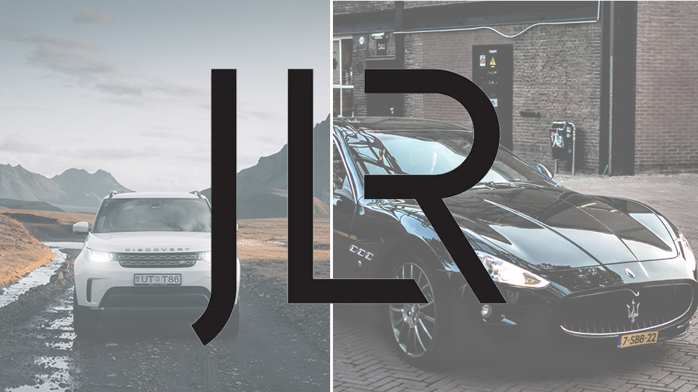
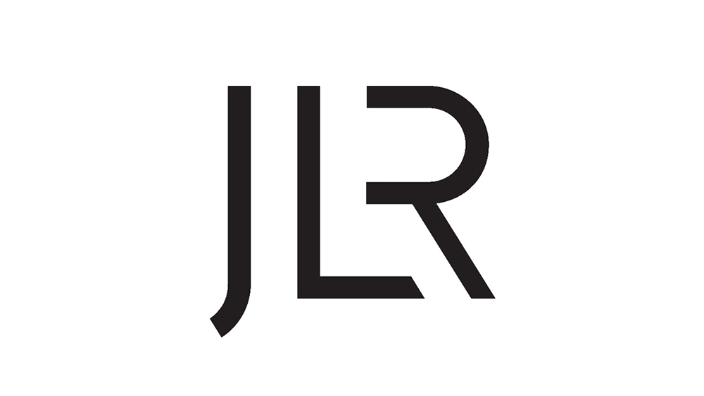
Jaguar Land Rover is no more. The British luxury car maker is now simply JLR (no points for guessing where the letters come from). There's a new logo to accompany the change, and the design is simple and... well, simple.
Many fans of the brands seem to be unimpressed. Some are getting distinct Nokia – dare I say even Kia – vibes, but that may partly be because of confusion about the logo will be used for (see our pick of the best logos and the best car logo rebrands for ones that got it right).
So a whole decade after its merger, Jaguar Land Rover has abbreviated its name to just three letters: JLR. It's a lot easier to say, but the accompanying logo is provoking some harsh words on social media, with some comparing it to the unimaginative generic look of an upmarket nightclub or even defining it as one of the worst rebrands in history.
Well if this isn’t one of the most poorly conceived and executed rebrands. I don’t know what is. Very few brands have the emotional connection with enthusiasts that Land Rover has, muddying the waters with marketing speak is daft.https://t.co/rS5lArZAmqJune 2, 2023
"Worthless. It’s either a Jaguar, Range Rover or a Land Rover," one person wrote in response to a tweet from AutoExpress. "It looks so generic. Almost like the name of an aftershave you see at duty-free," someone else wrote. "Nice for a firm of accountants, which of course the company actually is," was another response. Others have compared the decision to remove the vertical of the 'R' to the Nokia and Kia logos.

Some of the reactions may be due to a confusion about what the logo will be used for, with some people fearing the new design will be appearing on vehicles. That's not going to be the case. The JLR logo will be used by the company for its corporate business, website, press releases and the like. It isn't expected to appear as the badge on vehicles themselves, with both Jaguar and Land Rover continuing to use their heritage names and logos.
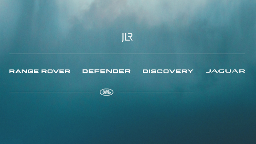
Things do get a bit confusing in an image from the JLR website. It lists the Land Rover sub-brands of Range Rover, Defender and Discovery as part of JLR on the same level as Jaguar, which requires it to clarify below them that they're part of Land Rover. But we can at least rest assured that the Land Rover and Jaguar names aren't being dropped.
Despite some awkwardness in the execution, the rebrand does make some sense, replacing a terribly long-winded name and resolving the inelegance of having to always use two brand logos side-by-side in communications. Chief creative officer Gerry McGovern OBE says the idea is to create "a House of Brands, which is a natural evolution, with a purpose of elevating and amplifying the uniqueness of our characterful British marques."
This is all part of JLR's £15 billion 'Reimagine' strategy. That investment is getting it more than just a new logo, of course. It's also upgrading manufacturing facilities with electric vehicles in mind.
The news comes just after we were treated to a new Porsche logo. For more car logo crimes see our piece on Car logo rebrands: the good, the bad and the ugly.