We never imagined that the death of a pope and the election of his successor would generate so much design controversy. First, there was the issue of the kerning on Pope Francis's tomb. Now people are raising questions about Pope Leo XIV's coat of arms.
The design is based closely on the one Robert Francis Prevost, the new head of the Catholic Church, used during his time as a cardinal, with the external ornaments changed to reflect his new position. But it turns out that papal observers can be a picky bunch.

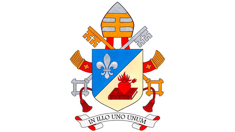
According to Vatican News, Pope Leo XIV's coat of arms is intended to reflect his Augustinian roots and the values he seeks to promote during his pontificate, particularly unity and communion within the Church.
Like the new pope's coat of arms when he was cardinal, the shield is divided diagonally into two sections, each depicting an emblem, known as a charge in heraldic terminology.
The upper half features a white lily on a blue background, representing the Virgin Mary. Some suggest it could also be seen as a reference to the French influence in his home state of Illinois and family roots in Louisiana.
The lower half of the shield has a 'light background' and displays an image of a closed book and a heart pierced by an arrow – a reference to Saint Augustine, who described how the Word of God pierced his heart.
Pope Leo XIV has also chosen a motto that reflects the Augustinian tradition: 'In Illo uno unum', which means 'In the One, we are one', from Saint Augustine’s Exposition on Psalm 127.
But some people want the brand guidelines to be more specific.
"Is the background supposed to be gold/yellow or silver/white? Your description of a 'light background' isn’t exactly heraldic nor clear," one person complained on X. "Very confusing. The lower half looks cream-coloured in this illustration: is it supposed to be argent or or?" another person said.
"What is the tincture of the field of the lower part of the escutcheon?" someone else asked. "If it's argent, why does it not resemble the fleur-de-lis? If or, why does it not resemble the key and tiara?"
It's starting to sound like this unconventional colour decision may be the papal equivalent of anti-design. I expect the Holy See to publish the hex code and Pantone forthwith.

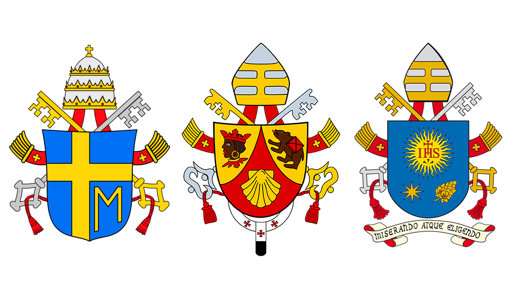
Others still haven't got over the decision to switch the papal tiara for a common bishop's mitre – a change that was made two decades ago (and two popes ago).
While the tiara is still used as a symbol of the papacy on the coat of arms of the Holy See and of the Vatican City State, it hasn't featured on a pope's personal coat of arms since Pope Benedict XVI replace it in 2005.
"Kinda bummed out he chose to use a Bishop’s mitre instead of the papal crown in his coat of arms. I was hoping he’d get back to that… It’s a powerful symbol of the Kingship of Christ," one person wrote on X. "RIP the Papal Tiara," another person commented.
"I think it should have an American flag! He's from Chicago," another person added, apparently in all seriousness.
Perhaps the Vatican should study our style guide examples. For more of the week's branding and design news, see the new Google logo.


