Hello and welcome to another edition of The Crunch!
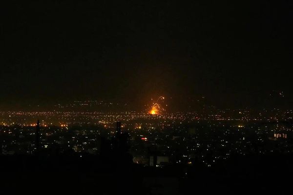
In this week’s newsletter we have charts on the safest seat on an airplane, the number and heights of Scottish mountains, and the cumulative impact of evacuation orders in Gaza.
But first … How Trump has supercharged the immigration crackdown
We’re sorry to say we missed this excellent piece of work from our colleagues in the US when it was first published, so we’re remedying the oversight now.
Based on data from a freedom of information request, Maanvi Singh, Will Craft and Andrew Witherspoon were able to show that despite Trump’s claims that his administration is seeking out the “worst of the worst”, the majority of people being arrested by Ice now have no criminal convictions:
The huge ramp-up in arrests has resulted in detention facilities becoming increasingly overcrowded, and the US system is over capacity by more than 13,500 people.
Four charts from the fortnight
***
1. No seat is safe
Following a horrific crash of an Air India flight in June – in which one person survived – Reuters has taken a deep dive into how rare it is for people to survive such crashes, and whether some seats are safer than others.
Looking at 1400 plane crashes where there were survivors, they concluded that there is no safe seat. Instead, survival depends on an interplay of many factors – impact angles, speed, and evacuation conditions among them.
We really recommend you click through and explore the data and timeline in the story.
***
2. The shrinking space to exist in Gaza
The ABC have cobbled together all the different evacuation orders that Israel has issued in Gaza since March this year, revealing how little space is left. One of the people the ABC talked to said she had been forced to move more than 30 times over the course of the war.
The interactive in this article is really powerful – it gives not only the sense of scale, but the repetition and cumulative effect over time.
***
3. A third of outpatients treated for wounds at MSF’s Gaza hospitals in 2024 were children, figures show
Statistics published by The Lancet, and covered by the Guardian here, show the terrible damage Israeli strikes are doing to Palestinians.
Children under 15 years old made up almost a third of outpatients treated for wounds in field hospitals run by Médecins Sans Frontières (MSF), according to the data:
According to MSF, the majority of violent trauma injuries were from bombs and shelling, due to explosive weapons being used in dense urban areas.
***
4. You call that a mountain munro?
We’re big fans of Tidy Tuesday – a weekly “social data project” where people from around the world, using different tools and languages, create visuals using the same dataset. This week it was a dataset of “munros” – a Scottish mountain with an elevation greater than 3,000 feet.
Dr Lucia Layritz from the UC Berkley put together this beautiful time series of the number of munros over time. “The reason the numbers vary is because there is not a very clear definition of what a munro is, so upon re-surveying they sometimes get taken out of the list again,” Layritz told The Crunch.
We also loved this ridge map of where the munros are. This density chart of munro height. A map of munro density and spread. And this one on munro classification.
Bookmarks
Using LiDAR to show before and after the LA fires
Hundreds of migrants are still dying in the Mediterranean
“1899 was the peak year for African-American patents per capita. It still is.”
Off the Charts
There’s no “correct” way to project a sphere (such as Earth) on to a flat surface. But some ways may be better than others. The African union has endorsed a campaign to adopt an “Equal Earth projection”, which some say more accurately reflects the true size of Africa. You can see this in a graphic from the New York Times:
The standard world map most of us know uses a projection called Mercator (Google Maps, for instance, uses a modified version of Mercator). Mercator projections tend to exaggerate areas around the poles and shrink areas near the equator.
You can see in the Mercator map above that Greenland appears about the same size as Africa. In reality Africa is many, many times larger than Greenland.
If this has piqued your interest, here’s an interactive notebook that visualises a bunch of different world map projections. All of them have their own issues – when you’re flattening a sphere the distortion has to go somewhere. Sinusoidal projections for the win.
Sign up
If you would like to receive The Crunch to your email inbox every fortnight, sign up here.


