Hello and welcome to another edition of The Crunch!
Another Australian election has come and gone in a flurry of maps, virtual parliaments and an animated dunk tank for losing candidates.
In this week’s newsletter we’ll have all our favourite election visuals and a renewables explainer, as well as visualisations of the Met Gala and earthquakes in Myanmar from international outlets that decided not to go all-in on our election.
But first … a great big map!
This election has seen a bunch of surprises across the country, and there are lots of ways to slice and dice the – still unfinalised – results. Australia’s preferential system, and redrawn boundaries for some seats, can make it hard to get your head around exactly what happened.
This map-based story from our colleague Andy Ball takes the election right back to basics – plotting the first preference vote at every booth.
There are also maps to compare electorates and areas between the 2022 and 2025 elections, so you can see exactly where the swings were.
The data team have put together a bunch of other election visuals you should bookmark and check out, including our complete results page and this updating page of the count and swing in undecided seats.
This election also saw the continuation of the long-term decline in the major party vote. Nick and Andy put together this deep dive just before election day.
We don’t have full preference flow data yet for this election, but Josh created an interactive of how preferences flowed at the last one to illustrate why it’s important – and how it works.
Four (other) charts from the fortnight
***
1. You get a chart. And you get a chart. Everyone gets a chart
It was hard to pick from the many great visuals in the ABC’s explainer about how renewables fit in the energy system, which also covers what the national energy market is, why and how the market has evolved over time and how pumped hydro works.
This is probably a story to sit with for a while. We went over it a second time to write this newsletter and learned even more. Shoutout to the little graphic on why so much solar potential is wasted.
***
2. Bigger and bolder
As has been repeatedly covered in this newsletter, we aren’t fashionistas. But even for us, the Met Gala is hard to ignore. Here’s Reuters with a very creative way of illustrating how the looks have become bigger.
If you check the methodology at the end, it sounds like this was largely done manually – by tracing hundreds of photos of celebrity outfits. Fantastic.
***
3. A top-down view of a top-down view
Firefighting aircraft can seem ever-present during Australian summers. But from the ground, it’s hard to conceptualise what’s really going on. This visual story from the Age and Sydney Morning Herald, about efforts over the Grampians this summer, really makes you appreciate how much goes into fighting a fire from the air.
The combination of the spot fire indication and the flight paths is great.
***
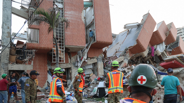
4. Why Myanmar’s earthquake was so devastating
Another beautiful if horrific story from Reuters, illustrating how big the “supershear” was in the earthquake that hit Myanmar in March.
There’s a lot of putting things in perspective in this story. Millions of people have been affected by the quake in Myanmar, from a rupture that is longer than Sri Lanka.
Spotlight
We’re focused on the Australian election this week, so this great New York Times tariff visualisation, and a bunch of other incredible stories unfortunately don’t make the cut.
It is a truth universally acknowledged that there should be more triangles in datavis. So please enjoy the ABC’s ternary scatterplot showing the rise of the independent vote in Australia.
We really liked this Sydney Morning Herald explainer on how preferential voting works.
We took a look at what went wrong for the Coalition, with some charts.
And the ABC made a Big Scrolly showing how Labor won and where.
Off the Charts
We’re going to end this packed edition of The Crunch on what is undoubtedly a high note: after 500 days, Valerie the dachshund has been found and reunited with her owners. After a lot of back and forth at Crunch HQ, we decided this cartoon by our colleague First Dog counts as a chart:
Sign up
If you would like to receive The Crunch to your email inbox every fortnight, sign up here.