Space is often described as the final frontier, and it's certainly proved to be a challenge for logo design. We've seen all manner of space-related logo controversies over the years, from SpaceX's wonky NASA logo to the much-mocked US Space Force designs.
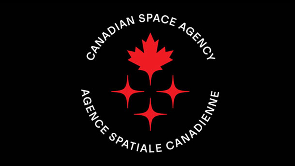
Now the Canadian Space Agency has taken a risk with a new logo design that departs from the usual tropes in the sector, and it may just be the most Canadian logo ever. The design features a maple leaf – Canada's national emblem – and three stars symbolising... well, stars. But it's actually rather nice (looking for tips for your own designs? See our guide to how to design a logo).
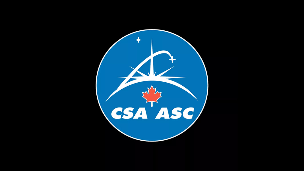
The Canadian Space Agency's new logo is intended to communicate 'daring invention and our sights set on the future, ready to push the boundaries of ingenuity and innovation." Or maybe it just shows a maple leaf being launched into space. Either way, the design that will be worn on the suit of the first Canadian astronaut to launch to the moon with NASA's next Artemis mission is a lot cleaner than the agency's previous effort.
The CSA has taken the reduced, simplified approach that we've seen taken by brands the world over in recent years. It's stripped back its previous design, which dates back to 1996, to just two simple elements: a modified version of the well-recognised emblem of the maple leaf and a trail of three stars.
While the stars could simply be stars, the agency suggests they also represent 'brilliance, intelligence and expertise' and all of the people involved in Canada's space program, including industry, scientists, academia and STEM (science, technology, engineering and mathematics) organisations.
A circular version of the logo includes the full name of the agency in English at the top and in French ("Agence Spatiale Canadienne") at the bottom. They're spelled out in full rather than abbreviated like in the previous logo design, but nevertheless, the design is still a lot cleaner. The previous design was overloaded with elements, with a smaller maple leaf stuck under a busy horizon that included both the sun's rays and a vector extending to a four-pointed star.
The new logo design is actually quite unusual for a space agency. Despite space looking black, the majority of institutions, from the NASA logo (the 'meatball') to China's CNSA and France's CNES, go for a deep blue as their main colour. They also tend to include some form of arrow or swoosh to suggest a rocket launching into space, hence the Space Force logo's resemblance to a design from Star Trek.
Canada's taken a refreshingly different approach, and despite its simplicity and the lack of shadows or swooshes, it manages to give the impression that the Maple leaf is taking flight by the way it tapers towards the stars below it. Canadians seem to be pleased. "The new logo is full of symbolism and it looks beautiful as well," one person wrote on YouTube. "It's nice that it looks less like NASA's logo," someone else wrote.