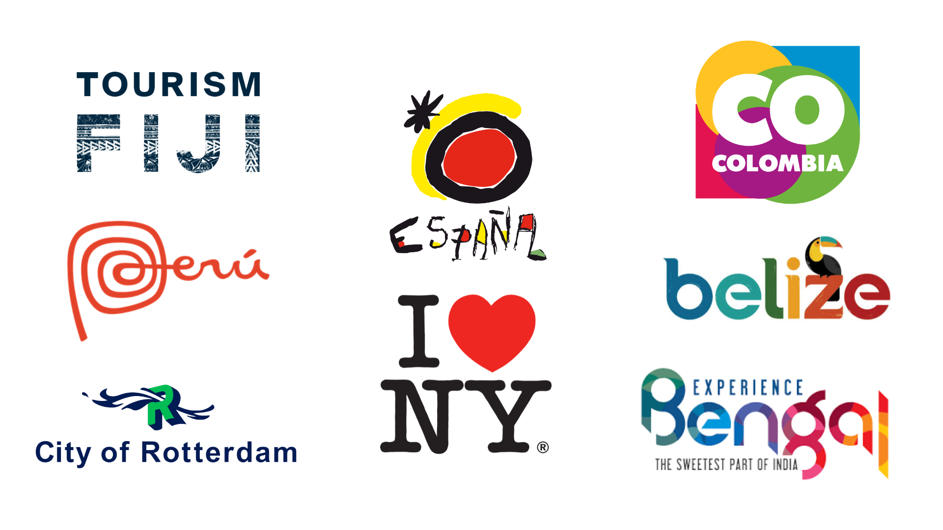
Tourist boards play a vital role in inspiring travellers to visit their destination, whether they’re telling you about the hottest new festivals and bars, or working with celebrities, writers and influencers to spread the word. In order to stand out and represent their country, city or region, they need an eye-catching logo: something that fits the destination and feels modern. It then gets plastered over all kinds of promotional materials, from pens and memory sticks to t-shirts and posters.
Sometimes, they firmly fit the trends of their launch period, perhaps having a distinct ‘iconic 80s logos’ feel, but other times they remain relevant for decades to come – see New York or Rotterdam for proof.
We’ve picked the best tourist board logos to give you wanderlust; we looked for the best logos that feel custom-made for the destination, do something a bit different, and would look just as good on a keyring as on a billboard, whether they’re made by the best logo designer or not.
01. PROMPERU (Peru)
This South American country is best known for its archaeology: Machu Picchu, the mysterious Nazca lines, the circular Incan terraces of Moray, and the Temple of the Sun in Cusco. That’s why we’re not surprised to see a hand-drawn wordmark that echoes the creativity of Peru, and has been in place since 2011, courtesy of Futurebrand, for use in tourism and trade. The circular pattern on the letter ‘P’ could also make you think of a fossil, or the curve of a clay pot.
So, what else could they have chosen to incorporate? Peru’s food scene is also increasingly popular, with visitors flocking to taste ceviche (fish cooked in lime juice) and Pisco sours (cocktails with egg white), but let’s face it: those wouldn’t really work in a logo, especially if you’re trying to appeal to vegans. We’re glad they stuck to the archaeological theme and kept it simple.
02. Brand Colombia
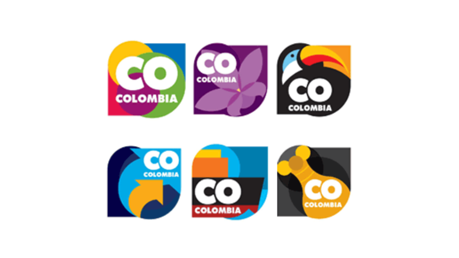
Remarketing a country that has had political struggles isn’t easy, but Brand Colombia may have cracked it from a design perspective – this major tourism and business campaign launched in 2012, with a logo that mirrors the country’s eclectic mix. Colombian companies Sancho BBDO and Señor López were behind the identity, whilst advertising partners included JWT.
At the time of the launch, Claudia Hoyos, from Marca País Colombia, said: "Our greatest strength is in our megadiversity… we have many regions, cultures, accents and dialects, many landscapes and different climates."
Therefore, there are different coloured versions of the logo; as Hoyos puts it, "violet represents the variety of flowers we have, especially the orchid, our national symbol," with each region and theme represented by simple geometrical shapes, like a drum for music. Reducing Colombia to 'CO' isn’t just a case of saving space: it shows the ISO country code, recognised all over the world. However, travel industry website Skift didn’t approve, saying the new identity was "all over the place".
03. Turespaña (Spain)
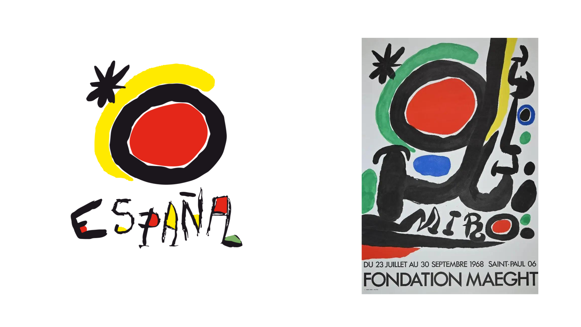
This logo for Turespaña is very much a product of its time, so it doesn’t look as effective today, but we couldn’t resist adding it to the mix – Spain even commissioned artist Joan Miró to design it in 1983. Art tourism is a huge part of Spain’s appeal, with visitors drawn to works by Picasso, Velazquez, Dali and many others, but it was a coup to get Miró on board.
Sadly, Miró was too ill to create a brand new work, so he incorporated elements of other designs to get this result, known as The Sun of Miró, which was revealed to the public in 1984 and has been used ever since. The colourway harks back to the red and yellow of the Spanish flag, while the sun emblem certainly fits the Mediterranean climate. Both the sun and the star were taken from a much earlier poster which – whisper it – was for an art museum in France. If you're in need of an art fix, don't miss our round-up of the best art books.
04. Belize Tourist Board
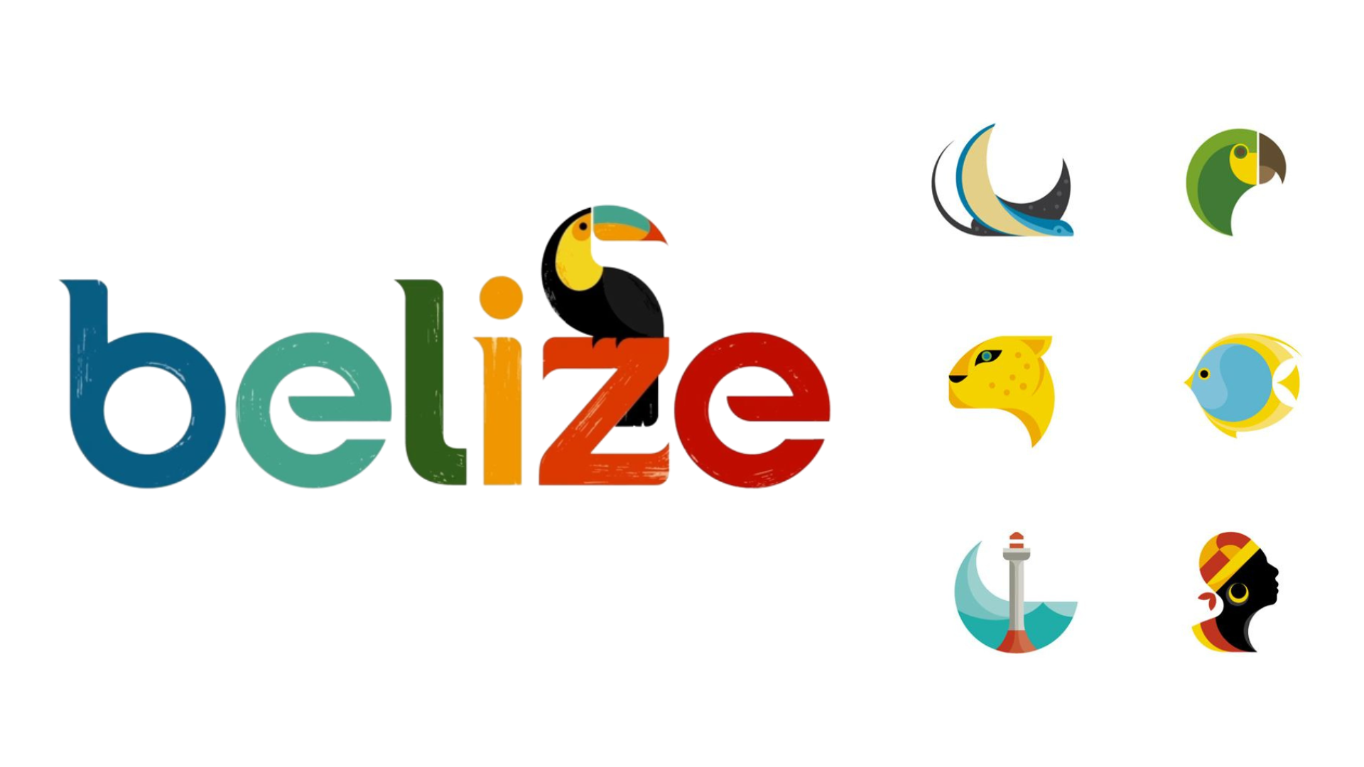
How does a small central American country make its mark? With a rainbow of colour and nature-inspired details, thanks to Studio MPLS. Here, Belize uses some curved serifs at the top of its letterforms, mirrored by the diagonal first stroke of the 'e'. The overall rounded lettering mimics the number of circles the designers found in their research across the country’s wildlife, landscapes and culture. A toucan perches on the letter 'z', adding character without making the word illegible. As with Colombia, the icon is interchangeable for different regions, which have their own colour palettes; others include a lighthouse (for the Central Coast) and a tropical fish (for the reef).
The typeface has a slightly worn feel, thanks to little inner streaks letting the background show through. The logo can also be presented with the toucan seen separately, and its body and beak has some of those well-worn streaks. This rustic feel fits Belize’s nature-driven tourism, which often includes visits to the jungle and rainforests, and also the "hand-painted weathered signs" that Mike Fetrow, one of the designers, noted.
05. Tourism Fiji
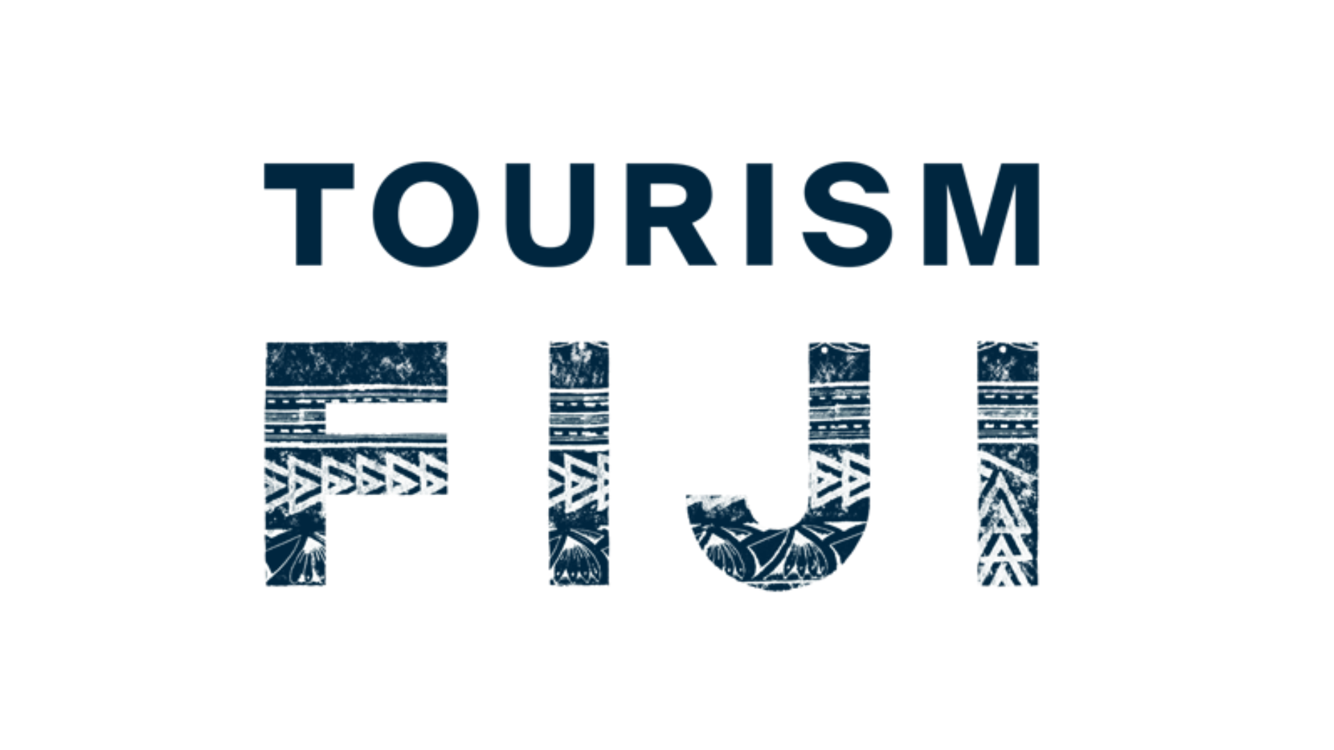
The current version of Fiji’s logo is a vast improvement on its 2013 attempt (which was overly simplistic, forgettable, and burdened with the bland tagline ‘Where happiness finds you’). This much more inventive wordmark, from Australian agency Host/Havas, includes repeated traditional patterns seen on Masi fabric, a Fijian craft. Each motif symbolises a village, family or community.
The Prussian blue also makes this stand out from many other logos – though tourist boards love a bit of blue, this rich shade has real depth. The designs were created by Wati Maraiwai Talavutu, a Masi artist.
The national airline, Fiji Airways, worked with Masi artist Makereta Matmosi to revamp its logo in 2012 when it rebranded from Air Pacific. If this gives you the urge to fly, take a look at our round-up of airline logos.
06. New York Board of Tourism (USA)
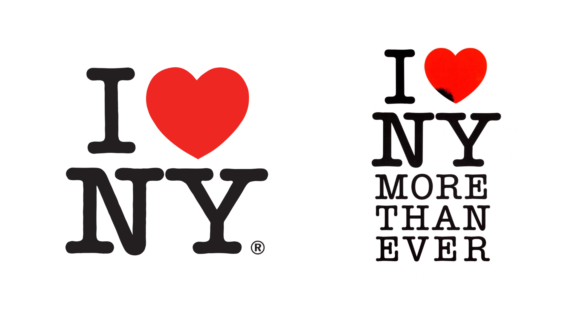
It wouldn’t be fair to exclude the most iconic tourist board logo in the world. Milton Glaser’s design for New York has been replicated countless times, even though it says nothing about the city or its unique selling points – it’s simply about loving the place. There’s no trace of the skyline or attractions here; not even a nod to the city’s ‘Big Apple’ nickname (unless the red heart reminds you of a red apple, in which case you’re probably just hungry). The lettering is set in American Typewriter, which has rounded slab serifs and feels suitably casual for the city that never sleeps. Glaser drew the sketch in red crayon back in 1976, and the original drawing can be found at New York’s Museum of Modern Art.
After 9/11, the logo was adjusted by Glaser to remind residents and tourists how strong New Yorkers can be; he changed the text to read ‘I [heart] NY more than ever’, and gave one edge of the heart a small scorch mark; you can find this emotive design at the 9/11 Memorial and Museum.
Glaser died in 2020, but this year we saw the logo morphed into ‘We [heart] NY’ thanks to Graham Clifford Design. We weren’t the only ones disturbed by the new look, with its cheap-looking 3D heart and thick sans-serif lettering – a misstep that Glaser thankfully never saw.
07. Experience Bengal (India)
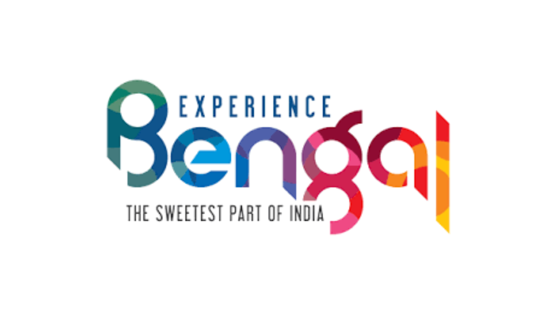
Bengal’s wordmark has a similar feel to Belize – thankfully, there are thousands of miles between the two, as this one is in India. However, there are some precise details that mark this logo as a little bit different. The East Indian state has an incredibly colourful and modern logo that flows well and makes its mark against its competitors. It might remind you of a paint chart or a colour wheel, as each letter contains various fragmented shades. The sloping arcs of the 'n', 'a' and 'l' stems nicely elevate the logo by dropping below the baseline, moving it away from a boring straight line to something more inventive.
So, why should Bengal be seen as colourful? In parts of West Bengal, the soil is red; meanwhile, the tea plantations and the Himalayas create dramatic scenery. The state also has its own distinct style of weaving, which appears on saris, and its own art movement, known as the Bengal School, in the early 20th century, as well as a history of Patachitra painting. If you want to apply the chosen slogan, ‘the sweetest part of India’, to Bengali food, that’s pretty colourful too – speciality desserts include amriti, which are spirals of sweet dough fried in ghee.
08. City of Rotterdam (Holland)
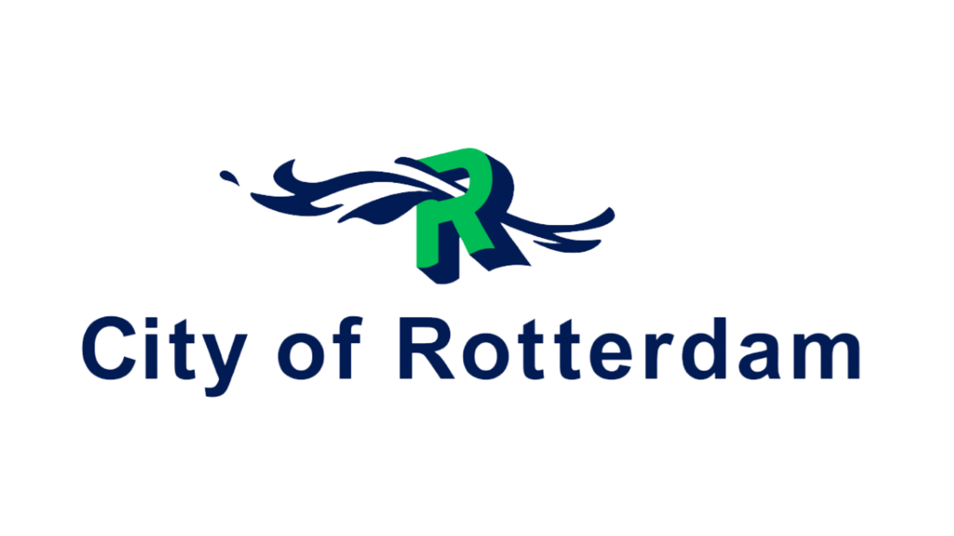
Did you guess that Rotterdam is a riverside city and also a port? This logo, covering the wider Rotterdam area, depicts a flowing river bursting through the letter 'R'. What was almost a 2D logo has been enhanced with a drop shadow on the lettering, in the same dark blue as the water, making the green façade of the letter really stand out. It has been in place since 1999, but by 2017, politician Sven de Langen called for this logo to be replaced with the city’s coat of arms and its original motto, 'Strong through struggle'. Thankfully for design lovers and modernists, this has not come to pass.
So, why else is the water theme relevant here? Rotterdam has the largest port in Europe, so water is the key to trade. Plus, many cities in the Netherlands are passionate about sustainability, and Rotterdam is no exception. There’s even a self-sufficient floating farm on the water, home to a herd of dairy cows, which attracted press coverage worldwide; plus, this year, an exhibition called Water Cities Rotterdam, developed by the Niewe Instituut and the architecture firm NLÉ. Whilst the tourism logo lettering is placed in the river rather than floating on top, it definitely shows that water is a key part of life in the city, and this design wasn’t plucked out of thin air.
For more on logos, see our best simple logos, best 20th century logos and best 90s logos roundups.