The best logos of the 1980s are bound up with our memories of pop culture from the decade, from music and TV to design and fashion. But looking back at iconic logos from the 1980s isn't just interesting for from a nostalgia point of view since they continue to influence today's graphic design.
What were the best logos of the 1980s? For a balanced view, I spoke to experts from leading agencies to get their views. Below, I've gathered their favourites along with what the experts had to say about each design. To see how these logos fit into the bigger picture, don't miss the other pieces in our best logos by decade series. And for help crafting your own designs, consider using the best graphic design software or trying the best free logo makers.
See the video summarising our list below, and then read the expert commentary.
The best logos of the 1980s
What made 1980s logos so special? Well, they weren't the 1970s for a start. The decade saw a new period of optimism as the 1973 energy crisis faded into history and the threat of nuclear war began to abate. The 1980s also saw an explosion of new technology, with the popularisation of home computers and electronic gadgets triggering visions of the future that would influence all areas of design.
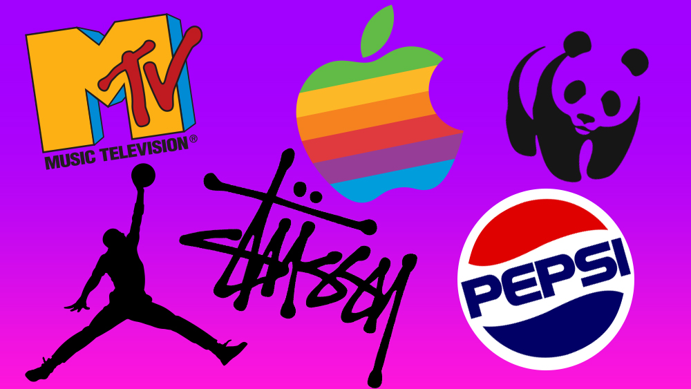
This optimism provoked the emergence of vibrant aesthetics, experimentation and, at times, unbridled excess; from garish fashion trends to infectious synth-pop melodies. In logos, too, there was a renewed sense of colour, energy and confidence. Here are 12 examples of 1980s logos that global design experts think stood out.
01. The rainbow Apple logo
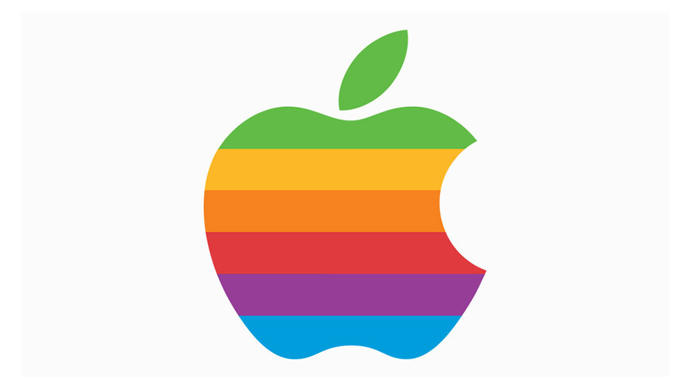
The Apple logo of the 1980s may have since been superseded by a simpler, single-colour version. But this rainbow coloured version instantly conveys everything you need to know about 1980s design. Appearing in 1984, it was actually a redesign by Landor & Associates based on a similar design created by Rob Janoff in 1977. The changes to the apple itself were minimal: the major change was the decision to remove the brand name and use the icon alone, a move that still demonstrates the power of Apple's branding today.
"It was a significant departure from the standard corporate logos of that era," explains Jake Howlett, creative graphic designer from Free The Birds. "I love the vibrant, colourful design, which really stands out against a sea of conservative logos typically associated with tech companies: it really came to represent Apple’s innovative and rebellious spirit."
This use of bright and bold colour was characteristic of the era, but also served a more specific purpose, he notes. "The design of this logo tied in with the launch of the Apple II computer, and its world-first, colour display was represented in the rainbow colour scheme."
"The Apple logo is one of the most sophisticated, minimal, perfect logos ever created," enthuses Oliver Maltby, executive creative director and portfolio lead at Interbrand. "It's created with two simple shapes: an apple, with a bite mark removed – apparently added to make it not look like a cherry – and a leaf that parallels its shape.
"There is also an uncorroborated myth that it honours Alan Turing, the father of modern computing, who was persecuted for being homosexual, and who took his own life by eating an apple laced with cyanide. It may not be true, but either way, the potential symbolism of the logo is inspiring." For more details, read our article on the Apple Logo: a history.
02. Back to the Future logo
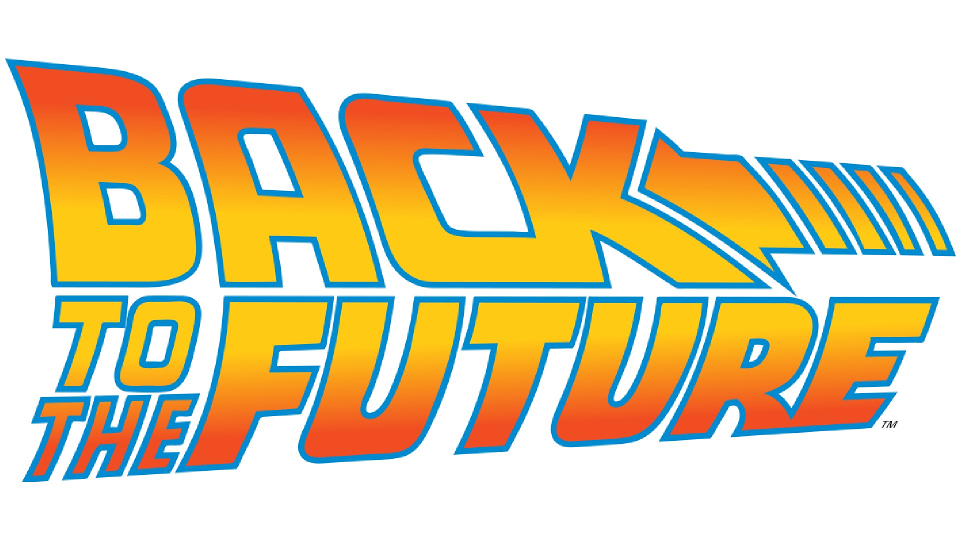
Ironically for a time-travel movie mainly set in the 1950s, Back to the Future remains one of the best-loved films of the 1980s today. While its sequel's depiction of 2015 never came true – we don't have flying cars powered by nuclear fusion – it's such a brilliantly scripted and energetically acted tale, who cares? Not to mention its terrific art direction (read my interview with John Bell for more on that).
The film was released in 1985, a year in which there was stiff competition from the likes of The Goonies, Rocky IV, Beverly Hills Cop, Police Academy 2, Rambo, Cocoon and other popular movies. So branding was everything, and thankfully the logo got everything right. The lettering was suitably sci-fi, the colours were fiery and exciting, and the linear gradient evoked the sense of forward motion that was crucial to a fast-moving action comedy.
"Back to the Future is the place I got to when thinking about the 80s, and this also holds true of the film's logo," says David Nathan Davies, design director at Design by Structure. "Consisting of a tightly stacked set of words, it's skewed both backwards and forwards, instantly conjuring up the feeling of time warping. This so perfectly captures the central theme of the film; the more you look at it, the more you feel you’re being dragged back in time with it!"
It might seem odd to a modern audience to feature a movie logo as one of the best of the decade. But as Ross Clugston, CCO of Design Bridge and Partners, explains, big screen entertainment was hugely dominant at a time before the internet, and when videogames were still a niche pursuit.
"When I think about the 80s, it's all about video, home video, and the movie theatre," he explains. "That was the 'AI' of the time; the 'metaverse' of the time. The imagery of VHS and video cassettes instantly come to mind; everything was about TV and movies. MTV, Nintendo, NBC’s Peacock, Universal, all of the memorable logos of the 80s have to do with the advent of 'There’s entertainment in your home, and it’s all about the screen, everywhere.'
"In the 80s, screens represented a whole new canvas, a whole new cool way to do your logo," he adds. "Before screens, logo guys would show up to clients with a piece of paper and say, 'here's your brand, you can't argue with me'. So, the introduction of screens meant more: more space for creativity and all the swooshy shiny design, but it also allowed clients more space to iterate with the agency or designer. Designing for screens in the 80s was probably the beginning of true co-creation and collaboration in branding. And Back to the Future is the best film logo of all time, right?"
03. Pepsi logo from the 1980s
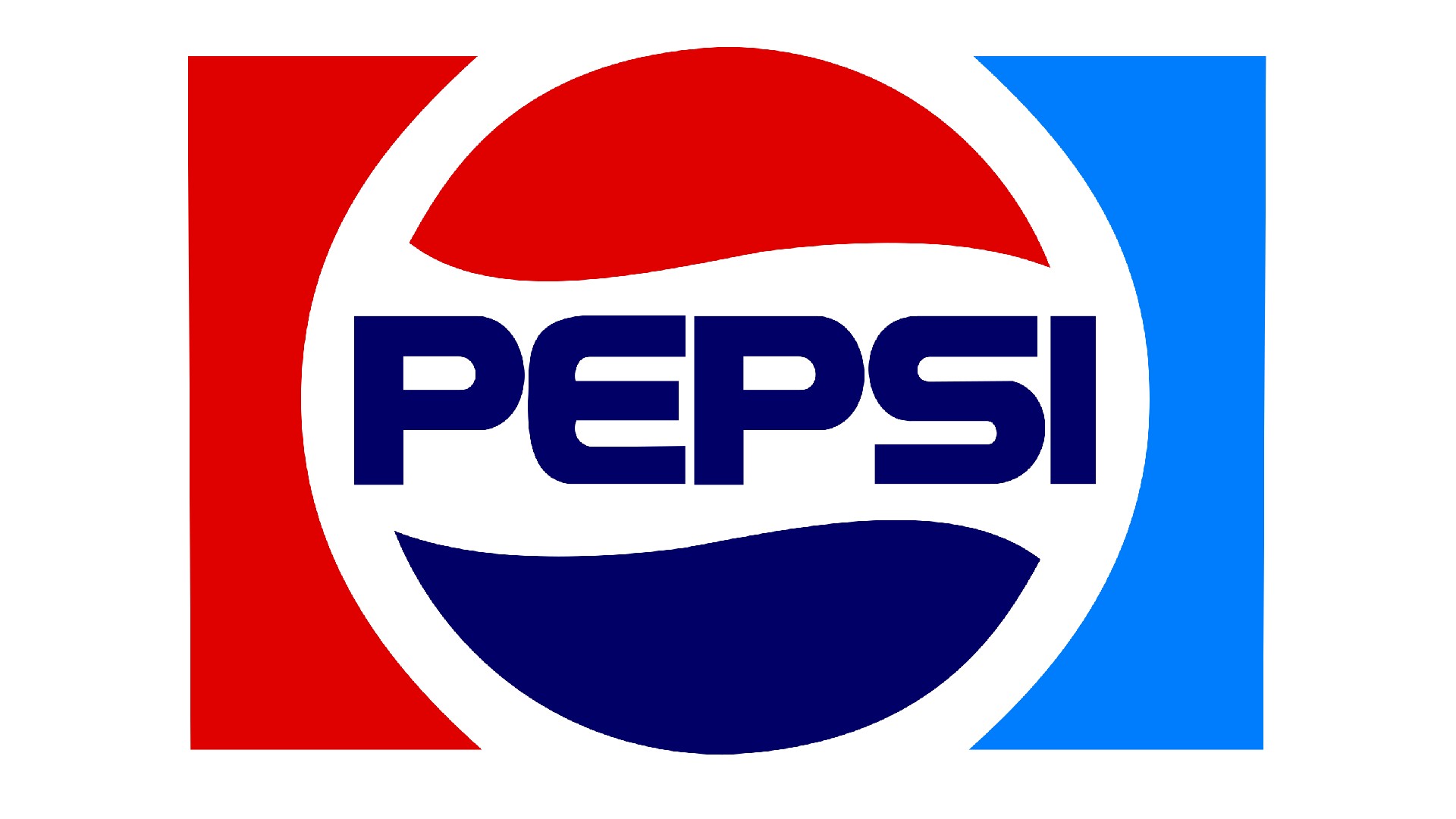
For decades, Coca-Cola had been undisputed as the leading brand of cola. But in the 1980s, things were much more evenly matched. Pepsi boosted its market share thanks to the 'Pepsi Challenge', which saw consumers blind-taste the two drinks, often finding they preferred Pepsi. Coke responded by launching 'New Coke', which was a huge disaster. And Pepsi's growing confidence was reflected in its new branding, including a logo redesign in 1987.
"This revamped Pepsi logo gave the brand a modern and refreshing look, replacing the design which had been in place for over a decade," recalls Howlett. "It represented a larger strategy of continuous innovation that saw it stand out against its competitors, namely Coca-Cola who favours red.
"It also came at a time when Pepsi sought to associate itself with the younger generation and their design language with wavy lines and bright colours," he adds. "For me, it fully portrayed a sense of fun and youthfulness, which allowed them to align with influential pop culture icons of time such as Michael Jackson and Madonna."
04. Nike Air Jordan 'Jumpman' logo

If there's one logo that symbolises the renewed optimism of the 1980s era, it's Nike's 'Jumpman' logo for its Air Jordan line, depicting basketball superstar Michael Jordan in full flow. Sadly, the positive energy the design embues stands it contrast to the controversy over its creation.
The silhouette is widely believed to have been inspired by photoshoot for Life magazine by then-student Jacobus Rentmeester shortly before the 1984 Olympic Games. Nike licensed the shot, but due to copyright issues, then decided to recreate it with another photographer. This second image was then used to draw the final emblem in 1988 by Tinker Hatfield, based on a sketch idea by Air Jordan creator Peter Moore.
When Rentmeester complained, he says Nike paid him US$15,000 for a two-year, North America-only licence for posters and billboards. He then alleges it broke the terms of this agreement, and so he sued the company in 2015. However, the court found in Nike's favour, maintaining that the footwear giant didn't copy the photo but merely used it as inspiration.
Legal arguments aside, the logo remains an iconic design that evokes a much-loved era of sporting greatness, and it remains one of the best sports logos today. Scott Hancock, CEO at California-based branding agency BLVR, is among its fans today.
"I admire the logo for its vivid capture of Jordan’s signature dunk," he says. "It’s a perfect symbol of the brand’s belief in defying limits and the power of audacious dreams. It merges unwavering determination with defiant style, embodying the pursuit of excellence that inspires me personally."
05. McDonalds logo
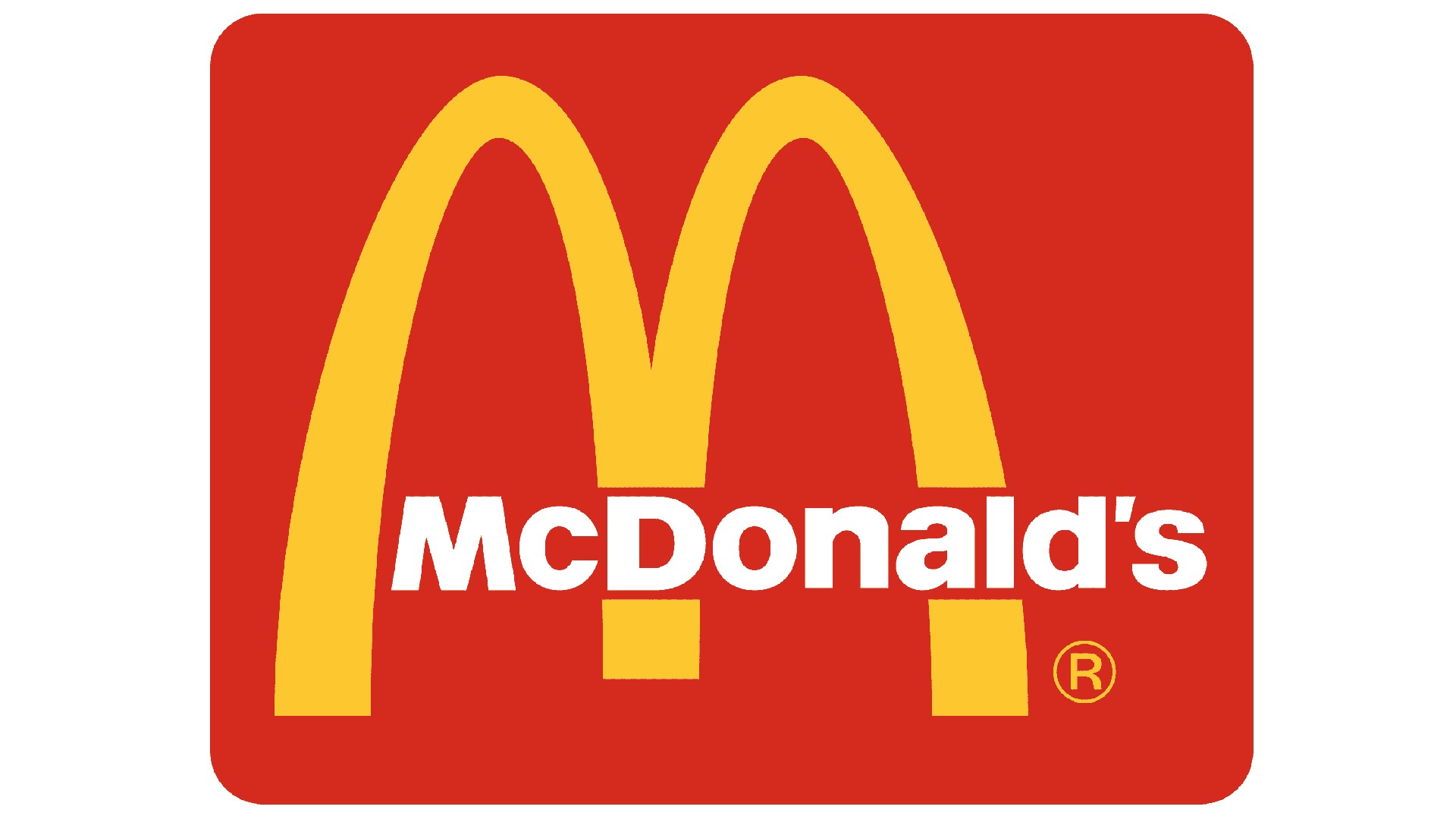
As we explain in the story behind the McDonald's logo, the fast-food giant has been around since the 1940 and its branding has a long and complex history. But it's arguably the 1983 logo which remains the most iconic. Not only is it a powerful symbol of the brand itself but more broadly of consumerism, American culture and confident capitalism.
"The '83 logo was the first which incorporated what is now the unmistakable red square element," recalls Howlett. "They abandoned the browns and blacks of previous designs to bring together these standout colours – red, yellow and white – which have remained consistent to this day. It’s a great example of a simple but iconic logo which doesn’t need complexity to communicate its friendly and accommodating brand message."
06. Sega logo
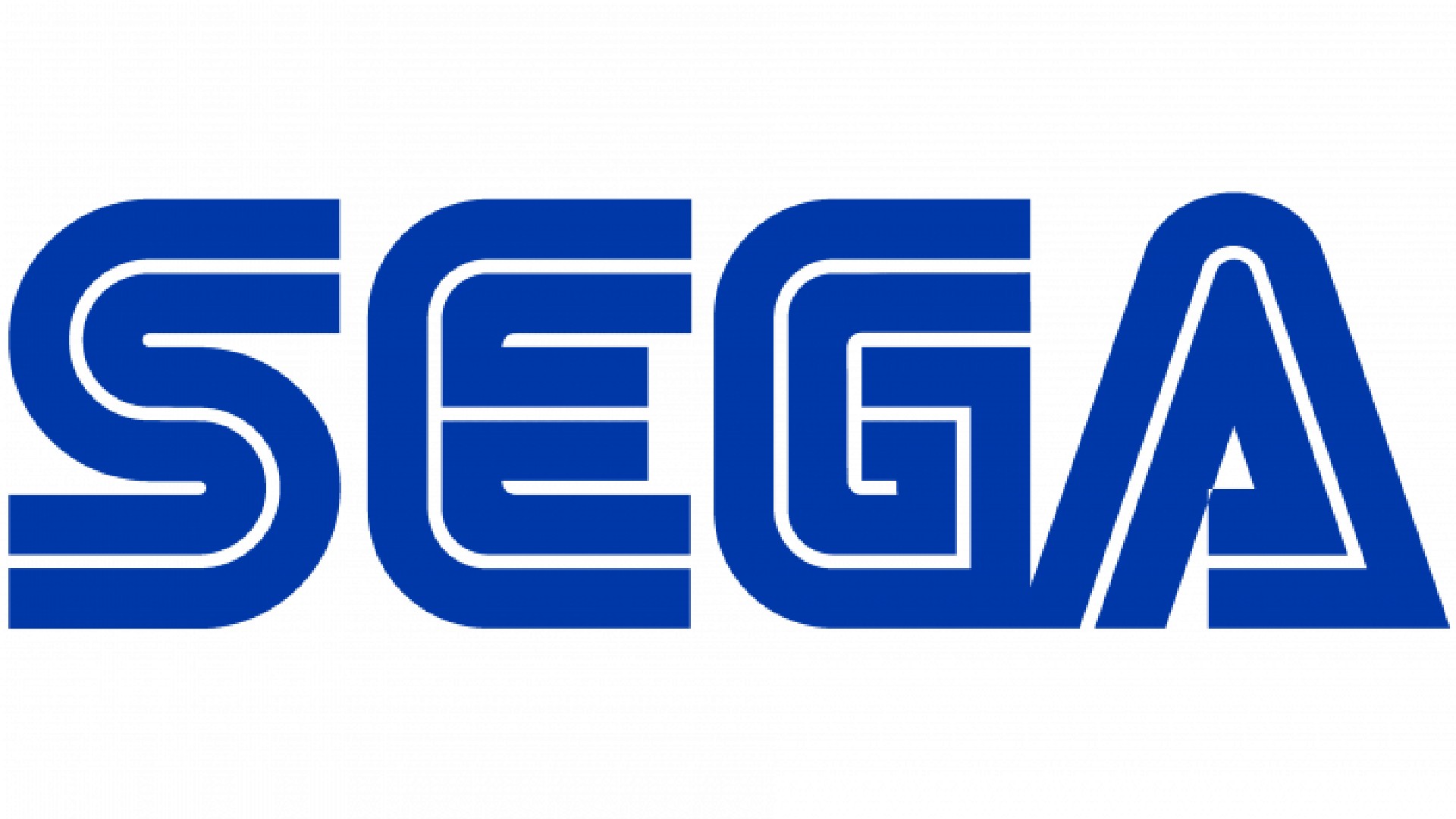
Today, the battle of the gaming consoles is mainly a three-way fight between Nintendo, Sony, and Microsoft. But back in the 1980s, there was another huge player: Japanese games brand Sega. Having made its name in arcade games, it launched the Sega Mega Drive in 1988 (known as the Genesis in the US), which would ultimately launch Sonic the Hedgehog, one of the most loved video game characters of all time.
"The Sega Master System epitomised 80s video game culture, bringing R-Type, California Games and Double Dragon to home gamers worldwide," recalls James Kirkham, former designer and founder of Iconic. And the logo was suitably forward-thinking and sci-fi futuristic, neatly emulating the lines of code used to program the cutting-edge console.
"This emotive 80s classic used a typeface by Japanese designer Teruoki Yagi, who also designed the logo for CNN," explains Kirkham. "The accompanying tightly-spaced, bookish serif fonts were commonly used in the 1980s for technology brands, most famously Apple."
07. Ghostbusters logo
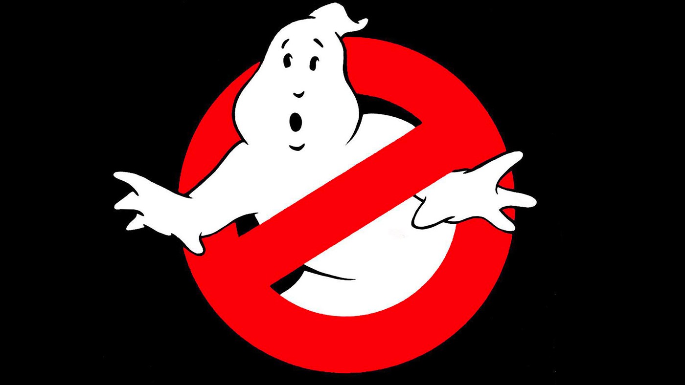
In the 1980s, the blockbuster movie was king, so we make no apologies for including another movie logo on our list. The 1984 comedy about a team of scientists who fight ghosts brought together the comic talents of Bill Murray, Dan Aykroyd, and Harold Ramis and wasn't just a huge hit, but became one of the most-loved family films of all time.
Its logo, meanwhile, had to work doubly hard, because it also appears within the film itself as the team's corporate mascot. It succeeded in this task brilliantly by following one of the most fundamental principles of logo design: abstract the concept to make it as simple as possible.
"The Ghostbusters logo is really graphic, but it has loads of personality," explains Emma Barratt, global executive creative director at Wolff Olins. "It’s so literal and so simple, it’s genius! It worked brilliantly as part of the film and to promote it. Could you imagine anyone creating a logo like that these days? I doubt anyone would be brave enough." See our Ghostbusters logo history to see how the design was tweaked over the years.
08. Stüssy logo
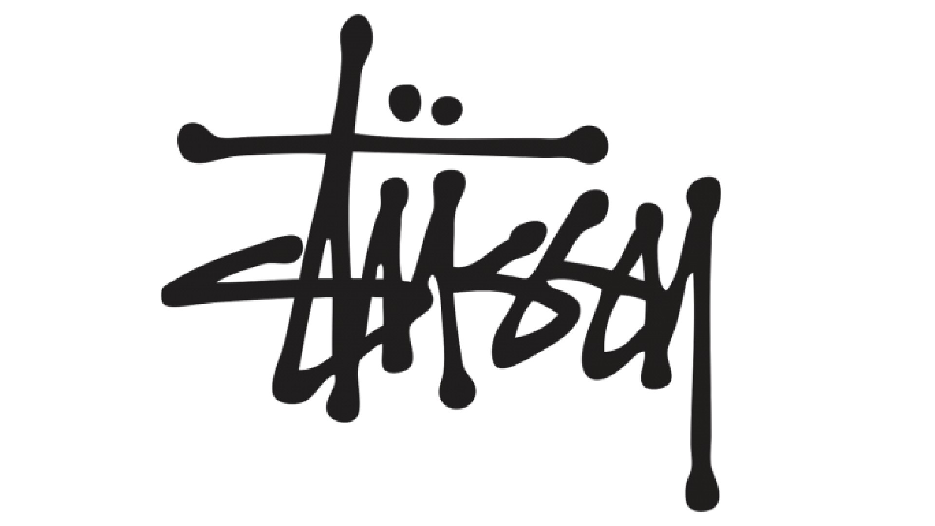
So far, we've focused on corporate logos on this list. But the 1980s was also the decade in which the stuffed shifts no longer had a monopoly on culture, as urban subcultures based on the streets began to take over the world. And Stüssy, a fashion label founded in the early 1980s by Shawn Stussy, offers a great example of how this trend began to influence logo design.
Stüssy grew out of the surfwear trend originating in Orange County, California. Its logo originated in the early 1980s, when the eponymoyus founder scrawled his surname on handcrafted boards with a simple broad-tipped marker.
The signature itself was actually copied from that of his uncle, Jan. Stussy used the logo on T-shirts, shorts and caps that he sold out of his car around Laguna Beach, California. The brand later exploded after being adopted by the skateboard and hip-hop scenes, as well as punk and other subcultures.
"The Stüssy logo’s graffiti-style typography deeply resonates with me because it draws from the surf and skate roots," says Scott Hancock, CEO of BLVR. "I’ve always been drawn to the logo’s bold expression of individuality and counterculture. To me, it stands as a powerful testament to Stüssy’s belief that creativity and style audaciously challenge the status quo."
That said, this new movement wouldn't stay underground for long, eventually going from kicking against the mainstream to becoming the new mainstream.
"The 80s for me represents the rise of subculture: skateboarding, surfing, hip hop, and so on, each with its own visual language," remembers Clugston. "Vision, Psycho Sticks, the Mark Gonzales stuff: it’s all still burnt into my retina, and it's still really cool. Skateboarding imagery was all that we drew on; it was about going into a skateboarding shop and just drooling at the wall.
"The look of the 80s, with the neons and everything else, we were able to laugh at ourselves a little bit. In the 90s we rebelled against all of that neon, and visually we took ourselves so seriously, really grungy. Everything was cocky. And plaid."
09. MTV logo
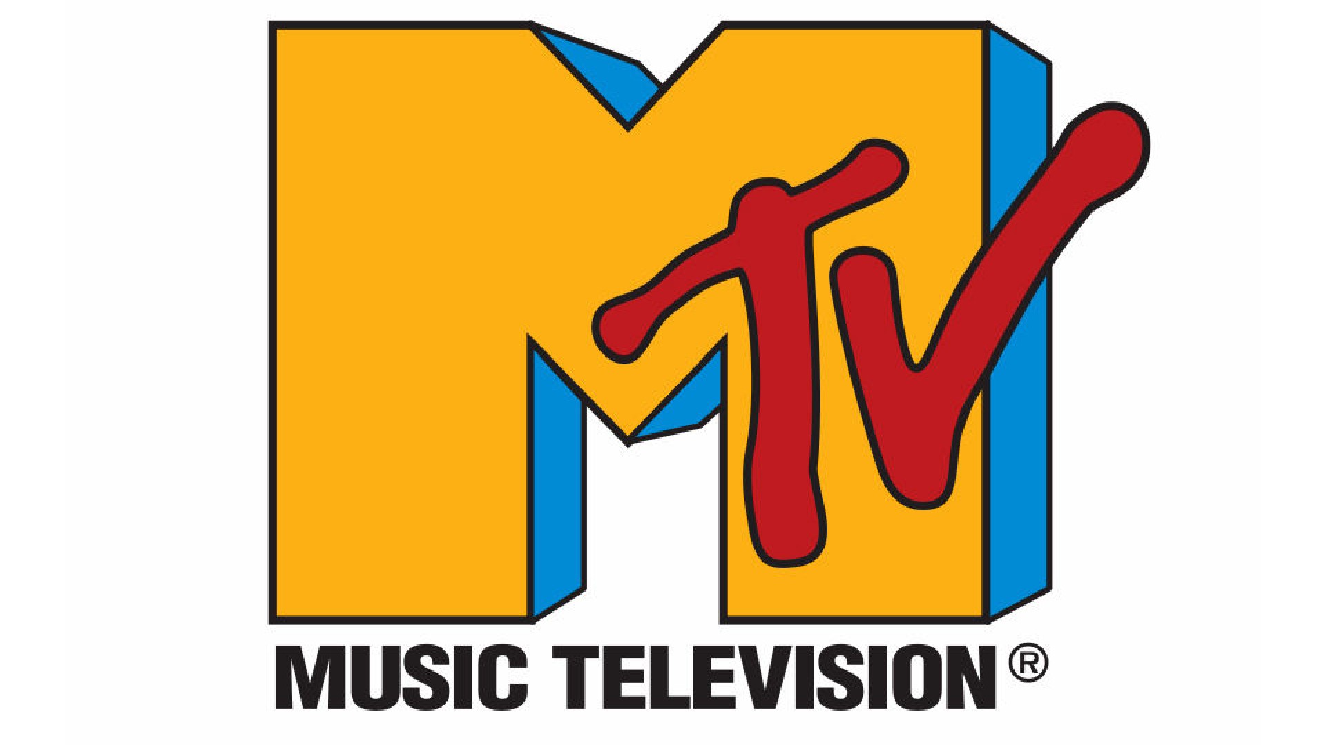
Another iconic 1980s logo taking its cue from graffiti art, albeit in a more subtle way, was that of MTV. This TV channel, which stood for music television, revolutionised the pop world by being the first to show round the clock music videos, a medium that was itself in its infancy. All of a sudden, bands had to pay almost as much attention to their videos as the music itself. And rather than just filming the band miming, they became increasingly like mini-movies, leading to big budget epics like Aha's Take on Me and Michael Jackson's thriller.
MTV's logo, created by Manhattan Design in 1981, made its mark too. "The much-revered MTV logo was one of the biggest influences on me from a playful and progressive approach to logo design," says Mark Nichols, creative director at WMH&I. "I’m a big advocate for logos that can flex and come to life in electrifying aways across multiple channels of communication, instead of remaining the same restrictive imprint of the brand in every execution. MTV led the way in this flexible approach to logo design, allowing the brand to stay as fresh and engaging today as it was back in 1981.
"The imprint of the logo allows the brand to be filled with multiple colours, patterns, textures, and even new figurative depictions of the logo imprint. When we look at Google, The Natural History Museum or the even more obvious reference in the City of Melbourne identity it is clear that the 1980’s paved the way for scalable and flexible logo design approaches."
Chris Chapman, creative director of design at adam&eveDDB, agrees. "While its original garish ‘Memphis Design’ expressions have dated, its variable concept still feels contemporary ... and I’m not sure this is entirely coincidental," he says. "In a way, MTV’s zeitgeist-chasing, and then-pioneering, 24/7 programming pre-figured the context many brands are designed for today." For more, read our article on How the MTV logo captured the creative spirit of the 1980s.
10. V&A logo
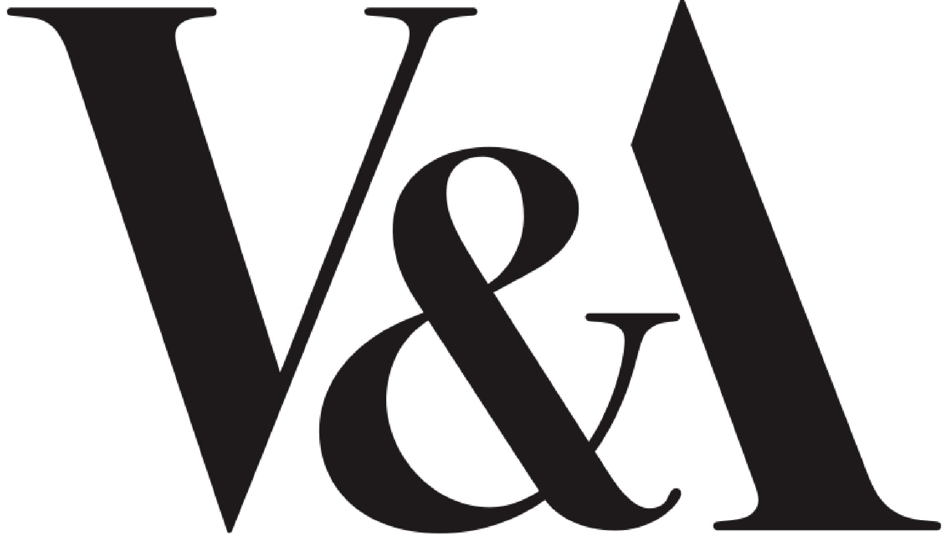
Founded in 1852, the Victoria and Albert Museum (aka V&A) in London is the world's largest museum of applied arts, decorative arts and design, housing a permanent collection of over 2.27 million objects. But while that description might make it sound fusty, it's anything but. This museum has remained up-to-date and current throughout its existence, recently exhibiting outfits by Rihanna and Lizzo in its Diva exhibition.
The same was true in the 1980s, when director Roy Strong reimagined it as 'the National Museum of Art and Design'. This era also saw a new logo, designed by Alan Fletcher at Pentagram in 1989. "Fletcher's V&A logo is an outstanding example of the power of thoughtful typography," says Davies. "It's set in Bodoni, with the uppercase ‘A’ cut in half, with the ampersand’s serif acting as the crossbar, creating a satisfying and unified lockup.
"The logo strikes an impressive balance between classic and contemporary," he adds. "Some of the more contemporary feel comes through from the logo’s flexibility of use, often cropped and integrated within pictures and compositions around the museum."
Nichols agrees. "The beautifully observed V&A logo effortlessly combines a classical, sophisticated look, with that of a very contemporary piece of typography," he enthuses. "Leaving out the left side of the ‘A’ had a very reductionist approach and seemingly bucked the trend in an era where many seemed to opt for maximalism, highly stylised typefaces and where colour was king."
11. NeXT Computers logo
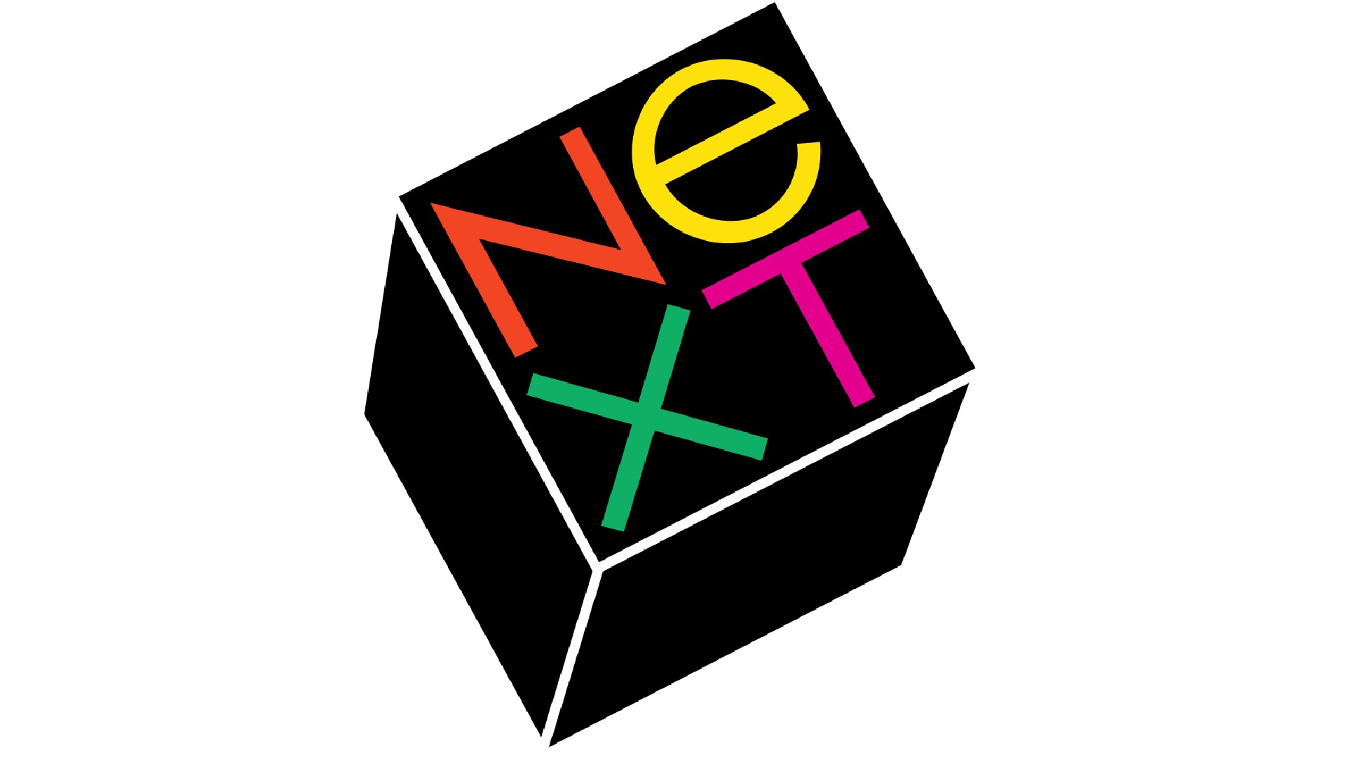
Today, Apple is the largest company in the world by market cap, but back in the 1980s things weren't going so smoothly. The board actually forced founder Steve Jobs out in 1985, and he took a few employees with him to found a new company, NXT. The computer they launched has now been largely forgotten, but the company logo, commissioned by Jobs and designed by legendary designer Paul Rand in 1986 for a reported $100,000, is a different story.
Rand certainly took the logo design seriously, developing a 100-page proposal book that walked the reader step-by-step through the conceptual process to the final outcome. Crucially, he suggested adding an 'e' to make the name a more legible and friendly NeXT.
Rand's creation remains a firm favourite of designers today, and Davies is among its admirers. "It’s built around a 3D cube with four bright and colourful letters set at the same 28-degree angle," he explains. "It’s an unusual and arresting composition that works, both as a symbol – or jewel as Jobs described it – and a logotype, instantly building brand recognition."
12. WWF logo
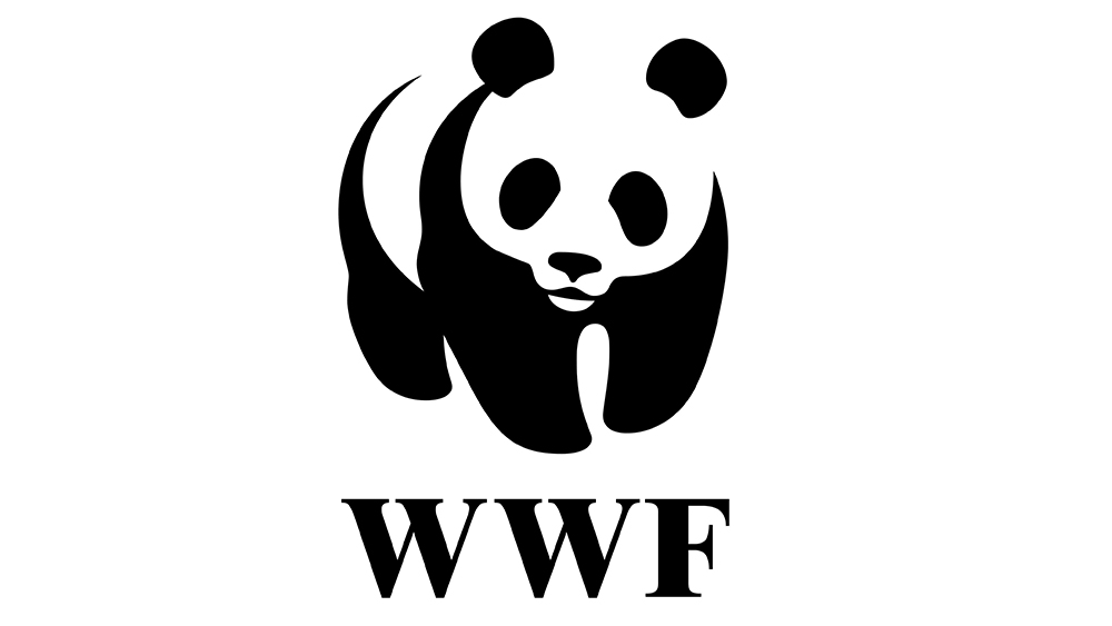
Of course the problem with some of the best logos from the 1980s is that they were very much of their time. Some had to be changed quite significantly. It's hard to imagine Apple using a rainbow logo today. But some brands already had minimalist logo design mastered even during this period of excess.
The World Wildlife Fund – now the World Wide Fund for Nature in most regions – is immediately recognisable thanks to its panda logo. The WWF logo was already well known by the 1980s, having been created for the NGOs foundation in 1961, but it was redrawn in 1986 to create the version that we know today.
The original logo was designed by the WWF’s founder, the naturalist and painter Sir Peter Scott, who was The original logo was inspired by the arrival of the giant panda Chi-Chi at London Zoo in the same year he set up the charity. The redesign of 1986 adjusted the form and proportions of the panda, simplifying the icon and making it easier to interpret.
"It's great example of the difference that a logo redesign can make", says Aliana Orellano of Hermana Creatives. "The WWF logo was already very clever. By choosing a species that was much-loved and well-known internationally as being endangered, it transcended language barriers. The redesign introduced a refined illustration of the panda that's much more balanced and harmonious, and that's what made the design timeless and iconic."
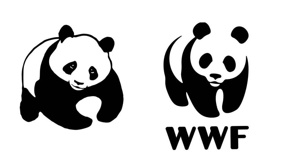
The WWF has continued to adapt its 1980s logo to the times. In the year 2000 it switched the serif typeface to a bolder, more modern sans-serif sans-serif that nicely complements the soft rounded lines of the panda. More recently, the introduction of the WWF stencil, which allows imagery to show through parts of the panda logo that would normally appear black. But the shape of the panda remains the same as that from 1986.
For more logo inspiration, see our pick of the best fashion logos and the best car logos. And if you're looking for tips for your own work, see our guide to how to design a logo. You can see the best prices on Adobe's Creative Cloud suite of design software below.