The best entertainment logos are deeply familiar to all of us. We see them before we watch movies, when we load up streaming services, when we boot up our consoles. They used to be austere typographic designs, but many have since evolved into more pictorial and complex icons.
Here, I've picked what I think are the best entertainment logos of all time, some of which are up there with the best logos ever made. It's you'll have seen most if not all of these before, but I've dived a little deeper into just what makes them so effective, and how they've come to stand the test of time.
Some of these great entertainment logos have gone on to spawn animated or audiovisual versions as our entertainment media have become more varied and sophisticated. If you feel inspired and want to create a similarly great logo, then check out the best logo designer software to help you get started.
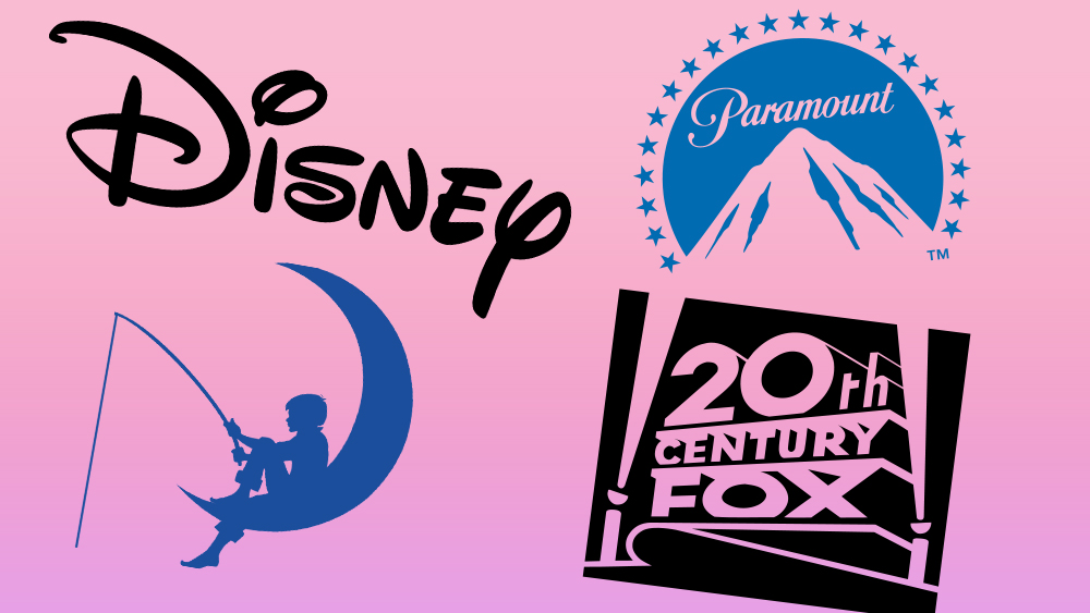
01. Disney
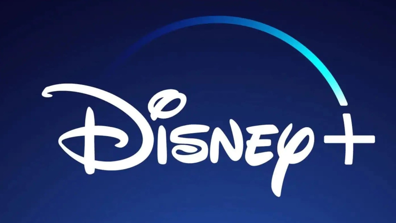
The Disney logo has been used since 1956. It is based on a stylised autograph of Walt Disney and is sometimes called the most recognised logo in history. One notable feature of the logo is the 'D', which makes use of the Golden Ratio three times (though some people have been reading it wrong for years).
It has also more recently been translated into the version featured above for the streaming service Disney+. This version makes clever use of Disney's history – the arc that is historically formed by a firework in the famous Disney ident that would appear before all the studio's films now leads the eye right to the '+' symbol, growing brighter as it gets closer. It's a clever use of the company's history and identity to put a new spin on a classic.
02. CNN
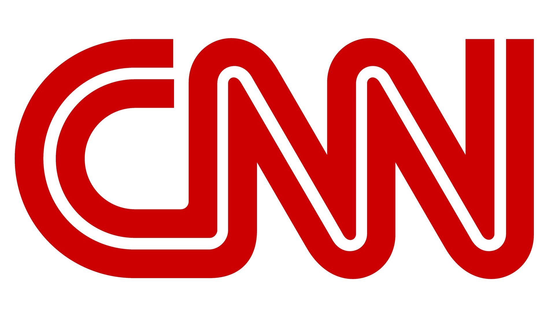
CNN came into being on June 1, 1980. Its logo, designed by Anthony Guy Bost, is the only one used by the channel. It’s a great example of minimalism and like many of the greatest and most iconic logos of all time, it has a hidden meaning – the white line between the letters symbolises cable television, which would send the channel into millions of homes across America.
For me, the design is reminiscent of the Canadian National logo, which is simple like this one and comprises two letters, each flowing into the next. The impactful combination of red and white is a popular choice for logos, featuring in such legendary icons as the Coca-Cola logo, as well as that of Marvel Comics, which we'll meet a little later in this list.
03. 20th Century Fox
20th Century Fox came about as the result of two companies merging in 1935, one run by William Fox and the other by Joseph Schenck and Darryl F. Zanuck.
This logo has always struck me with its power and I love the way it animates on screen. To me, it captures the true American spirit. While the image form is striking, it is even more impactful when paired with animation and sound.
In 2020, 20th Century Fox dropped the Fox and became just 20th Century, but the great logo still stands (just without the Fox).
04. Pixar
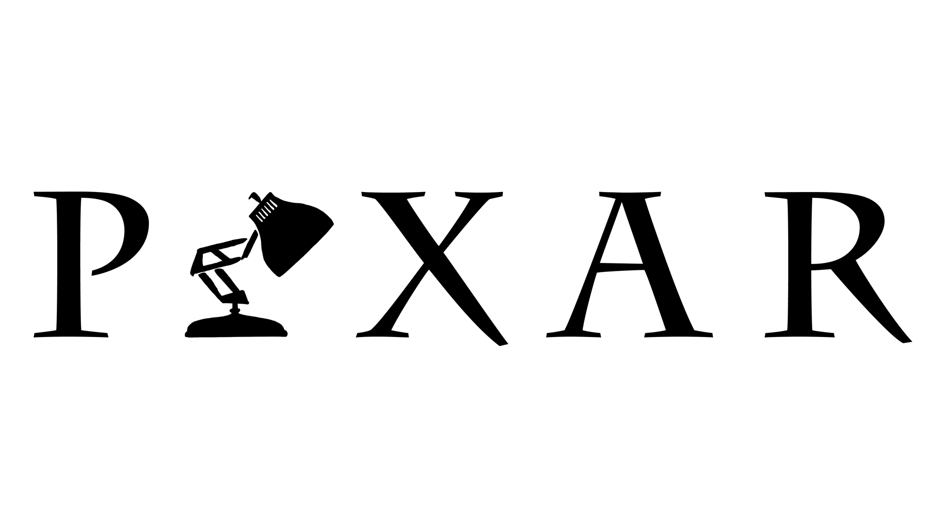
Pixar is known for clean, smooth animations and this is reflected in its production logo shown at the start of films. If you're a Pixar fan and you've seen any of the animated films, you have surely seen the animation featuring Luxo Jr, the company mascot. In the animation, the lamp bounces around, exhibiting qualities which make it seem lifelike, and Luxo squashes the 'i' in the logo and replaces it. The lamp is instantly recognisable and makes the logo really stand out.
05. DreamWorks
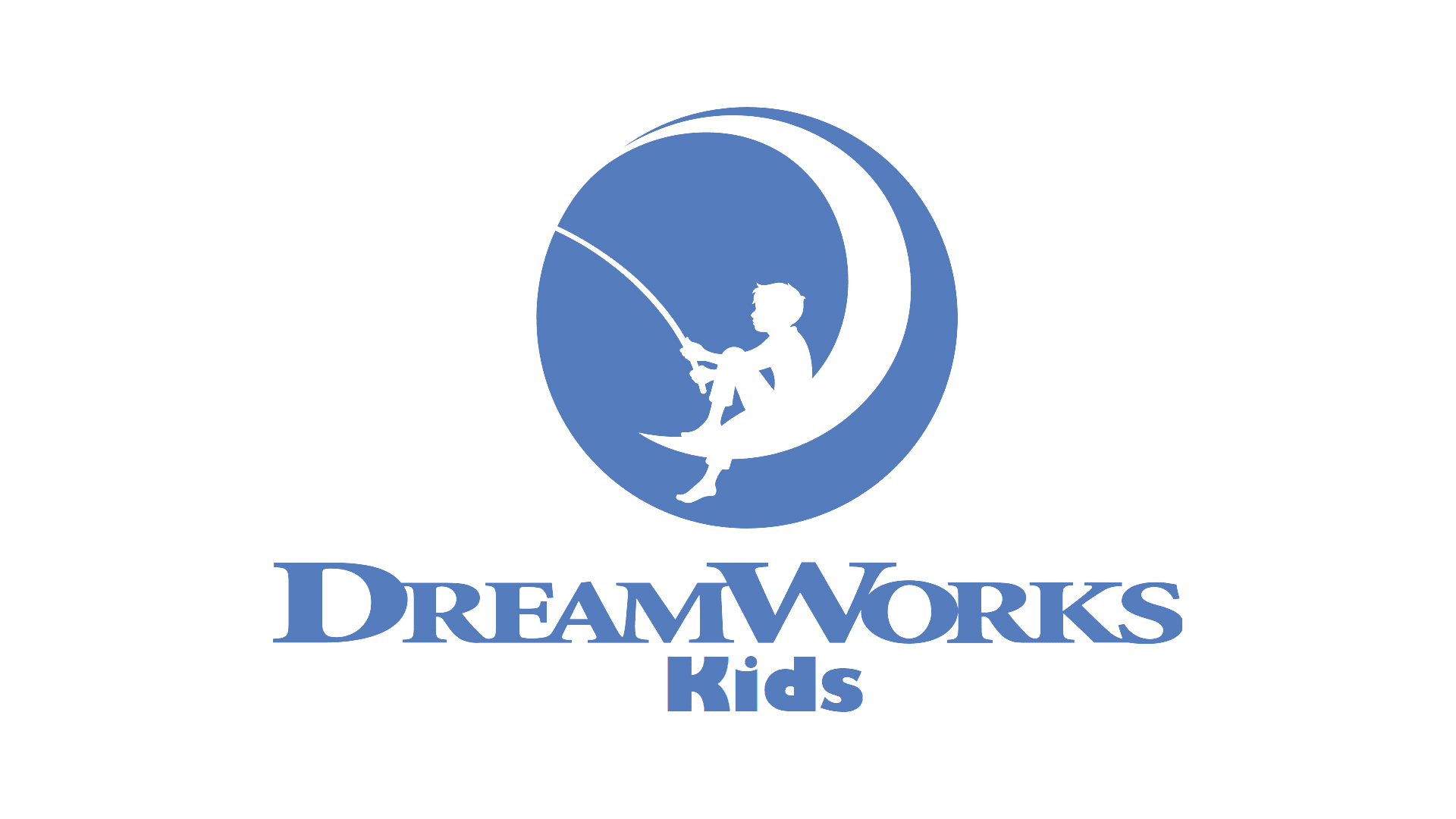
The DreamWorks logo is one of the most recognisable in the entertainment history. Initially, it was simple, with the company name written in white letters in a black box. This was used until 1997, until the studio began creating animated films such as Shrek and Antz.
Between 2004-2006, Dennis Murren, a visual effects supervisor and filmmaker, suggested a painted form of the logo. Artist Robert Hunt created the new design, of a boy sitting on crescent moon while fishing. The boy represents the innocence and limitless power of children. This aligned with the DreamWorks vision.
What makes this logo memorable is its simplicity. Silhouettes are often used for striking images and the DreamWorks logo is a perfect example.
06. Marvel
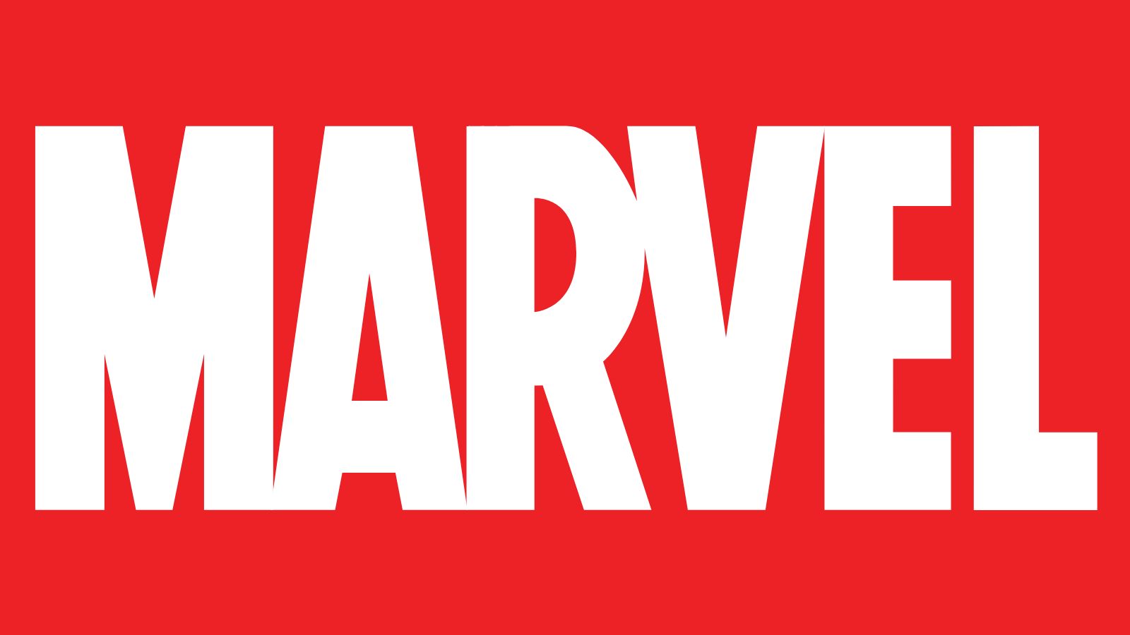
Before Marvel became a name synonymous with titanic tentpole blockbusters, and before those blockbusters became synonymous with a thing that everyone was a bit tired of, and that felt a bit played out, and what do you mean I need to watch three separate Disney+ series before I can understand what's happening in this film... before all that, it was but a humble comics company.
Marvel has gone through many different logo iterations since its formation in the 1960s up to the present day, but this impactful number, the one you've seen on a thousand hoodies and caps, first appeared in 2001. The large uppercase letters had been a mainstay of previous logos, but that bold red just screams superhero. It's all the more impactful for its simplicity – just the single word, no icon, no image. The instant you add anything else, the spell is broken – which is the main reason why those suffixed logos for Marvel Studios, Marvel Animation and Marvel Comics just don't hit the same.
07. Universal
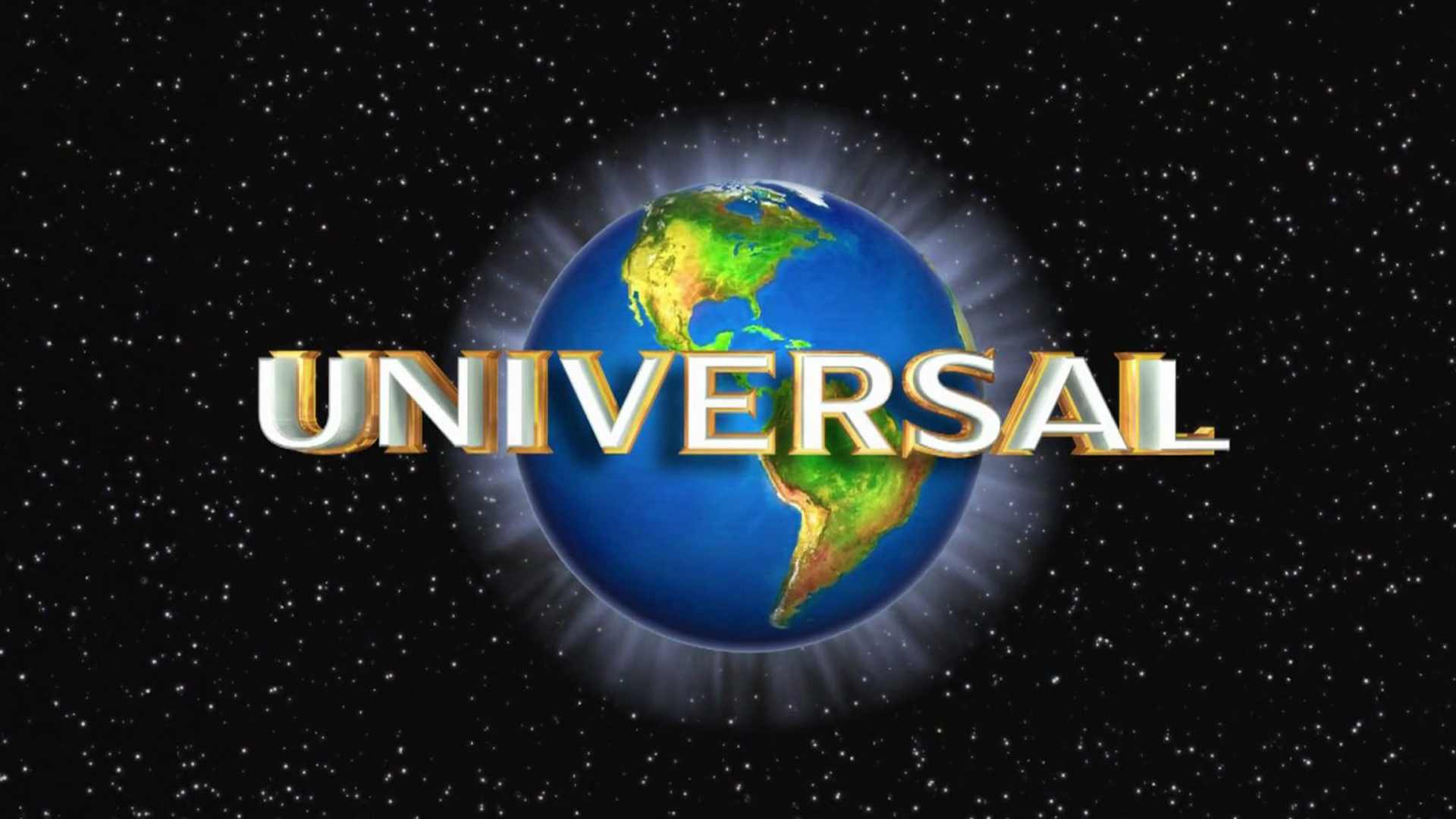
The Universal logo has gone through many changes over the years. It was created in 1912 and was originally a black and white logo. At various points over the years, it was a highly detailed black and white halftone drawing. The actual logo itself is still a simple, stark, black and white image.
As for the movie color logo we see today, that style began between 1954-1963 and it has continually evolved over the years. The animated logo is quite striking, partly because it makes use of a specular glow around the planet, which makes it appear to shimmer. Another major reason it stands out is that there's nothing quite like it.
08. THX
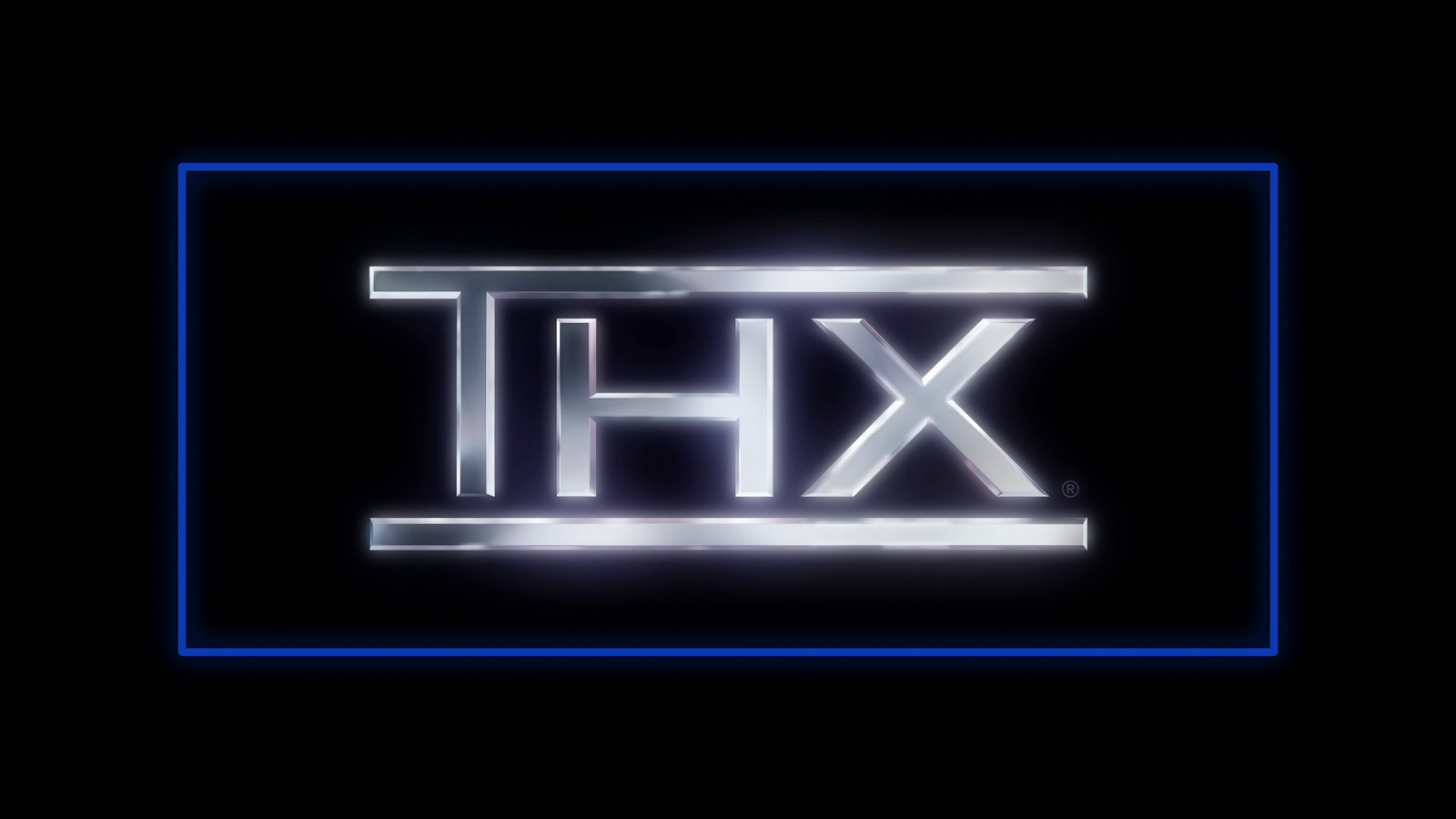
An entertainment logo with an audiovisual quality, the THX mark is famous for its accompanying 'deep note' – a synthesised note that builds in a thundering crescendo, signifying that the film you're watching has been THX-certified for its superlative audiovisual quality. The standard was developed at Lucasfilm for the release of Star Wars: Return of the Jedi, and has since appeared in front of cinematic and DVD releases worldwide.
Though the audio component is of course important, the visual identity of the THX logo is distinctive too. Those metallic letters have a glittering sheen that gives them a three-dimensional quality, and the blue-line frame evokes the shape of a cinema screen, with a futuristic laser-like quality. See our full history of the THX logo for a deep dive into how this icon has evolved.
09. Paramount
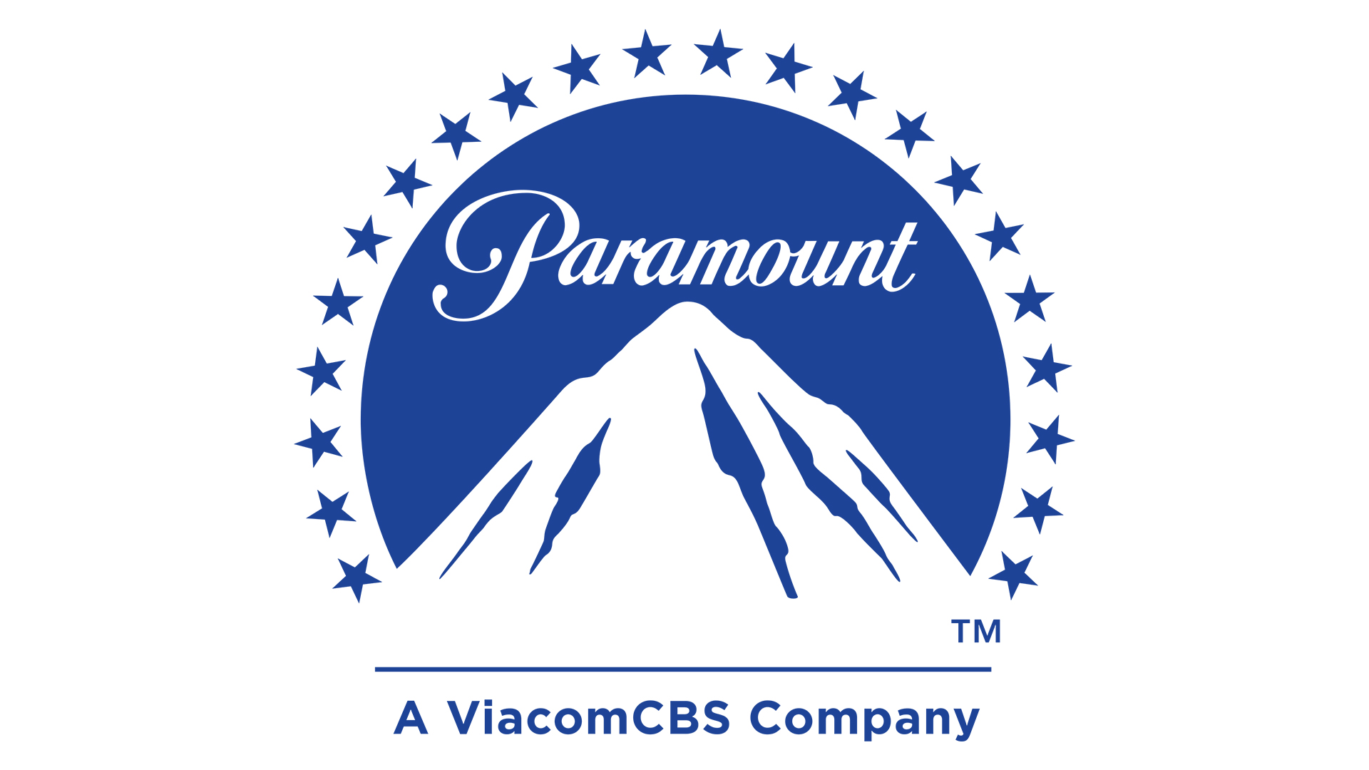
Paramount, now a part of Viacom, is the oldest studio in Hollywood. This logo shows a stark image of a mountain with 24 stars in a circle around it.
Legend has it that the logo was created by William Wadsworth Hodkinson and the design was inspired by Ben Lomond mountain in Utah. The stars are meant to represent the 24 actors who signed with the studio in 1914.
In 1957, the logo was changed to a minimalist design with fewer detatails. Another change happened in 1987 when a painting was commissioned. The logo received its latest logo in 2002, when shooting starts were added over the mountain peak.
What makes this logo work is its simplicity, much like the DreamWorks logo.
10. Nintendo GameCube

The logo so good that we cannot stop writing about it – the icon for the Nintendo GameCube console, created in 2001, is an embarrassment of riches for the design geek. It's a G, a C and a cube, all in one mark that simultaneously manages to be a 3D optical illusion. The design was built into the foundation of the console's UI. Here, enjoy the startup animation again – you deserve it.
It regularly tops opinion polls and informal Reddit polls as the best games console logo of all times, and Nintendo certainly has never topped it since (no, sticking a '2' next to the Switch icon is not the same). Still, it seems harsh to give Nintendo too hard a time over this – after all, it's a lot to ask for lightning to strike twice.