Which rebrands have caught your eye this year? In recent years, we’ve seen some rather interesting redesigns, from the BBC’s in 2021 to Aston Martin’s last year, and 2023 has proven to be no different.
Here, we’ve taken a look back at some of the rebrands to catch our eye this year – either because they’re excellent, or because they’re rather less so. Just as we looked back at the best new logos of the year so far a few months ago, as well as this year’s hottest design trends, we’ve got the best and worst rebrands of 2023, right here.
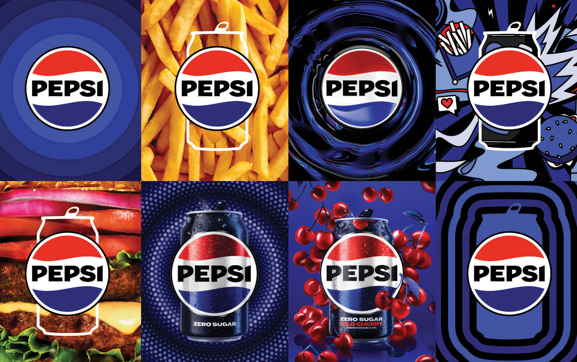
Pepsi
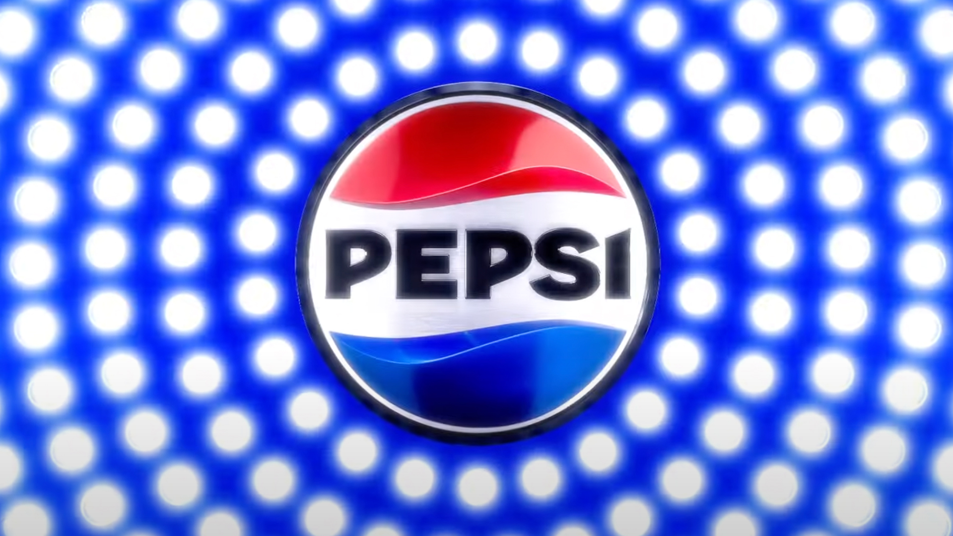
Back in March, Pepsi underwent its first rebrand in 15 years. It’s something of a step back, with a more retro feel, but a step forward too as it looks effortlessly cool and in line with contemporary design chains.
Pepsi’s globe design has been straightened out, and the curvy, lower-case ‘Pepsi’ is now in upper-case and a lot bolder. There’s a heavier focus on black, too, which is down to the brand pushing their sugar-free drinks. Meanwhile, Pepsi’s sister drink 7Up has undergone a successful rebrand too – there must be something in the water at PepsiCo…
Twitter/X
Where do we start with Twitter – sorry, X. It’s difficult to know what Elon Musk was thinking with this rebrand – surely, the old adage of ‘If it ain’t broke, don’t fix it’ must have come to mind? Sure, Twitter may not have been perfect, but it had such a consistent brand identity and almost everyone was familiar with the big blue bird.
It was a massive blunder. Put it this way – half a year later, pretty much everybody still calls X Twitter, so what was the point?
Nickelodeon
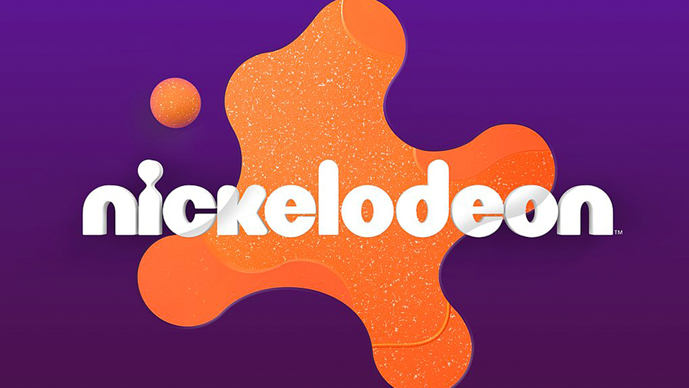
Nickelodeon is another brand that has seldom gone in for rebrands, with this year’s being the TV channel’s first in 14 years. They’ve kept their iconic orange splat, but it’s more rounded and textured in the new incarnation.
It did away with the splat for a while, but found that its legacy identity was incredibly strong. For the past decade and a half, the design was far more minimalist, but the splat remained firmly associated with the brand.
Nokia
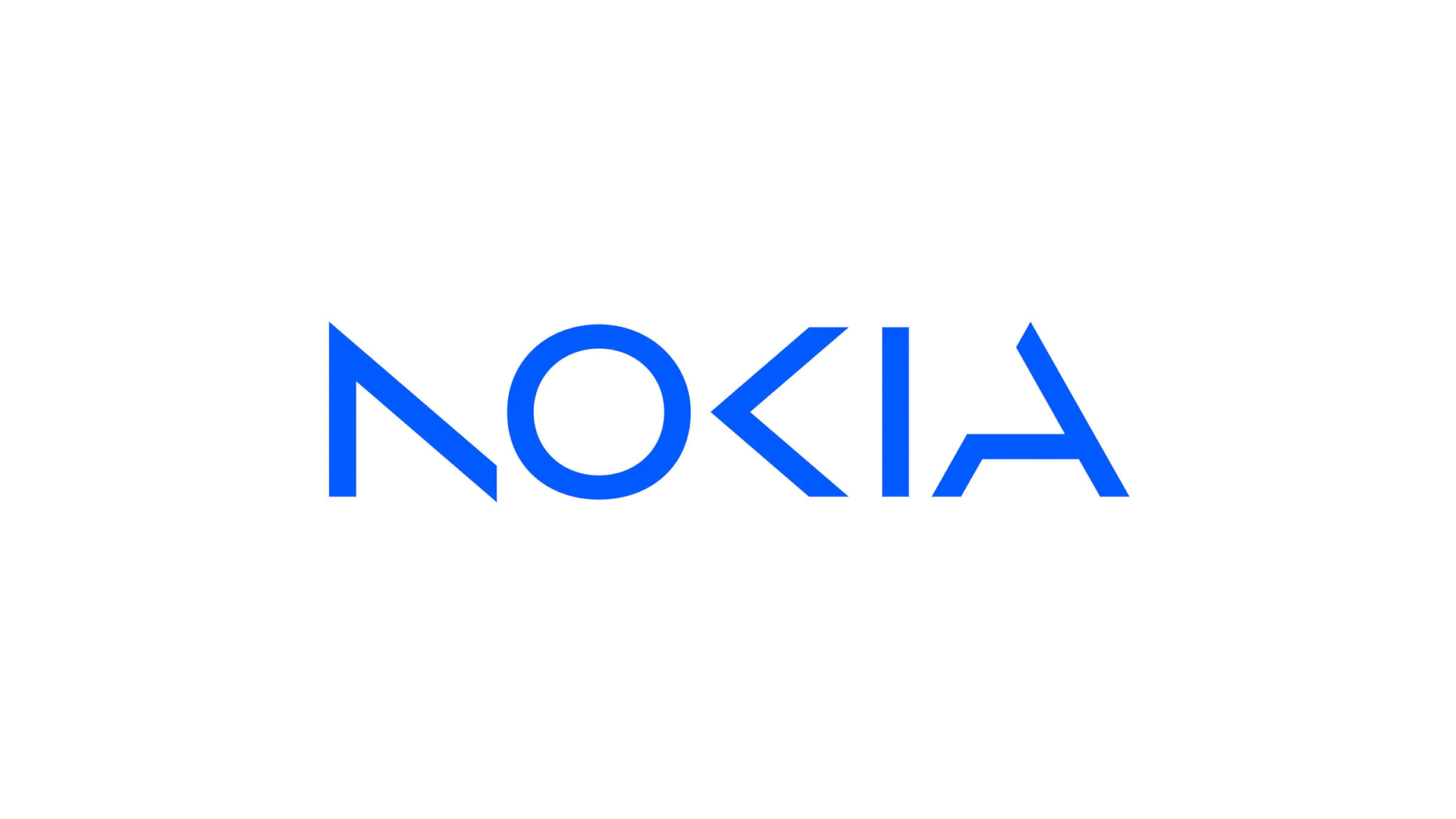
In some ways, a Nokia rebrand was probably overdue. It’s still associated by many with the ‘brick phone’ era, and has struggled to compete with the likes of Apple and Samsung in the contemporary smartphone market, so a rebrand was, on paper, a good idea.
However, getting rid of Nokia’s famous typeface and navy blue covering may have been a mistake. The new logo is in a lighter blue, while some of the letters have parts missing – which seems to be something of a new trend. It’s been compared to the Kia rebrand, which similarly didn’t have a great reaction.
Burberry
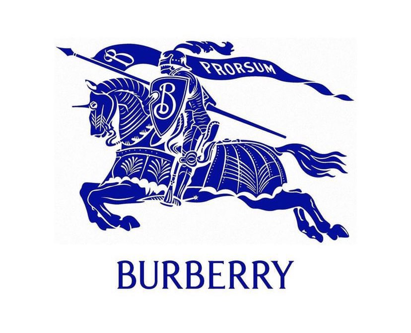
In 2018, Burberry helped to set new trends in the fashion world with a flat, sans-serif typeface, but five years later the luxury fashion house went back to classic roots with a design inspired by past branding.
The sans-serif lettering has remained, but in a different guise, while it has also brought back its Equestrian Knight Design (EKD), which has its roots way back in 1901. It’s the perfect example of how to bring back a classic design that’s been given a subtle modern update.
HBO Max
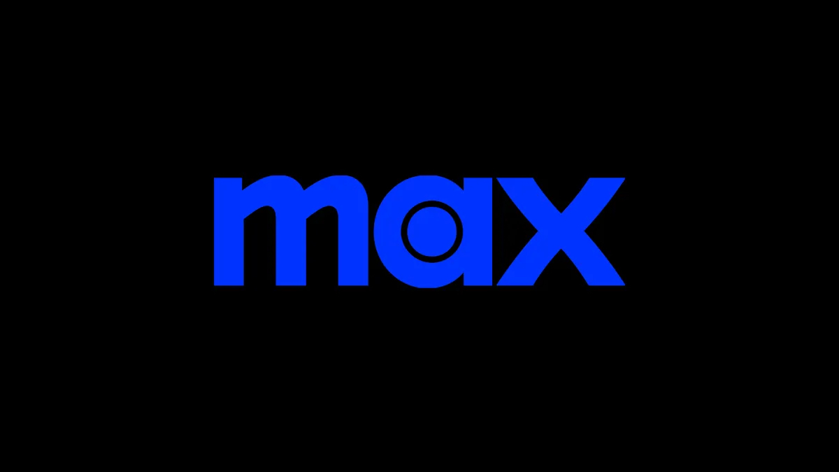
In April, HBO Max rebranded to, simply, Max, as the streaming platform merged both HBO Max and content from Discovery+. While a rebrand in this context might make sense, people on social media weren’t happy with the loss of HBO from the platform’s name, or the new tagline: “The one to watch for HBO.”
It’s the sort of rebrand that risks alienating fans – those who subscribed to the platform specifically for HBO and their loyalty to the brand.
Trivago
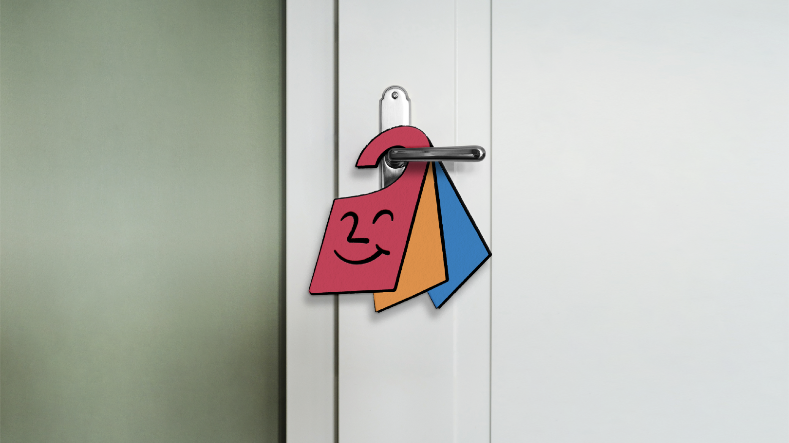
Hotel price comparison and booking site Trivago has had a whole new revamp complete with fresh wordmark, mascot, and design style. It’s bright, friendly and inviting, and comes with plenty of detail – consider the checkmark incorporated into the wordmark and the smiley door hanger mascot, Hank.
It’s refreshing to see a brand go down the playful, friendly avenue rather than focus on sterile minimalism, and shows that you don’t have to be boring when you launch a modern redesign.