2023 has been a big year for rebrands, which means it's also been a big year for logos. And while recent years have seen pretty much every brand in the land adopt a simple (read: dull), flat, sans-serif wordmark, plenty of designers appear to have reversed course this year, with a notable number of brands resurrecting logos from their own history books.
Below are some of the most notable new logos we've seen in 2023 – some of which were triumphs, and others that, judging from the response online, didn't quite hit the mark. And if you're in the mood to look to the future rather than the past, take a look at some of our anticipated graphic design trends for 2024.
The Good
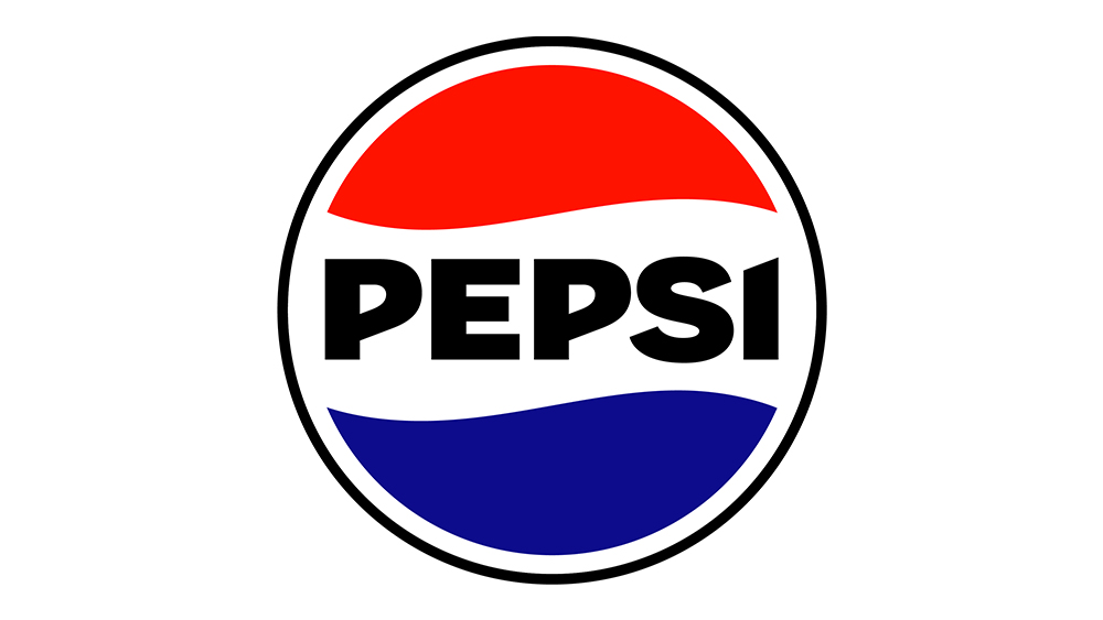
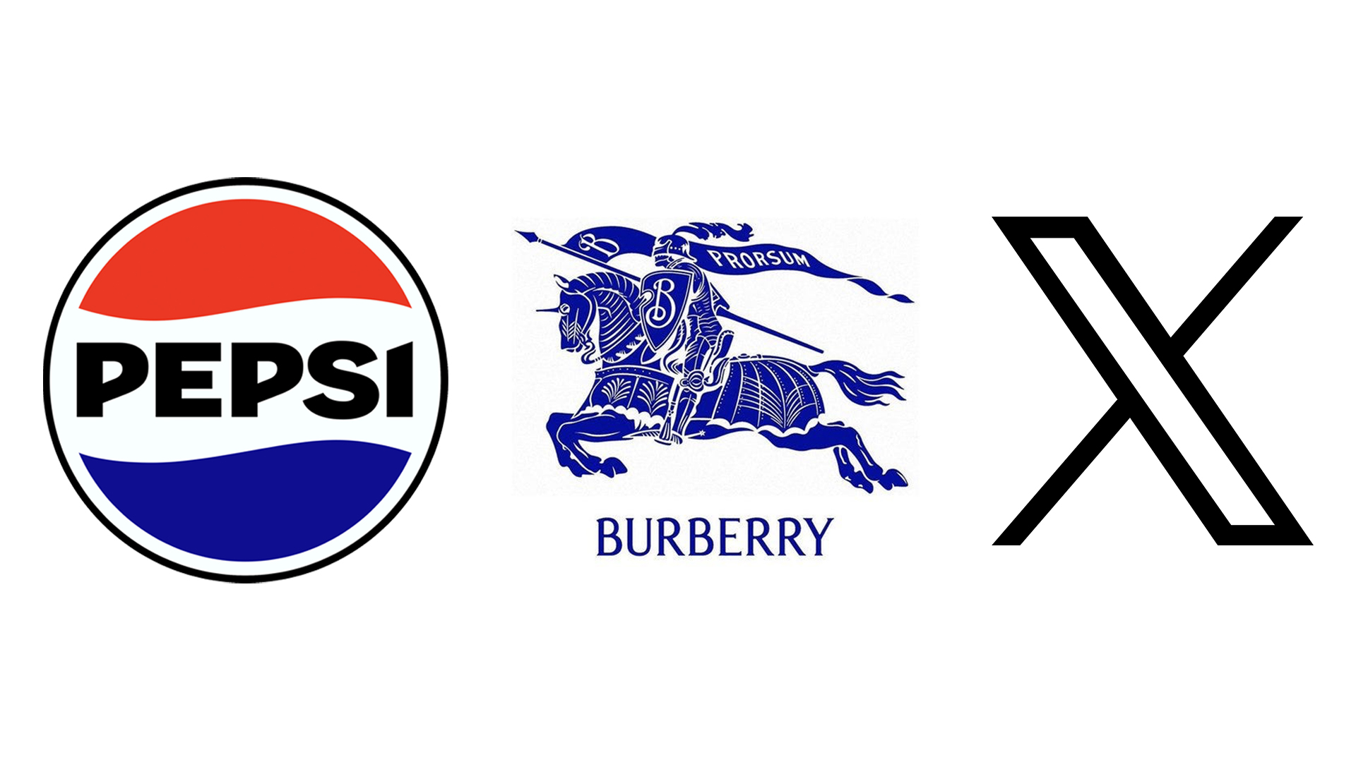
The new Pepsi logo provided a welcome dose of nostalgia when it landed earlier this year. The brand's iconic 'globe' design has been straightened, and the wordmark (now a bold, upper-case sans serif) has been placed in the centre like it used to be back in the day (the day being from 1962 to 1991). "We wanted to create something that nods to Pepsi’s past but leaps boldly into the brand’s next chapter, PepsiCo's chief design officer, Mauro Porcini, recently told Creative Bloq.
Still, let's spare a thought for the previous logo, and the ridiculous design document that accompanied it.
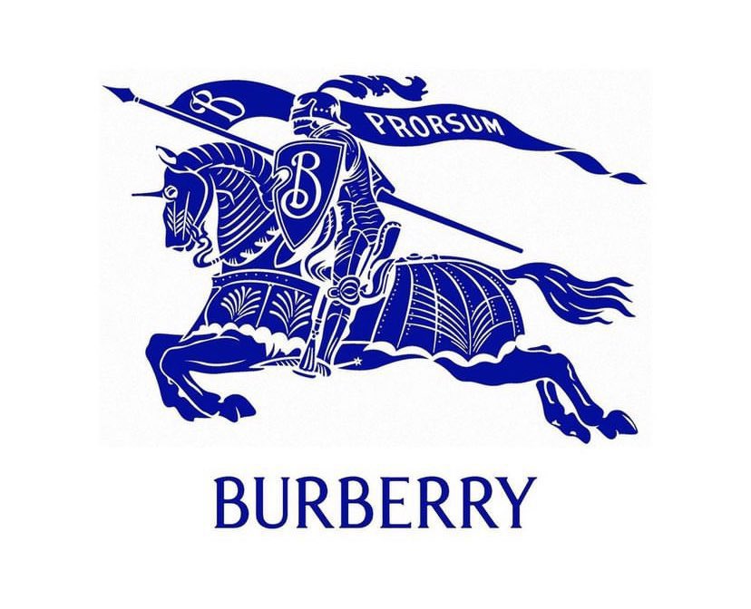
Another delightfully retro logo arrived in 2023 courtesy of Burberry, which wound the clock back even further than the 1960s. The fashion house went back to its roots this year with a new "archive-inspired" sans-serif look, resurrecting its 1901 '‘Equestrian Knight Design’ (EKD) symbol for good measure (above). The rebrand comes as new chief creative officer Daniel Lee has taken over the company. According to Burberry, "The original Equestrian Knight Design was the winning entry of a public competition to design a new logo, circa 1901. The design features the Latin word 'Prorsum' meaning 'Forwards'."
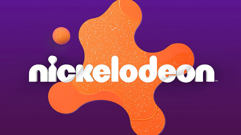
Kids TV channel Nickelodeon made a splash, or rather a splat, with its new logo design, and it's another one that looks back to the past. The channel's first rebrand in 14 years brings back the splat shape from the 1990s but with softer, more rounded and textured for a warmer modern look. Designed by Roger, the new Nickelodeon logo feels vibrant and fun, slightly nostalgic but vital and contemporary, perfectly fitting for the channel.
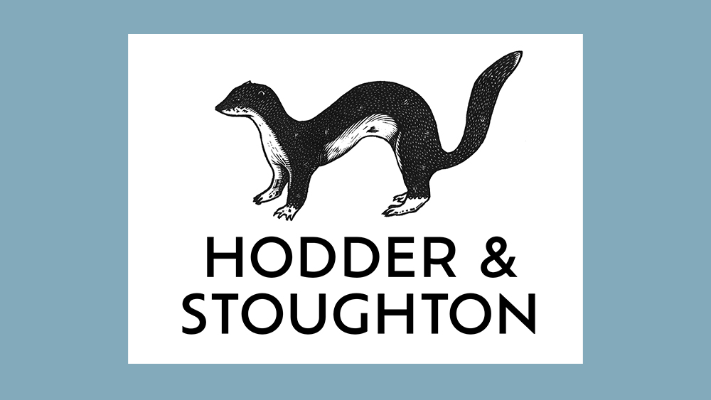
We've seen plenty of logos with hidden messages over the years, but few that help the viewer pronounce the name of the brand. UK publisher Hodder and Stoughton recently revealed an adorable new design featuring an animal designed to help anyone tripping over the name of the brand. Designed by the publisher's art director Alasdair Oliver with freelance illustrator Jonathan Ashworth, the new logo features a hand-drawn stoat. Because, yes, it's pronounced 'Stoat-on'.
The bad
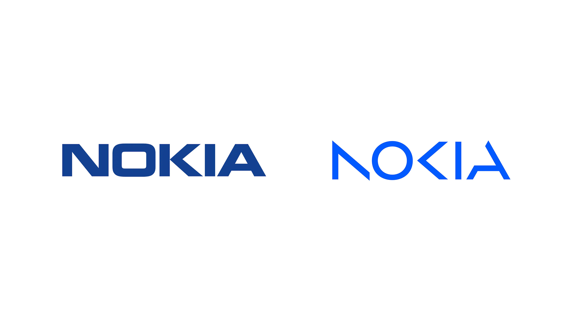
And now on to some of the less successful designs we saw in 2023. Bringing back memories of 2022's illegible Kia logo, Nokia decided to signal a shift away from mobile phones by unveiling a radically new logo. Nokia's iconic typeface and navy blue colourway are replaced with a much lighter series of disembodied shapes – ones that our readers declared much harder to read (is it AOCIA, AOKN or NOKIA?).
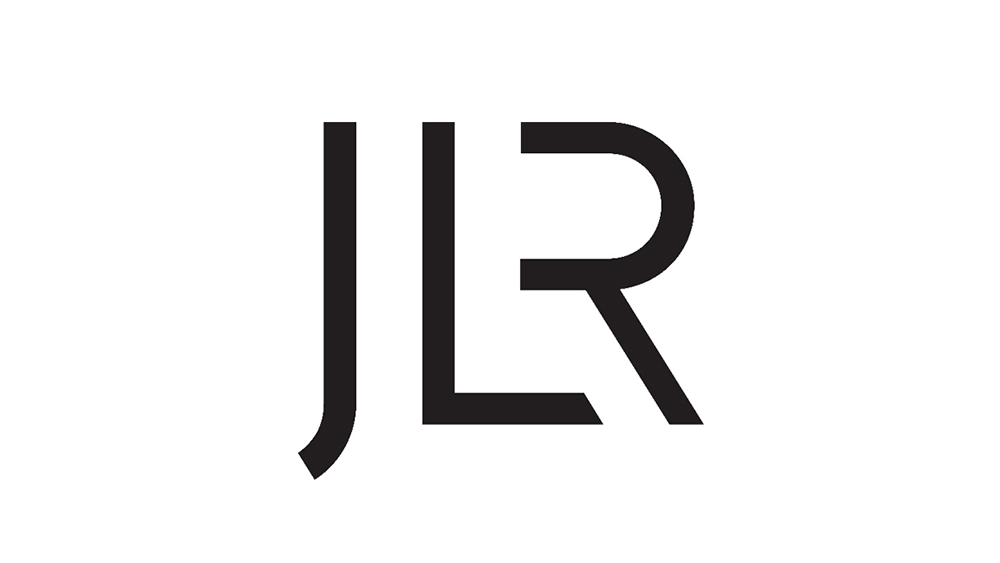
Here's one brand that didn't seem to get the memo that dull logos are no longer in fashion. A whole decade after its merger, Jaguar Land Rover saw fit to abbreviate its name to just three letters: JLR. It's a lot easier to say, but the accompanying logo provoked some harsh words on social media, with some comparing it to the unimaginative generic look of an upmarket nightclub.
The ugly
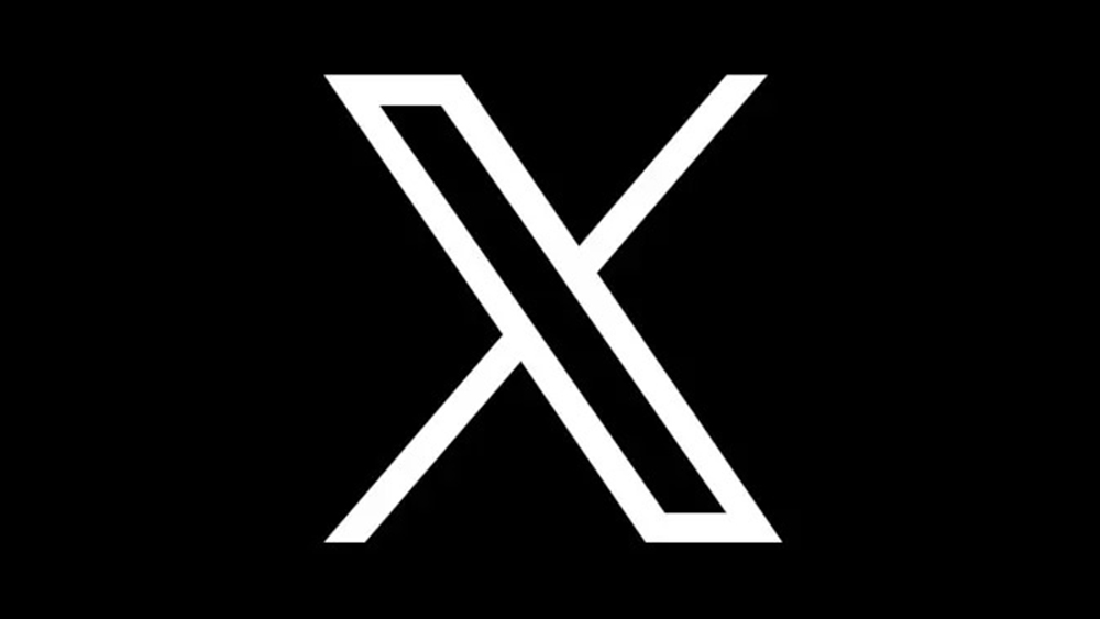
And, yes, of course, Twitter rebranded too. Perhaps the most chaotic rebrand in history, the social media platform's overhaul was a miscellany of confusing decisions, right down to the new logo. From design changes that lasted mere hours to garish light-up logos, the whole thing was nothing if not unpredictable. Was the rebrand a success? Given the fact that most people still seem to refer to the platform as "X (formerly known as Twitter)," we're not convinced.