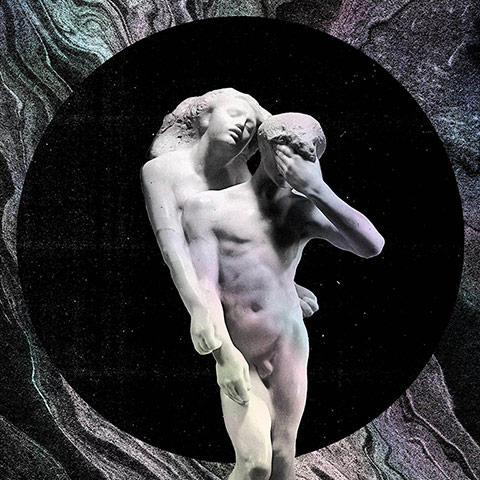
There’s some fairly direct symbolism to unpack in Arcade Fire’s eerie positioning of Orphée et Eurydice, Rodin’s sculpture of the musician who tried to rescue his lover from Hell, against the perfectly round mouth of a flat black underworld. The silver marbling and circular opening is meant to suggest a watery portal to lost worlds, including, apparently, the bygone age of CDs. Photograph: PR
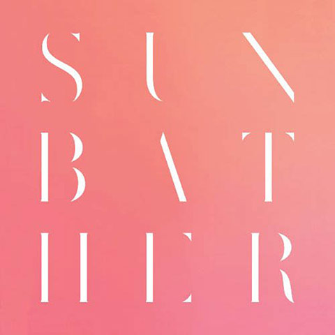
The smooth, sunny hue recalls West Coast art icon Ed Ruscha’s text paintings, and points to this noise band’s Californian roots. Yet the font is more ancient Greece than LA, also suggesting Scottish concrete poet and artist Ian Hamilton Finlay’s experiments with classicism. Photograph: PR
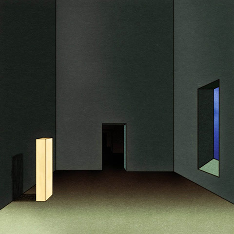
Swiss animator Georges Schwizgebel’s work for Oneohtrix Point Never recalls Edward Hopper’s Sun In An Empty Room. Instead of a serene, yet-to-be-inhabited American new build, however, this is a Kafka-esque nightmare. That sinister pure white modernist block could be a mute totem for a lifeless, possibly post-human world where geometry rules. Photograph: PR
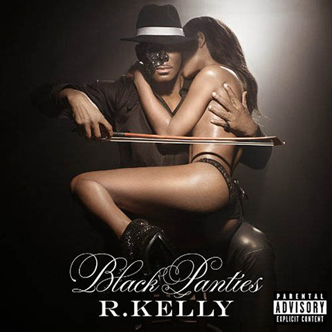
The distinguished art-historical antecedent to R Kelly’s album cover, with the singer playing a woman like a cello, is Man Ray’s joke on objectified sexuality, Le Violin D’Ingres. In this surrealist photo, a curvy nude female back is transformed into a violin. Photograph: PR
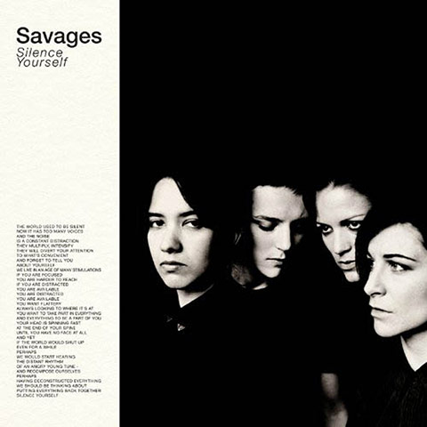
Savages’ Silence Yourself goes for instant classic status, recalling past album artwork that’s left an indelible footprint from rock’n’roll onwards. The extreme lighting and stagey composition suggests the Rolling Stones’ debut sleeve, the minimal styling of post-punk outfit Wire and promotional shots of 90s indie bands sporting all-black and undercuts, like Elastica. Photograph: PR
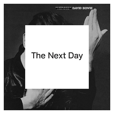
Designer Jonathan Barnbrook’s appropriation of Bowie’s own album artwork is one of the sharpest sleeve designs of the year. Obscuring the iconic image from Heroes with some minimal black text on a white square is a stark gesture: thumbing its nose at an era of internet memes reworking pop culture and a rock music scene fixated on past styles. Photograph: PR