Some say the 1990s was the height of advertising. With people tuned into the same TV shows on more channels than ever, commercialism rife and the internet in its infancy, brands had multiple platforms to launch adverts like never before. The influence of TV, music, football and culture stars were booming – lending advertisers a rich pool of references and talent to pull from to drive their message home.
Brand identity leaned into iconic soundtracks, famous faces, legendary taglines, emotive imagery, and became a staple of pop culture. Here we share the weird, witty and downright iconic adverts designers, directors and industry experts hold up as the pinnacle of advertising from the 1990s. Groundbreaking, memorable and with lasting effects, here's our list of the best (in no particular order).
Check out more in our ads of the decade series here, and for more nostalgia-driven fun, we’ve got a logos of the decade series too, including the best logos of the '90s.
01. Guinness
“The Guinness Surfer ad from the '90s stands out as my all-time favourite – still sending shivers down my spine every time I watch it, despite it being almost 30 years old,” says Leigh Chandler, founder and creative director of creative agency Sister Mary. “A pint of Guinness famously takes 119.5 seconds from the initial pour to being ready to drink, encapsulated by the iconic tagline, ‘Good things come to those who wait’. The surfer ad cleverly draws parallels between this anticipation of the perfect pour and the patience required by surfers waiting for the ideal wave. It’s visually captivating from beginning to end.”
Directed by Jonathan Glazer and conceived by Abbott Mead Vickers BBDO (AMV), the 1999 ad was shot in Hawaii with Polynesian surfers in tow. It was then set against a memorable soundtrack by British electronic group Leftfield, which later formed part of their track ‘Phat Planet’. It helped Guinness’s sales shoot up and repositioned it as a more sophisticated product.
“This is what really takes this ad into the stratosphere for me, creating an unforgettable masterpiece that seamlessly intertwines anticipation, craftsmanship, and raw power,” Leigh says.
Alistair Moir, deputy director of the History of Advertising Trust also points to the music as being key to the ad’s success. “The track is perfect for the piece and was used to represent the sound of the blood in the surfer’s head, when he is risking his life, riding the perfect wave. It certainly achieved this and complements the powerful voiceover by Louis Mellis, which draws inspiration from Herman Melville’s Moby-Dick. The combined effect was a masterclass in building anticipation and tense emotional connection for the viewer, which burst onto screens in 1999.”
“The original idea for Surfer came from a poster that was also part of AMV’s pitch. An image featured a man sitting on a beach and looking out to sea – waiting for the perfect wave. This was combined with direct inspiration from a striking 1893 artwork by Walter Crane, entitled Neptune’s Horses, which vividly conveys the immense power and wild unpredictability of the sea,” Alistair continues. “In the final commercial this effect would turn out to be the most expensive part of the composition. The CGI required to add the horses to the waves, accounted for over half of the ad’s budget.
"For the lead role in the ad, Glazer chose a local surfer rather than a professional actor or model – an inspired selection which gave authenticity to the film and allows the average viewer to make an easier connection with the surfer. At the beginning of the ad his furrowed brow and slightly off-centre gaze, increase the mystery of the first 17 seconds, which initially draws attention with silence.”
“The ad industry was in awe of the creative and technical showcase,” Alistair ads. “It demonstrated a new standard in TV advertising, and how cutting-edge CGI technology could enhance a great creative idea. Surprisingly, during the creative process Surfer didn’t actually do very well in audience testing. In fact, research suggested that viewers wouldn’t warm to it. Fortunately, trust in the creativity prevailed and the 100 second ad turned out to be one of the most enthralling and effective ever produced.”
Paul Birkhead, creative director and co-founder of creative agency syn., agrees. “It’s a ridiculously impressive piece of emotive storytelling that manages to build tension and intrigue all within 90 seconds. For me, the brilliance is the way in which Glazer links so many elements to create something so complex, and it feels effortlessly simple. It might be an obvious choice when asked about the best ads of an era but it's only the obvious choice because it is so good.”
For more from Guinness, see the best Guinness adverts.
02. Flake
Creative Bloq Editor Georgia Coggan can't help but summon up this '90s classic when she thinks of iconic ads. Cadbury's Flake ads were known for their sensual portrayal of women enjoying Flake bars in different locations, and this one was the pinnacle of the hilarious take on the theme. It caused some controversy for going a tad too far with the brief when the actress touched her tongue on the chocolate ahead of biting into it. While the urban myth is that this ad was banned for being too erotic, it wasn't.
"It's the kind of ad you think you've imagined looking back as an adult," Georgia says. "It's so of-the-era in style and so ridiculous in concept that it couldn't possibly be real. But the genius is that I distinctly remember watching it as a child and a brand couldn't ask for more from an ad in terms of longevity.
Flake ads had been walking that line for a couple of decades by the 1990s, and the addition of a bath into this era's version pushes respectability even further.
"I love how Flake was so far into an ad concept that they were able play with the feeling of parody (of its own ads) but still end up with an ad that feels fresh, fun and cinematic," Georgia continues. "Truly iconic."
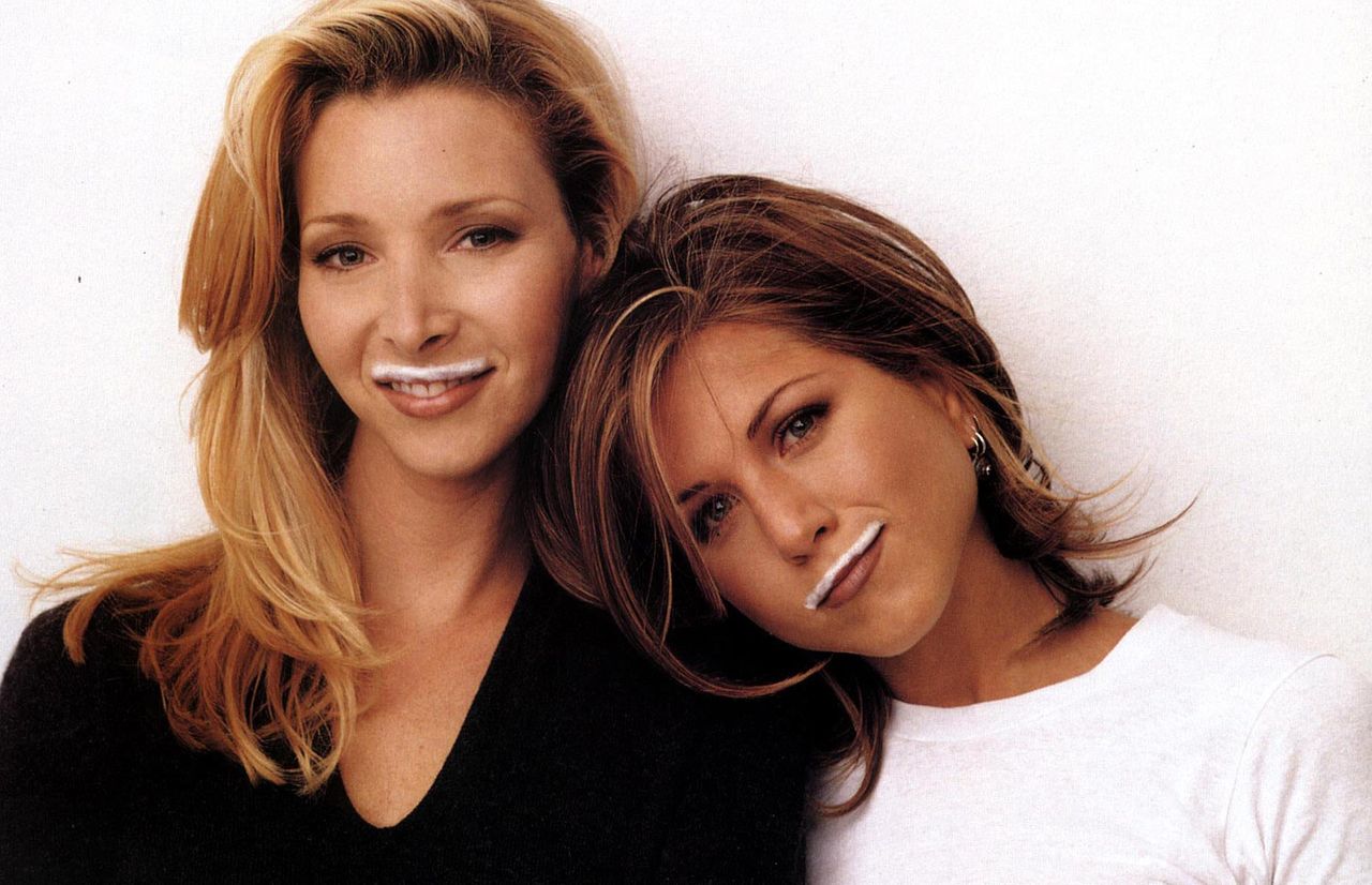
03. Milk
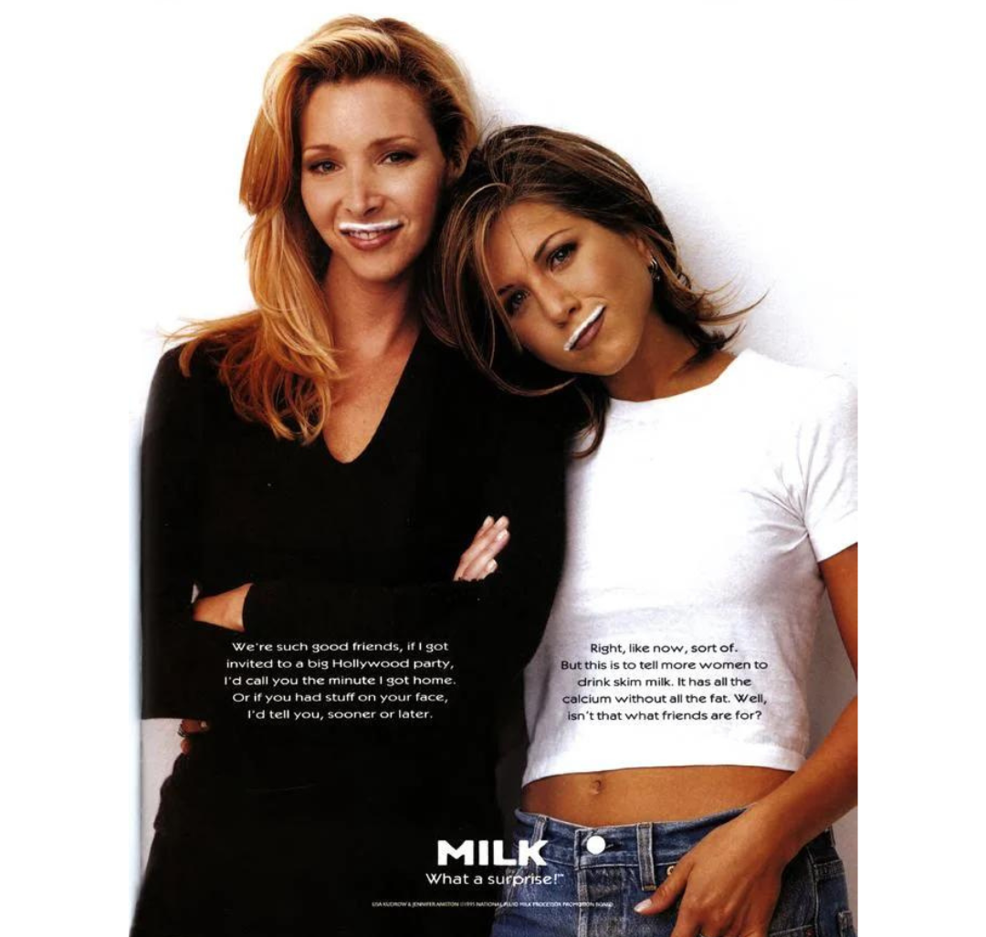
“No lineup of ‘90’s ads would be complete without a mention of the iconic ‘Got Milk?’ campaign,” says Lisa Franck, strategy director at design and advertising agency Tavern.
The California Milk Processor Board was aiming to make milk a necessary household staple, hiring Goodby Silverstein & Partners who came up with the 'Got Milk?' campaign starting in 1993. The tagline was then licensed by Milk Processor Education Program (MilkPEP) in 1995 for use nationally, with agency Bozell dreaming up the milk moustache visuals for TV and print, with many of the famous faces snapped by legendary photographer Annie Leibovitz.
“The campaign took a relatable, everyday moment, the milk moustache, and turned it into an instantly recognisable brand equity for a commodity most people barely thought about,” Lisa adds. “Putting the milk moustache on well-known celebrities made the drink aspirational, while at the same time making us feel that the celebrities are just like us. The simplicity of the creative idea enabled the campaign to repeat, yet stay fresh, for years to come and become a cultural phenomenon in and of itself.”
04. Budweiser
“You can’t say much in ads for alcohol because of the regulations, but this one brilliantly sidestepped all that bullshit by creating content with no obvious joke, instead of creating a boring beer ad,” Dave Buonaguidi, ad expert, author of Blah! Blah! Blah!: Memories and advice from one of British advertising's mavericks, and printmaker known as Real Hackney Dave. “It’s also interesting because of the casting, no tokenism here, just authentic reality and because of that it was massively memorable and repeatable.”
The Budweiser Wassup ad, from agency DDB Chicago was inspired by short film True, written and directed by Chuck Stone III in 1998, about himself and a group of longtime friends who also call out 'Wassup' to one another.
“The ad is simple, which is what makes it so iconic. Four friends, watching the game, having a bud. The focus of this ad is the friendship and humour between the group; the product is merely an extra,” says Natasha Nanner, senior director of creative strategy at Whalar, an agency working with brands to drive growth via social channels. “The brand tapped into sports culture and male friendships in a new, refreshing and honest way. It feels so authentic, you’d believe that the group are friends in real life. And I later learnt that a few of them were.
“Ultimately, the best thing Budweiser did was trust that less is more,” she adds. “By keeping the script simple, leaning into the cultural truth that men don’t sit [chatting] on the phone for hours (or say too much when they do) and using authentic language, it stuck in our heads for years to come. ‘Wassup’ became a word synonymous with the Budweiser brand and that is a level of marketing you still rarely see.”
05. Nike
Several commercials from Nike were experts’ top picks for this list, so we’re rolling them into one bumper entry from the sports giant, starting with this 1997 spot set to the infamous track Parklife by Brit-pop band Blur. Conceived by agency Simons Palmer, and directed by Jonathan Glazer, it starred major players Eric Cantona, Robbie Fowler, David Seaman and Ian Wright.
“The idea back then was still King. And this one for Nike is a great idea. Take the top footballers and put them on Hackney Marshes on a Sunday morning,” says Rob Fletcher, founder and executive creative director of creative agency Isobel. “The endline, ‘Whatever league you’re in’ – Perfect. Great use of Blur. Great attitude. Hit the nail on the head really.”
Next up, Nike’s Brazil airport commercial ahead of the World Cup in 1998, featuring the Brazil squad – Cristiano Ronaldo, Rivaldo Ferreira, Roberto Carlos, et al – was every delayed passenger’s dream. And another example of how Nike pairs music and football, this time with Mas Que Nada, originally by Jorge Ben and sung here by Sérgio Mendes.
“For me this was and still is one of the best football ads ever made. Big statement, but even now watching it again after so many years it stands the test of time,” says syn.’s Paul. “The mix of brand, talent, culture and music are so well aligned and executed brilliantly. Football was becoming more and more commercially driven at the time of its airing but the ad pulled it back down to its base level, a level all football fans can relate to. All you need is a ball, a space and some mates.”
And lastly, but certainly not least, the 1992 spot Instant Karma, set to another famous track, this time from John Lennon, directed by David Fincher. “During that era Wieden + Kennedy could do no wrong for Nike. Frozen Moment? Barkley on Broadway? Lil Penny? If You Let Me Play? So many good ideas, so well written and filmed. But, the one I go back to again and again is Instant Karma,” says Paul Hirsch, CEO / CCO Doremus+Co.
“To me this is kind of a Mount Everest of commercials. After you do it, how do you top it?” he adds. “You have David Fincher, John Lennon and, to me, the glue of this whole thing, typography by Pittman Hensley. I’d give my right arm to have had any one of those things to work with, but all three? And Michael Jordan is just stretching in it! 60 seconds of joy that makes me want to get off my couch.”
06. Apple
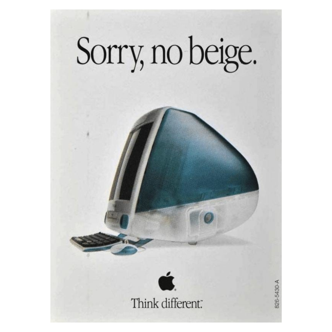
Two ads from the 1990s made it into the list for Apple. The first, is the iMac ‘Sorry, no beige’ campaign from 1998 by TBWA\Chiat Day.
“A simple ad that’s packed with meaning, Apple’s ‘Sorry, no beige’ delicately balances the promotion of both brand and product – and does it in style,” says Lisa. “One of the key selling points of the iMac G3 was the plethora of colours it came in. This wasn’t the everyman’s computer, it was a status symbol that showed off the owner’s individuality and desire to break convention. The simple headline positions the computer, and the Apple brand itself, as the first choice for customers who believe themselves to be non-conformists. This narrative resonated strongly at a time in history when Western culture was shifting away from collectivism towards individualism.”
The second, ‘Here’s To The Crazy Ones’, was conceived by agency: Chiat Day, with direction from Jennifer Golub, Jessica Schulman Edelstein and Yvonne Smith and aired in 1997. It was the first in the ‘Think Different’ campaign and was originally voiced by Steve Jobs, though never aired.
“Still inspiring today, this ad spawned an entire sub-genre of advertising. Richard Dreyfuss’ voiceover and just 23 edits in 60 seconds make it a masterpiece of branding,” says Alex Moulton, chief creative officer of branding and design agency Trollbäck+Company.
07. United Colors of Benetton
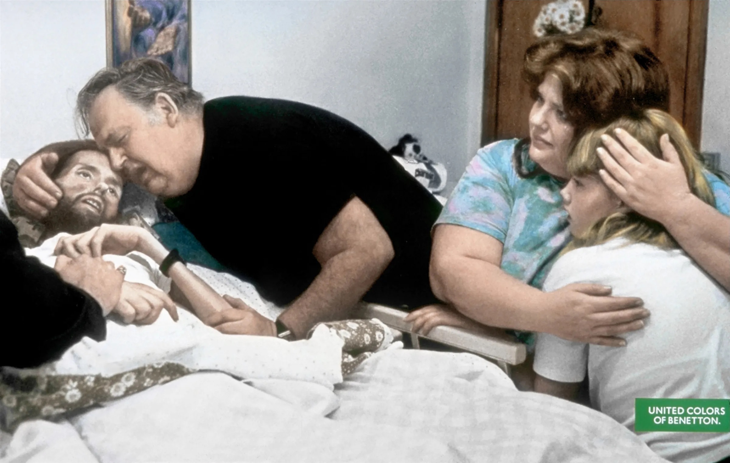
This next ad divided opinion. The Face of AIDS, photographed by Therese Frare in 1990 (with later colourisation by Ann Rhoney), depicts gay activist David Kirby in bed dying, and was originally published in black and white in LIFE magazine.
“In 1991, United Colors of Benetton, known for controversial imagery, broke new ground with their ‘Pieta’ campaign, a profound visual narrative on the AIDS crisis. This campaign was inspired by the work of Therese Frare, who, in 1990, was documenting life inside a hospice for people living with AIDS. There, she met David Kirby, an AIDS activist, who consented to be photographed under the condition that his image wouldn't be used for personal gain,” says Anastasia Kārkliņa Gabriel, cultural theorist, strategist and author of Cultural Intelligence for Marketers.
“Olivierio Toscani, Benetton’s creative director, discovered one of these photos in a magazine. The subsequent campaign centred around a startling photograph of David Kirby on his deathbed at Ohio State University Hospital in May 1990, surrounded by his father, sister, and niece. Toscani chose to use a colourised version of this intimate family moment, likening Kirby's appearance to a stereotypical Jesus.
“Benetton claimed they aimed to highlight the issue yet faced criticism for commodifying Kirby’s suffering. In response, gay rights activists held boycotts against the clothing brand,” Anastasia continues. “Despite the public outcry, Kirby's family supported the use of his image, believing that Benetton's platform fulfilled David's wish for global awareness about AIDS. This controversial move on the part of the brand not only shed light on the grim reality of AIDS but also marked a departure from traditional advertising norms. It is a significant artefact because it disproves the misconception that conscious marketing that sparks public backlash is a recent phenomenon.”
08. AT&T
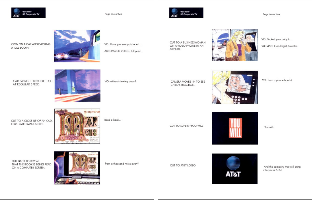
“Apple’s 1984 TV commercial helped make technology a sexy cultural touchpoint, but by the end of the decade, the telecommunications giant AT&T was losing its lustre in the public imagination because it was mired in a price war with new upstarts who were presenting communication as a commodity. Yet at the time, AT&T’s Bell Labs was churning out an average of three patented inventions a day,” says Professor Nancy R Tag, former ad agency creative director and founding director of City College of New York’s master's in branding and integrated communications, of the 'You Will' 1993 campaign, which elevated the brand, while the tagline also formed part of the first ever web banner ad in 1994.
“The campaign, by NW Ayer shifted the narrative back to the brand’s reputation as a global innovator in the tech space. The campaign was conceived by the creative team of Nick Scordato and Gordon Hasse who worked with director David Fincher and cinematographer Jordan Cronenweth (of Blade Runner fame) to create a series of commercials that featured fantastical vignettes driven by futuristic technology,” Nancy continues. “The spots were narrated by Tom Selleck who posed rhetorical questions such as ‘Have you ever paid a toll without slowing down?’, ‘Have you ever tucked your baby in from a phone booth?’ or ‘Have you ever opened a door with the sound of your voice?’ These hard-to-imagine scenarios were made suddenly more real by the understated, but dramatic tagline, ‘You Will’, which made the future not just definitive, but within reach.”
09. Ronseal
“The 90s were a riotous time for advertising in the UK. There were giant, hairy, pulsating bellies, chasing people down the high street. There were town criers, dressed in Victoriana and screaming about double-glazing. There was actual bodily harm, committed by a brand mascot in fully-body orange paint. I like these ads. They’re smart and silly and single-minded in a way that seems rare these days. But, while I like them, I don’t love them,” says Sam Russell, creative director at verbal branding agency Reed Words. “Not in the way that I love Ronseal’s ‘Does exactly what it says on the tin’. A tagline that became widely used beyond the ad, even by former UK PM David Cameron and in a song by Katie Melua.
“There’s the delivery: no frills, straight to camera, the product never out of shot,” Sam continues. “There’s the script and its wonderfully crafted repetitions, like something from Samuel Beckett: ‘It protects your wood and is rainproof in about thirty minutes. Which means in about thirty minutes your wood is rainproof and protected.’ And there’s the tagline. Seven words, but not one you would call eye-catching or unusual. Does, what, it, on – this is the glue of the English language, essential but invisible. But combined together, repeated year after year, those words achieved a cultural currency beyond the wildest dreams of other brands.
“Remember: this isn’t a tagline for a running shoe, or a soft drink, or any other product people might naturally be drawn to. This is wood stainer, for staining wood: the dullest product imaginable, leaving its mark indelibly on the English language.”
Chris Bosher, head of strategy at creative agency Borne agrees: “How many campaigns can claim to have shaped the British vocabulary? Not many. This one did,” he says. “I’d been trying to think of obscure, deep in the D&AD, bet-you-haven’t-seen-this examples for this list, to show how supremely cultivated my taste in advertising is. But that’s really not the point. Great ads are famous. They live in the memory.”
10. Tango
Another ad with a classic tagline that caught on in daily language beyond the commercial was Tango’s ‘Orange Man’, from ad agency HHCL. The bold ad helped the brand take on its soft drink rivals and boosted sales by more than a third. It was the first ad in the ‘You Know When You've Been Tango'd’ campaign, which ran until 1996, and relaunched in 2002.
“‘You’ve been tango’d’ has got to be up there as one of the best concepts of all time,” says Holly Bamford, head of client services at Borne. “In an era where lots of advertising was following a similar rule book, these ads were just completely fresh and irreverent – and, sickeningly funny. I used to find them hard to watch – but that was the point. They made Tango famous in an instant – and now enduringly so.”
Chris also points to another classic in-your-face, almost confrontational ad from the brand, also by HHCL, for Tango Blackcurrant, one of several different style ads for the various other flavours.
“It’s brilliant and it’s funny – which gives the brand permission to tap into big old British nerves, when it really has zero legitimacy in doing so. And, reputedly, it only ran on TV 10 times – impact over frequency nerds take note.”
11. The Economist
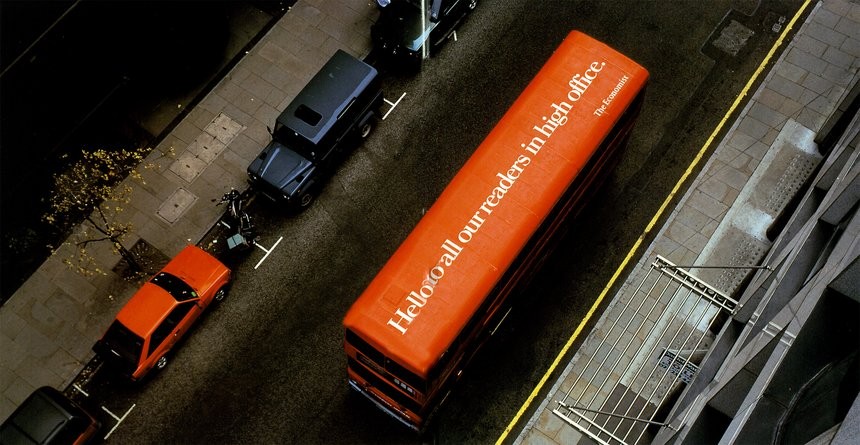
In a departure from print and TV, this next 1994 ad for British weekly The Economist was placed on the top of a bus. It was part of the ‘White on Red’ campaign, which ran from 1988 to 2001, was conceived by AMV BBDO and saw circulation increase by 65%, subscription numbers by 95%.
“This innovative advertisement showcases unconventional thinking by presenting a lateral strategy to effectively reach a target audience,” says John Randall, senior graphic designer for Magpie Studio.
“The Economist's readership primarily consists of individuals who have achieved success in the corporate world. By leveraging the top of a bus as a canvas akin to a 48-sheet poster is nothing short of brilliant – ensuring maximum visibility among the high-ranking decision-makers and professionals who inhabit the top floors of corporate offices. The cherry on top is the fact that the iconic red London buses already seamlessly align with the Economist's brand identity.”
12. Boddingtons
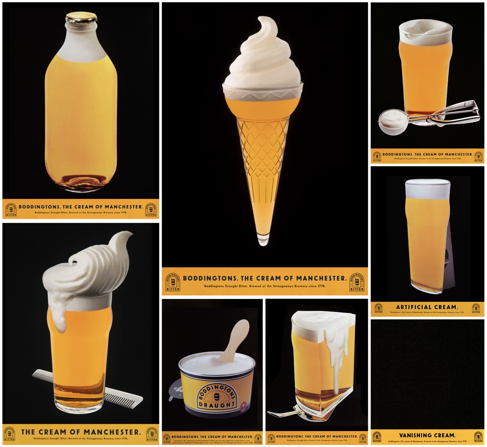
This ‘Cream of Manchester’ campaign, by BBH, was commissioned to help turn Boddingtons into a national brand without losing Mancunian roots. Within 18 months of it launching, Boddingtons canned beer became the market leader and within six years 84% of consumers were able to recognise the ads without any branding.
“With its distinctive straw-golden colour and hoppy flavour, it was one of the first beers to be packaged in cans containing a widget, giving it a creamy draught-style head. By this date most beer campaigns led with television commercials, but BBH chose to launch the new theme in 1991 with a series of stunning press ads, concentrating on a single product attribute or truth – in this case the beer’s supreme smoothness,” says Alistair.
“This was communicated visually through inventive cream analogies (despite perceived wisdom indicating that creaminess wasn’t an attribute that sold beer) focusing on the creamy head of the pint itself and then riffing on other products – ice cream, milk bottle top, cake icing, sun cream, shaving cream. One of the spots even showed a blank space representing vanishing cream.
“The award-winning campaign’s appeal was further broadened via a series of memorable TV commercials,” Alistair continues. “These were witty parodies of established genres and featured characters whose punchlines were unexpectedly delivered in a broad Mancunian accent. One of the most well-known of these helped to launch the career of Melanie Sykes and the campaign was credited with raising the profile of the city of Manchester as a whole.”
13. Levi's
“BBH and Levis – what a dream,” says Holly, of this 1995 ‘Planet’ ad featuring Babylon Zoo’s hit Spaceman. And the kitsch sci-fi ad, which oozes that glam metallic '90s style, subsequently led to the track becoming the fastest-selling British single since Can’t Buy Me Love by the Beatles.
“The film is a deep ‘90s, silver lame-clad, scare-the-parents classic – but it’s the music that changed everything. I remember dancing around the living room to this ad, and every radio station in the country was playing the track. The ad belonged to culture.”
For more in this series, read all about the best ads of the '60s, the best '50s adverts and the best 1970s ads.