It was a decade that saw cuts, strikes, Thatcherism, Reaganomics, Chernobyl, the AIDS epidemic and the fall of the Berlin Wall. Beyond the austerity, the possibility of prosperity in cities came in its wake. And, with this, the birth of the 'yuppie'.
In this new greed-is-good era a multitude of TV channels, across terrestrial and cable, gave companies the chance to advertise globally to a new generation hooked on MTV, big hair, neon and PCs, who were driving consumerist culture.
From food porn to power suits, here, in no particular order, designers, directors and other industry experts pick their top adverts of the 1980s. Check out more in our ads of the decade series here and you may also like to feast your eyes on the best logos of the 1980s.
01. Apple
Described as the ad that led to the Super Bowl becoming TV’s biggest commercial showcase, this 60-second Apple Macintosh personal computer spot shook up both the advertising and the tech worlds in 1984. Directed by Ridley Scott and conceived by agency Chiat/Day, it’s loosely inspired by George Orwell famous novel.
“Aired in the Super Bowl and only shown once on air and billions of times in various new business meetings, it was the first epic ad that came decades before social media,” Dave Buonaguidi, ad expert, author of Blah! Blah! Blah!: Memories and advice from one of British advertising's mavericks, and printmaker known as Real Hackney Dave. “It was long and had a huge budget and was selling something really interesting…the future.”
02. Ralph Lauren
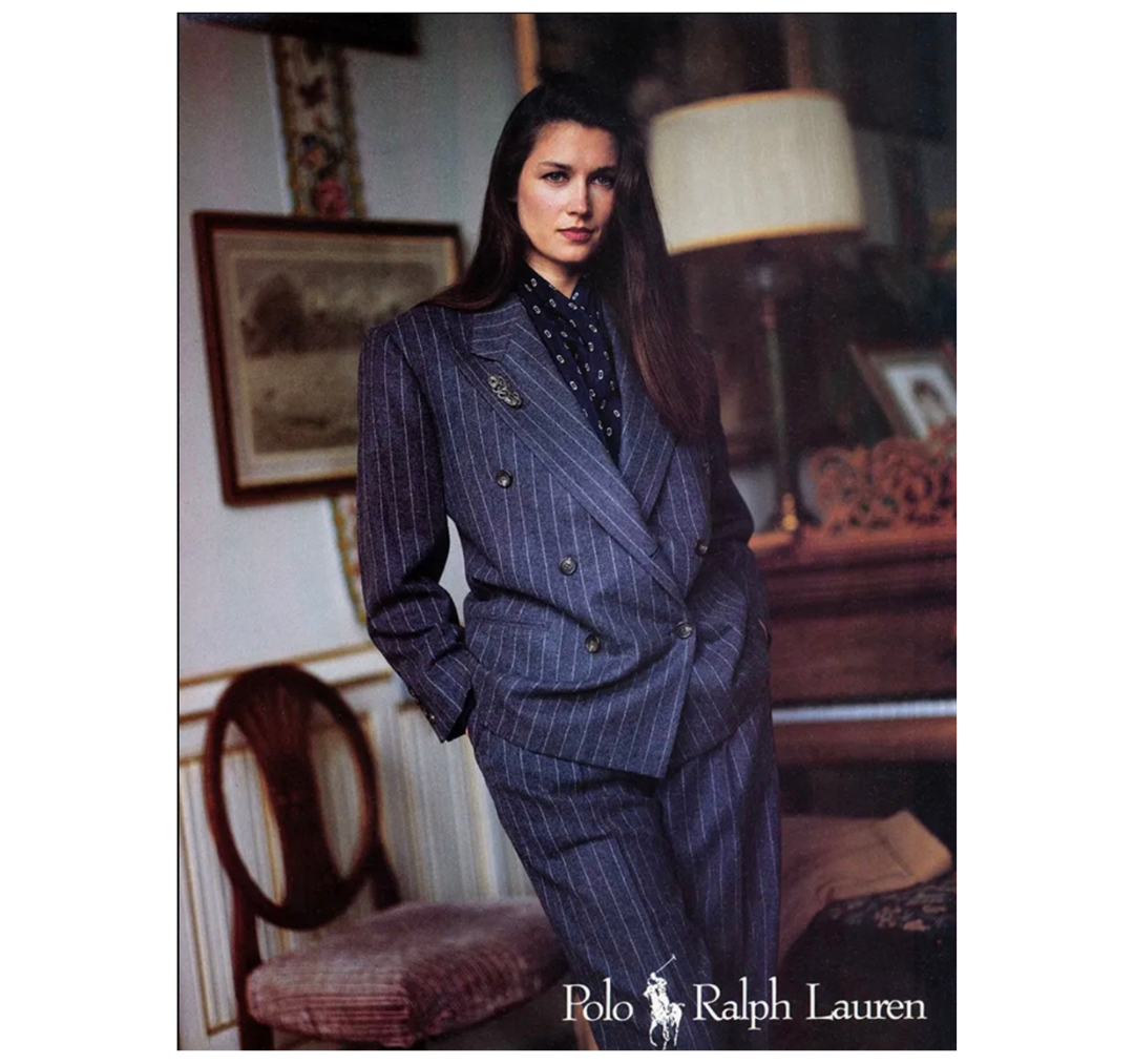
“By the 1980s, the term ‘glass ceiling’ – coined by management consultant Marilyn Loden to refer to invisible barriers preventing women from rising to positions of power – gained cultural prominence. On the heels of the second-wave feminist movement, the eighties saw an apparent shift in the representation of women in ads – from being portrayed as desirable sex objects or docile homemakers, women were now handed the trope of the ‘superwoman’ who could do it,” says Anastasia Kārkliņa Gabriel, cultural theorist, strategist and author of Cultural Intelligence for Marketers. Advertising of this era projected an idyllic image of gender equality, she adds, presenting a “new woman” who was expected to excel at work, manage household duties and satisfy her husband.
“Polo Ralph Lauren’s ad campaign, which focused on the power suit tailored for the contemporary working woman, aimed to show that suits, symbolising power, were no longer exclusive to men,” Anastasia continues. “At the same time, the symbolic role of the power suit, with its padded shoulders to resemble broad shoulders and a loose fit to hide the body, communicated that women were expected to assimilate into masculine norms to succeed, yet another trope that would be rejected and criticised by feminist activists who demanded more women-centric portrayals of female empowerment.”
03. Levi's
“This is such an iconic ‘80s ad and I love the sense of humour and cheek of it all. With young potential buyers romanticising the ‘50 and ’60s and the stars of that era, setting this commercial in that time was the perfect move to grab their attention – and having the male model (who looks like a young Elvis!) casually undressing has something incredibly rebellious about it. I'm not surprised younger audiences responded well to it,” says Caroline Hajny, a London-based director working across music, fashion, commercials and film. The 1985 commercial, created by ad agency BBH, helped reignite Levi’s 501 jeans, with the shrink-to-fit jeans booming in popularity.
“It’s also a great example of perfect music placement: the recognisability of Marvin Gaye’s song gets people hooked immediately, and the knock on effect of the ad bringing the ‘60s song back in the charts would then filter back to the commercial becoming even more popular – genius,” she adds. “This ad played a huge role in reviving Levi’s as a brand, cementing it as a desirable staple piece in every young person’s wardrobe: Levi’s sales were up by 800% as a result, so if that doesn’t speak for itself, I don’t know what will.”
04. Atari
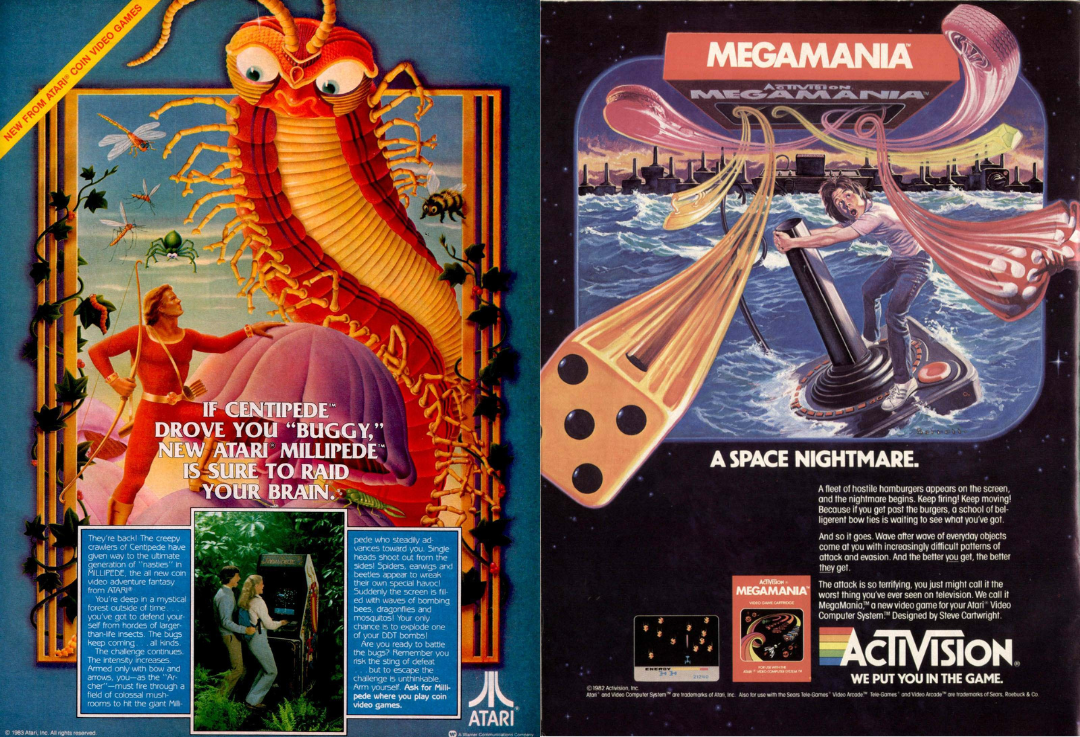
“I was seven years old when Nintendo launched the Famicom, eight when Mario first appeared. My best friend had an Amiga and even if I couldn’t have one (we were a Dragon32 Household), it didn’t mean I couldn’t pore over the game ads in the back of [comic mag] 2000AD,” says Neil Whitfield, creative director at verbal branding agency Reed Words. “Imagining the worlds they described, manufacturing dopamine-by-proxy from the wide-eyed expressions of the lucky lads (always lads) in the photos who got to play them.”
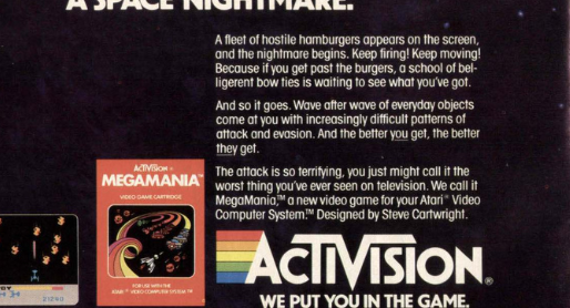
Neil says he could have picked any of a hundred ads, but he feels that these are typical of the genre. “Look at those baddies, flying out at you with such ferocity that the frame of the poster can’t hold them. Feel the pace of that copy – you almost want to read faster to escape the terrifying fate that approaches humanity,” he says. “The attack is so terrifying you may just call it the worst thing you’ve ever seen on a television! Quite possibly – but not how you mean it. And this is what surprised me most when revisiting this era of advertising as an adult. The hyperbole. Nay... lies. The way they almost universally eschew any kind of product truth for a pure emotional benefit.
“Maybe it was the nascent industry they were feeling out, or the accepted reality that a half-decent graphics card was about four generations of console away, but I will never again feel guilty for upping the sauce on a product descriptor or brand promise. If a client complains I’ll just say. ‘Well, you bought an Atari, didn’t ya?’”
05. New Balance
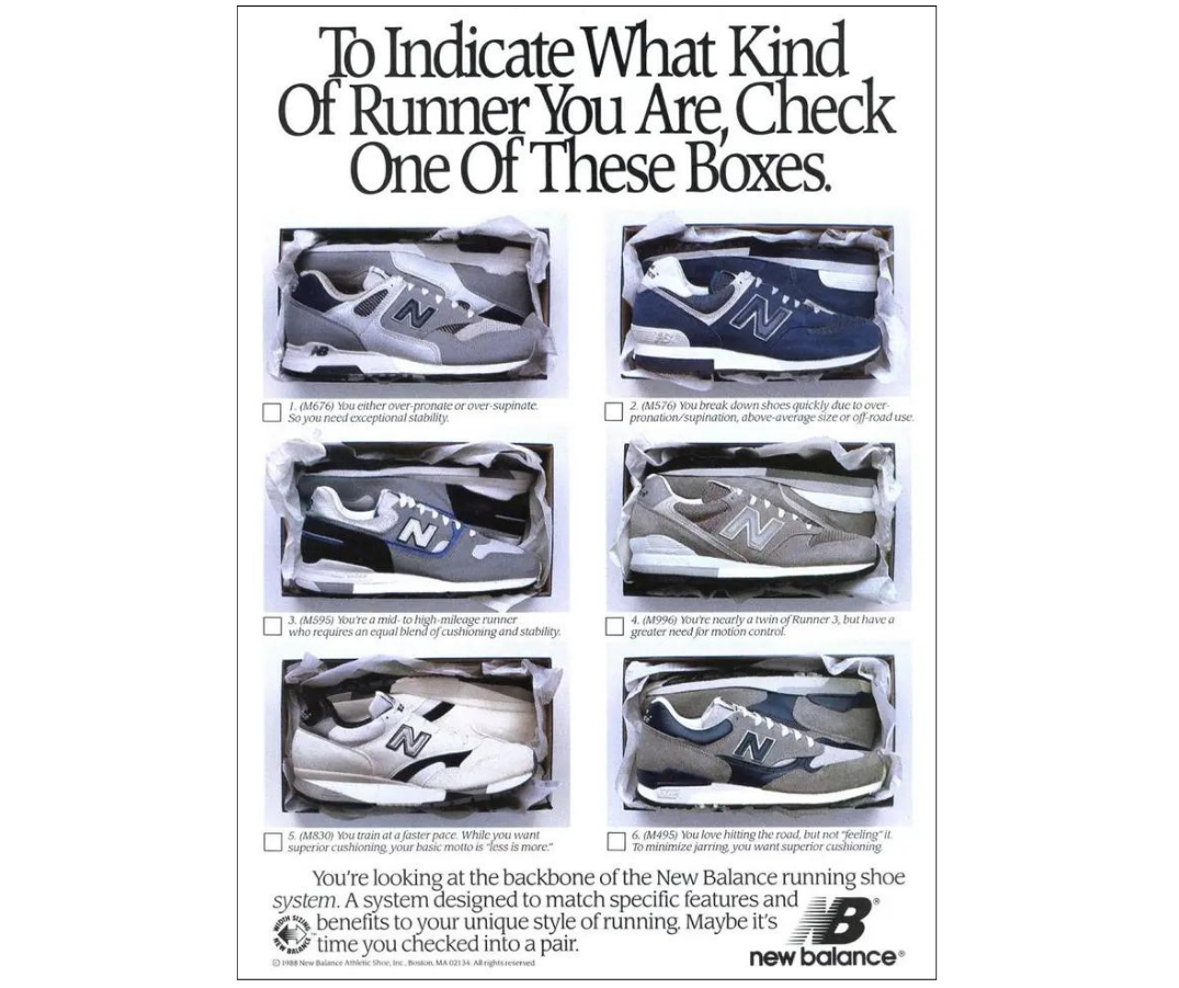
It’s the cleverness and simplicity of the ‘80s New Balance ads that put them top of the era for Jonny Aldrich, co-founder and managing director of London-based branding and packaging design agency Deuce Studio. “First of all, they are quite similar to the classic advertising of the ‘60s and ‘70s, simple product photography on a white background, combined with a witty tagline and supporting long-form copy,” he says, highlighting the 1989 print ad directing readers, 'To indicate what kind of runner you are, check these boxes.'
“The condensed serif font at the time was probably used to stand out against the condensed bold sans, but today it just looks positively vintage and brings about a feel of nostalgia: a simpler era,” he adds. “Some brands of today even try to mimic this style, with the same typefaces and similar vintage-looking imagery, but the witty headlines are not there, they lack in personality and often end up feeling a bit cliched.”
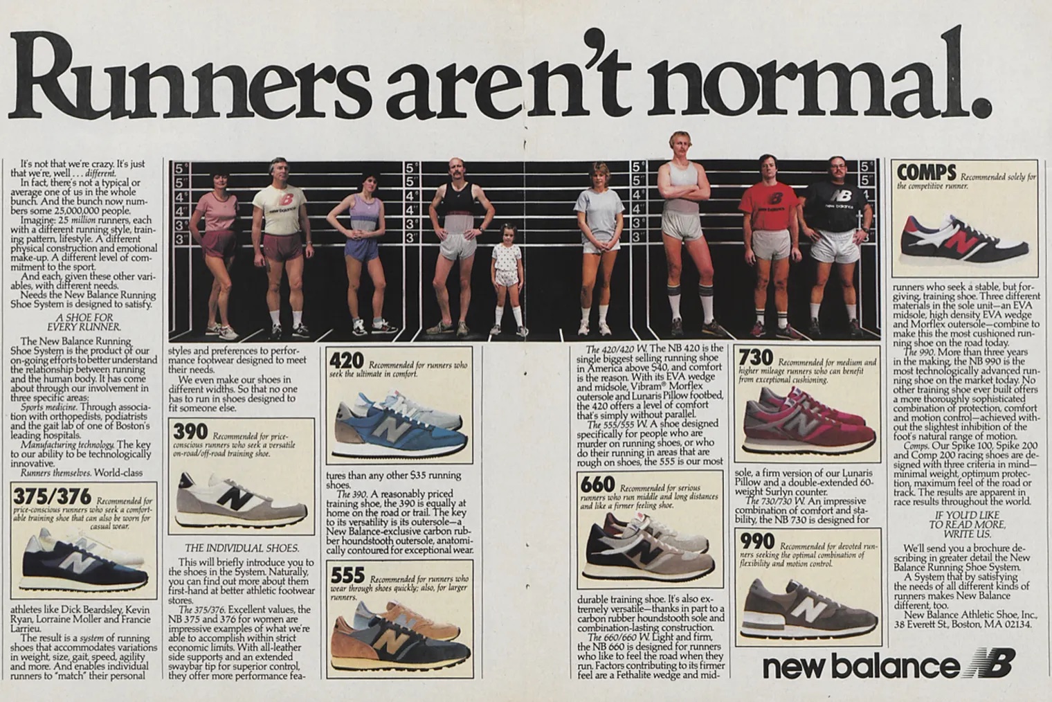
Also from the era, the 1982 iconic 'Runners aren’t normal' double page print advert is another example of how the brand aimed to caters for the variety of people that wear New Balance trainers – a tagline and concept revisited later, in a 2022 TV commercial.
06. Chambourcy Mousse
“Whether we love them or hate them, arguably the most effective advertisements are the ones etched in our memories since childhood, and the Chambourcy Mousse ad from the ‘80s is a prime example that remains vivid in my recollection,” says Leigh Chandler, founder and creative director of creative agency Sister Mary. The ad, whether aimed at adults or to lure the kids, was a world away from the company’s Hippo-pot-a Mousse commercial.
“While it was annoying as a child to be told that the mousse wasn’t intended for youngsters, the commercial’s opening with a bold 'WARNING: this commercial is for adults only' and its conclusion with a seductively whispered ‘Just don't tell the children’ might seem dated today, but was actually groundbreaking at the time, as it created a whole new category of how brands market food – later referred to as ‘food porn’ and setting a tone that inspired subsequent campaigns by brands like M&S and others.”
07. London Transport
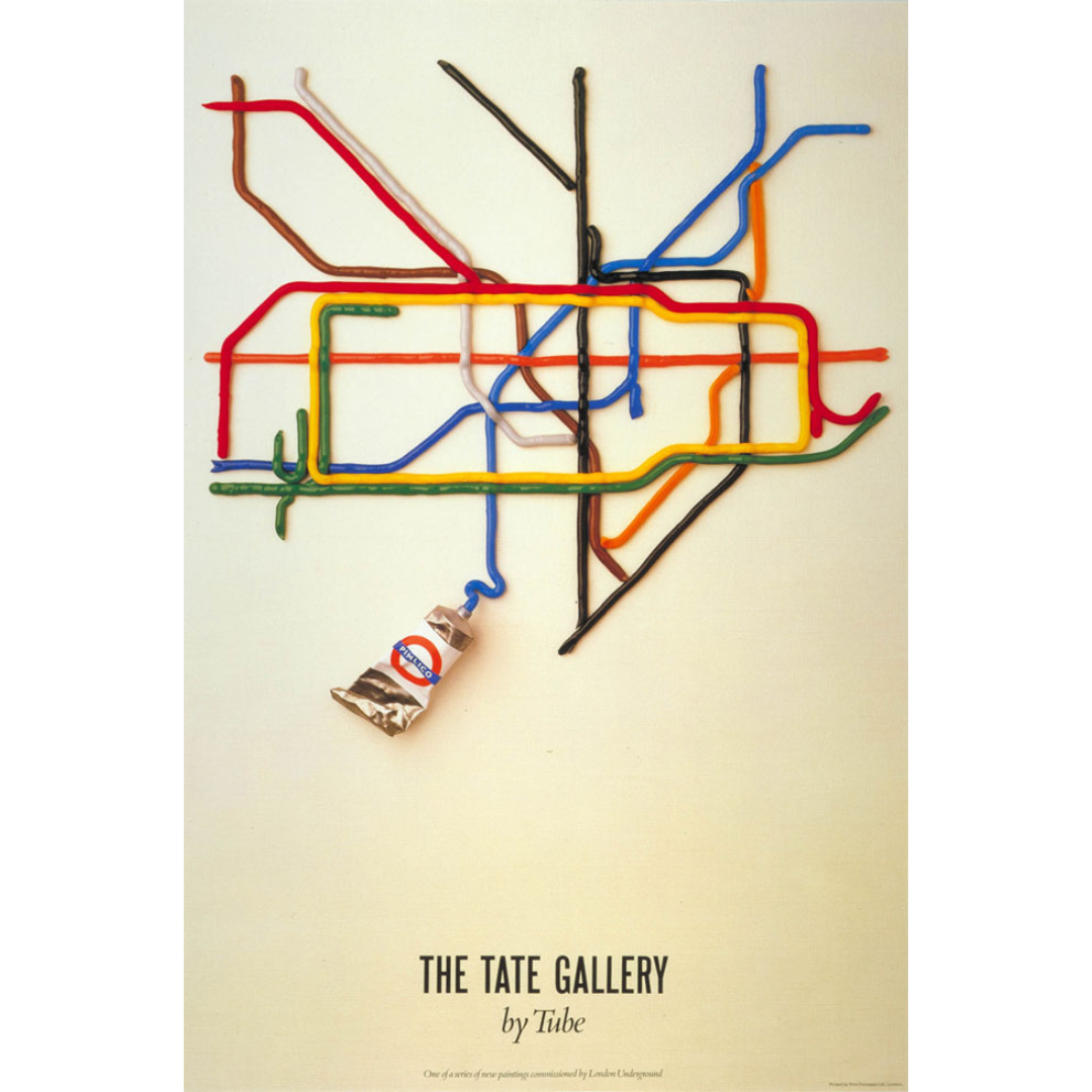
“In the 1980s, advertisements overflowed with celebrity endorsements and clever copylines set in ITC Garamond – undeniably stylish, yet ubiquitous for its time. However, amidst this trend, one print from that era has consistently stood out to me for its divergence,” says John Randall, senior graphic designer for Magpie Studio.
This ‘Tate by Tube’ was commissioned as part of the Art on The Underground series, launched the year prior in an attempt to re-establish the London Transport poster tradition (while using decorative pieces to cover up empty ad spaces in stations).
“Created in 1987 by David Booth of the Fine White Line agency, this particular piece distinguishes itself with its minimalistic and slightly abstract essence. Booth ingeniously reimagined Harry Beck's iconic Underground map by depicting a tube of paint being squeezed out,” John continues. “His witty twist on the diagram showcased the main Underground lines in paint, offering a playful double entendre to the word 'tube'. In my view, this print represents a perfect fusion of wit and sophistication –a concept that undoubtedly stirred envy among commuting creatives.”
08. Kia-Ora
“As the saying goes, often the ads are better than the TV programmes, and back then this was true,” Rob Fletcher, founder and executive creative director of creative agency Isobel. “This ad for Kia-Ora, written by the great John Webster, is still, for me, the most iconic. It’s not really the idea, and ideas are everything, but for me the vibe is positive and celebratory without getting anywhere near to cheesy.”
Webster – the advertising legend who was behind some of Britain’s best loved ads, including Smash, Kia-Ora, John Smith’s and Walkers – said the inspiration for it came from some music a sound engineer had mixed of his dog barking, and he told him he would use it at the next possible opportunity. The cartoon, though arguably questionable in hindsight, paired detailed and trippy animation with the surreal tagline 'Too orangey for crows', to stick in the minds of audiences.
09. Diet Pepsi
“As a child of the ‘80s who idolised Michael J Fox, this ad succeeds where so many fail,” says Alex Moulton, chief creative officer of branding and design studio Trollbäck+Company. “Its comedic action and amazing Harold Faltermeyer synth soundtrack make it feel like a mini-movie. This is my favourite of the memorable multi-year campaign.”
The 1987 ‘Apartment 10G’ ad for Diet Pepsi, conceived by BBDO and directed by Rick Levine, was one of several popular, award-winning ads from Pepsi in the ‘80s – another being a 60-second ad from 1985 for Pepsi Cola, where a team of archeologists from the future uncovering a bottle of rival Coca-Cola and don't know what it is.
10. Carling Black Label
This 1989 90-second parody of the 1955 war epic The Dambusters, was part of Carling’s ‘I bet he drinks’ campaign, often depicting someone doing something daring or difficult. Carling was Britain's number-one-selling lager brand at the time (since 1985), and despite the Black Label name being dropped, it remains the UK’s top choice today.
“There really too many to choose from the era, but this, for Carling Black Label, is still very good,” says Rob, who acknowledges that the subject matter may not be something advertising engages with nowadays but that it was a funny and memorable spoof. “And better than anything else on TV at the time,” he adds.
Want more advert content? See our best adverts of the 1950s, 1960s ads and 1970s ads and stay tuned for more in this series.