The 1930s wasn't the happiest time in history; it was the decade in which the fun of the Roaring Twenties morphed into the misery of the Great Depression and the rise of the Nazis. But every action produces a counter-reaction, and this was also a decade that saw a surge of innovation and resilience. And that made the 1930s a golden age of advertising; a period when creativity bloomed in the face of adversity, and brands dared to be different
For this article, we asked the experts to select their favourite 1930s ads. And this was not just an exercise in nostalgia, because these designs have a lot to teach modern designers. Like the best 1930s logos, these ads are mini works of art, infused with the spirit of the times. They capture the anxieties and aspirations of a nation grappling with economic hardship and yearning for a brighter future.
If this article inspires you, then make sure to read our guides to the best logos too. Our repository of the best logos by decade is a great place to start.
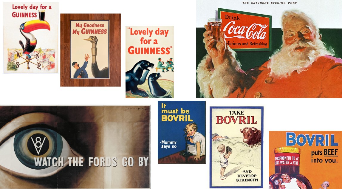
01. Guinness
Marketing has always been key to the success of Guinness, and that's been the case now for almost a century. In the 1930s the brand commissioned artist John Gilroy to create a series of expressive ads and they were a monumental success, carving a special place in advertising history for their ingenuity, humour, and enduring cultural impact.
"Gilroy's 'My goodness, my Guinness' is a great example of taking a brave creative leap into the abstract with various circus animals depicted in humorous situations," says Matt Hauke, senior designer at Design by Structure. "On paper it makes little sense, but captures a joy and humour that only creativity could bring. Such was its success the Toucan remained an icon for Guinness throughout the 20th century, and the campaign paved the path for the brand's quirky and off-beat advertising for years to come."
A personal favourite of Gary Jacobs, creative partner at Live & Breathe, is Gilroy's 'Lovely Day for a Guinness'. "This timeless masterpiece revolutionised advertising art by infusing whimsical and captivating visuals into everyday activities, centred around the enjoyment of a pint of Guinness," he explains.
"Gilroy's artistic brilliance, coupled with the campaign's ability to evoke joy and camaraderie, transcends its era, making it an enduring icon and an inspiration for aspiring advertisers. The magic lies in transforming a simple product into a narrative that creates an emotional bond with consumers, showcasing the everlasting allure of creativity in the advertising industry."
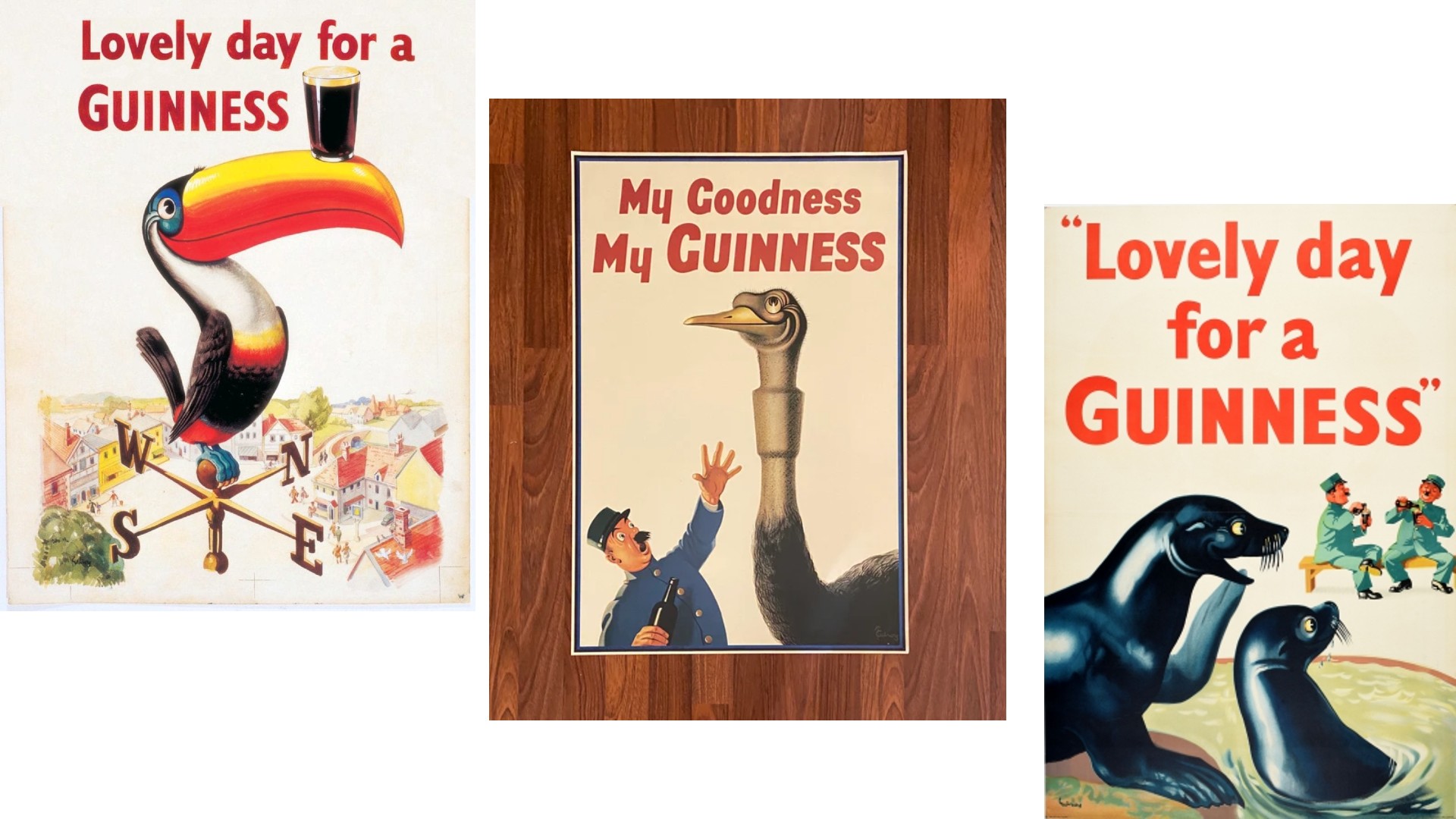
02. Bovril
Bovril is a meat extract paste that's played a pivotal role in British history. It was a favourite of football crowds, a popular choice amongst soldiers during the First World War, and the only hot drink that Ernest Shackleton's team had when they were marooned on Elephant Island. Advertising was key to maintaining the brand's market dominance, and The History of Bovril Advertising by Peter Hadley is required reading for anyone in the advertising profession today.
"Bovril's art style was so very 1930s," says Benny Bentham, creative director at Waste Creative. "A sense of art deco wholesomeness, with bold colours and usually a picture of a cow or a heroic man flexing his muscles after drinking it. These posters are iconic, of an era, yet also timeless. 'It must be Bovril', 'It puts beef into you' and 'Develop strength' are three lines of copy I've remembered since childhood, after seeing my gran's Bovril poster showing a boy taking a photo of a cow that looks very displeased it's about to be turned into a drink. I always found it mildly disturbing, but I remembered it!"
Karim Salama, director at e-innovate, is equally enthused about this pioneering brand. "Bovril’s 1930s campaign is often regarded as a product of the zeitgeist of the time," he explains. "Symbolising health, prosperity and strength in a period of substantial economic uncertainty was a fantastic way to market a brand. The inclusion of the iconic bull was one of the first popular instances of anthropomorphism, and its influence is reified to this day.
"It would be hard to say that any of the most popular marketing campaigns involving animals would still be here were it not for Bovril’s Bull," he adds. "The perspicacity of GEICO’s Gecko; Aflac’s Duck; even Frosties' Tony the Tiger may not have been nearly as effective were it not for Bovril’s inclusion of an animal in the marketing. The fact Bovril managed to use this symbolism effectively taught every brand since that anthropomorphism is a very effective marketing tool."
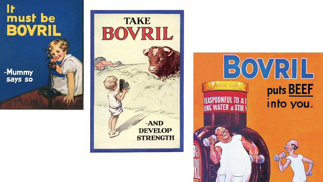
03. Coca-Cola
There's a persistent urban myth that Coca-Cola invented Santa Claus, which is certainly not true. But the company's advertising did play a big role in shaping the jolly character we know today.
Before the 1930s, there were many different depictions of Santa Claus around the world, including a tall gaunt man, an elf and even a scary version. But then in 1931, Coca‑Cola commissioned illustrator Haddon Sundblom to create paintings which established Santa as a warm, happy character with human features, including rosy cheeks, a white beard, twinkling eyes and laughter lines. The ad first appeared in The Saturday Evening Post and Collier's in December 1931.
"You can't get more iconic than Coca Cola's Santa, surely?" says Hauke. "Their 1931 campaign was initially launched to remind people that Coca Cola isn't just for hot, summer weather but all year round too. It proved to be a stroke of genius giving the drink an unrivalled, and globally understood, brand ambassador – at zero cost – and permanently tied the drink to one of the most loved holidays in Christmas. Such was its impact it has maintained relevance for generations to come."
04. Agfa
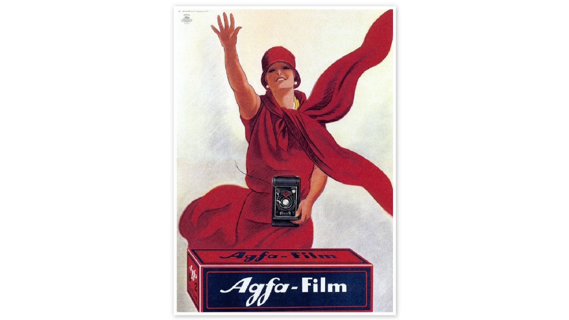
When the German multinational conglomerate Agfa introduced Agfacolor Neu, a multi-layer colour reversal film in 1936, it was a true game-changer. Considered the first commercially successful colour film, its vibrant colours and ease of use revolutionised photography. And of course, it needed a suitably eye-opening advert to draw attention to this incredible innovation.
"The beauty of this ad is its graphic simplicity," says Natasha Blevins, creative director at We Are Collider. "Ditching traditional headlines and calls-to-action, it instead opts for product focus and expressive imagery. Its strength lies in the dynamic diagonal layout, where hands and a flowing scarf pull the eye.
"The restrained colour palette supports this with striking visual contrast. But there’s also a clever narrative: the protagonist is getting the attention of the people she’s photographing, as well as us – the audience. In an era dominated by housewife-centric ads, this offers a refreshing and progressive portrayal of female modernity."
05. Dubonnet

Created by wine merchant and chemist Sir Joseph Dubonnet in 1846, Dubonnet is an aromatised wine originally conceived as a way to get French Foreign Legionnaires in North Africa to drink quinine. This beautiful 1930s ad for the brand was created by painter, commercial poster artist and typeface designer AM Cassandre, whose innovative and avant-garde approach to design earned him a prominent place in the Art Deco movement.
Adele Leyris, design director at House 337, outlines just what's so clever about it. "It's a three-step sequence showing the different moments of pleasure while interacting with the drink," he explains. "You start by admiring it (Du bo = Du beau), then you enjoy drinking it (Du bon), and then you serve yourself another glass of Dubonnet wine. Cassandre masterfully uses negative space to show the impact of the product on the character as he fills up in colour.
"This is the perfect example of considered design efficiently serving an emotional message about the brand, which was never seen before in 1932," he adds. "You still see some of the old painted ads in rural villages and cities across France."
Rob Kavanagh, executive creative director at Oliver UK, is also a fan. "Ever since I saw this poster at university, it’s held a place in my mental scrapbook of great and guiding work," he enthuses. "The ad is elegant and clever, but it’s also instructive. Back in the 1930s, creatives weren’t armed with insights. Here, Cassandre presumably took a long, hard look at the product, and the inherent creative solution patiently revealed itself."
06. Taxol
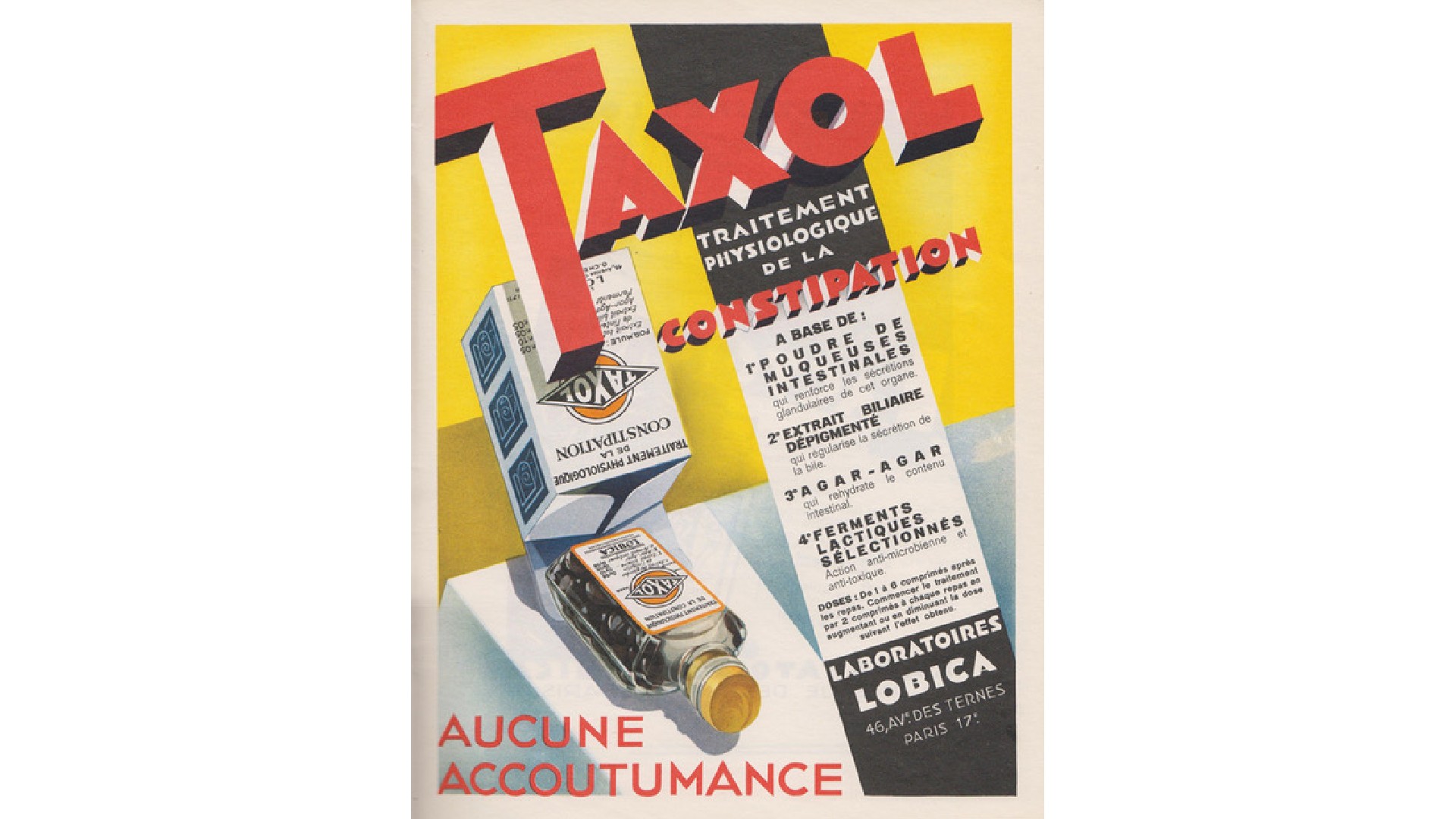
When compiling lists of the best historical adverts, it's tempting to focus solely on the fun stuff like the brands we've covered above. But while the subject matter of pharmaceutical advertising may be uncomfortable at best and disgusting at worst, from a designer's point of view it's still fertile ground for inspiration, argues Ed Lloyd, creative strategist at Seed.
"Pharmaceutical advertising involves the challenge of communicating precise – and perhaps dry – information in an interesting way," he points out. "Many adverts in France in the 1930s met this challenge through incorporating bold and experimental graphic styles that drew upon popular art movements of the time, such as Bauhaus, Constructivism, Art Deco and Art Nouveau."
This example for the constipation medication Taxol (not to be confused with the cancer treatment of the same name) features striking type, clashing colours and diagonal lines often associated with constructivism. "Interestingly, TFL’s latest safety campaign, designed by illustrator Andrew Hudson, seems to be pulling from a similar artistic territory to also communicate well-being quickly and boldly," adds Lloyd.
07. Cadillac
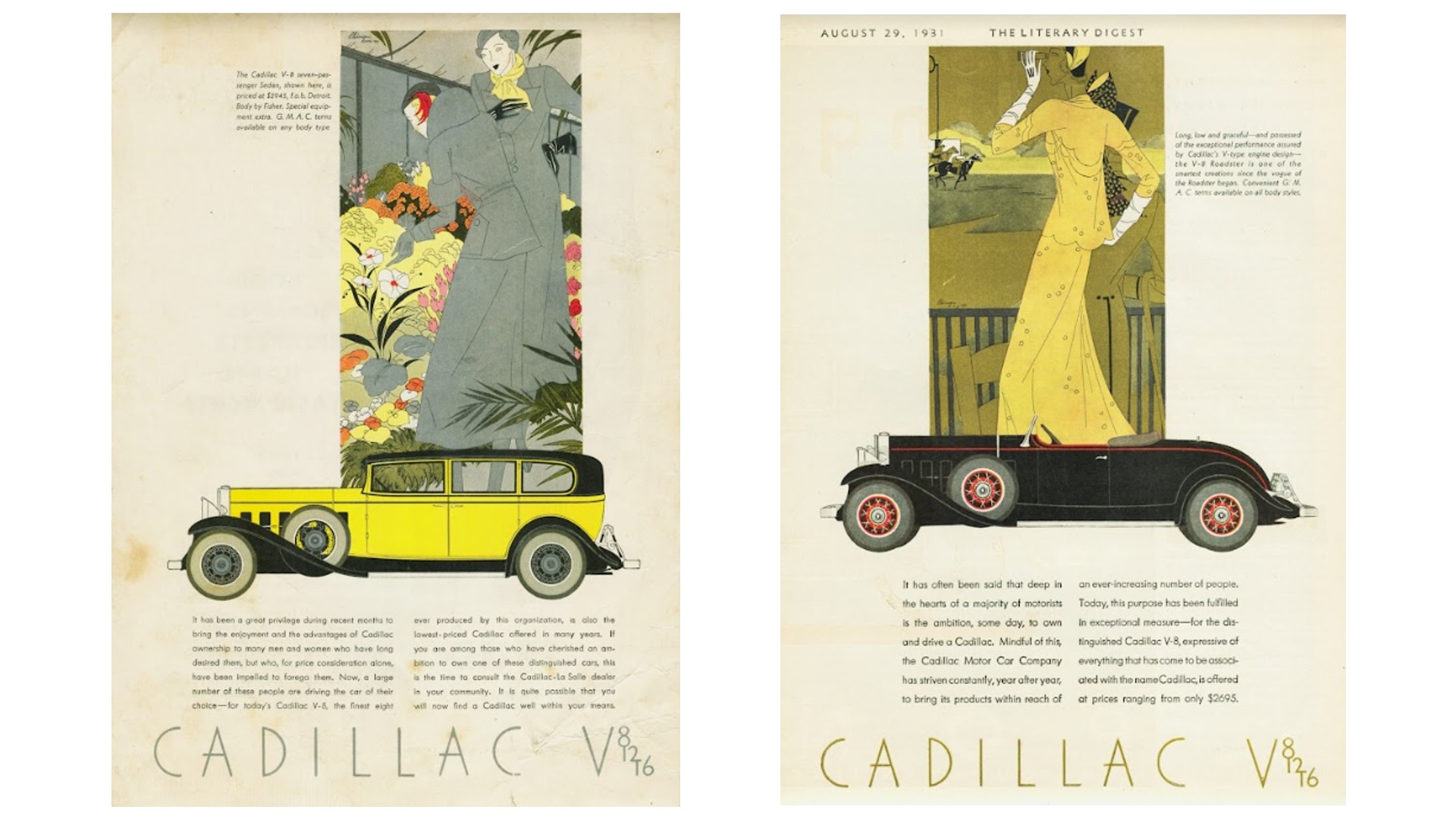
We may associate Cadillac with the 1950s and 1960s, but it was founded long before that, in 1902. And Raj Davsi, creative director at FutureDeluxe, is in love with these 1930 ads for the American car brand.
"One admirable aspect of their advertisements in each car release is the consistent design language throughout the collection," he notes. "The illustration of the car is beautifully simple, and I particularly enjoy the graphic nature of the side profile. It feels very iconic, and the car's central position attracts the viewer's eye to it. I love this and adopt this central framing a lot in my work today."
He continues: "The image illustration combined with the car has been executed in a clean and tasteful manner, with a great use of the Art Deco style. It provides a glimpse into the possible lifestyle of the car owner. The ad's clean layout and thin typography create a luxurious feel, which is very fitting for the car."
08. Doxa
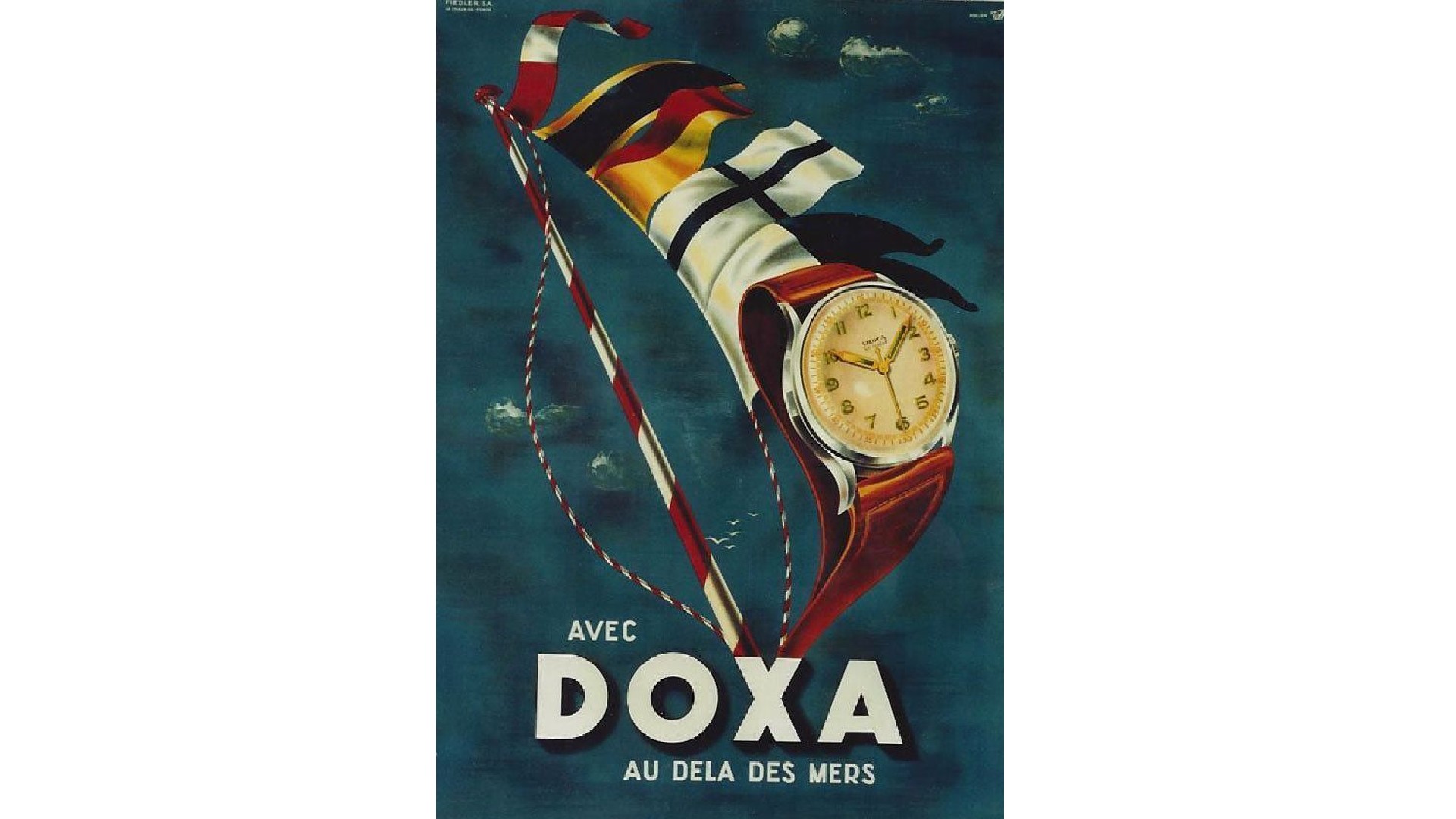
Another favourite of Davsi's is this ad for Doxa, an independent Swiss watch manufacturer founded in 1889 and today best known for its dive watches. "There are many reasons I love what they have done with this ad," he says. "The chosen colours give off a luxurious and expensive vibe, reflecting the intended target market. I love the balance of blues, browns and reds. The beautiful use of composition is so pleasing.
"The angle used to compose the watch feels heroic and strong," Davsi continues. "We have had the privilege to design and develop watch commercials at FutureDeluxe, looking for similar compositions when making a watch film. The compositions of the watch extend seamlessly into the sail, which is such a nice touch and feels like luxurious promotion. I am into the bold type and composition. It feels robust, almost representative of the watch."
09. Ford
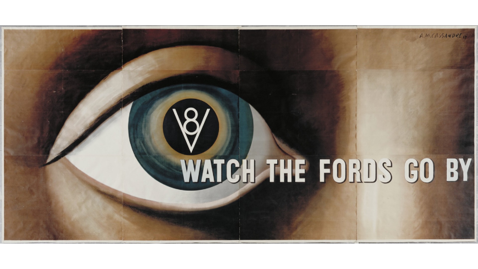
As the O.G. of mass production, we tend to think of Ford cars as basic, solid, simple and dependable. But there's nothing simple or boring about this 1937 ad for the brand, another classic designed by A.M. Cassandre.
"The artist strips away practically every convention in advertising in this ad," says design commentator Daniel Shannon, "harnessing European minimalism to elevate the medium to something more akin to modern art. At the same time, he pre-empted the more emotive approach seen in decades to come.
"A striking, singular all-seeing eye remains curiously anonymous in an age where most advertising was heavily gendered," Shannon continues. "Our faceless protagonist rises above the role of consumer and is instead an observer – liberated and seemingly unwanting. The headline, so unassuming as to verge on the existential, pulls away from the iris – the first place the viewer’s eye naturally falls. The delicate alignment of the cap ‘W’ with the V8 icon lends a compositional elegance rarely seen at a time where typography was often an afterthought."
10. London Underground
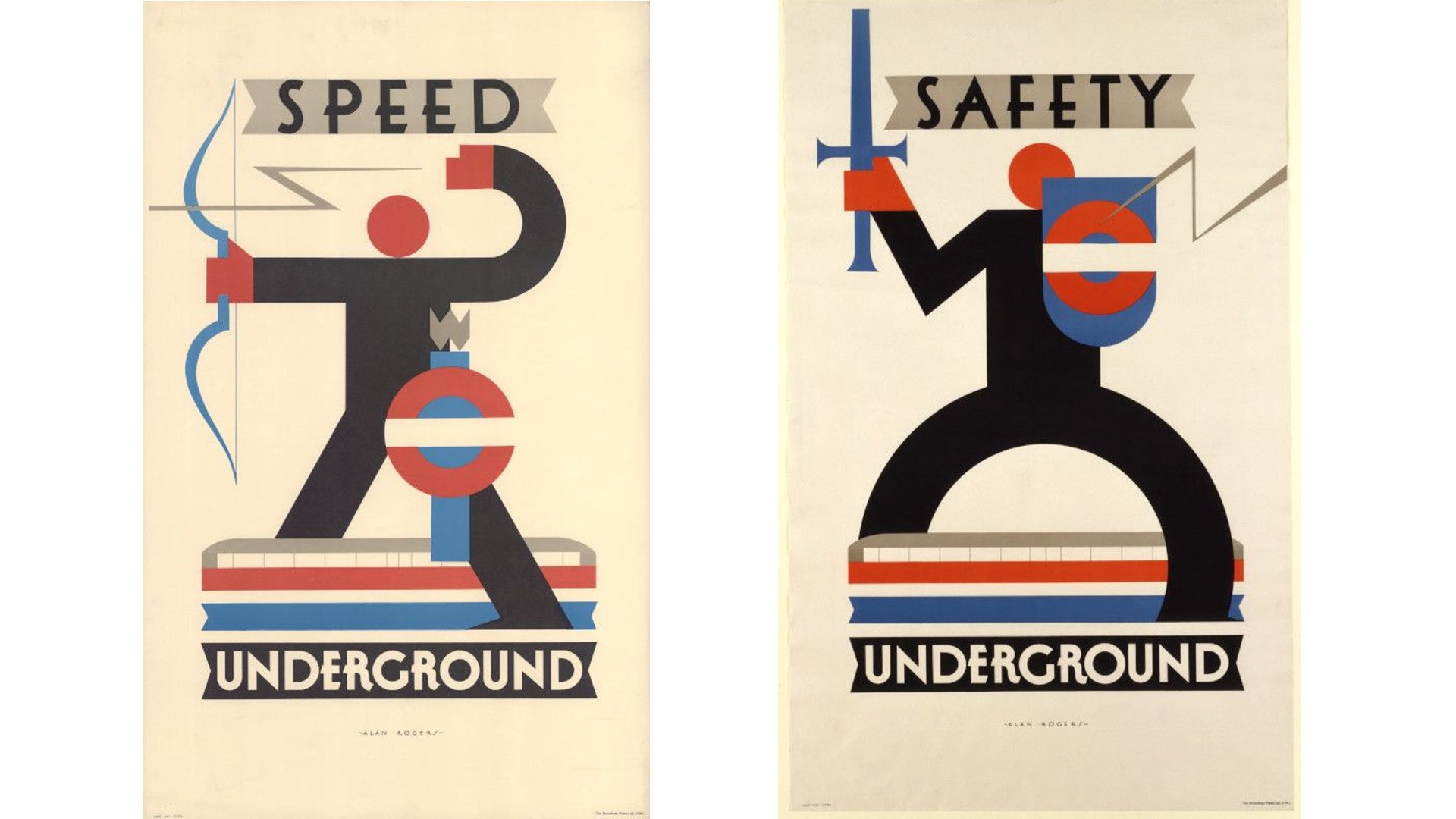
The London Underground map and logo are two of the most celebrated pieces of design in modern history. But there's plenty more to discover in the transport network's past, and here are two great examples of its long-standing tradition of effective and impactful advertising.
As Marc Allenby, co-founder and chief creative officer at Hijinks Collective, notes: "The London Underground design, iconography and poster design has become a key part of London’s rich history and a visual representation of the city itself. An artist named Alan Rogers created these beautiful pieces of advertising for the London Underground. Less ad, more art, Alan elegantly – and in my mind so smartly – incorporated the iconic roundel into his bold, modernist designs."
These posters may have been published in the 1930s but they remain timeless pieces of communication. "These ads elegantly and stylishly convey their message through beautifully crafted illustration and typography," says Allenby. "They communicated a new world, a world of optimism and futuristic romanticism of travel. They helped to turn OOH posters into something that you’d put on your wall. My takeaway; let's bring art back into today's OOH!"
11. Kodak
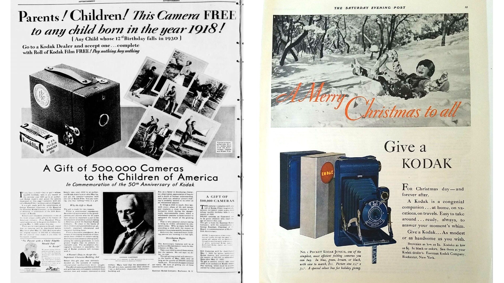
Kodak played a crucial role in making photography accessible to the general public from the late 19th century onwards. A company that was all about visual communication could be expected to deliver great advertising, and they didn't disappoint.
"Kodak has a rich advertising history in the early 1900s," says Angela Sturrus, creative director at Hook. "With memorable slogans such as 'You press the button, we do the rest' and 'Take a Kodak with you', the Kodak brand became an established household name that made photography accessible and approachable. By the 1930s, Kodak started to broaden its target market by approaching the younger generation and, subsequently, their parents."
Sturrus recalls how they started this advertising strategy with a splash on their 50th anniversary by giving 500,000 cameras away to any 12-year-old child. In the coming years, they coined their holiday slogan of 'Give a Kodak' where they reinforced the idea of gifting a Kodak to children.
"This creative approach helped embed Kodak into the hearts and minds of the Greatest Generation, which continued to pay off for the brand for decades," adds Sturrus. "Overall, Kodak’s creative strategy during that time was not only captivating, catchy, and insightful but also completely futuristic."
For more design inspiration, see our favourite print ads.