Some might say some shades come and go… making headlines one season, gone the next.
Today, spin the colour wheel and the result is far from random… the arrow is firmly pointing towards green.
“Green is one of the most naturally comforting colours we can bring into our homes because it connects us instantly to the world outside,” highlights Marianne Shillingford, creative director and colour expert at Dulux.
“As the colour of leaves, gardens and new growth, it carries all the optimism and freshness of spring with it, helping spaces feel calmer, lighter and more restorative.”
Indeed, she says it’s also becoming one of the most popular colours in our homes. “We have an immediate and powerful affinity with green because we instinctively recognise it from the world around us.
“It’s the colour of life and nature… it’s also right in the middle of the visual spectrum, which makes it the most balanced versatile shade on earth.
“Green means go – because it goes with everything,” suggests Shillingford.
Cited as the new neutral and easy on the eye, she goes on to say botanical greens in particular have a wonderfully grounding quality, “helping to create interiors that feel relaxed and supportive of our wellbeing.”
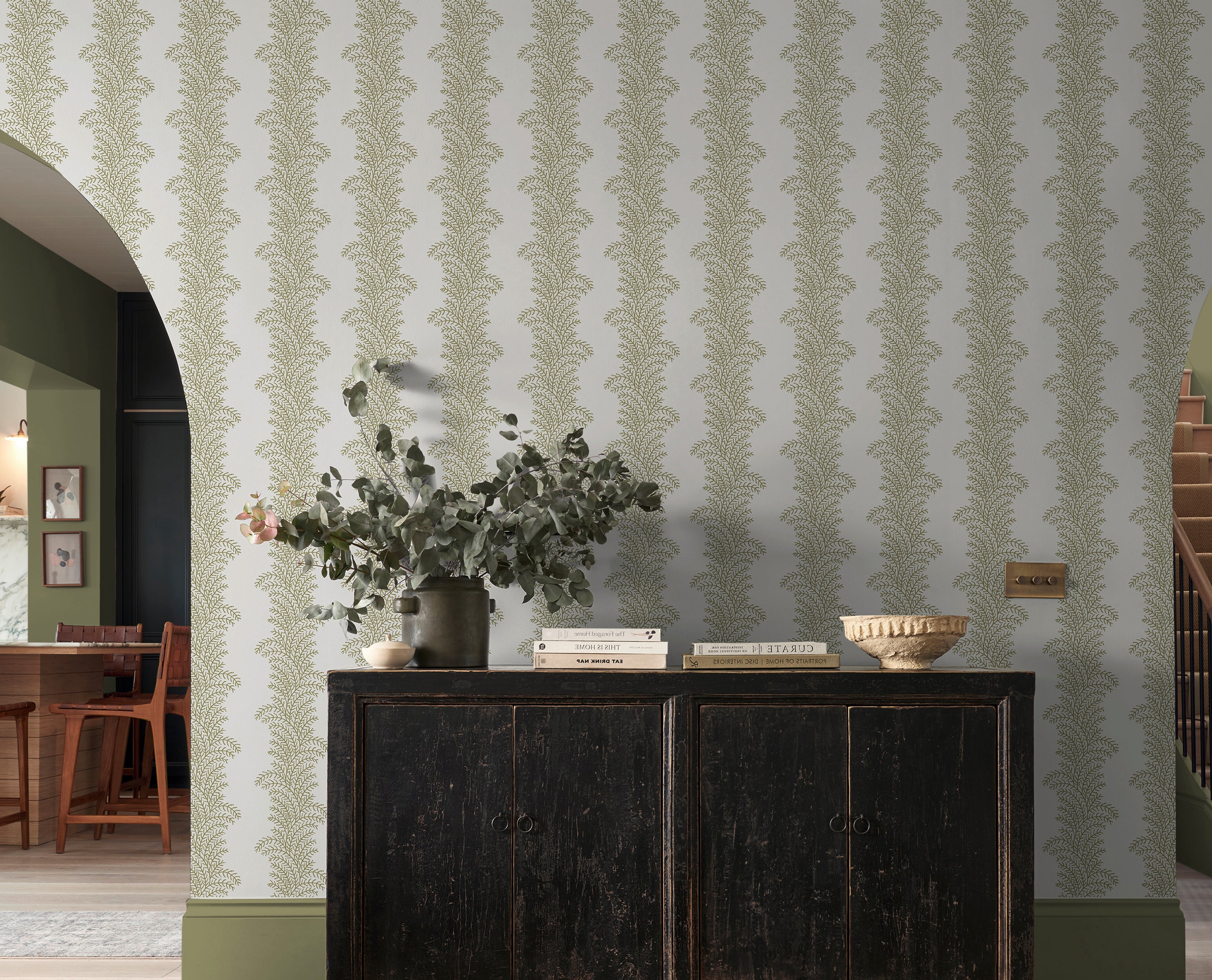
With its ability to calm and signal serenity, she says shades such as sage green and khaki capture this beautifully.
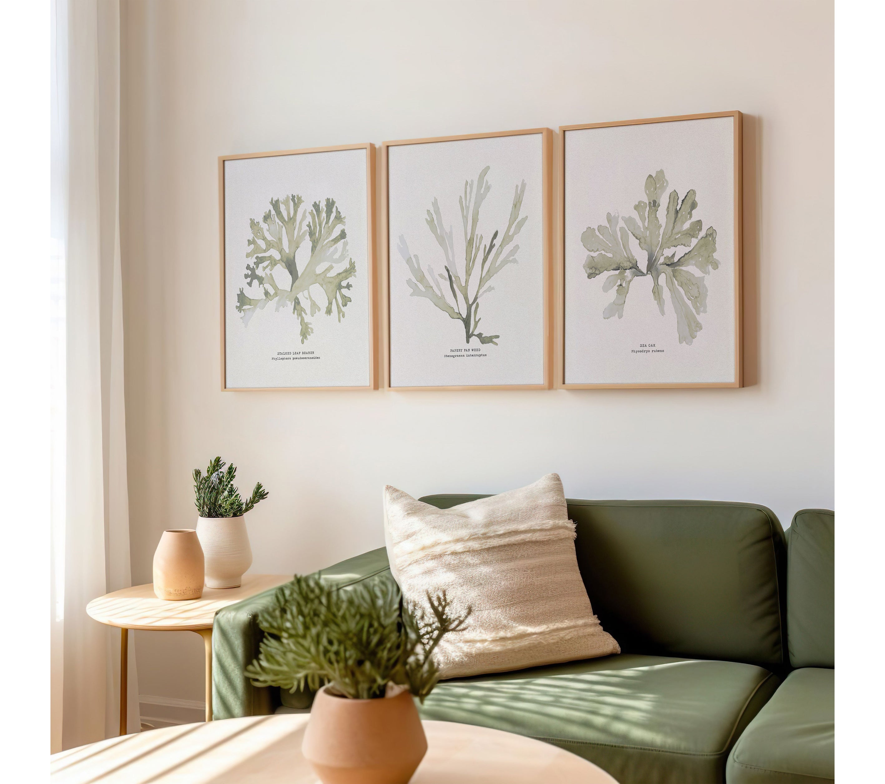
She describes sage green as having “a soothing, natural quality that makes it perfect for creating peaceful spaces that still feel fresh and full of life.”
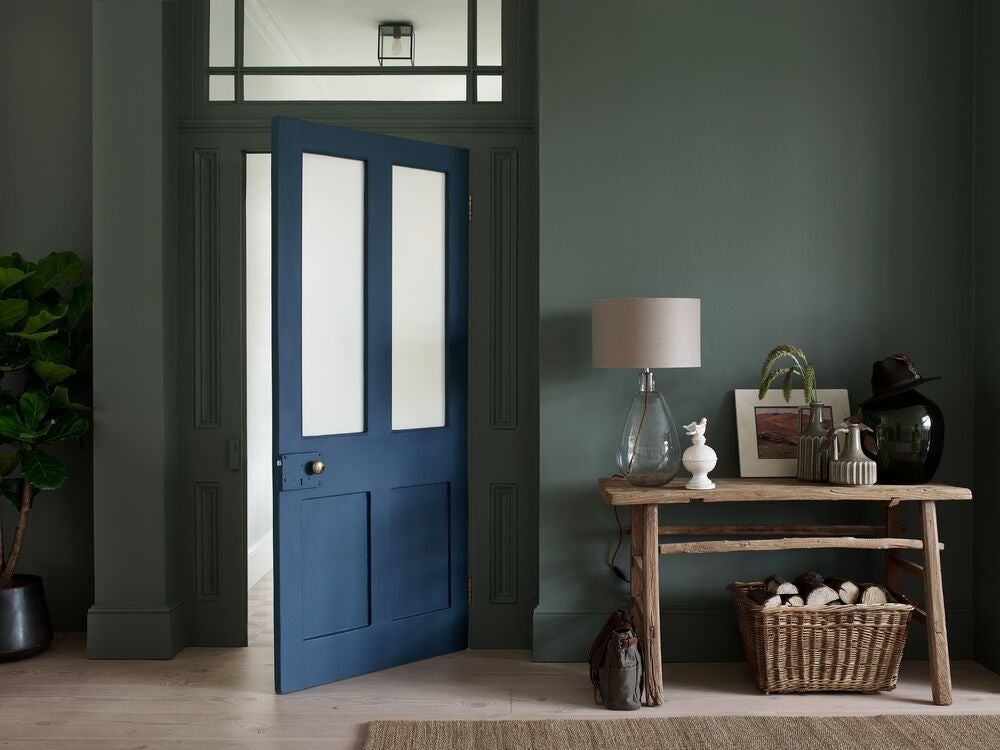
While the colour khaki “brings quiet sophistication to a room. It has the versatility of a cool neutral while still carrying the calming influence of botanical greens,” notes Shillingford.
Moreover, she says the real beauty of green is its versatility…
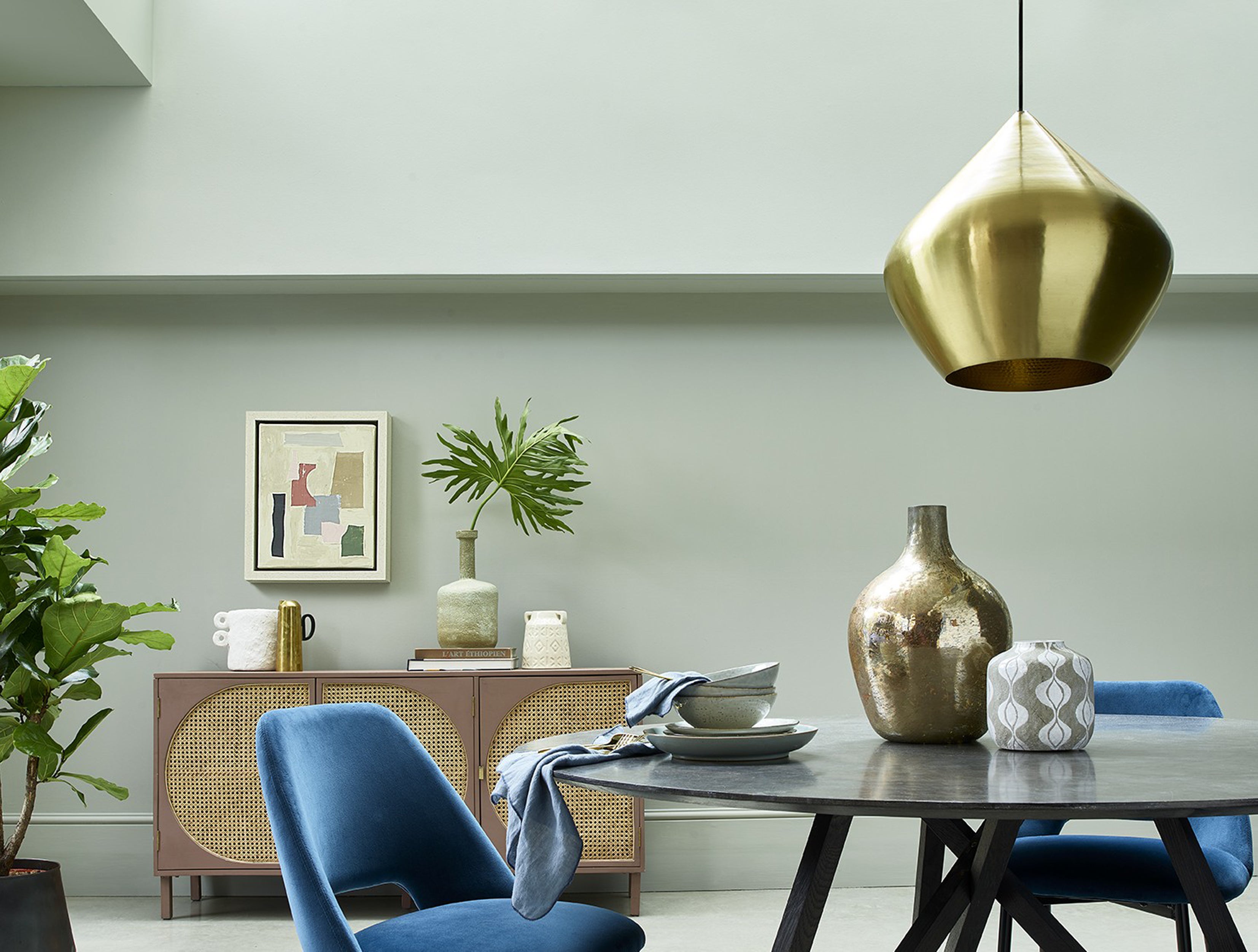
“In lighter tones it feels fresh and uplifting, while deeper shades can feel cocooning and elegant.”
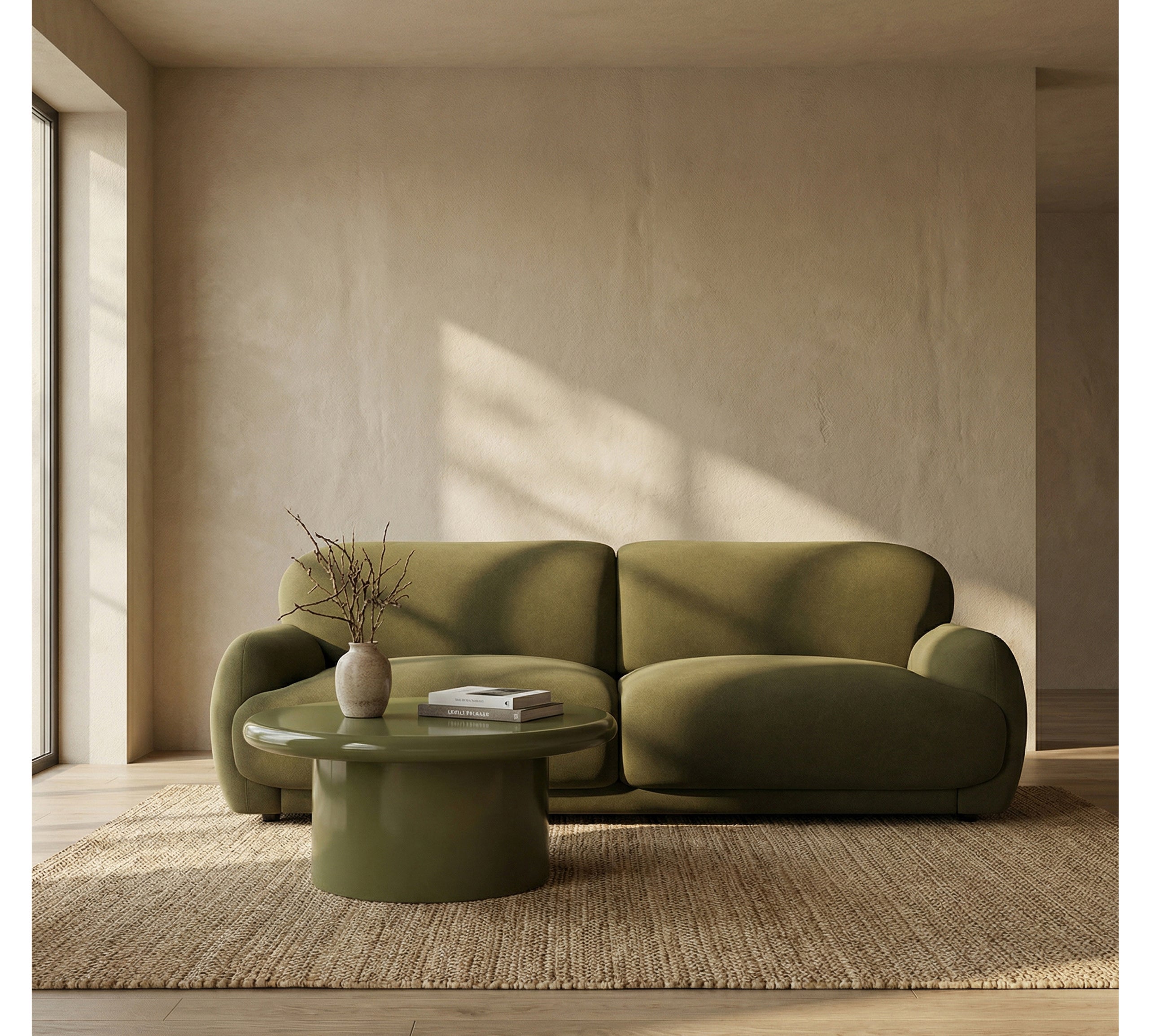
“Greens like these work beautifully with natural materials such as wood, stone and linen, and they also create a delicious energy when paired with contrasting reds and pinks.”
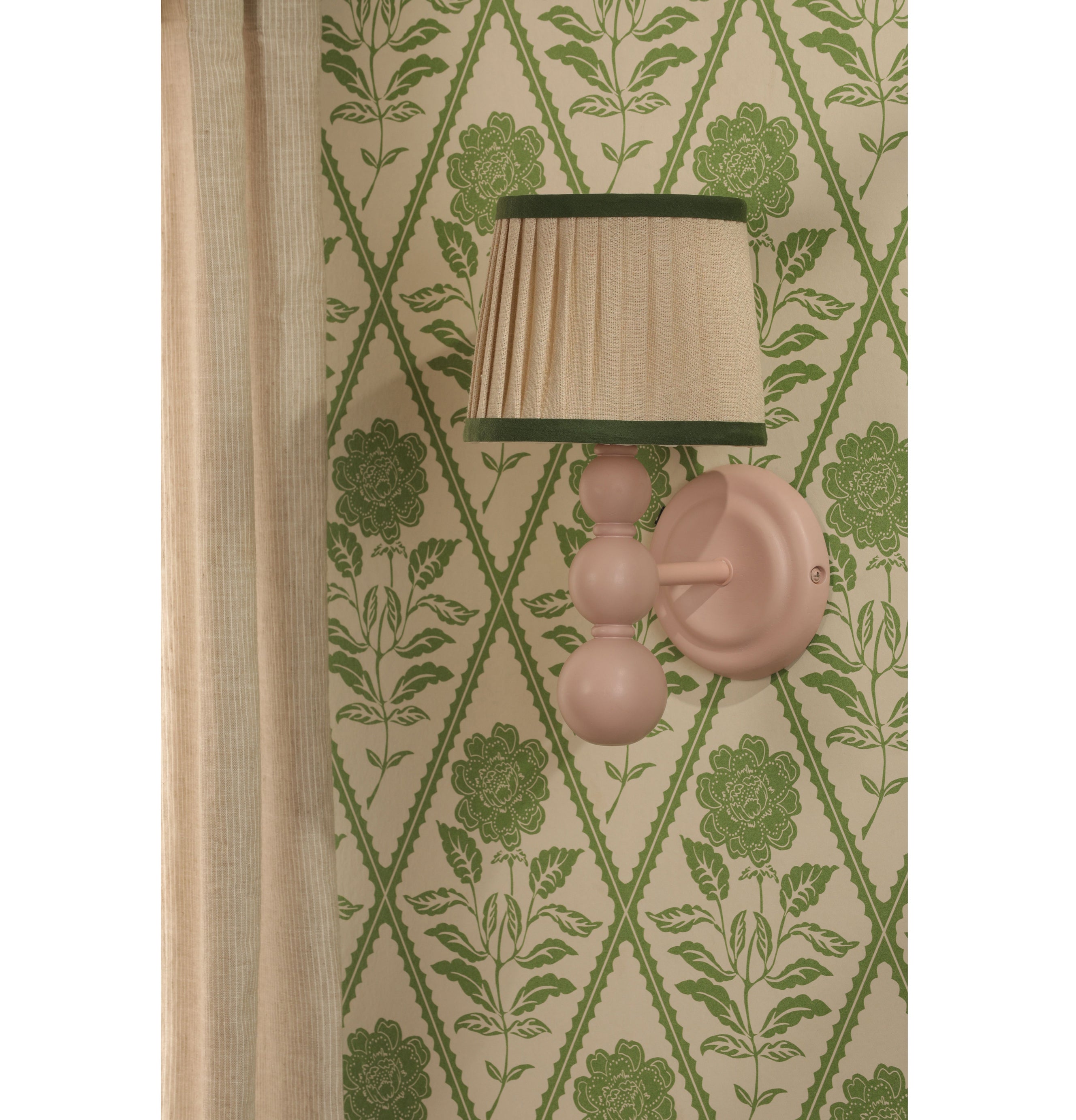
To create contrast and warmth, the colour expert suggests soft blush pinks and dusty rose shades which “sit particularly well alongside green, creating a gentle contrast that feels balanced and natural.”
“While deeper red or terracotta tones can add warmth and richness to a space.”
That adaptability is why green continues to grow in popularity, she explains.
“It’s a colour that not only looks beautiful, but helps our homes feel more balanced, calm and connected to nature,” underlines Shillingford.