Many housing analysts argue that large-scale upzoning policies create affordable housing. This was a justification for the major upzoning in the 2016 Auckland Unitary Plan (AUP). The Auckland experience is now of intense interest in housing debates.
Widely cited in media reporting is a paper by Ryan Greenaway-McGrevy and Peter Phillips (referred to in this article as GMP) entitled “The Impact of Upzoning on Housing Construction in Auckland“.
Here’s the Vancouver Sun covering it. The study even made it to The New York Times.
In areas that were upzoned, the total number of building permits granted (a way of estimating new construction) more than quadrupled from 2016 to 2021.
Closer to home, The Sydney Morning Herald, The Conversation, the Australian Financial Review, and housing policy websites have covered the topic and this research.
Eyeballing the data from GMP’s paper in the chart below, it looks like Auckland’s upzoning policy was a huge success — there was an obvious boom in dwelling consents (building approvals) in the upzoned areas after implementation.
The conclusion of GMP’s paper is that:
21,808 additional dwellings were permitted over the five years following the zoning reform, corresponding to approximately 4.11% of the dwelling stock of the Auckland region.
Astonishingly, they note that
Permits issued per year have approximately doubled over the five subsequent years to the reforms.
But does it pass the sniff test?

An initial sniff test
Unpacking the upzoning effect is a tricky empirical problem. While the authors have piloted an innovative approach to solving it, there are issues with the analysis that we think seriously undermine the main result.
It is the nature of research to disagree on methods, assumptions, and interpretations. We welcome rigorous feedback on any of our papers; you may find errors, strange assumptions, or contestable interpretations that should be discussed.
We provided feedback to the authors, who have now published some extensions and sensitivity testing of their analysis.
The next graph provides the first clue to the problem.
It plots the annual dwelling consents in New Zealand’s two largest urban areas, Auckland and Wellington. One of these cities had a home-building boom that doubled housing consents compared to the pre-2016 trend, thanks to upzoning. The other has a zoning policy some describe as “a racket to stop housing being built.”
Can you pick which is which? Is Auckland City A or City B?

Data coverage
The first issue with GMP’s paper is the partial dataset used for the analysis. Unfortunately, it’s a biased sample.
Dwelling consents from a separate Special Housing Area (SpHA) program that ran prior to the 2016 upzoning are removed, as are certain locations in the city. SpHAs were an inclusionary zoning policy enacted in late 2013 that allowed developers across New Zealand to build at higher density in exchange for providing a proportion of new dwellings as affordable housing.
The authors explain that:
Care is taken to remove construction activity generated by other government policies during our sample period. In particular, consents issued under ‘Special Housing Area’ (SpHA) authority are omitted from our sample.
When the Auckland Unitary Plan began in 2016, these SpHA approvals became redundant in Auckland. These approval types dropped away fast in the consent data, showing they were true substitutes —substitute locations for buyers and substitute markets for developers and builders. They were part of the same city-wide housing market.
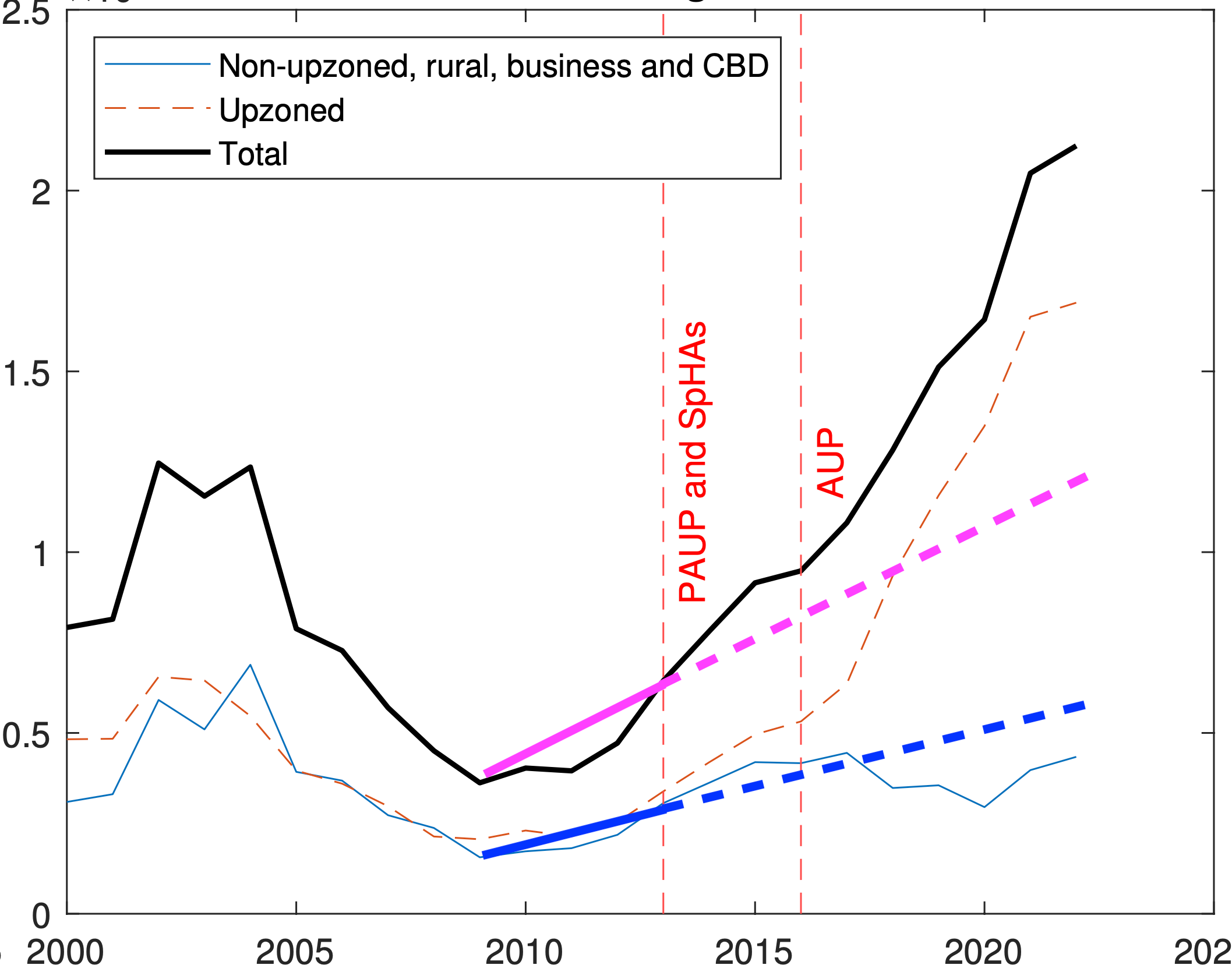
The light-grey line in the chart below shows dwelling consents for the upzoned areas in GMP’s sample. The kink in the line suggests a clear change in trend in 2016.

But the total dwelling consent data for Auckland, in dark grey, shows no such change. The dashed black line shows the data missing from GMP’s sample, which by its absence generates the kink in their upzoned area data.
When the missing consents are included in the upzoned area total, the chart looks like this, and the kink disappears.

Excluding this data effectively converts a growth trend for Auckland indistinguishable from that in Wellington, which was not upzoned, into a series with a distinct structural break.
In their extension paper, the authors include these missing dwelling consents, noting:
Total permits no longer exhibit a substantial break in trend in 2016, when the AUP became operational.
Linear assumption and identical pre-AUP trends
The second issue is that the counterfactual from which GMP estimate the upzoning effect assumes (a) linear growth, and (b) identical trends in upzoned and non-upzoned areas prior to the AUP.
This introduces significant biases, as we will show.
The chart below explains GMP’s method of estimating the net additional dwelling consents caused by upzoning.
First, the straight line of best fit for non-upzoned areas from 2010 to 2015 is extrapolated out to 2021 to define a counterfactual for non-upzoned areas. That’s the lower of the two straight grey lines.
Then, the pre-2015 levels difference between upzoned and non-upzoned areas is added to this to define a counterfactual for the upzoned areas. That’s the top grey straight line.
Next, the difference between actual and counterfactual non-upzoned area consents is calculated in order to estimate the spillover from these areas to the upzoned areas. That’s the grey shading. The idea is to ensure the policy effect isn’t over-cooked by counting pure substitution of activity from one place to another as an increase.
Finally, this spillover is subtracted from the deviation of upzoned area consents above its counterfactual, in order to estimate the additional dwelling consents net of spillovers (the red-shaded area).

To our point (a), there is no reason the counterfactual trend should be linear. Not many economic trends are. Fitting a curve to the pre-treatment trend fits that data better, and extrapolating it produces a bigger spillover and smaller net (spillover-robust) treatment effect. By our estimate, the net effect falls from 22,000 extra dwelling consents to about 4500 with this one small change.
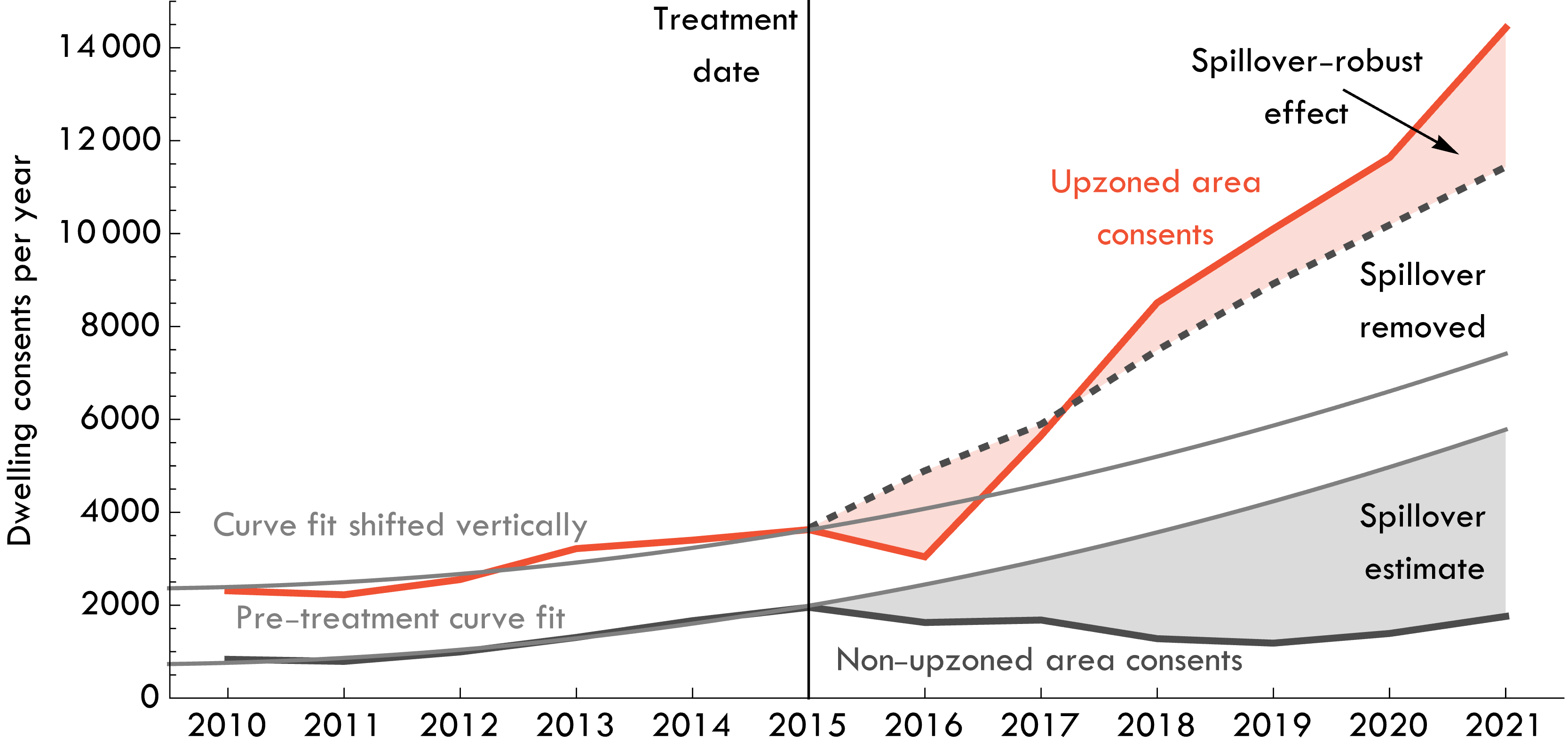
To our point (b), assuming upzoned areas have the same pre-treatment trend as non-upzoned areas implies a fixed difference between the two counterfactuals in all future years (about 2000 consents, in GMP’s sample). But what if the upzoned areas were already growing at a faster rate pre-treatment?
The authors note this concern and explain it is in principle possible to deal with it:
Our approach to modelling counterfactual scenarios based on pre-treatment trends in the control group could easily be extended to incorporate trends in both the treatment and the control group.
However, in practice, they assume the non-upzoned trend also applies to the upzoned areas (and hence to the market as a whole).
For their partial sample, this is fine. But for the full data, the assumption of linear and parallel trends is clearly inappropriate. Total consents in Auckland were growing non-linearly, so there is no reason to expect the levels difference between sub-areas to be fixed over time.
When we replicate their method with the full data (counting all missing consents in upzoned areas) and with both (a) non-linear and (b) independent pre-treatment trends, the estimate of a spillover-robust treatment effect turns negative.
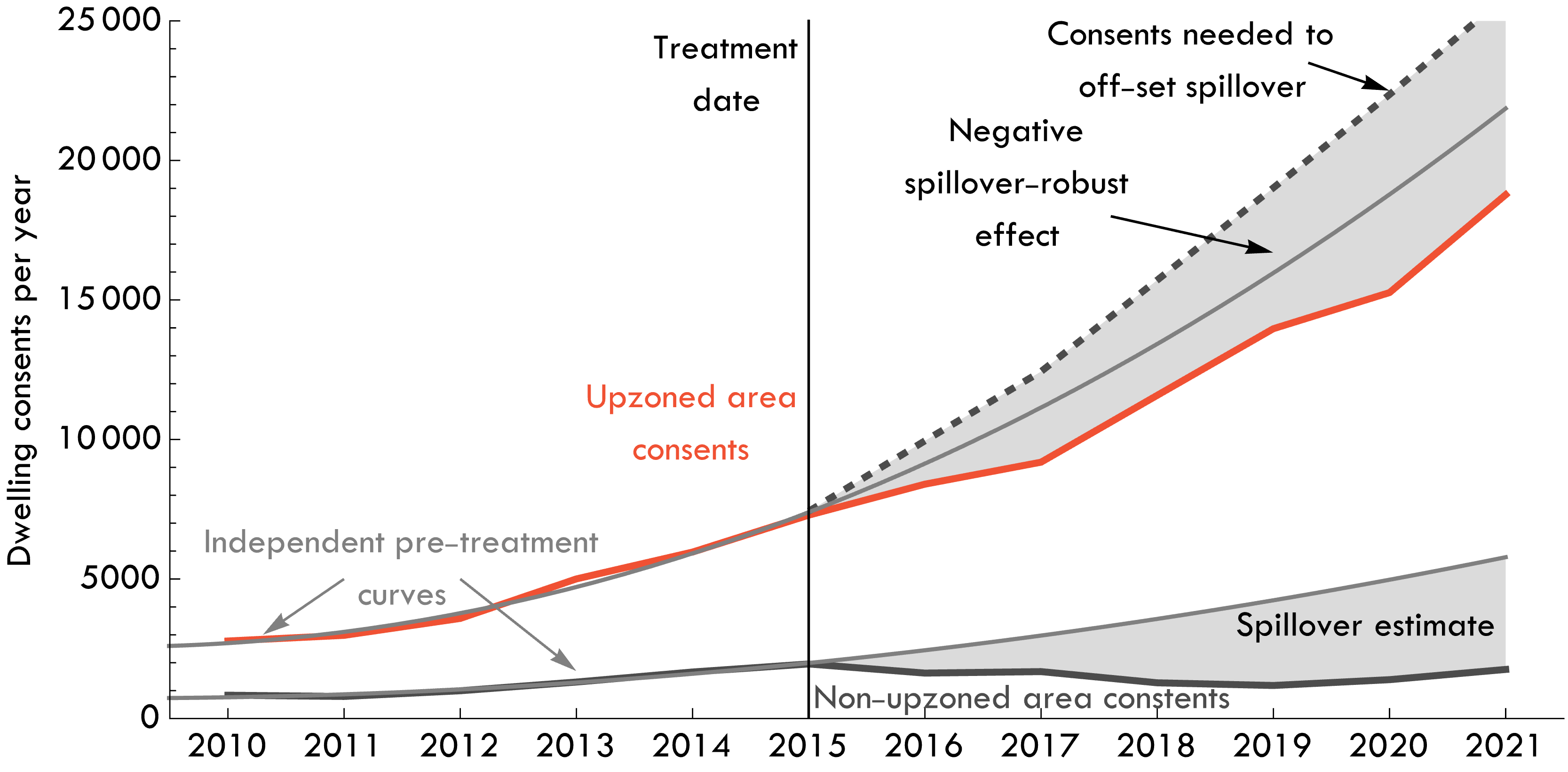
We’re not suggesting the AUP actually reduced consents. Extrapolating growth this far forward is unrealistic. And this is part of our point: whether using a linear or non-linear trend, extrapolating a short and highly-cyclical series a long way into the future is an inherently unreliable way of defining a counterfactual.
The chart below from the extension paper shows the enormous cyclical variation in dwelling contents. On it, we’ve marked in blue the linear trend the authors extend into the future for the non-upzoned areas. The authors assume an identical linear trend and fixed levels difference for upzoned areas. So in pink, we’ve shown what this implies as their counterfactual assumption of total dwelling consents without the AUP upzoning.
It doesn’t match the data (the black line) at all.
The authors re-estimate the policy effect in their extension paper, this time from a treatment date of 2013 (when the SpHAs began). As in the original, actual permits over the treatment period — in this case the nine years from 2013 to 2022 — are compared to a counterfactual linear trend.
This kind of linear extrapolation is a highly unreliable guide to the counterfactual outcome.
Interpretation of consents as extra dwellings
A final note of caution concerns the interpretation of dwelling consents as extra dwellings. Historically, about 90% of consents become completed dwellings after two years, as the authors note.
Recently, however, net additional dwellings, as measured by the change in the number of residential electricity connections, have not grown as fast as completions would suggest. Net additional dwellings two years after approvals fell from 77% prior to 2018 to 69% since 2020. This implies that more existing homes are being demolished for each new home.

The total number of residential electricity connections increased by 49,726 in Auckland between January 2016 and January 2022. It seems generous to imagine that almost half of those would not have occurred but for the AUP — especially given similar trends in Wellington we noted earlier.
We agree that more homes are better than fewer, but good planning matters too. Organising the location and types of dwellings can reduce total infrastructure costs and avoid social costs that cause a net loss in utility.
The disorderly nature of where post-AUP development occurred is hated by even the most strident supporters of the policy now living through it.
The single road in and out of our suburb is a shitshow in the morning. And in the afternoon. And on weekend mornings. Yep, we have traffic jams trying to leave our suburb at 10am on a Saturday. The tacit agreement we made when accepting density out west was that it would come with improvements to public transport and infrastructure; or at the very least that dense inner suburbs would reduce the load on our outer transport links. The best we’ve seen is a half-assed bus lane and ridiculous bar leaners instead of seats in bus stops.
If upzoning could deliver a benefit in the form of more homes and lower prices, even with the social costs of disorderly and haphazard development locations, it would be a trade-off worth making. But where are these benefits?
This is why housing supply analysis is hard
Housing and property analysis struggles with the fact that markets are cyclical, locations are substitutes, consumption responds to price, and individuals migrate to improve their quality of life. Housing analysis faces many of the same problems as empirical macroeconomics — a lack of controls, idiosyncratic local factors, and more.
It may simply be that GMP’s approach of estimating a policy effect on a housing market without reference to trends in comparable markets, by choosing a control group that is essentially within the true intervention group — the Auckland housing market — just cannot be made to work.
Auckland’s consent trend, like Wellington’s, looks a lot like a growth cycle spurred on by an uptick in migration around 2014, and a normal cyclical boom, one also seen in Australia’s major cities following the post-GFC recovery period.
Judgement on whether the AUP delivered the goods will need to await a fine-grained comparison between Auckland as a whole and comparable cities. On the basic data thus far, we’ve seen nothing to justify the headlines.
This was republished with permission from Fresh Economic Thinking! by Cameron Murray.
An earlier version of the paper dated May 2022 concluded that 26,903 additional dwellings were consented as a result of the policy (equal to 5% of the pre-AUP housing stock). The numbers cited above are from the May 2023 version, in which a calculation error in the original has been corrected.
Thanks to Matthew Maltman, author of the onefinaleffort.com blog, for pointing out an error in the original version of one of the charts.