Unless you've been living under a rock (a real one – not a Photoshopped one), you've probably caught wind of the ridiculous social media furore that has surrounded the Mothers' Day family photo shared by Kate Middleton, the Princess of Wales, this week. On close inspection, the image was an embarrassment of riches for anybody who enjoys seeking out Photoshop fails. From misaligned arms to misaligned heads, the whole thing was generally, er, misaligned.
Which, of course, has got us feeling nostalgic about some of the other Photoshop fails we've seen throughout the years. From disastrous movie posters to accidentally rude typography, we've seen all manner of facepalm-worthy digital art clangers. Here's our hall of shame.
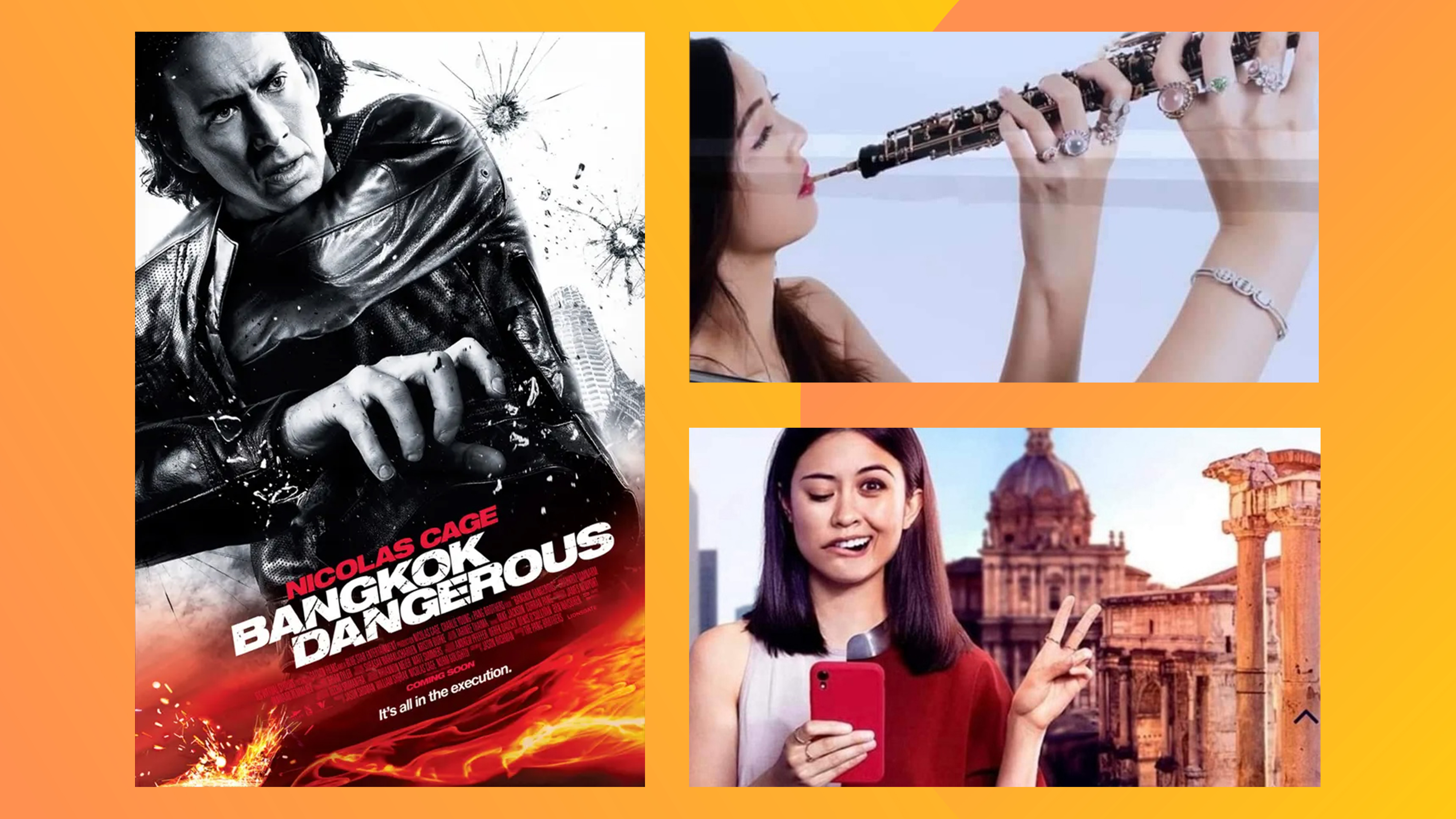
01. Bangkok Dangerous poster
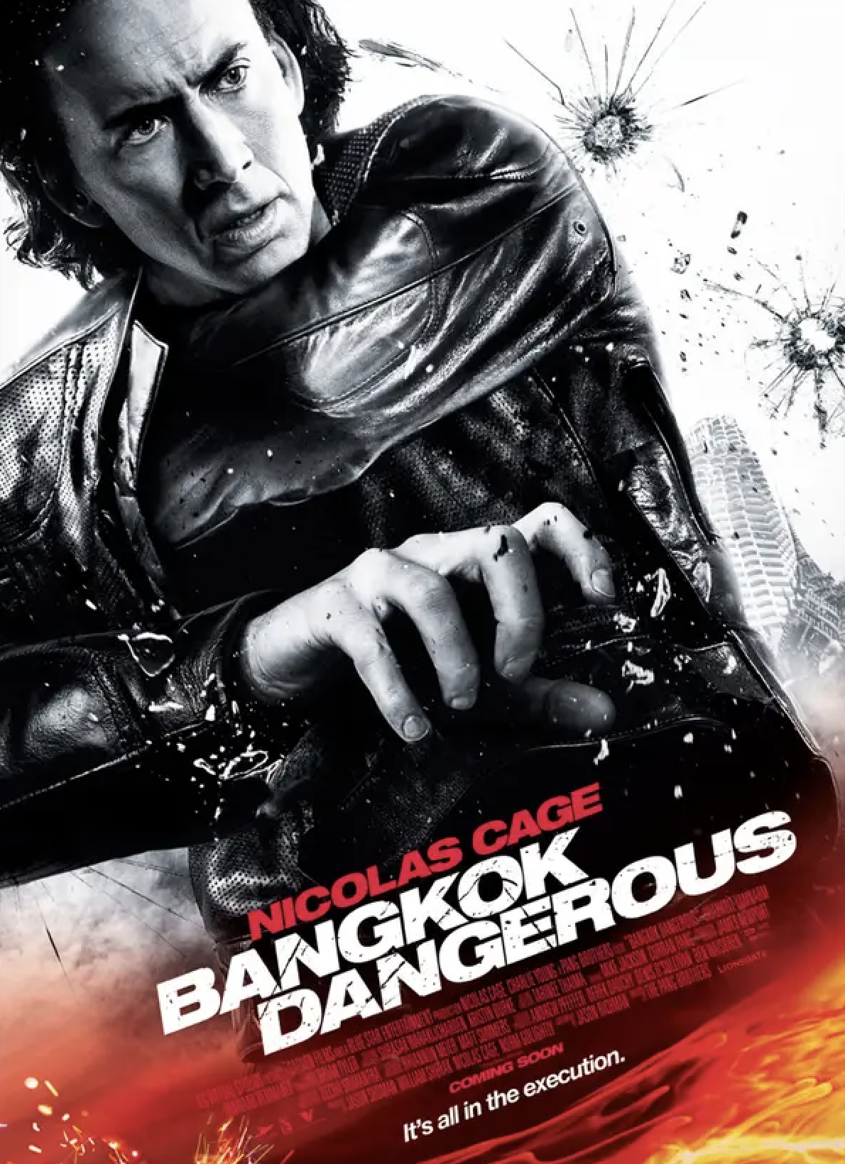
We've already seen plenty of brilliant new movie posters in 2024, but when it comes to botched editing jobs, the Hollywood one-sheet reigns supreme. There are almost too many to choose from, but our vote goes to the design for Nicholas Cage-fronted 2008 action flick Bangkok Dangerous. Somehow the designer has managed to cock up both arms. The left appears to be extending at an impossible angle into the jacket. And in the right hand? Clearly there's suppose to be a gun there. But for some reason, there isn't. It's all in the execution, the poster tagline reads. We couldn't agree more.
02. Travel nightmare
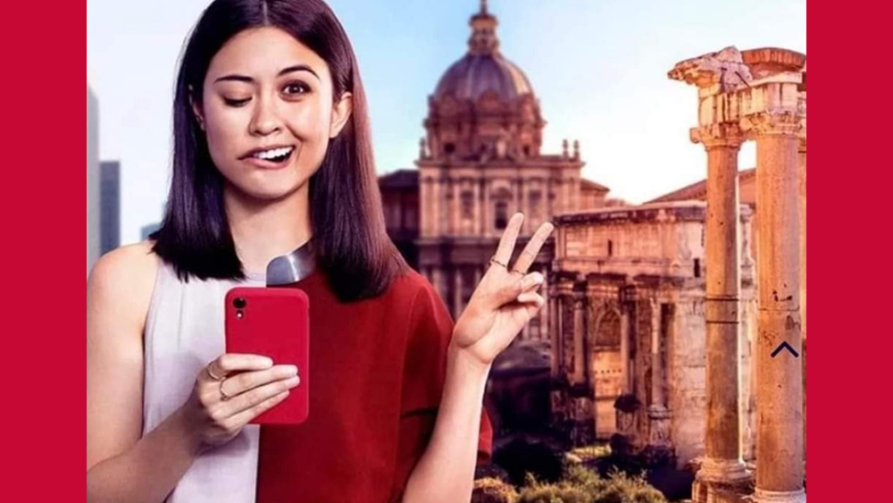
This monstrosity went viral on Reddit a couple of years back. I get it, I think. A travel brand wanted to show a sudden transformation in the face of a young woman as she goes from travelling vicariously by staring at people's social media feeds to taking a selfie of her own on holiday in Europe. A few pixels of space between the two images might have made that work. Maybe. But as it is, the result looks like something very different. "Fly to Europe and have a stroke", one Redditor surmised.
03. What's the title?
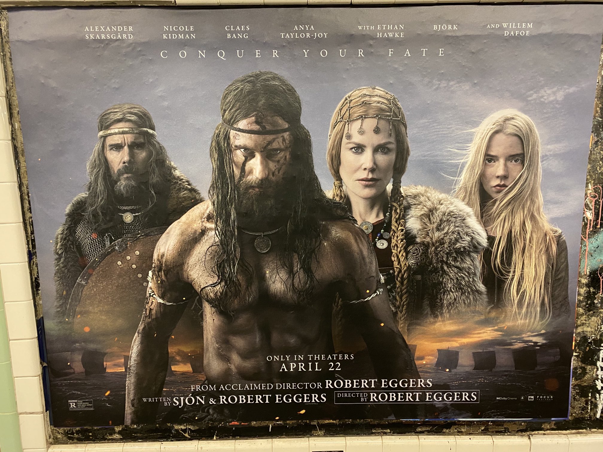
There are a few particular elements you can reasonably expect to see on any given movie poster. Images of the cast? Check. Names of the cast? Check. An intriguing tagline that manages to reveal absolutely nothing about the film? Check. The title of the movie? Believe it or not, it seems this one is no longer a given. New Yorkers were been left baffled by a billboard poster for Viking action film The Northman, after it appeared across the city's subway system sans title. It looks like one of the most basic design fails imaginable – but then again, it did get everybody talking.
05. How not to hold an oboe
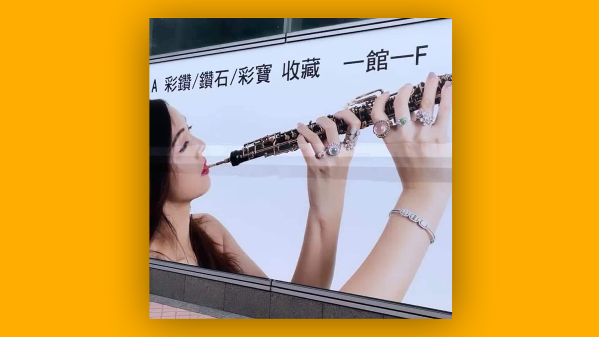
Here's a design fail that hits all the wrong notes. A jewellery ad surfaced on social media a few years back featuring an oboe being played, er, not quite correctly. The ad, designed to showcase a collection of gleaming rings on the musician's (and we use that word lightly) fingers, shows the oboe being held aloft – as opposed to the traditional downward angle – with the hands crossing at a frankly bizarre angle.
Spotted by musical instrument shop Meridian Winds on Facebook, the ad proved a hit on social media – for all the wrong reasons. "Is that one of those rare Japanese wooden, double reed, cross over flutes?" one user comments, while another simply adds, "Using her feet would be easier." But let's not forget, as another sagely chips in, that Jimi Hendrix played the guitar backwards.
05. The world's most offensive logo
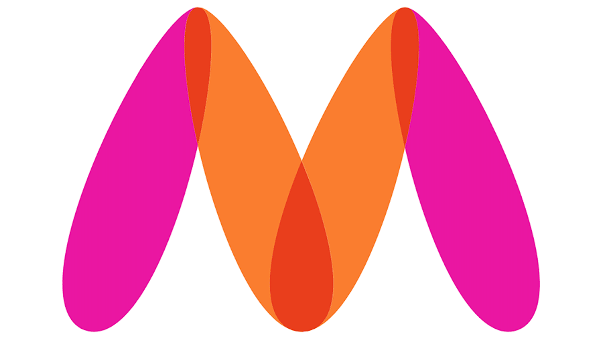
Ever seen a design so bad you wanted to call the police? Same – but here's the only logo we've known actually receive a police complaint. Indian fashion website Myntra was forced to replace its "offensive" logo with a subtly tweaked (but not altogether different) design after complaint was filed against the logo with Mumbai Police’s cyber crime department, claiming that the original 'M' logo (below) "resembled a naked woman". We're not sure we'd have spotted it before, but now, erm, well, um, yes. Many of the best logos of all time feature secret messages, we're assuming (hoping) that Myntra's wasn't intentional.