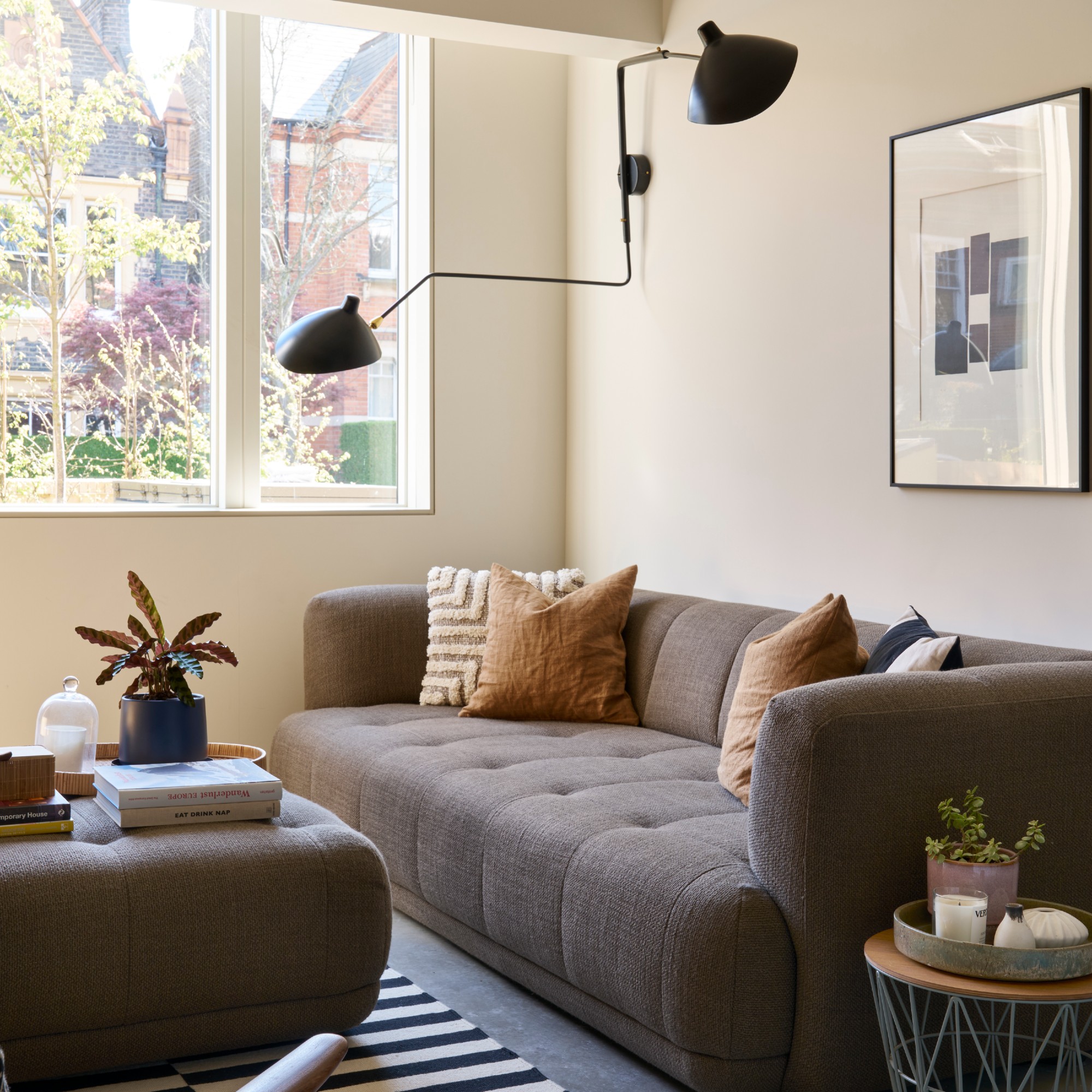
Choosing a colour scheme for any room is usually both exciting and a little daunting. But when dealing with a small lounge, making a decision gets even trickier as you need to be clever here – going for any of the worst colours for a small living room could potentially make your already tiny living space appear even smaller.
But by knowing what shades to avoid and which small living room colour ideas are best to go for, you’re setting yourself up for success. That’s why I’ve asked interior experts what the no-go shades for small lounges are, and they all agreed the below three colours are pretty much the worst offenders.
‘It is generally advised to avoid very dark shades, overly intense colours or harsh, vivid bright tones in small living rooms,’ sums up Bailey Oates, colour expert at Earthborn. But here is a more specific list of the worst colours for small living rooms…
1. Bright white
This one might seem a little counterintuitive as I’m sure we’ve all been told at some point that white living room ideas work well for smaller living spaces. But while white paint might make your small living room appear bigger, it’s also likely to make it look less inviting than if you opted for a softly coloured paint.
‘White is often recommended for small spaces, but very bright whites can make a room feel flat and boxed in,’ says Marianne Shillingford, creative director and colour expert at Dulux.
Claire Garner, director at Claire Garner Design Studio, confirms, ‘Stark whites can feel clinical and uninviting in a compact space.’
Use instead – Warm cream
But, of course, you can find the best white paint for any room, even a small living room. It’s all about the shade and the undertone. And by opting for a warm off-white or cream instead of stark white, you’ll be much better off.
‘Calming neutrals like warm creams work beautifully to reflect natural light and create a sense of spaciousness,’ Bailey at Earthborn says.
Claire Garner agrees, ‘Consider warm neutrals. These tones reflect light more naturally, creating a sense of openness and helping a small living room to feel cosy but not cramped.’
Ammonite is a warm neutral paint shade with grey undertones which is one of Farrow & Ball's best and most popular colours for small rooms. So why not give it a go in your tiny lounge?
2. Bold red
Very bright primary colours in general are not the best small living room idea. But I think we can all agree that red is a lot more intense on the eyes compared to the likes of blue or yellow.
‘Very bold primary colours, such as bright red, can be overwhelming in a small area, creating visual clutter and making the room feel busier and more cramped,’ Bailey at Earthborn says.
Use instead – Soft blush
If you still want to inject some colour into your small living room, instead of going for bright primary colours, opt for soft pastels like blush pink which won’t overwhelm the space.
‘Soft pastels, such as a delicate blush can also add a subtle touch of colour without overwhelming the space. These tones help to create a serene and focused atmosphere while enhancing the feeling of openness and comfort in a smaller living room,’ Bailey at Earthborn explains.
Using Farrow & Ball's new Scallop shade in a small living room is one of the best ways to decorate with it. If you are after a muted pink paint, you'd be hard pressed to find a softer shade than this one.
3. Black or very dark shades
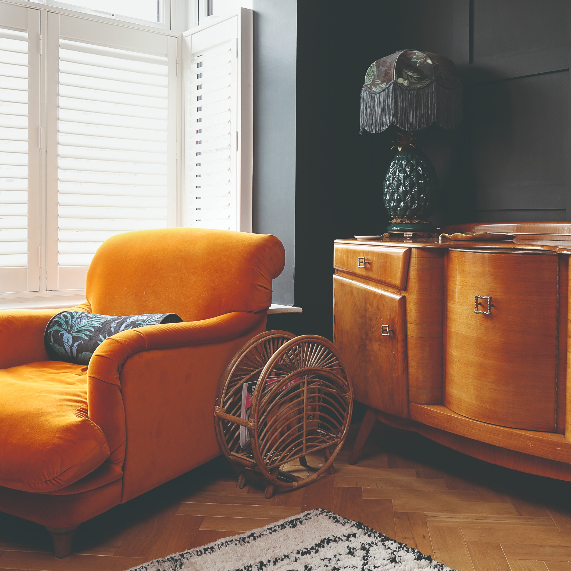
While certain dark shades can have a cosy and cocooning effect, you need to be very careful with dark colours like black, charcoal or deep jewel tones in a small lounge.
‘In small living rooms, the wrong paint colour can make the space feel more closed in than it needs to. Dark, cold shades like charcoal grey, navy or deep forest green will absorb light and make a room feel smaller, especially if there’s limited natural light,’ Claire Garner says.
If you really want to incorporate a dark colour, living room feature wall ideas could be the way to go. ‘For a small living space, a feature wall can help to add depth and visual interest – especially using a darker colour,’ Marianne at Dulux suggests.
Use instead – Sky blue or sage green
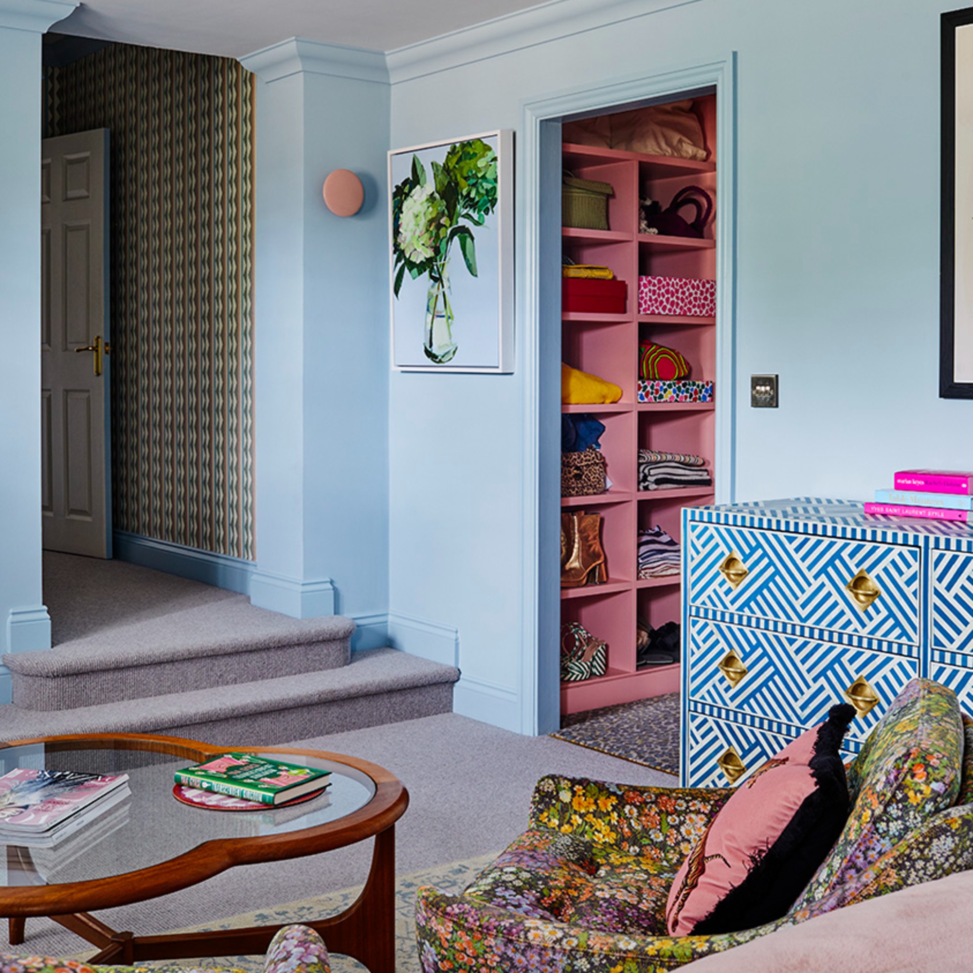
Going for soft, nature-inspired tones like sage green and sky blue is not only a nod to biophilic design ideas, but it will also create an airy and open look which is certainly desirable in a small living space.
‘If you have a small space, consider a muted, calm colour like sage green,’ confirms Emma Bestley, creative director and co-founder of YesColours.
Lick's Blue 04 is part of the brand's colour palette of the year for 2025. And it's the most perfect tone of soft sky blue that you could imagine.
Hopefully, this little guide to the worst colours for a small living room has averted any decorating disasters. Colour is a great tool in making a small living room look bigger and it would be a shame to achieve the exact opposite effect with the wrong colour choice.