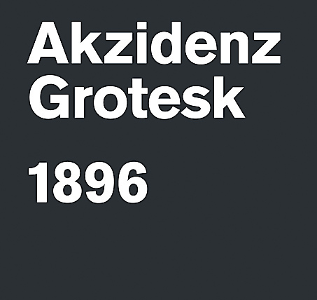
Probably the best typeface ever designed. First released by the Berthold Type Foundry in 1896 in Germany, its popularity increased after it was developed in the 1950s under the direction of Günter Gerhard Lange with a wider range of weights and variants. Akzidenz influenced a whole range of other fonts including the infamous Max Miedinger’s Helvetica and Adrian Frutiger’s Univers – though neither of these has the detail and elegance of Akzidenz. Its strength derives from its neutrality and the fact that it doesn’t overdominate when used, allowing the designer more freedom and versatility Photograph: Domenic Lippa
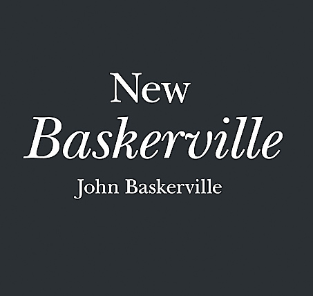
Probably the best serif typeface ever designed. Not showy but full of confidence, Baskerville is known as a transitional serif typeface and was originally designed in 1757 by John Baskerville (1706–1775) in Birmingham. A transitional typeface is positioned between the old-style typefaces of William Caslon, and the modern styles of Bodoni and Didot. Since then many versions have been produced by various type foundries including this popular New Baskerville version. What really makes it work is the way the roman and italic versions are successful whether used together or individually Photograph: Domenic Lippa
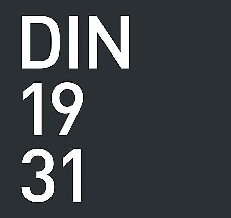
Designed in 1931 for the German standards body DIN – Deutsches Institut für Normung (German Institute for Standardisation) – it looks and behaves as if it had been produced today. It extols all of the principles of the Bauhaus and has not dated in any way. It has two strong characteristics – first, it is a condensed font, meaning on a very simplistic level that it creates a strong mass when used as text and therefore the type can become more of a shape. Second, it has a quietly beautiful rounded detail, which makes it feel like it was designed for the age of computers, but still retains a gentleness Photograph: Domenic Lippa
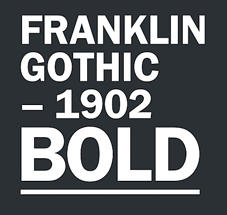
Produced by the American type designer Morris Fuller Benton (1872–1948) in 1902, it reflects everything that America was aspiring to and would become – confident, bold and expressive. It’s American through and through. The bold version I think is best: its blackness is just so powerful. Franklin Gothic has more character than other realist sans serif fonts. I’ve always believed Franklin Gothic works best next to a more subtle, sensitive font. The best example was seen in the groundbreaking work by the American-based French designer Fabien Baron for Vogue Italia in the late 1980s Photograph: Domenic Lippa
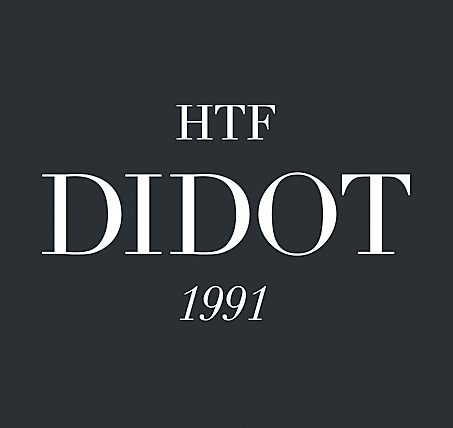
This is a revival font. I could have chosen Bodoni, which I also love, but Didot gets the nod over its Italian sibling. However, it’s this particular cut by the type designers Jonathan Hoefler and Toby Frere-Jones that I think is something near to perfection. It was created for the Harper’s Bazaar magazine in the 1980s for the aforementioned Fabien Baron. It just feels like a fashion font – effortlessly beautiful but honed and crafted. But beware – it is tricky to use as it’s so delicate. It needs to be handled with care as the characters have extremes of thicks and hairline thins. It’s simply beautiful Photograph: Domenic Lippa

Released in 2000 by Hoefler and Frere-Jones, this clean, modern sans serif typeface has become possibly the most popular font for designers over the last 13 years. It is rumoured to be Obama’s favourite typeface but I’m not sure whether this is just an urban myth; it was, however, specifically used by the Obama campaign during the 2008 election. Originally commissioned by GQ magazine, it is very much an American font in that its design was inspired by the lettering found on the architecture of New York City Photograph: Domenic Lippa
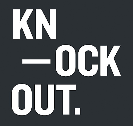
Knockout gets my vote almost just for its name. All the variants are based on different boxing weights. It is another design from the Hoefler and Frere-Jones type foundry, consisting of a family of 32 different sans serif weights. Knockout’s nine-width, four-weight family offers a range of options that cannot be achieved with even the best modern sans serifs. Most fonts begin their life with maybe just a regular, bold and italic version. If a design is successful then more weights are added as required over the years. Knockout was created as a family from the outset and therefore has achieved instant integration and balance Photograph: Domenic Lippa
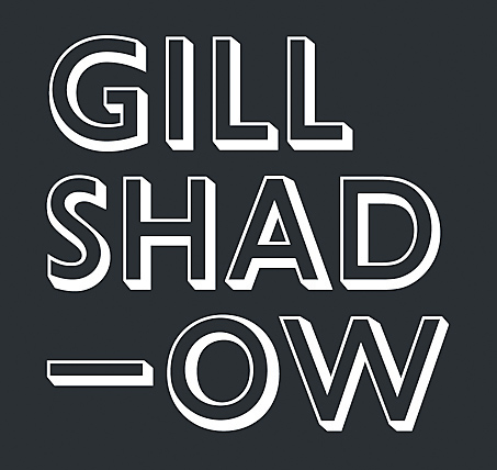
Eric Gill designed this quintessentially English font in 1928, produced by the Monotype Corporation. The typeface was inspired by Edward Johnston’s Johnston typeface which was designed for the London Underground. Gill had worked with Johnston and this was his attempt to make the most legible sans serif font. Unlike other more functional sans serifs, Gill was imbued with distinctive characteristics – look at the cap “R”, for instance. Used extensively by many, including the BBC – Gill also made sculptures for the facade of Broadcasting House in London. The variant Gill Shadow stands out as one of the font’s most gloriously idiosyncratic expressions Photograph: Domenic Lippa
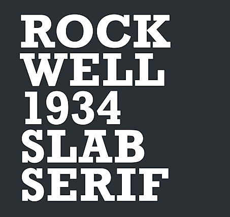
Rockwell is an instantly recognisable slab serif font where the serifs are similar in weight to the horizontal strokes of the letters. Designed by the Monotype foundry’s inhouse design department in 1934, its distinctiveness originates from its geometric form. Although primarily used as a display font, it is the type of font that adds personality to any piece of design. Most typefaces need to be respected and work with your design; however Rockwell is robust enough for you to do things to it. You can pull it apart and clash it together. It has such a great sculptural form but somehow retains its quality Photograph: Domenic Lippa
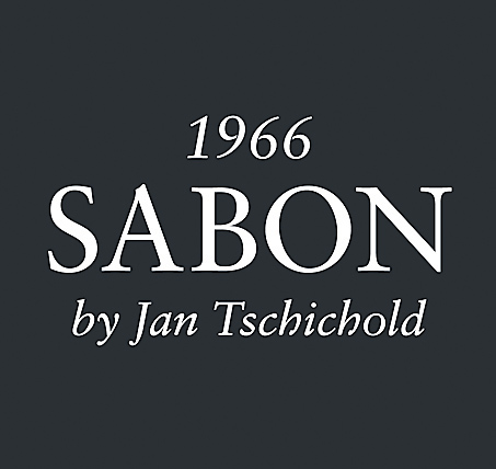
Jan Tschichold was a pioneer of modern graphic design. Swiss by birth, Tschichold was active in possibly the most influential period in graphic design history. Between 1947 and 1949 he worked in England where he oversaw the redesign of hundreds of paperbacks for Penguin Books. Most graphic designers do not make good type designers; Tschichold is an exception. He designed several fonts but it’s his 1966 old-style Sabon serif for which he’s most widely known. Based on the typeface Garamond, its uniqueness is that the roman, italic and bold weights are all the same width when typeset Photograph: Domenic Lippa