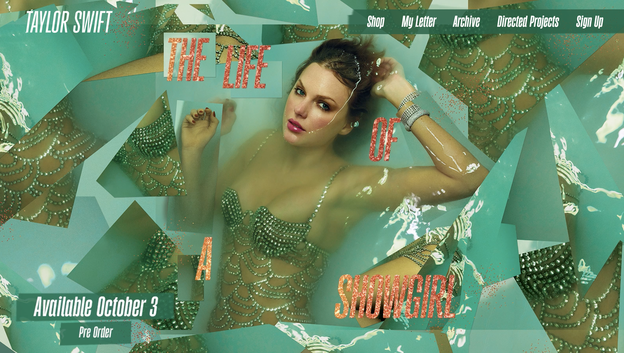
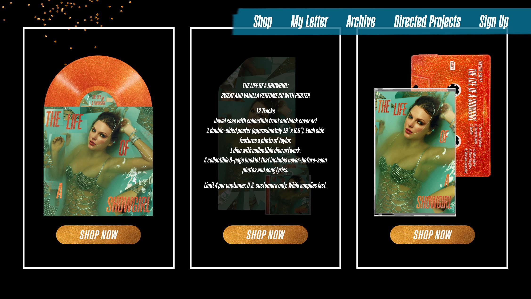
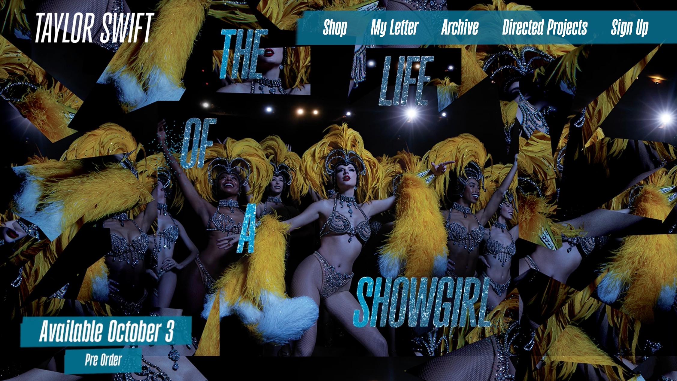
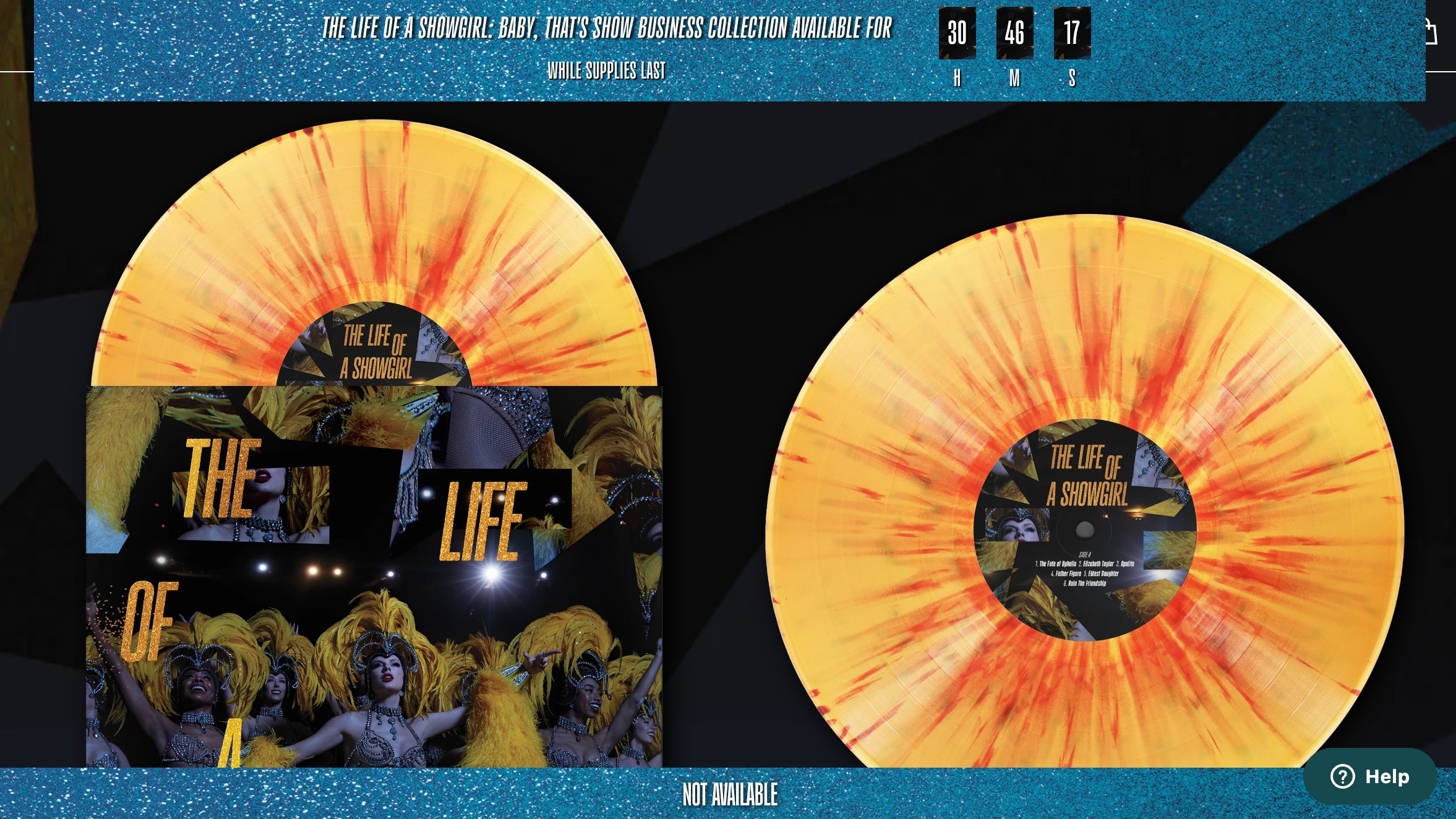
By now, Swifties have (somewhat) recovered from the collective hysteria of Taylor's upcoming album announcement, and while many were suitably enamoured by the cover design, there's one pressing fatal flaw – that colour scheme. While orange and green might make a fetching palette, it spells bad news for accessibility, meaning there's much to be learned from Ms Swift's design flaw.
You can employ the best designers or opt for the best website builder, but without accessibility at the forefront of your design, you risk alienating a huge audience. By today's standards, aesthetics and accessibility need to work in tandem, and sadly, Taylor's website misses the mark.
The design flaw of Taylor Swift's website revamp was discovered by brand and web designer Lauren Sherrard. In a blog post on her website, she outlines the multitude of accessibility issues with the site, stating that functionality should be a baseline to any design project (especially one from a billionaire with a huge record label).
Fundamentally, Lauren highlights that the orange and green palette is "almost indistinguishable" to those with colour blindness due to their closeness in the colour wheel. She also points to glittery, flowing motion design, tiny unreadable fonts and all caps text, which can be difficult for certain users to process.
"Taylor Swift’s latest website is an example of how accessibility is overlooked in digital design. Low colour contrast, tiny fonts, missing alt text and broken HTML all create barriers that exclude people and limit independence," Lauren tells Creative Bloq.
"Accessibility isn’t a Helpdesk issue to be fixed later. It has to be baked in from the start, starting with branding and carried through every stage of website design and development," she adds.
For more design insight, check out the best accessible fonts or take a look at these stylish HTML examples.