
Tan France may be the fashion expert on Queer Eye, but (unsurprisingly), his excellent taste in clothing extends to his interiors.
The style maven recently shared photos of his home's kitchen, which he shares with partner Rob France on Instagram, and between the chic, black stove, marble backsplash, and black and white tiled flooring, it's a sight to behold. One of the most striking elements, however, is the gold-framed artwork.
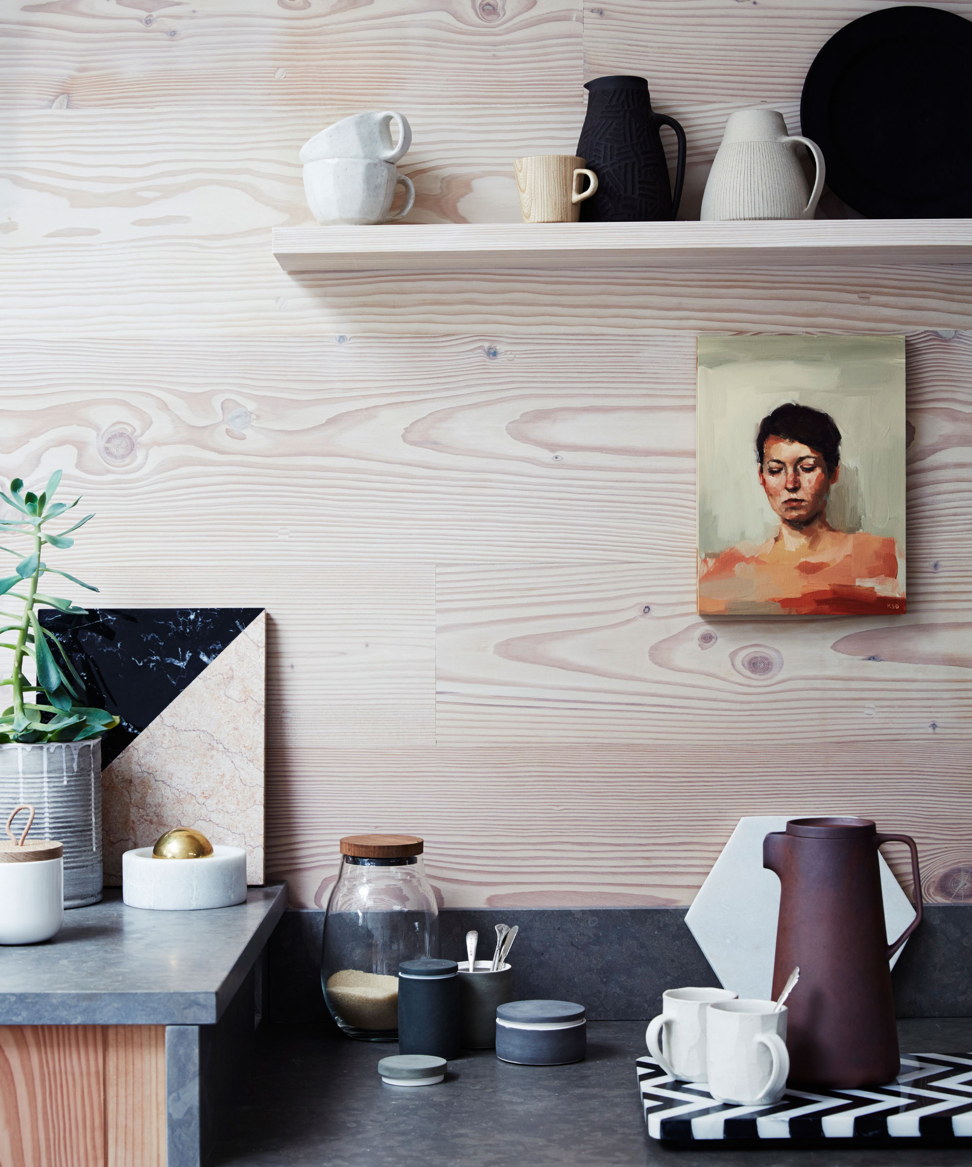
Choosing a piece of artwork for the kitchen can be narrowed down, first and foremost, by theme, as experts explain.
'In my experience, kitchens with lots of windows look great with canvas or prints depicting nature or water to bring the outdoors in,' says Artist and Creative Specialist at Green Lili, Michelle Collins. 'Botanical and nature-inspired prints can also raise mood and provide a sense of calm in cozier spaces with less natural light.'
Alternatively, Michelle says that modern kitchens can benefit from simple and minimal lined artwork, while humorous typography is great for enhancing light-hearted spaces.
Color is also a huge factor in choosing a piece of artwork for the dining space. Color is a mood-booster, and there fits in seamlessly in a gathering area like the kitchen.
'For an energetic, happy space, opt for bright and warm colors,' Michelle says. 'Reds and yellows can actually stimulate the appetite, and oranges and yellows can create a more homely feel.'
Meanwhile, those who prefer cooler or more neutral palettes have lots of options to choose from, too.
'Go for light blues for a relaxing, peaceful space, perfect for after-work dinners,' Michelle suggests. 'Fresh greens can create a serene space reminiscent of nature and botanicals. If in doubt, neutral colors never go out of style and are perfect for injecting warmth if you’re not as confident using color.'
Finally, consider placement; while our natural instinct may be to fill vast spaces with large prints, putting artwork in tight gaps can actually be a more effective way of displaying pieces.
'Smaller prints are often more versatile and easier to move if you want to redesign,' Michelle says. 'They also look great leaning against a worktop or sitting on shelves and cabinets, especially if you’re in a rental property and don’t want to drill permanent holes into your walls.'
Below, find a few different art prints that suit different kitchen styles.
A fine line against a white and gray background is the ultimate minimalist art piece.