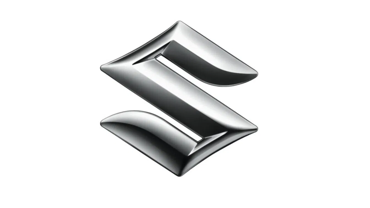
Suzuki has unveiled its first new logo in 22 years, thus ending its era of refusing to bow down to the flat logo trend. While most other car brands removed their shiny, skeuomorphic logo designs yonks ago, Suzuki has been proudly wearing its metallic sheen as a badge of honour. But this week, the motor brand redesigned its logo, and it's a more minimalist redesign for the digital age.
Many recent car logo redesigns have taken the new era to an extreme, with completely flat new marks, that retain none of the texture of the previous iterations (looking at you, Mazda). Suzuki, however, has retained key elements of its aesthetic detail – and I think this is a triumph of a redesign that doesn't feel boring or as if it only belongs on a screen.
See it below for yourself and decide if it's one of the best logos of recent times.

As you can see, the main body of the S has transformed to a matte grey/silver gradient. The 3D-style ridge within the S is gone, but there is a shiny silver ridge around the edge (inverted in colour from the old dark edge), which adds much-needed texture back in. The S itself is also more widely scaled, for better legibility.
When in situ on the car, the logo will be created in a silver paint rather than the glossy chrome, which is an environmental decision.
According to Suzuki, the new logo represents continuity and change, in a fast-paced chapter for the automotive industry. The redesign comes with a new tagline, 'By Your Side'.
Suzuki President and Representative Director. Toshihiro Suzuki explains: “The new emblem embodies Suzuki’s long-held commitment to create valuable products by focusing on the customer, as well as our determination to take on new challenges for the future."

This redesign is unlikely to come with any controversy, in fact fans over on Reddit are overwhelmingly positive.
What do you think about the new Suzuki logo? from r/logodesign
Perhaps due to the thread sharing the basic version of the logo, that comes in red and only shows the outline of the S mark, the usual voices crop up questioning "how much did they pay for this tiny change?". But even in this case there are responses defending a brand refresh for its purpose of retaining consistency while improving legibility and adding modern touches (for another example of that, see what happened when Walmart underwent a brand refresh). After all, as Jaguar proved, a total brand overhaul isn't automatically a great move.
Fans also reference the original Suzuki logo, calling it 'badass', and I've got way more time for this angle. That striking double phoenix illustration was awesome, and I wish we still had more illustrative logos around – but legibility and flexibility is also a key consideration with that amount of detail.
Overall though, when shown in the silver iteration, this redesign is markedly different. It's fresh, modern, and a positive move forward for the brand. What do you think? Let us know in the comments.
Want more? See the best rebrands ever here.


