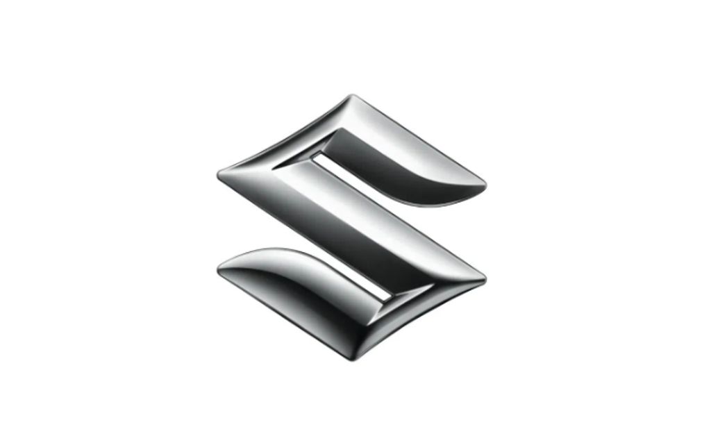
In the world of gearheads, Suzuki has to have one of the most recognizable badges because it uses the same emblem on both its motorcycles and cars. And I'm assuming most of you folks reading this are gearheads, so you may or may not be fairly happy to know Suzuki has given its emblem a refresh for the first time in 22 years.
Fear not, the iconic 'S' remains, but it lives in the same digital age as all of us now. The design is supposed to embody the brand's 'By Your Side' slogan, and remain true to Suzuki's mantra of "focus on the customer", while also looking toward the future.
Here's what Suzuki thinks when we talk about what comes next.

Speaking about the new logo, Toshihiro Suzuki, Representative Director and President of Suzuki, said, "The new emblem embodies Suzuki's long-held commitment to create valuable products by focusing on the customer, as well as our determination to take on new challenges for the future. Under the corporate slogan 'By Your Side', we will continue to walk alongside our customers by providing infrastructure mobility closely connected with people’s lives, contributing to the realization of a sustainable future.”
Gone is the bulging 'S' design that's synonymous with the brand, which looked like it was machined into a chrome medallion, with all the shading and curvaceous details we'd have associated with digital art two decades ago. Now, however, we've, or at least Suzuki has, moved past curvy designs in favor of a minimalist, near-flat design culture—just look at the Suzuki Jimny or V-Strom 800DE, and you'll see what I mean.
The latest design represents the modern, minimalist, or sometimes utilitarian design, we see in plenty of Suzuki's latest vehicles. The new badge has been flattened out, given a clean look, almost like it was cut from a thick sheet of metal, finished with some beveled edges—the only way you can tell this is a 3D image rather than a 2D sketch—and polished off. The part I like the most is that the new design does away with the chrome finish we're used to on Suzuki badges; in place is a new high-brightness silver paint.
The new paint finishes the look in a clean, modern way, but also cuts the environmental impact when producing the badge. Those of you who can't wait to see this in the flesh will get your wish soon enough, as it'll be on display on the concept machines at the 2025 Japan Mobility Show.


