Summer is almost in full swing, and the natural world is a kaleidoscope of vivid color. This summer's paint trends reflect the full-throttle color that summer ushers in, and for 2025, the memo from designers is clear: more is most definitely more.
When it comes to forecasting the biggest color trends for the summer season, the interiors scene in 2025 has been awash with bold, vivid, and unapologetic color, so if you are on the hunt for room color ideas, there is no shortage of inspiration this year.
Here, we have consulted expert designers and trend setters to get all these bang-on-trend colors in one place, so if you are re decorating, looking for summer decor ideas, or just interested in those colors that have got designer's pulses racing this season, this is the ultimate list of hues to look out for.
1. Baby blue is back for summer 2025
Baby blue is having a design moment right now. For centuries, decorating with blue has been a go-to, and it will remain so for centuries to come. As with all colors, though, there is an infinite variety of shades within the spectrum, and the blue shade in the spotlight this summer is its palest, gentlest form seen in irises, cornflowers, and hydrangeas.
'Baby blue is especially lovely set against antique brown furniture,' notes UK-based interior designer Sean Symington. 'Used thoughtfully, it can help other tones in the palette sing, whether that’s crisp whites, warm neutrals, or bolder accents.'
Beautiful baby blue shades worth swatching are Notting Hill by Mylands, or if you are keen on something even paler still, try Borrowed Light by Farrow & Ball.
If you are attending a wedding this summer season, there is perhaps no better wedding gift than this beautiful tablecloth patterned with stripes and detailed with dainty bows. Although, perhaps it's safest to buy two in case you find you want to keep it for yourself.
A mesmerizing mix of color and texture, this blue lamp is a true statement piece. Its urn-shaped ceramic base is speckled in a particularly beautiful shade of baby blue. Two of these in an entrance hall would look stunning.
If you love baby blue, this is the pillow to get your hands on. It would work in any interior style, and whilst it isn't a huge statement maker, it would look quietly elegant on any bed, sofa, or chair.
2. Red and yellow is the color combo of the season
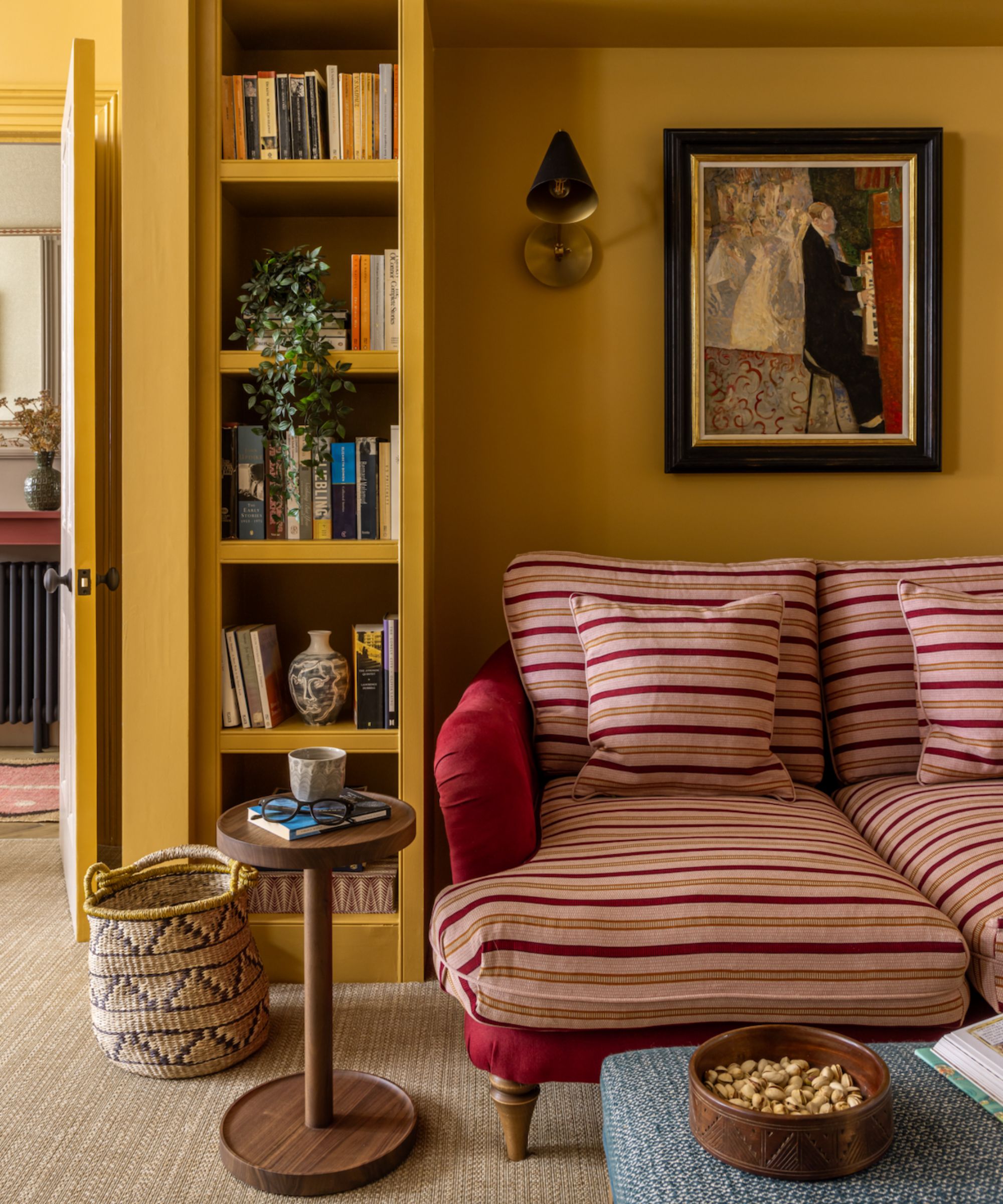
Many interior designers have their eye on the red and yellow color combination, and it seems to be the it pairing for summer 2025.
'The combination of red and yellow creates a bold, energetic statement in interiors, bringing warmth, vibrancy, and immediate design impact,' explains Ruth Mottershead, Creative Director at Little Greene. 'This pairing sparks energy and passion, making it perfect for lively, high-traffic areas such as a entryway.'
In this British home designed by interior design firm Otta Design, a saturated hue of red and yellow has been coupled together for maximum impact. 'The earthy ochre of Farrow and Ball's India Yellow gives this sitting room a warm and uplifting feel during daylight hours, but cozy and moody in the evenings,' explains Ali Johnson, Director at Otta Design.
Addison Ross trays have become iconic. If you are considering a deep red and yellow theme, this would be the perfect finishing touch.
Dolce & Gabbana's homeware is just as bold and expressive as its famous clothing, so pieces like this red wine glass will add a joyful finishing touch to your tablescape.
Bolster pillows will never, ever go out of style. This rich two-tone design is perfect for a colorful bedroom scheme or a simple room that needs a pop of energetic color.
3. Blue grays are seeing some resurgence
This is likely not the first time you have heard us say that decorating with gray has fallen out of favor with most homeowners and interior designers.
For many years, gray paint was the stalwart of interior design, but now most interior designers agree there are plenty of times when you should never paint a room gray, and when used wrong, it does nothing other than make a room feel eerie, cold, and bleak.
That said, there is a time and a place for a well-mannered gray paint. Many of us need to use, or would like to use, gray paint to punctuate spaces in our home, rather than painting an entire room in this chilly color. Doing so can feel like the interiors of the past if you don't choose your hue wisely.
Instead of flat graphite grays and simple scandi-sleek hues, summer color trends are all about those with a gentler, milder presence with a blue and green undertone. Too blue, it will read icy-cold, too green, and it will feel overwhelming. Judiciously selecting a gray paint that strikes the perfect balance has quickly become the ultimate test of the season. Our pick? Try Pigeon by Farrow & Ball or Lamb's Ear by Mylands for grays with personality.
This delightful little mirror is the perfect blue-gray tone, not at all corporate or harsh.
If you're already familiar with the sumptuous, blankety quality of Loro Piana's cashmere knitwear, then you'll know just how soft this gray and beige throw is. Perfect for the end of the master bed or guest suite.
An uber contemporary chair for an uber modern space. We can't peel our eyes away from this Slipper Chair, which adds a modern, sophisticated touch with plush velvet and sleek chrome.
4. Orange is the new neutral for summer 2025
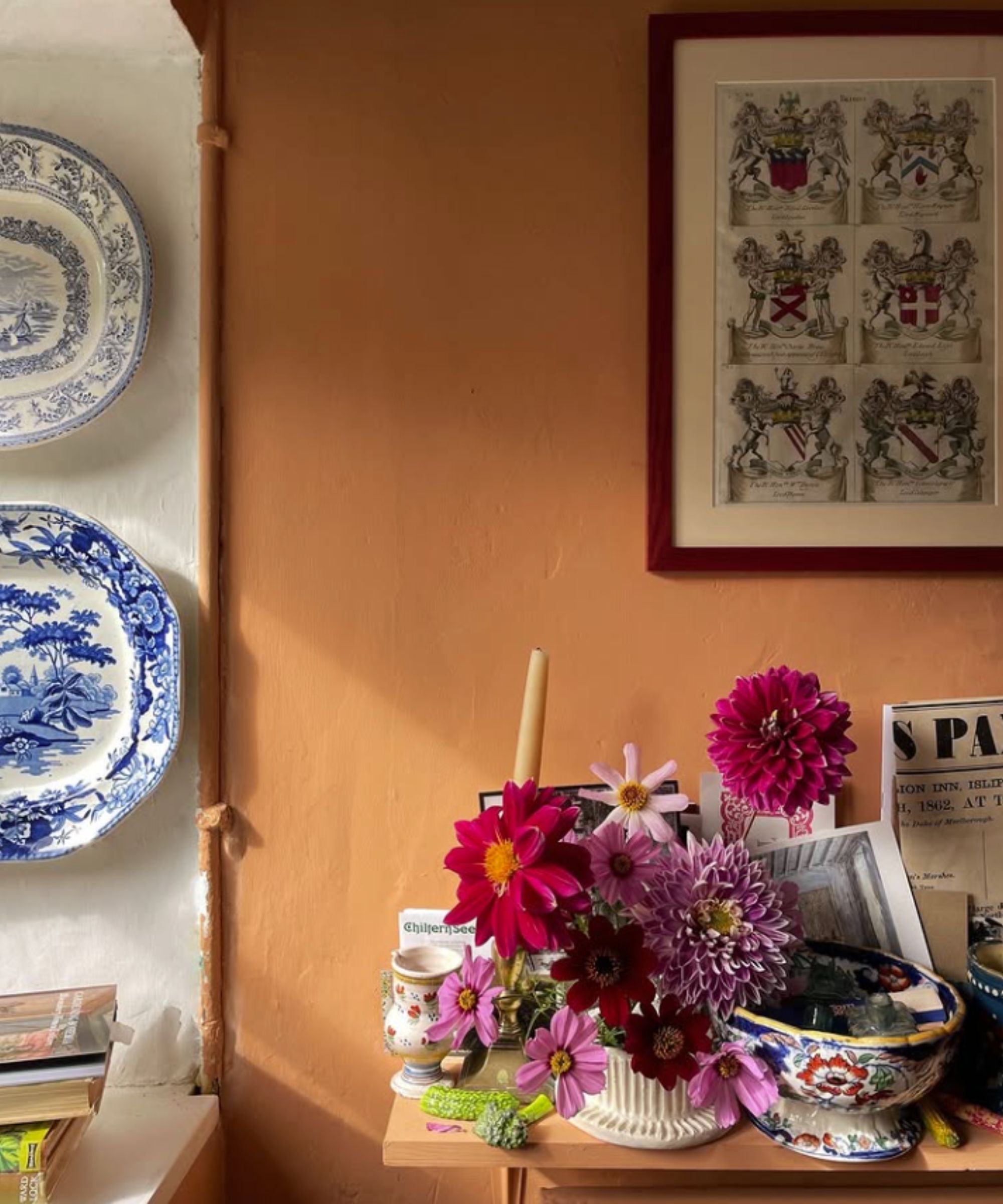
Terracotta paints were all the rage in 2024, and they remain on trend as we waft into summer 2025, too. But terracotta's louder and bubblier sister, muted orange, is having its best year yet, being seen in all the most coveted interiors across the country.
Decorating with orange may seem brazen, but its optimism and smile-inducing qualities are not to be ignored. Interior designer Leah Harmatz offers advice when picking an orange paint that will work.
'Pick orange shades that are warm, muted, and have an interesting depth to them. I lean toward shades that feel subtle and aren't overly saturated, with hints of brown and red. These colors are all shape-shifters depending on the light in the room, but they always have a warm, velvety feel.'
Interior designer Jen Bienvenu adds: 'Orange, coral, red, and all their radiant cousins are emotionally charged, and full of energy and invitation. They flatter candlelight, bring out the warmth in wood tones, and somehow make everyone look just a little more alive across the table.'
If you are wondering which orange paint to swatch, try muted, rich shades like Crayfish Party by Mylands or the most delicious shade 'Heat' by Little Greene.
This utterly beautiful sofa throw comes in a few colors, but the burnt orange is definitely the best and most coveted of the season. It would look stunning all summer, and you would still want it seen in fall and winter.
We have fallen head over heels in love with these copper colored velvet dining chairs. They have a hint of '60s vintage fun to them, and so look effortlessly cool and stylish.
Every summer, al fresco dining season calls us all to find our tablecloth collection and put them to work. It's easy to opt for white, which does always look chic, but gets messy and dirty fast. Try a darker but still sunny color, like this instead.
5. Move aside sage green, bottle green is taking over
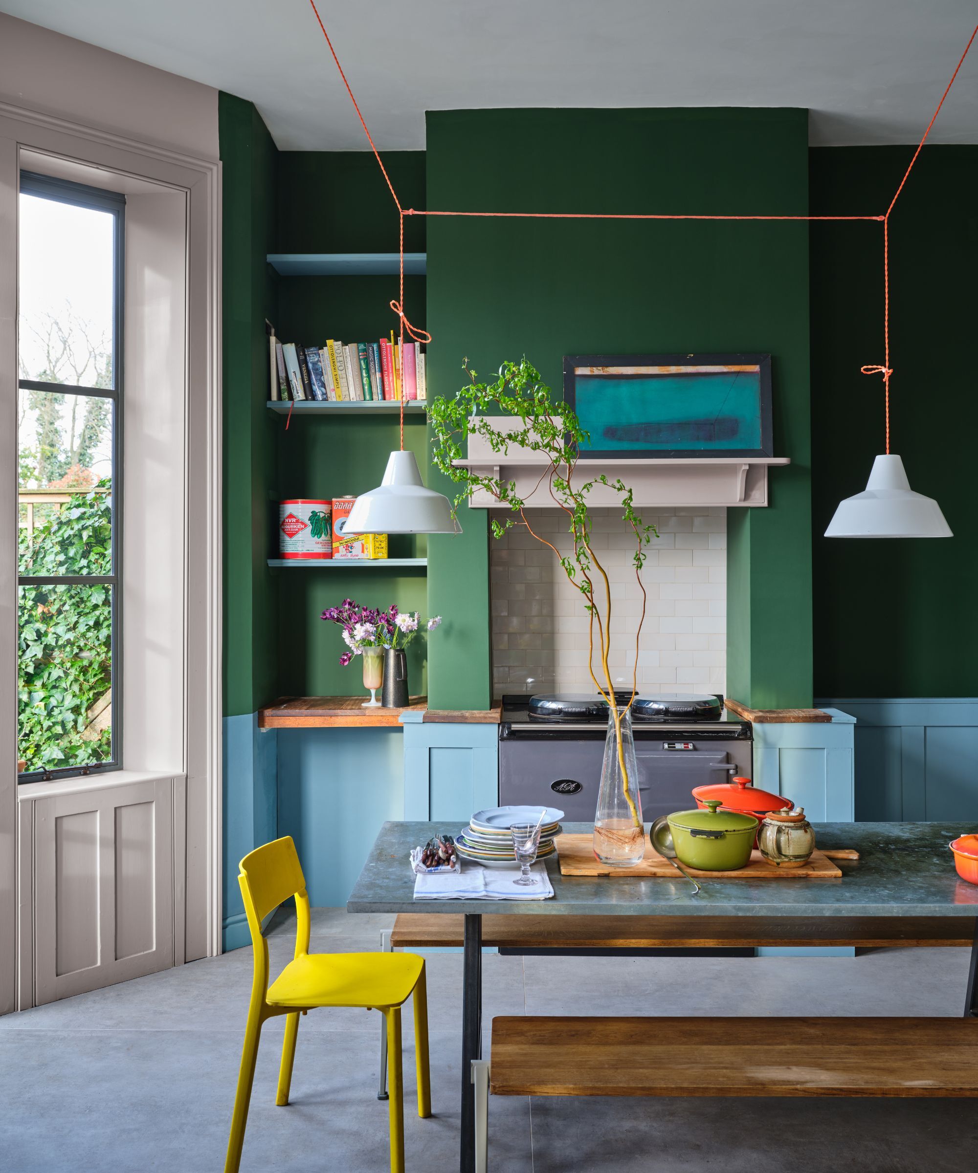
Whisper it, but the obsession with sage green paint seems to have well and truly passed for summer 2025.
Decorating with green has always been, and will always be, a timeless room color idea, no matter what season. That said, sage green seemed to soar in popularity in recent years, and its ubiquity meant it became so expected, so oversubscribed, that it often feels stale and uninspired.
Instead, interior designers have been moving towards stronger hues of green, especially at this chlorophyll-rich, lush time of year. 'A green color with a higher pigment content will feel more striking and more exciting,' explains London-based interior designer Fiona Duke. Bottle green in particular is having its moment in the limelight this summer.
Shades like Pleasure Gardens by Mylands or Hunter Green by Benjamin Moore are ones to get your hands on if you love this rich shade.
Get your hands on this gorgeous bottle green mirror with a scalloped frame, with soft, curvy corners. It would look infinitely elegant above a vanity unit with sconce lights on either side.
If you love that dark, verdant green color, then these placemats are going to be top of your list for dinner party planning. Layered with tonal green plates and napkins, this would be the tablescape of dreams.
Add a very literal pop of bottle green to your kitchen with these glasses made from recycled beer bottles.
6. Beige is out, plaster pink is in
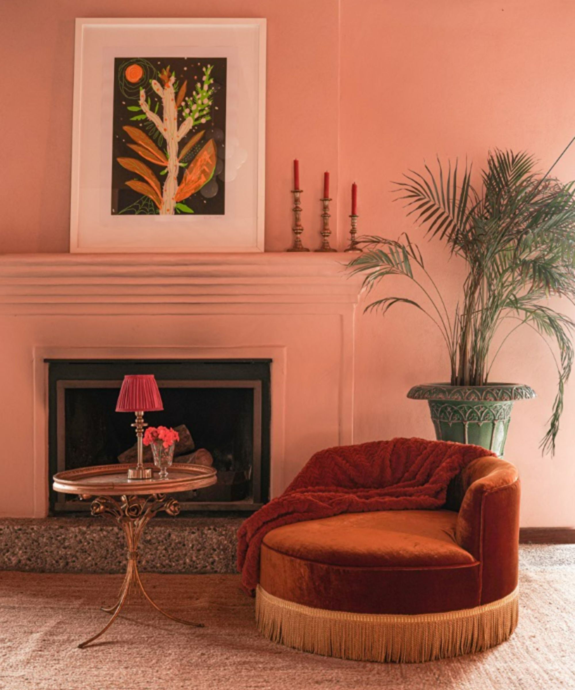
Plaster pink is another popular color trend that interior designers are turning to for summer 2025.
Interior designer Matthew Williamson explains: 'These days, I never tire of a soft plaster pink used on the walls or accessories. It’s always been my go-to neutral, as it is warmer than gray, more interesting than beige, and more forgiving than white. For me, it’s a color that I’ll return to again and again to create a bright yet inviting atmosphere for summer.'
'I love using this color to color drench a room in one tone, which adds a contemporary update as it unifies all the surfaces and makes the most of otherwise hidden details such as architraves and cornices.'
If you love plaster pink, then you have to invest in this rustic, dusky terracotta colored bedding set. It has that easy, laidback, life lived softly vibe!
These were originally popular mementos for the wealthy traveling in Europe in the 18th and 19th centuries. Traditionally, they are black and lilac, but Anthropologie has brought out these gorgeous iterations, perfect for the 21st century.
This color looks its very best when in linen. If you're looking for scatter pillows in this hue, these are perfect and have a silky texture, so ideal for the bed or couch.
7. Consider celestial and metallic tones
'Celestial and metallic colors are in for summer,' observes interior designer Nadia Watts. 'Using metallics and striking colors is a great way to add dimensions and excitement to your space without having to redesign your entire space.'
'When you incorporate bold color, you can use it sparingly and still get a big “wow” factor. Already have a blue color story? Add a pop of metallic cobalt. Starting with a green scheme? Bring in a celestial citrine.'
'Layering color on color in different finishes creates depth and interest and elevates your color story throughout.'
A beautiful, simple decorative pillow with delicate starry shapes and a soft silver fringe.
This beautiful and highly unusual silver-plated vase would make a serious aesthetic statement on any dinner table this summer.
This celestial-inspired wallcovering will lend a dazzling touch to your decor. It would of course, look stunning in a child's nursery, but equally as dreamy in a powder room or dressing room.
8. Butter yellow is going nowhere this summer
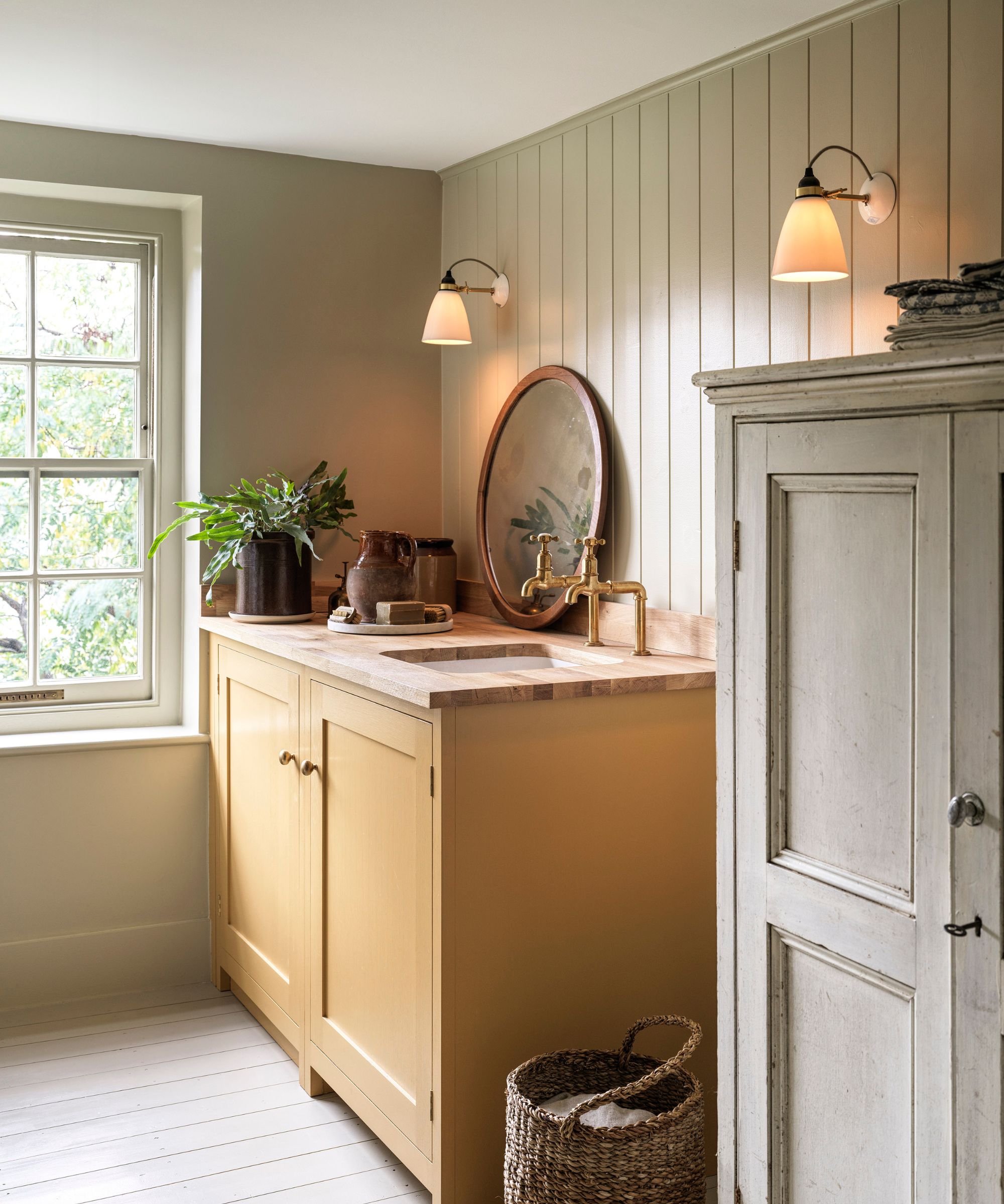
Buttery shades of yellow are one of 2025's biggest summer color trends. Giving creamy, magnolia shades a new lease of life, these buttery tones have a retro feel and are a sophisticated take on decorating with yellow. A trend that emerged first in the fashion industry, it's officially made its way into interiors and is one that designer Kristina Khersonsky of STUDIO KEETA loves.
Her favorite paint to use for this trend is Benjamin Moore's Mayonnaise, which she describes as 'a creamy warm white' that 'has a subtle butter yellow tone, which gives the space a lift and sense of freshness and warmth.'
'We’ve used this color top to bottom in a recent primary bedroom from wall finish, custom bed frame, and even down to the closet hardware. Our approach was monochromatic, and we opted to drench the room in this warm tone. The result was a neutral, palette-cleansing bedroom without cold or washed-out undertones.'
There is nothing sweeter than that retro-inspired look of butter yellow gingham. This sunny butter yellow pillow would work wonderfully in a butter yellow scheme.
This gorgeously soft linen bedding set is one of the most flattering shades of butter yellow. If you are thinking of bringing smaller accents of bright color into your home, this is a great way to do it.
If there was an award for the most bang-on-trend cereal bowls of the moment right now, the award would go to this set from Anthropologie. It's classic, it's timeless, we can't get enough!
Whether you choose to refresh the color of your walls this summer with paint ideas or turn to smaller decorative items, these summer color trends will soon refresh your home and achieve an on-trend, breezy summertime look.