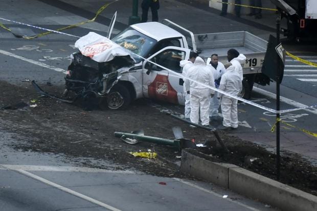
On October 31, New York saw the deadliest terrorist attack since 11 September 2001, when 29-year-old Sayfullo Saipov drove a truck down a bike lane, killing eight people and injuring more than a dozen.
With fears of attacks around the world at a high, Carnegie Mellon researchers teamed up with Robert Muggah, a global security expert and director of the think tank Igarapé Institute, to visualize terror risks from a bird's-eye view.
Together, they created Earth TimeLapse, an interactive platform that relies on data from the Global Terrorism Database to create maps of how many terrorism-related deaths occur annually worldwide. The larger the red circle, the more deaths in a given attack.
The project mapped attacks between 1997 and 2016 — here's what 20 years of that data looks like.
• This map shows the most dangerous countries in the world for tourists
• How to survive a zombie apocalypse
• Here’s how eating sugar affects your body and brain
Read the original article on Business Insider UK. © 2016. Follow Business Insider UK on Twitter.


