Starburst has unveiled a new brand identity bursting with creative flavour, featuring a reinvigorated design with future-proof flexibility at its core. Familiar enough to feel nostalgic, yet dynamic enough to draw in new generations, the revamped look ushers in an exciting new era wrapped in joy.
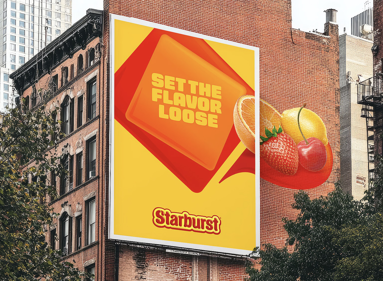
While we might think the best rebrands are about grand reinvention, sometimes a brand refresh is all you need to stand out from the crowd. With a revamped wordmark, expressive typography and a vibrant new colour palette, Starburst's new identity embodies playfulness and personality.
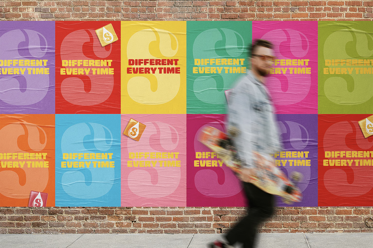
Created by brand design agency Straight Forward, Starburst's new identity is "built to flex", adapting to future generations with its vibrant yet timeless aesthetics. Embracing a simpler design, the packaging stands out in its boldness, using the familiar square motif of Starburst candy to leverage customer recognition and play on nostalgia.
The wordmark's typographical features remain fairly unchanged, with refinements to the border and an added square motif bringing a sense of visual harmony and design continuity. Chunky, block-style typography gives the brand identity a lively confidence, while vibrant colours and fruit imagery inject a dose of freshness into the mix.
When tackling a heritage brand like Starburst, it can be tempting to over-engineer the redesign until the brand feels indistinguishable from its identity. Straight Forward's stripped-back, yet thoughtfully refined new design is a perfect example of extracting a brand's essence to reinforce, rather than replace its identity.
For more brilliant branding, check out why brands should hold fire on launching a whole new identity or take a look at why 2025 is the year of the 'quiet rebrand'.