When it comes to the many shades of green that have entered the zeitgeist lately, none have done so with as much oomph as matcha green. At first, we were just drinking it, but now, it seems, we're decorating with it, too. Especially in our kitchens.
"Matcha is a refreshing yet calming green, and it’s a great kitchen color as it gives the space a contemporary edge while still feeling classic," explains London-based interior designer Nicola Harding. "It resonates in kitchens right now for the soulfulness and warmth it brings. Whether you have sweeping views over the countryside or a small courtyard, matcha green is a really good linking shade, especially effective if you want to draw the garden into the house, softening the lines between the two."
And, it's easy to layer in, she adds: "The shade works well with earthy tones, such as beige, cream, and taupe, but also pastels like soft pinks." Want proof? Below, discover six beautifully unique matcha kitchen ideas to inspire.
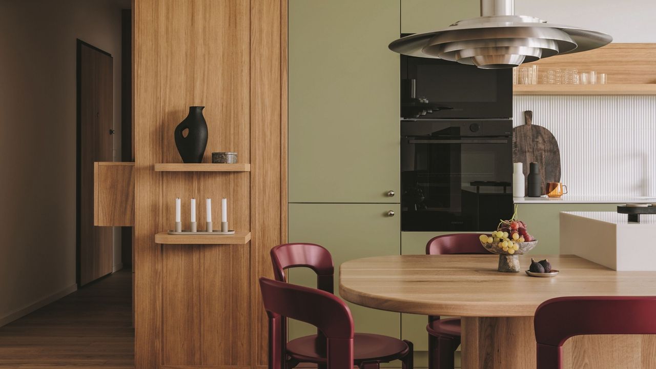
1. Use the Rule of Three
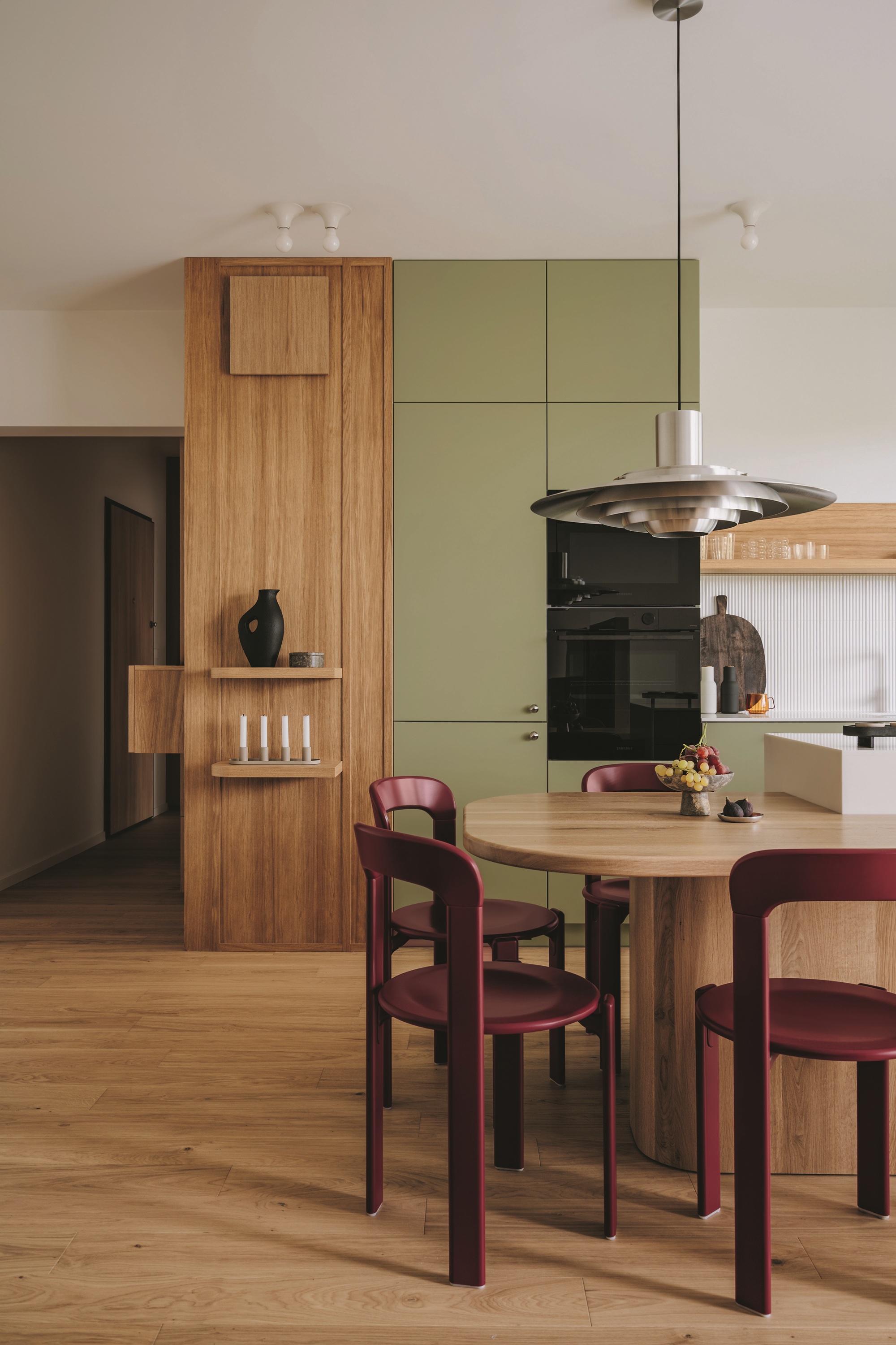
Matcha green is one of three blocks in this green kitchen by Polish interior design studio Na Antresoli, the others being the oak cabinetry and the burgundy chairs — a clever use of color that makes the space feel harmonious, instead of one hue dominating.
2. Go Green All Over
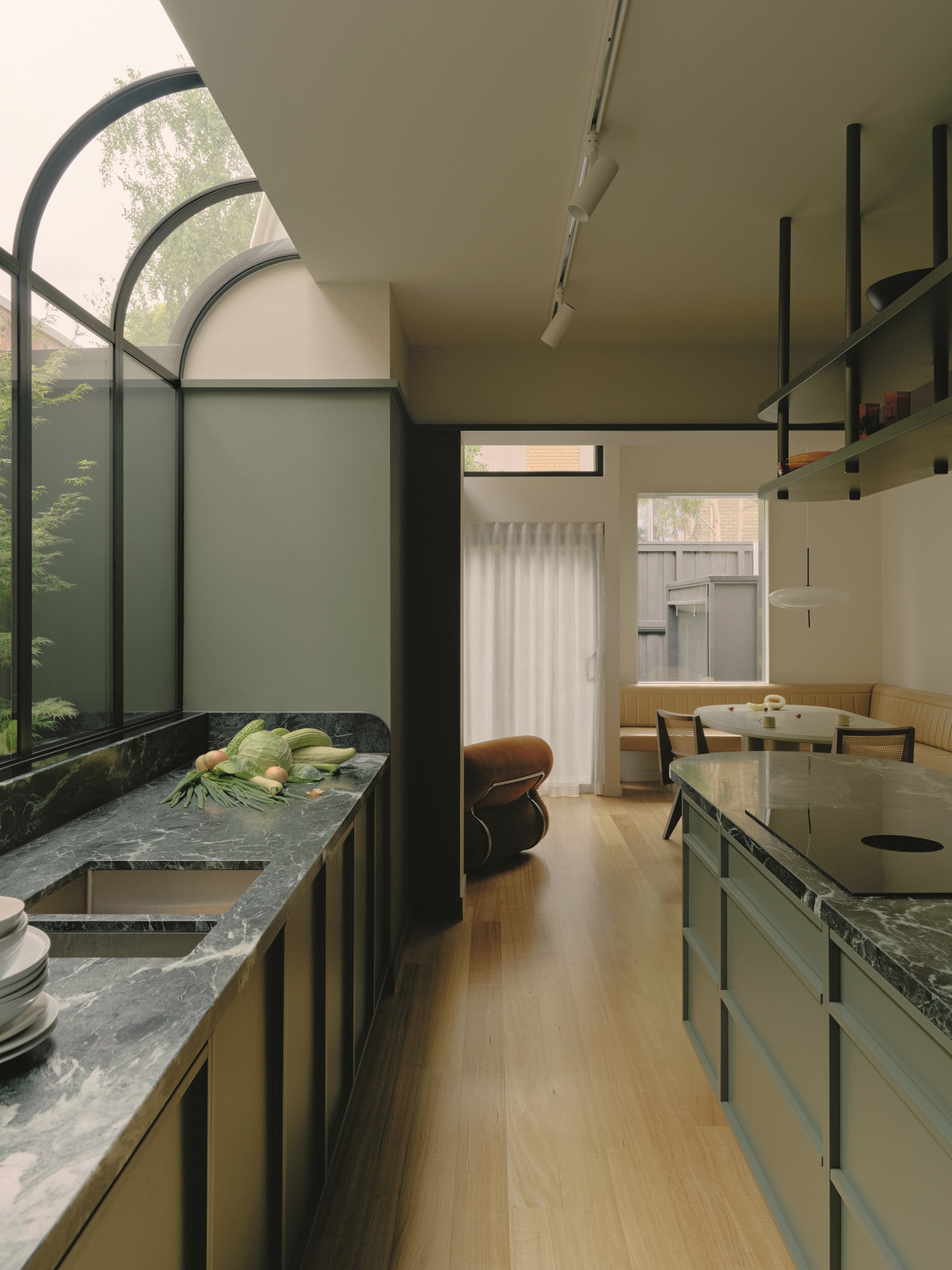
Melbourne-based architecture and design studio Placement went a step beyond the kitchen when they created this soothing green space — taking the color to the glazing through the curved frames that appear to cocoon the prep area.
Dark green countertops add depth and moodiness, while the light wood flooring and off-white ceiling provide a gentle contrast.
3. Pair It With Pastels
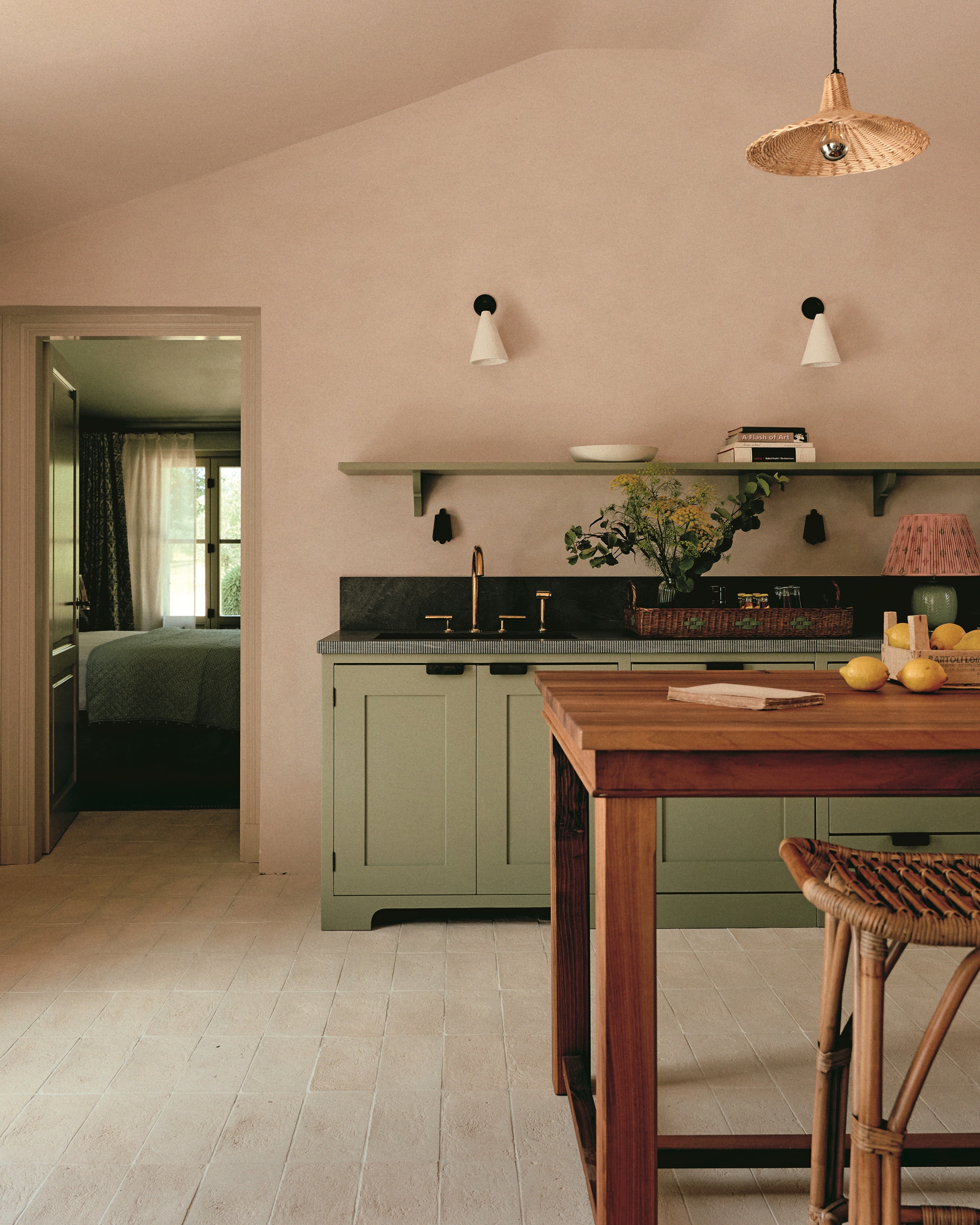
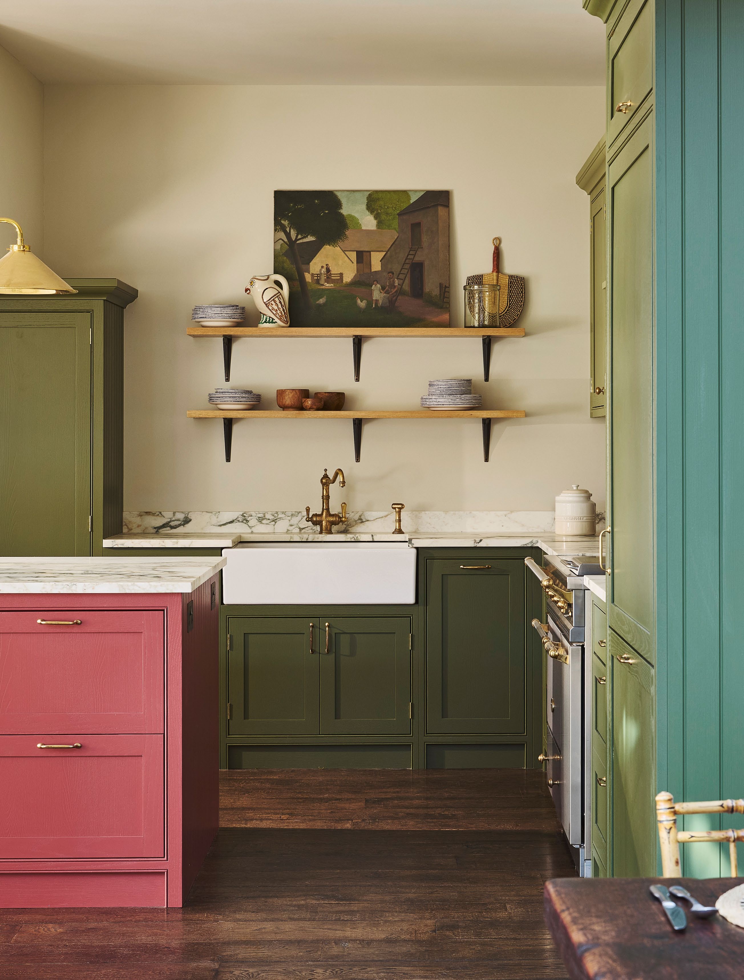
In this Tuscan villa project, interior designer Nicola Harding took a tonal approach to the cabinetry; the pale matcha hue is topped with a deep green stone worktop with fabulous fluting around the edge. The plaster pink wall finish warms up the space and offers a pleasing contrast to the green, as does the rich wood breakfast bar.
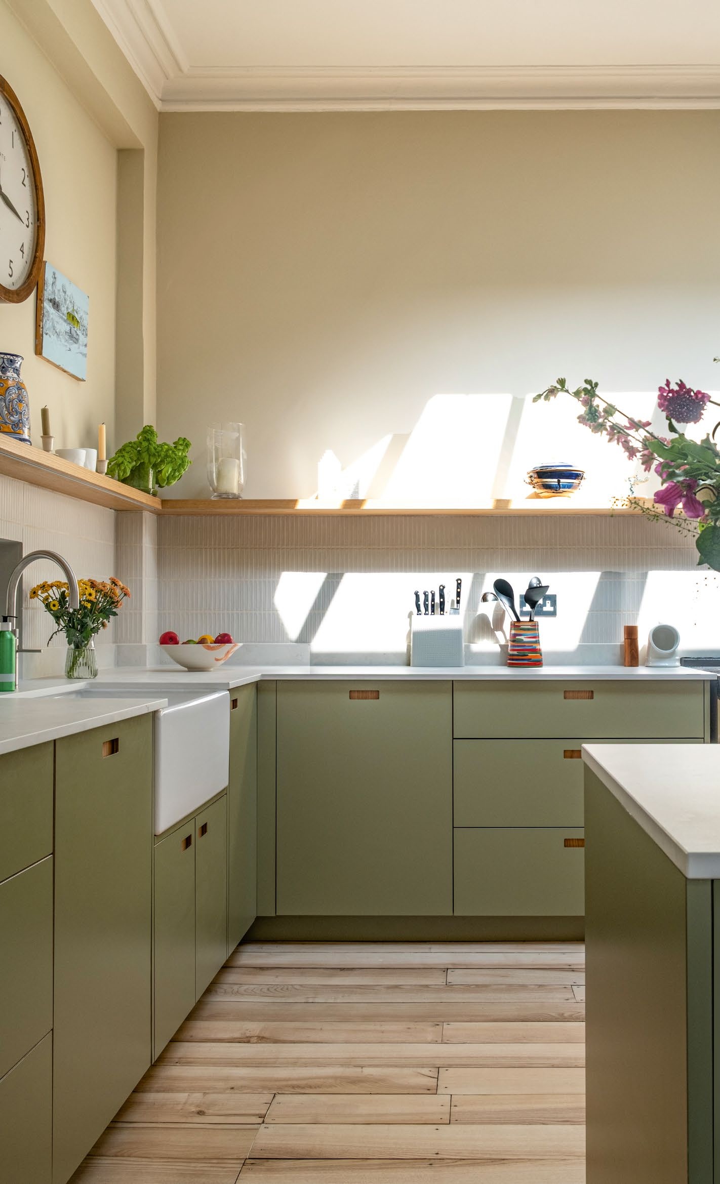
4. Take a Tonal Approach
Interior designer Dani Neville put color at the heart of this project, which features bespoke cabinetry by Naked Kitchens. Rather than using a single green shade across the wall units, she chose two hues — an archival Olive by Farrow & Ball and Olive Colour by Little Greene.
Together, they bring depth, while the island in Farrow & Ball’s Eating Room Red adds a perky note to the scheme.
5. Keep It Grounded
Pluck is well known for its use of jaunty color, and in this recent project, the studio used Brockwell Moss laminate for the cabinetry. "It’s a grounding, reassuring shade, a way to introduce color in your kitchen without using bold and dominant hues," says co-founder Leila Touwen.
The client wished to keep the original layout, as well as features such as their Aga — so this injection of color was a clever way to make the space feel new.
Perhaps you're not in a position to re-do your entire kitchen? Thankfully, you can shop this 'matcha green' decor edit instead.