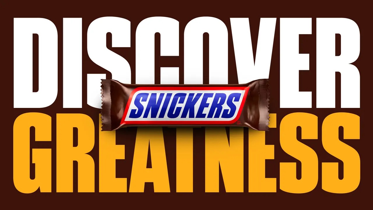
Snickers (or Marathon, as my elders like to remind me) has become a staple among the glossy chocolate-packed supermarket shelves. Launched in 1930, it boasts almost a century of confectionery goodness, which is why its latest project feels like a long time coming. We finally have a custom Snickers typeface.
A refined take on the classic American Gothic font family, Snickers Sans is an instantly recognisable typeface that captures the bold energy of the iconic chocolate treat. As one of the best logos in the confectionery sphere, Snickers' enduring logotype proves how effective a simple yet striking design can be in creating an identity that spans generations.
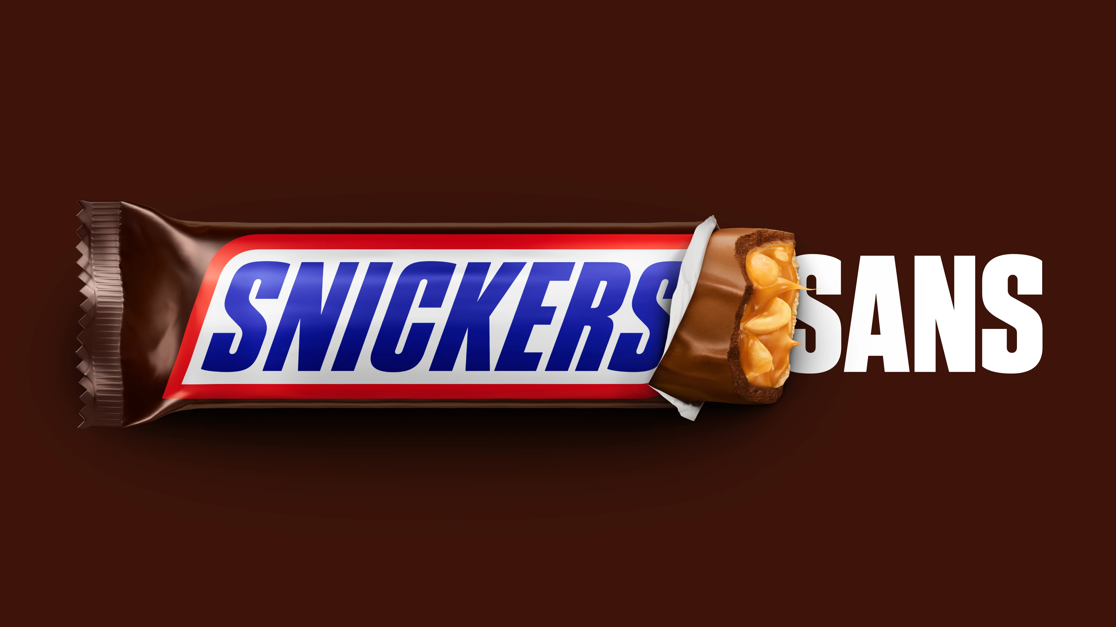
Created by type designers Studio Drama in collaboration with global branding agency JKR, the new typeface takes cues from the visual DNA of the Snickers wordmark. Inspired by the "distinctive spine of the 'S', the rhythm of the vertical strokes and the angled terminals," the brand's playful character is infused across the full alphabet of letterforms.
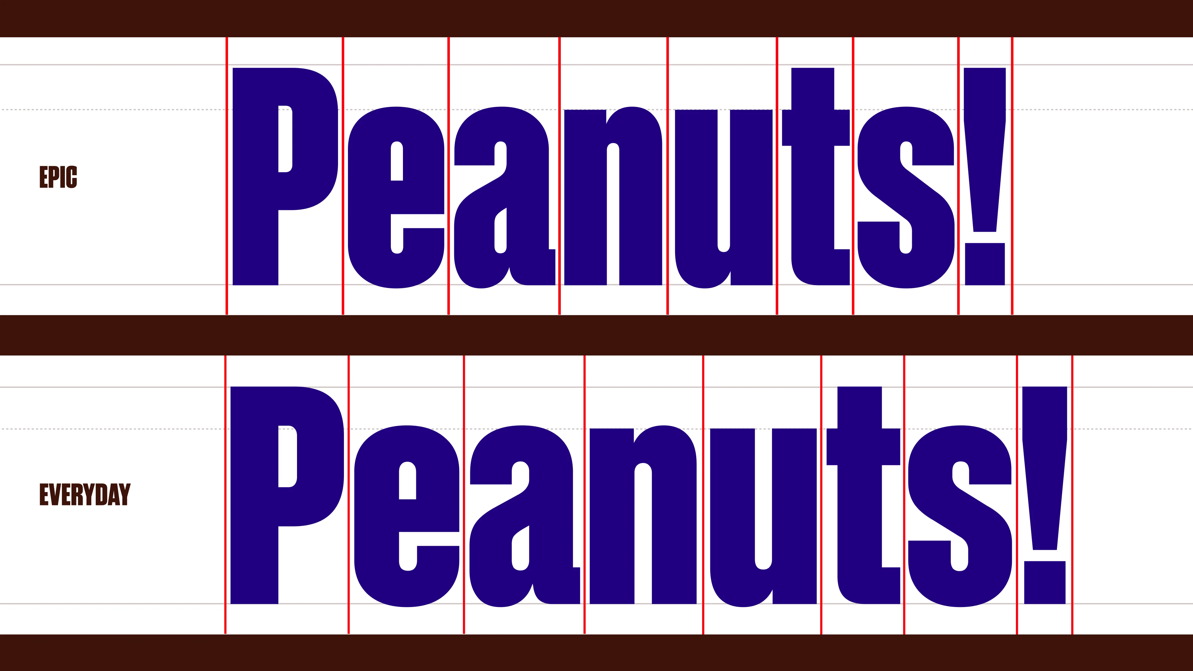
With both Epic and Everyday styles, Snickers Sans Display has the flexibility to be both casual or bold and punchy, transforming headlines, packaging and campaigns. Snickers Sans Text acts as an understated companion to the Display fonts, available in both Regular and Bold weights to ensure legibility and accessibility across the brand's copy.
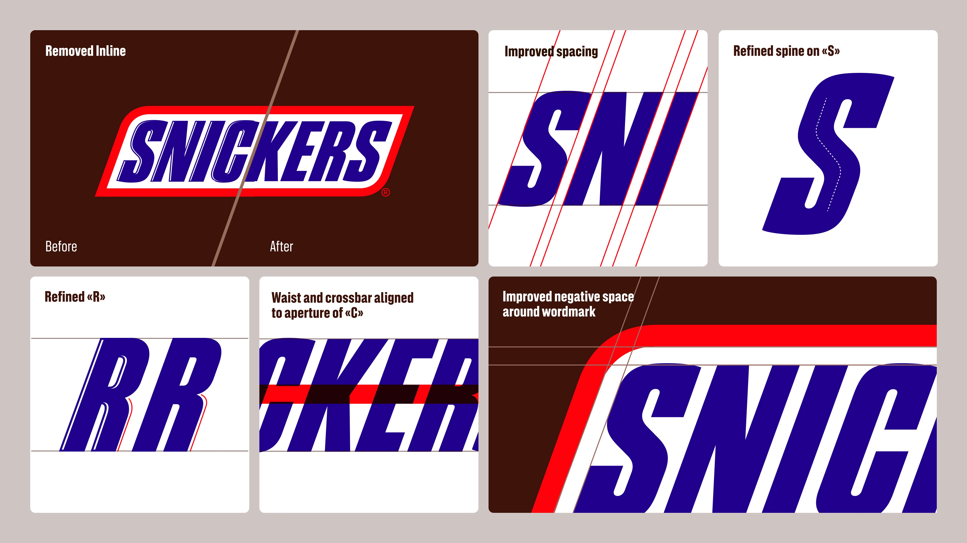
The project also revamped Snickers' iconic logotype, refining spacing and structural relationships between letters, while tightening subtle details for an elevated yet subtle tweak. A clean take on its iconic identity, Studio Drama's revamp brings the brand into a confident new era while preserving its quintessential Snickers attitude.
For more design inspiration, check out Fortnum & Mason's chocolate that you can hear (yes, really) or take a look at Divine Chocolate’s gorgeous illustrations, which show the power of storytelling