Royalty-free image site Shutterstock has revealed a brand new identity, elevating its look for a contemporary audience. The slick, stripped-back design follows many of the beats of a modern rebrand, with minimalist aesthetics and refined colours, yet for a brand like Shutterstock, it's a suitable new look (albeit rather safe).
While we might be led to believe that the best rebrands are about grand metamorphosis, Shutterstock demonstrates a self-awareness reflected in its new design. Clean, concise and bold, the royalty-free image site gives us a functional and unfussy new look that's everything you could want from an understated new visual identity.
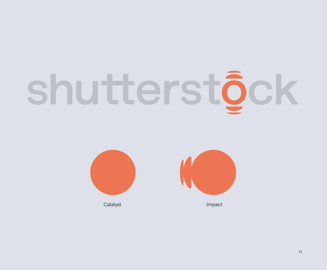
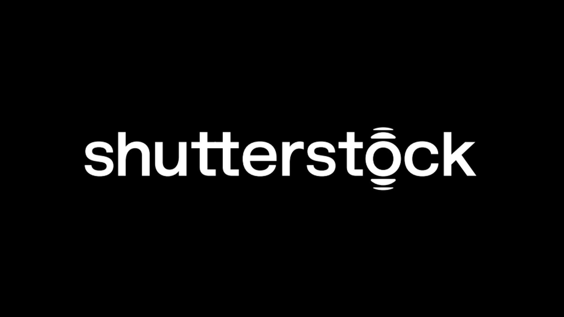
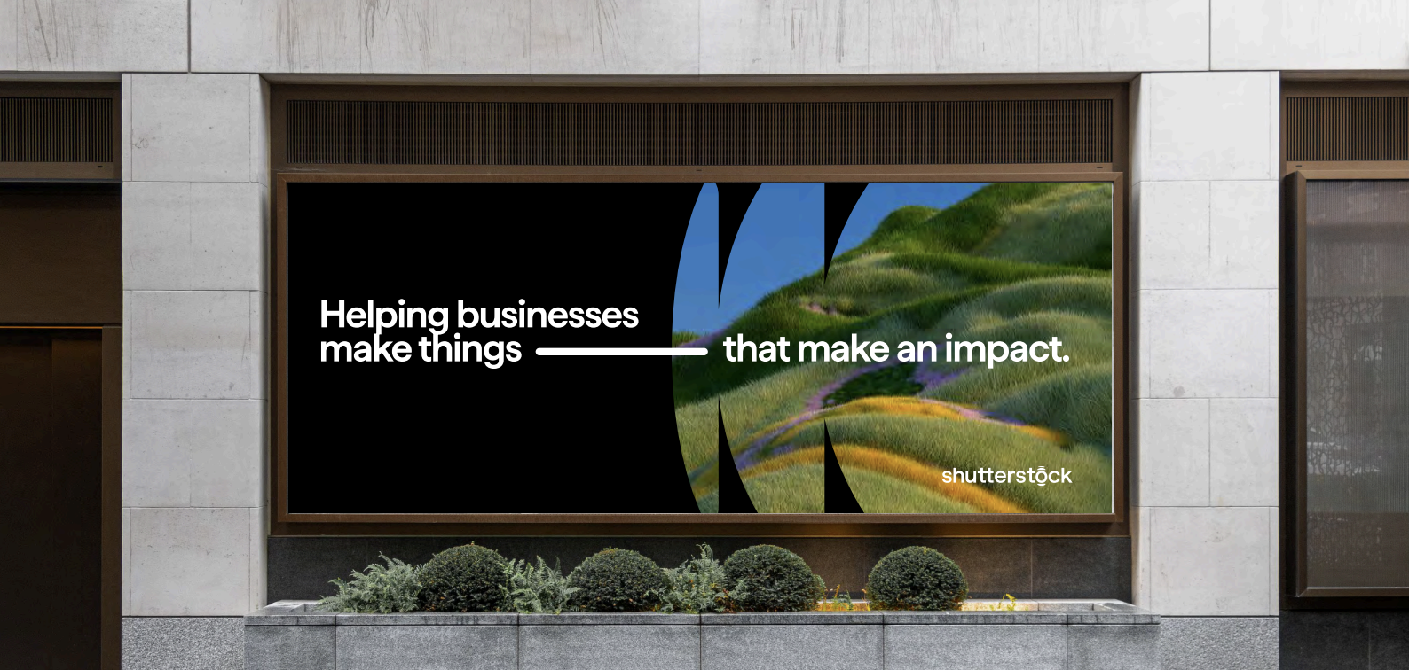
At the centre of the rebrand is Shutterstock's new logo. Featuring a clean wordmark with a graphic motif over the 'O', it's a simple yet effective design perfect for scalability and brand consistency across platforms. The bold motif is split into two separate elements that inform brand expressions – catalyst and impact. The former, a simple circle design, represents the "spark of an idea", appearing as a framing device in the new identity. Extending this concept, the latter introduces a ripple design, reflecting the "impact" of Shutterstock's creative potential.
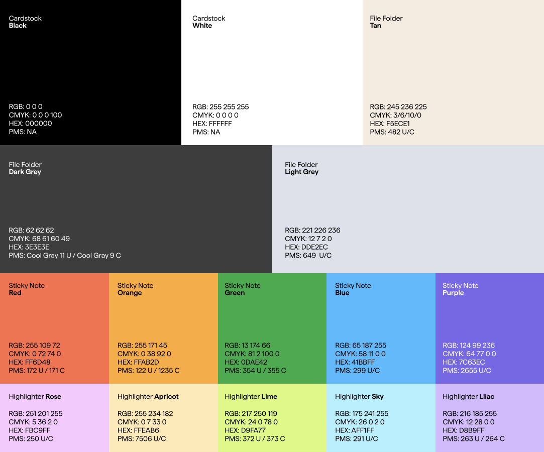
Introducing its new font, Haffer, the brand's updated typography has a minimalist appeal that spreads throughout its new identity. Practical and unpretentious, it carries an authority through its conventionality. A broad colour palette embellishes the new visual identity with a corporate feel, with a balance that is both "mature but not stodgy" and "playful but not young". With names such as 'Sticky Note Red' and 'File Folder Dark Grey', there's a familiar yet mundane aspect to the rebrand that lends to its 'safe' design.
When trying to form a concise opinion on Shutterstock's new identity, I find myself at a crossroads. While the design is certainly steeped in conventionality, its prosaic appeal is perhaps what makes it such an effective rebrand. Shutterstock seems to be aware of its place as a catalyst for creativity, understanding that its typically corporate audience isn't necessarily looking for a brand identity that's all singing, all dancing. It's safe, accessible and functional like its services, and while it might not be a rebrand for the history books, it serves its purpose with artful precision.
For more creative insight, check out why 'understated' may be 2025's buzzword amidst the rise in minimalist design. If you're after more branding news, check out why 2025 is the year of the 'quiet rebrand'.