The U.S. State Department’s font feud, Secretary of State Marco Rubio ditching Calibri in favor of Times New Roman, quickly became a surprisingly charged typographic story. What might seem like a minor design choice turned into a symbolic stand against so-called ‘woke’ fonts, as not for the first time this year, innocent things we love – Superman, Jaguar cars, New Zealand – have become a target.
The debate itself, whether a modern sans-serif like Calibri, adopted under a Biden-era accessibility policy, counted as a DEI initiative taken too far, sounds absurd outside design circles. Heck, it sounds absurd just writing that sentence. But it shows just how much people project values, identity, and even politics onto the shapes of letters.
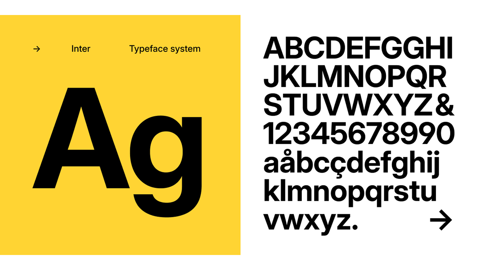
I love fonts like Inter or Circular for one reason: they’re clean, readable, and inclusive design. Personally, I think these kinds of fonts, having worked in print and now online, I welcome readable, flexible type. As this battle no one saw coming escalates, let's take a breather to celebrate 'woke' fonts (take the poll below).
These are fonts that work across media and can be easily read in many languages and by all. Oh, and they're open-source by nature, making them free to use and rework, which is, well… horrific. Right? Their very accessibility has earned them the label of ‘woke’, which is either an insult or a badge of honour, depending on which culture war trench you're sunk into.
The kind of fonts that can be labelled are those designed to be easily read and used, and have a combination of traits: rounded terminals that feel friendly rather than aggressive, open-source licensing that signals community-mindedness, and tall lowercase letters for accessibility. None of these qualities has anything to do with politics; they’re just good design.
Fonts don’t pick sides, but they do shape how information feels and how people connect with ideas. In 2025, when even a pair of Sydney Sweeney's jeans can spark cultural wars, a perfectly readable font somehow becomes another battlefield.
I think we should celebrate accessible fonts. What do you think? Vote below for your favourite 'woke' font.


