Choosing a paint color can feel like one of the most deceptively nuanced parts of home design. Even subtle variations in tone can have a dramatic impact depending on the direction of a room’s light, the materials it’s paired with, or even the time of day. Sea Salt by Sherwin-Williams is a prime example of this.
While often described as a green paint, its composition reveals far more complexity – a muted blend of green, blue, and gray that reacts sensitively to its environment.
Here, we take a closer look at what makes Sea Salt one of Sherwin-Williams' most popular paints. If you’re currently looking for inspiration, Sea Salt – with its misty, muted character – might catch your attention, especially when decorating with green in soft, serene palettes.
We spoke to Emily Kantz, Color Marketing Manager at Sherwin-Williams, to understand the full scope of how Sea Salt can be used in today’s interiors; what it offers, where it performs well, and where it may not.
Understanding Sea Salt’s color category
According to Emily, 'Sea Salt is a highly versatile color that technically falls within the green family, but its soft blue undertone gives it a serene, adaptable quality that works well in a wide range of spaces'. That blue note, combined with a subtle gray base, makes the color appear cooler and less saturated than many greens.
Depending on the light, it can read as bluish in north-facing rooms or more distinctly green in sunnier environments. This ability to shift gently between tones is part of what gives the color its broad appeal, though it does require thoughtful pairing to ensure it behaves as expected.
What aesthetic does Sea Salt work with best and why?
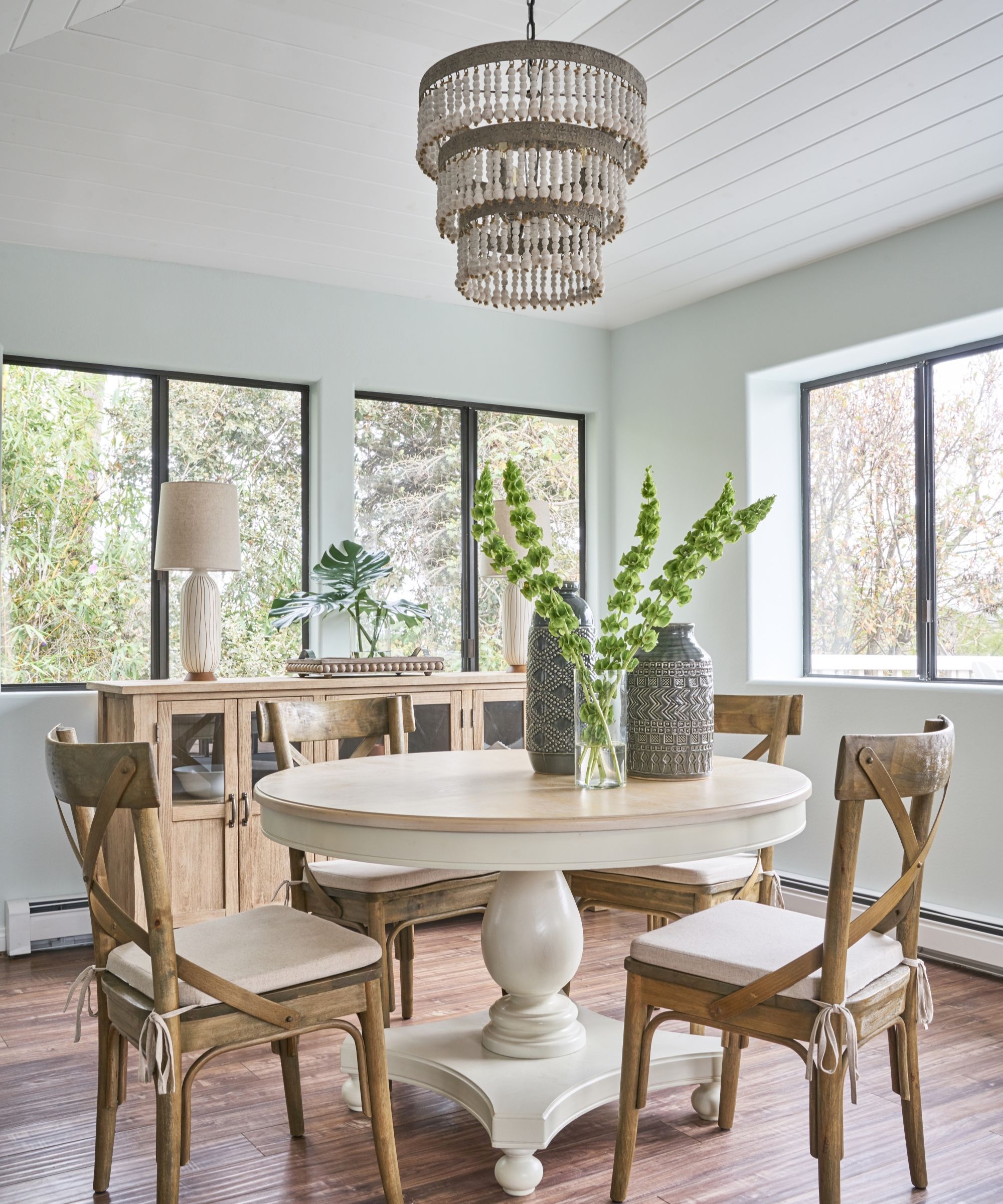
Sea Salt’s soft tone lends itself particularly well to light, natural interiors. As befits its name, it's a favorite in both farmhouse and coastal style homes, thanks to its ability to introduce a gentle wash of color without overwhelming the space. 'It's soft hue pairs effortlessly with the warm wood tones and neutral finishes commonly found in these styles, creating a balanced and inviting atmosphere,' explains Emily.
'In coastal settings, it draws inspiration from sea glass, while in farmhouse style spaces, Sea Salt provides a nice contrast between rustic wood and crisp whites.' It’s also well-suited to Scandinavian-inspired interiors. In these minimalist settings, Sea Salt’s muted presence complements light woods, clean lines, and bright whites.
According to Emily, the shade adds a subtle touch of nature-inspired color while preserving an uncluttered vibe. In all cases, the key to Sea Salt’s success seems to lie in its restraint. It’s a color that works best when the surrounding palette leans quiet and organic, relaxed rather than assertive.
Where does Sea Salt work best?
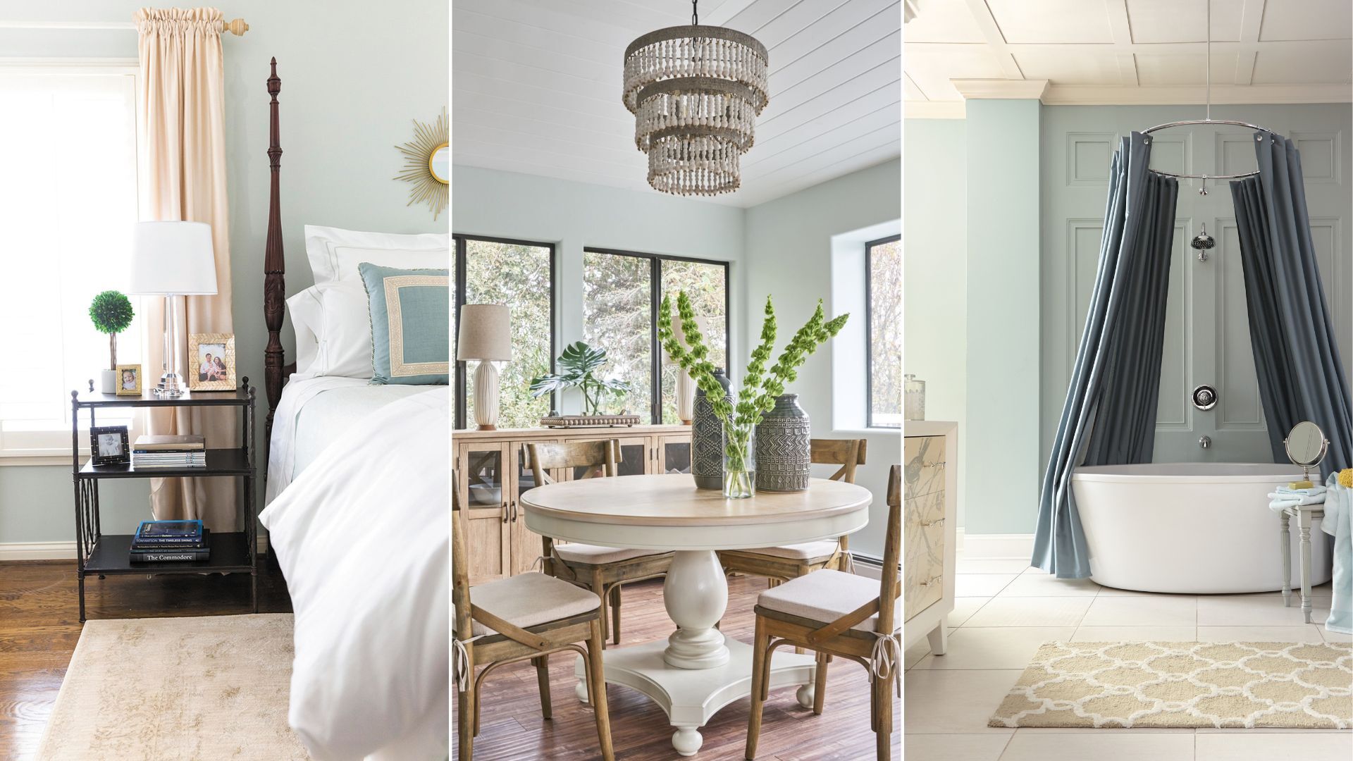
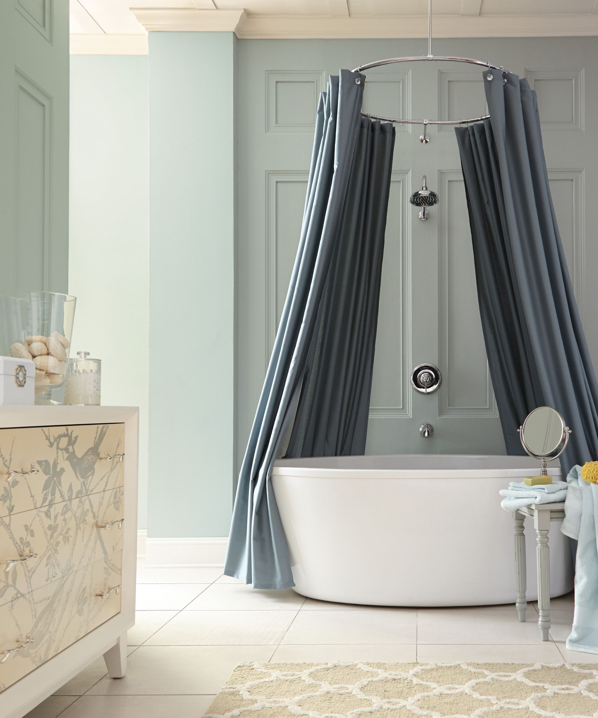
Sea Salt often finds a natural home in bedrooms and bathrooms, spaces where the goal is rest. Sea Salt’s soft blend of green, blue, and gray achieves a 'soft, spa-like quality, creating a soothing, retreat-like atmosphere. Its tranquil tones evoke a sense of calm, making it ideal for spaces for relaxation and self-care', especially when balanced with natural stone, linens, and wood finishes to avoid appearing overly cool or clinical.
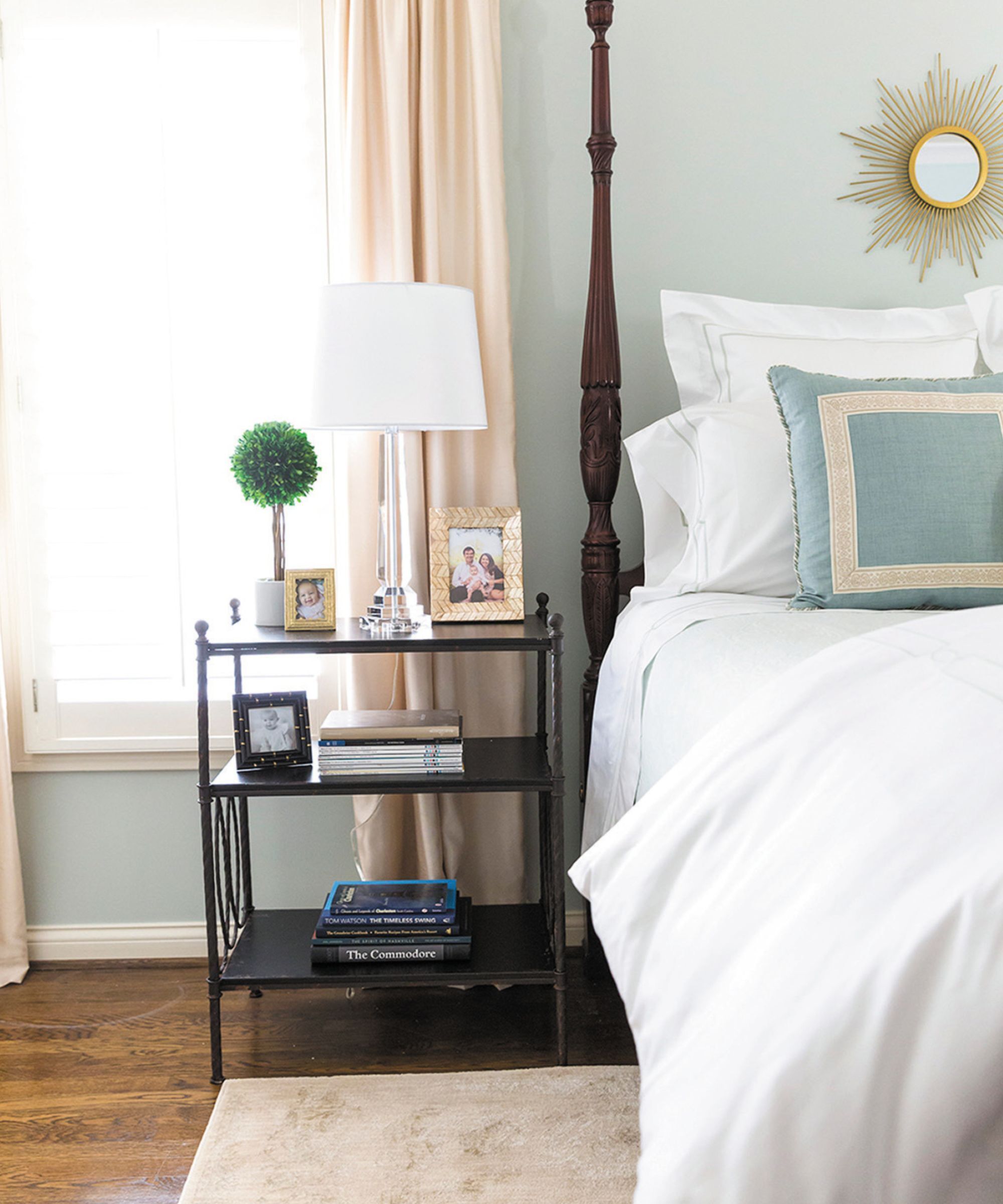
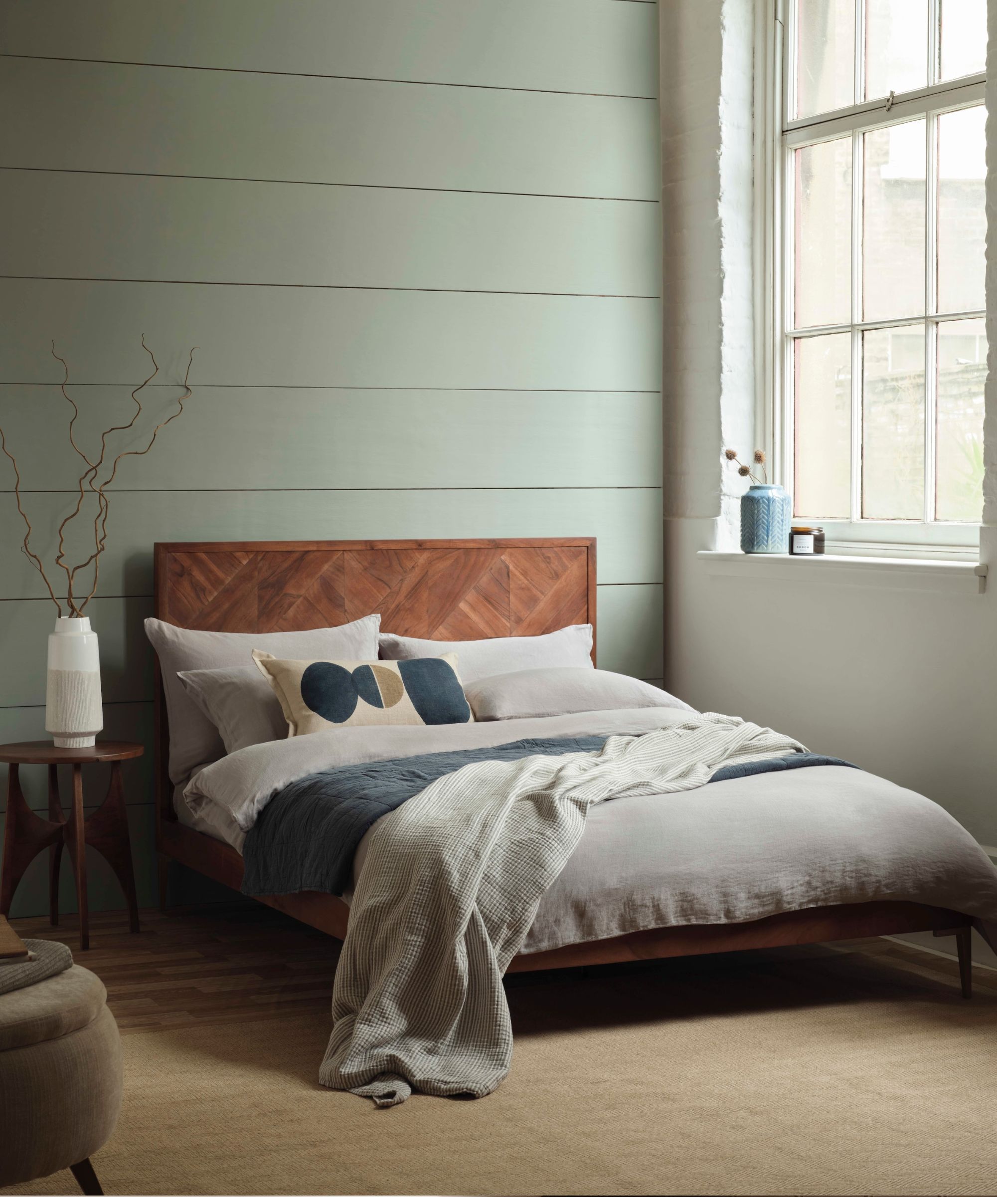
The same is true in the bedroom, when styled carefully, Sea Salt promotes a restful environment and complements a range of bedding colors and textures, from layered whites to soft linens and pale woods.
The shade also suits kitchens, particularly those styled with white cabinetry or light countertops. Emily explains that 'Sea Salt brings a gentle pop of color without overwhelming the space', maintaining a bright and welcoming feel. Its softness allows it to behave more like a neutral in these settings, especially when paired with the right finishes.
Where to avoid using Sea Salt
Despite its versatility, Sea Salt may not be universally adaptable. Because of its icy undertones, it may not perform well in spaces dominated by very warm colors or rich hues, particularly red-toned woods, terracotta, or golden shades. In this context, Sea Salt’s cooler character can feel rather dramatically at odds with the overall tone.
In darker rooms with limited natural light, its cool blue-gray undertones will likely dominate, which can feel chilly, steely, and unwelcoming. Understanding this limitation is important when considering Sea Salt for larger-scale use or in homes with a predominantly warm material palette, or light-deprived spaces like north-facing rooms or those which rely on artificial light.
What colors to pair with Sea Salt?
One of Sea Salt’s strengths is its compatibility with a wide range of other shades, so long as they’re chosen with intention. It pairs well with clean white paints, such as Pure White SW 7005, which offers crispness and contrast, and with softer, warmer off white paints like Dover White SW 6385 for a more blended, tonal feel. Emily also recommends pairing it with subtle neutral paints, such as Drift of Mist SW 9166, which can create a layered, serene backdrop.
For those looking to bring in more contrast, Sea Salt works surprisingly well with deeper, moodier hues. Colors like Cityscape SW 7067, a less nuanced graphite gray, or Charcoal Blue SW 2739, a deep navy, add dimension and balance without overshadowing Sea Salt’s subtle presence.
Homburg Gray SW 7622, a sophisticated green-gray, offers a more grounded contrast that still aligns tonally with Sea Salt’s palette. These color combinations enable designers and homeowners to create a space that feels both calm and considered, whether they’re building a soft, tonal scheme or one with a little more visual weight.
If you aren't in the market for a total room color change, the soft green of Sea Salt is a lovely color to bring in in smaller accents, especially as we go into the summer months.
Pretty plates for summer feasting, but since they're made from melamine, known for its resistance to chipping and breakage, they can be taken to the poolside or on picnics.
If you're thinking of painting your bedroom in Sherwin-Williams Sea Salt, then this herringbone throw is perfectly judged and modestly priced.
Skillfully hand-woven by artisans in India using high-quality wool, this runner is perfect for that unstuffy, laidback, and bohemian look.
Made of para green marble, these coasters are a subtle way to bring a touch of green to your dining or coffee table.
A little more relaxed than crisp cotton sheets, if fresh linen sheets are more your style, these are available as a linen mix or 100% linen – perfect for balmy summer nights.
If Jack Nicholson and Diane Keaton in Something's Gotta Give gave you serious quantities of interiors inspiration, this lamp is perfectly in keeping with that dreamy coastal look.
Sea Salt by Sherwin-Williams is a gentle, cool-toned green that behaves almost like a chameleon, shifting slightly depending on light and materials. Its appeal lies in its softness and flexibility, though those same traits require careful planning to get right.
It's undeniably a wonderfully calming color, and performs best in peaceful, light-filled rooms, particularly those in coastal, farmhouse, or Scandinavian-inspired homes. If you dream of injecting the Nancy Myers aesthetic in your home, then this is certainly a shade worth considering.