If there’s one thing interior designers agree on right now, it’s that color is back in a big way. After years of safe neutrals, they're leaning into shades that bring energy, warmth, and personality back into a space – which is exactly where Sherwin-Williams’ happiest paint colors come in.
These are paint colors chosen by the brand's color experts, not just for how they look on the wall, but for the energy, optimism, and happy room ideas they bring to a space. And according to Sherwin-Williams' color marketing manager Emily Kantz, these four standout shades from the designer-and-DIYer favorite paint brand will instantly give you a mood-boosting color scheme.
Sherwin-Williams’ Happiest Paint Colors
From joyful pinks to optimistic yellows, these four standout shades not only reflect the color-trends of 2026 but also prove that the right Sherwin-Williams paint color can instantly change how a home looks and feels. And if you aren't looking for a paint project, we've curated some home decor pieces to bring these vibrant colors into your rooms. Here are the top four Emily recommends.
1. Dragon Fruit
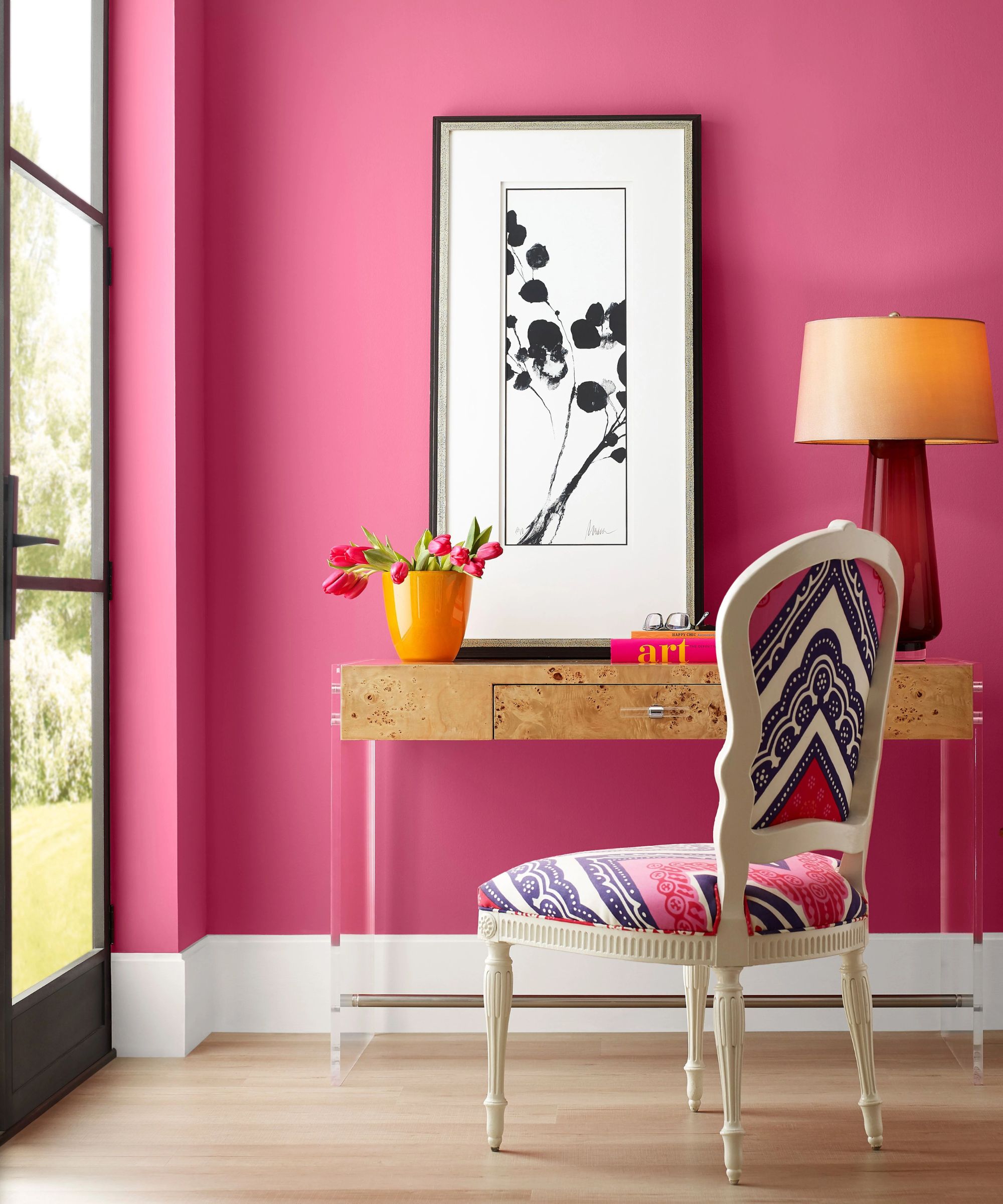
Decorating with pink is a well-known way to make a room feel happy. From blush pinks to dusty tones, pink has long been a preferred way to graduate from neutrals, but Emily suggests going even bolder in 2026.
'Dragon Fruit SW 6855 is a bold, high-energy hue that channels passion, creativity, and individuality,' she explains. 'This shade thrives when used with intention, such as on an accent wall in a dining room or entertaining space where homeowners want to spark conversation and make a statement.'
'Paired with minimalist furnishings, clean lines, and expressive artwork, Dragon Fruit creates a space that feels daring, modern, and unmistakably personal.'
If you're not feeling confident enough to pick up the paintbrush, throw pillows are an easy accessory to swap in and out that entirely changes the mood of a room. This pink striped pillow is seriously joy-boosting.
Similarly, a cordless lamp can be a brilliant way to bring in a pop of color and ambient light, without the need for any DIY. Addison Ross' are the best, coated in layers of glossy lacquer for extra shine.
Sure, this might be part of Anthropologie's Valentine's Day collection, but it's sweet enough to have out year-round. Made from handblown soda glass in a deep pink with an extra pop of pink on the rim.
2. Pennywise
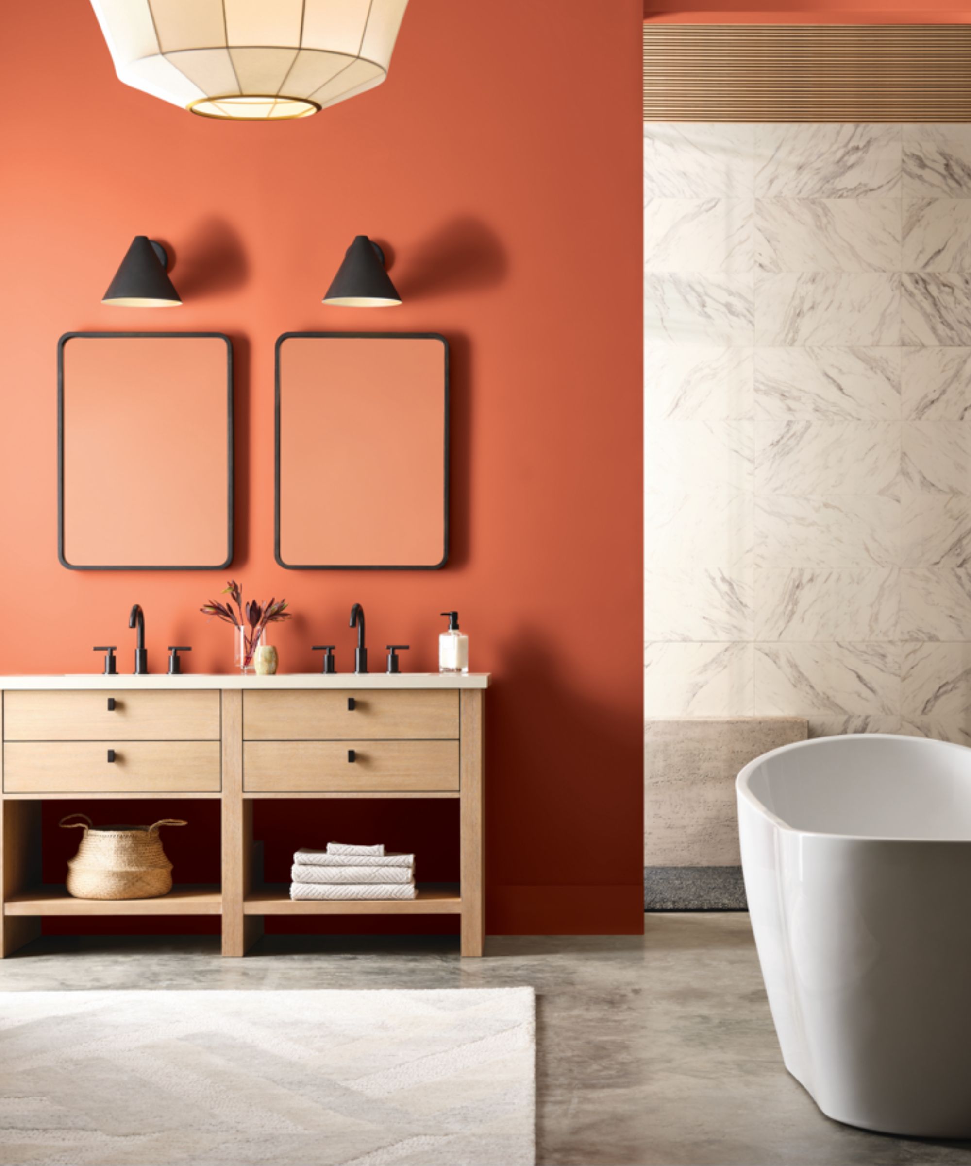
Warm, orange-reds are seeing a rather surprising comeback in 2026, with terracotta decor becoming one of the chicest ways to bring warmth into a space. Not quite decorating with red, and not quite decorating with orange, Sherwin-Williams' Pennywise SW 6349 is a rich terracotta-inspired orange that feels both energetic and inspiring.
'Its depth gives it an enveloping quality, making it ideal for living rooms or gathering spaces rooted in heritage, storytelling, and connection,' says Emily. 'There’s a warmth to this shade that feels nostalgic yet current, perfect for interiors inspired by cultural traditions or fall-forward palettes.'
'While bold in character, Pennywise SW 6349 remains inviting, adding visual depth and a sense of comfort that encourages people to settle in and stay awhile,' she adds.
Traditional terracotta pieces work wonderfully in any interior design scheme, from cottage to farmhouse, modern to rustic. This slim vase from Pottery Barn is made from a lightweight aluminum with a terracotta finish.
Not only is this throw super chic, but it is made from premium lambswool, which offers exceptional warmth while still remaining lightweight and extra soft. In a palette of brown and amber tones that mimic the hues of falling leaves.
While new drapes is a slightly bigger commitment than a new pillow, they're a sure way to brighten up a drab, neutral space and introduce some new tones and textures. Made from light-filtering linen to allow the sunlight in.
3. Aquastone
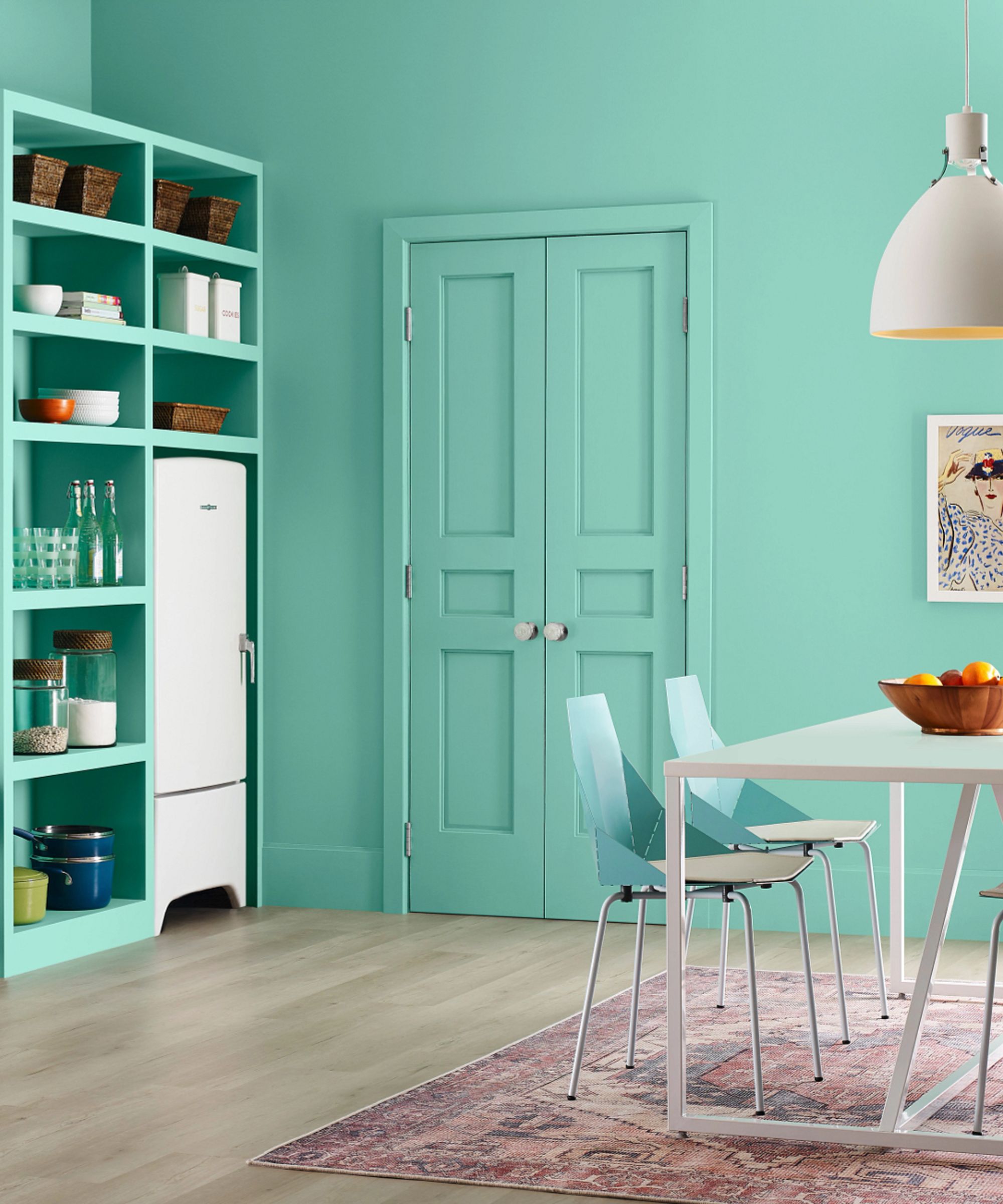
Sitting between blue and green, this almost-turquoise shade brings instant vibrancy to a room while still feeling balanced and surprisingly livable. Traditionally used as a color pop, December's birth month color is being embraced for bolder applications.
Whether used on a feature trim or wrapped across walls and ceilings, Aquastone SW 9043 delivers freshness, energy, and a strong sense of personality. 'Its a joyful blue-green that brings instant vibrancy to a space,' Emily explains.
'Traditionally, it works beautifully as a focal point in lively rooms like dining rooms or creative spaces, where its energy can really shine,' she says. 'But we’re also seeing growing interest in color drenching, and Aquastone is a fantastic candidate for that approach. Covering walls and even the ceiling, in this bold, happy hue, creates an immersive, expressive environment that feels fresh, confident, and unapologetically fun.'
These slub-weave pillow covers from H&M are a popular buy for a reason. Not only are they a budget-friendly way to bring in some new color, but the subtle fringed edge and rustic weave adds a new texture to your pillowscaping.
Crafted from high-fired porcelain and then wrapped in bright turquoise candy-colored stripes and a glossy finish, this vibrant vase could only be the work of Jonathan Adler. Just add some seasonal blooms.
Made of durable recycled fabric that behaves and feels like mohair, this gray-turquoise blanket is a real stand-out IKEA find. Use it to bring some much needed sky-blue tones and brighten up a neutral couch.
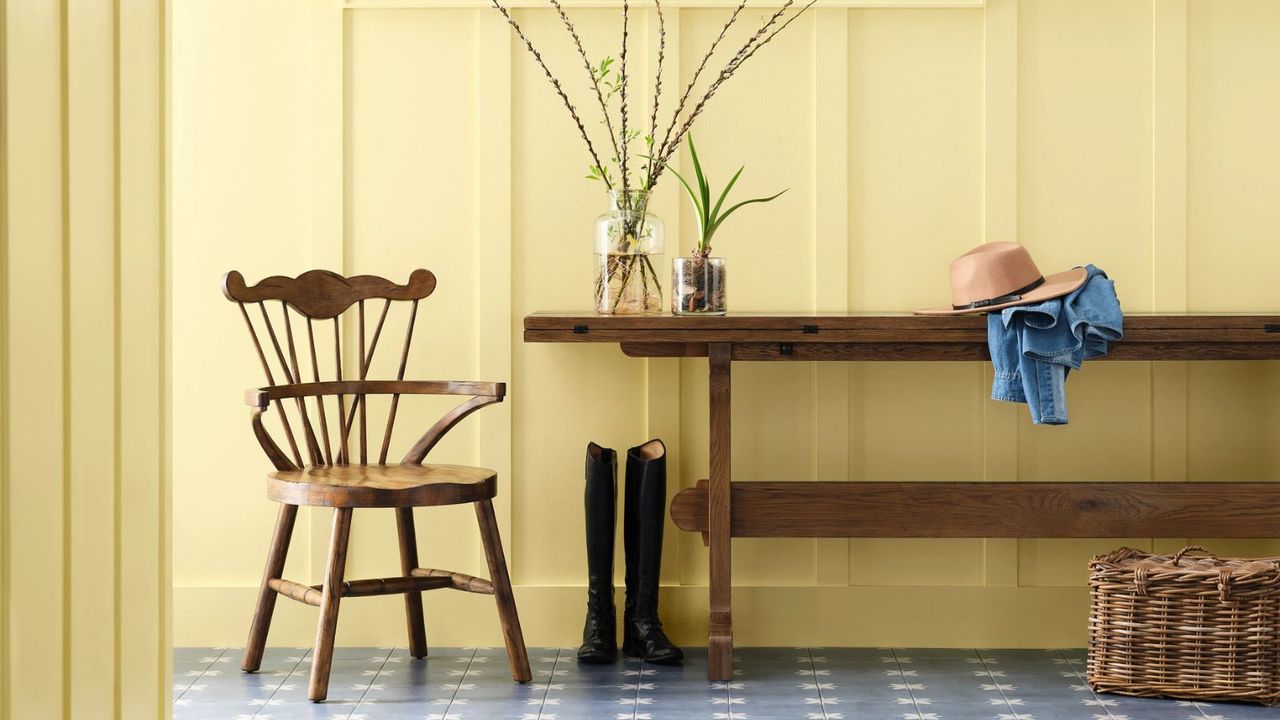
4. Icy Lemonade
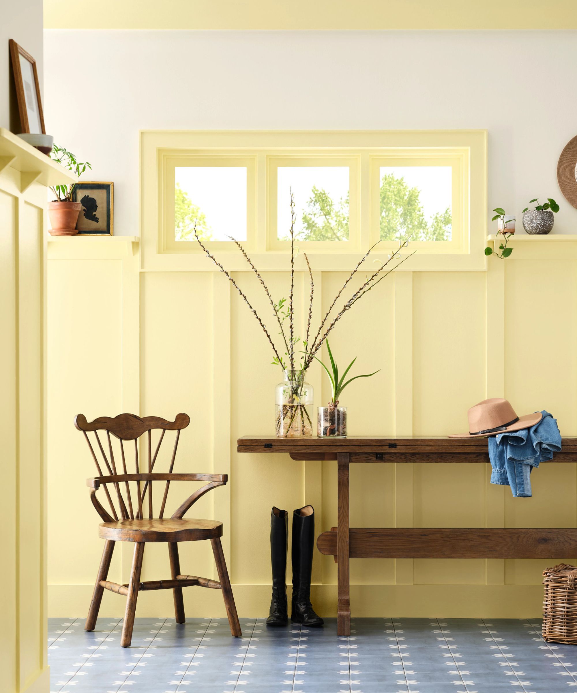
Of course, decorating with yellow is at the top of the list of sunny, happy colors. Icy Lemonade SW 1667 proves that yellow doesn’t have to be deep or golden to feel stylish. This lighter, playful shade offers a fresh way to introduce optimism and warmth without overpowering a space.
'We typically guide homeowners toward richer, deeper yellows because they’re often easier to balance in a space,' Emily suggests. 'But with the resurgence of retro-inspired decor, lighter, more playful yellows are having a well-deserved moment.'
'Icy Lemonade feels fresh, optimistic, and full of personality, making it a standout choice for adding energy without overwhelming a room,' she continues. 'It works beautifully as an accent on kitchen cabinets or doors, but it’s also surprisingly effective on all four walls in smaller spaces like mudrooms or entryways, where it instantly brightens the experience and sets a cheerful tone the moment you walk in.'
Swap out tired bed linens for these soft and buttery 100% cotton jacquard shams. Perfect to pair with a patterned duvet cover (think florals, stripes, or gingham) for a collected and layered bedscape.
Available in two sizes to suit your space, this glazed stoneware vase features a unique irregular shape and asymmetric opening to really show off your floral arranging skills. Pick up both sizes to style on your mantel.
The ball pillow trend sees no letting up in 2026, and what better way to introduce some sunshine yellow tones than a cushion shaped like the sun, too? Handwoven of recycled yarns with a nubby, boucle texture.
Happiness at home doesn’t come from playing it safe, but from choosing color with confidence. As interiors continue to move toward more expressive, personality-led interior design trends in 2026, introducing Sherwin-Williams’ happiest paint colors could be one of the simplest, most powerful ways to boost the mood of your home this year.