Sherwin-Williams has announced its color of the month for June. Icy Lemonade SW 1667 is a yellow shade, with a name that befits its cool, zesty personality. Despite its zing and vigor, this pastel yellow is tempered by a barely-there green undertone that gives it a surprisingly mellow, slightly nostalgic quality.
We take a closer look at Icy Lemonade SW 1667 – exploring its undertones, its behavior in different types of light, and how to make it work in the home. Whether you’re searching for the best yellow paint or simply exploring new ways of decorating with yellow, this color may offer more versatility than you might first have expected.
What color is Icy Lemonade?
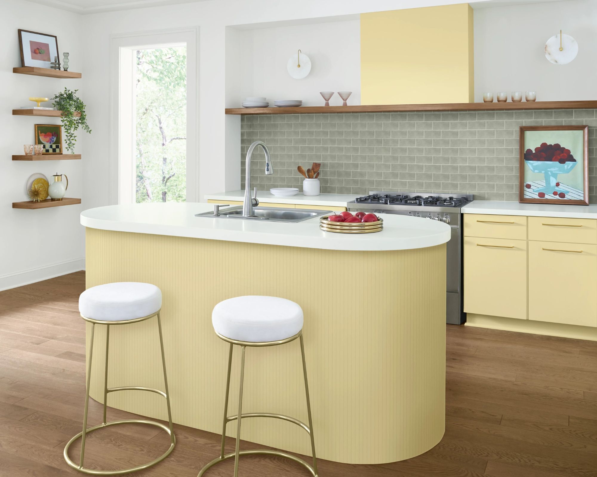
Part of Sherwin-Williams’ yellow family, Icy Lemonade is described as ‘a cold glass of sunshine on a summer day’. It’s a light, pastel yellow that’s softened by a cool green undertone – subtle, but present enough to shift the hue away from anything overly sugary or sunny. This touch of coolness gives the color an unexpected balance, making it feel more grounded than saccharine.
‘It’s a soft yet eclectic pastel yellow,' Sherwin-Williams explains, and that complexity is what gives the shade its strength. In rooms with good lighting, it radiates a gentle warmth. But it also holds its own against bright whites and soft neutrals, creating a breezy, optimistic palette.
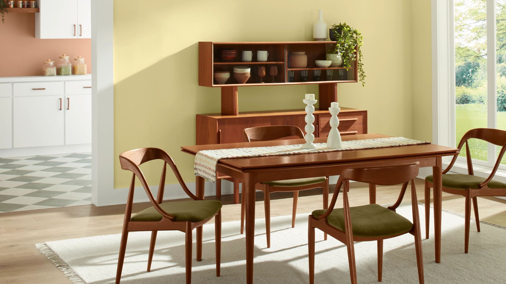
When paired with natural textures or vintage-inspired furnishings, Icy Lemonade takes on a mid-century ease. But it can just as easily feel fresh and contemporary when used in clean, minimalist spaces. That balance between charm and calm is what makes it stand out within the broader spectrum of yellow paint.
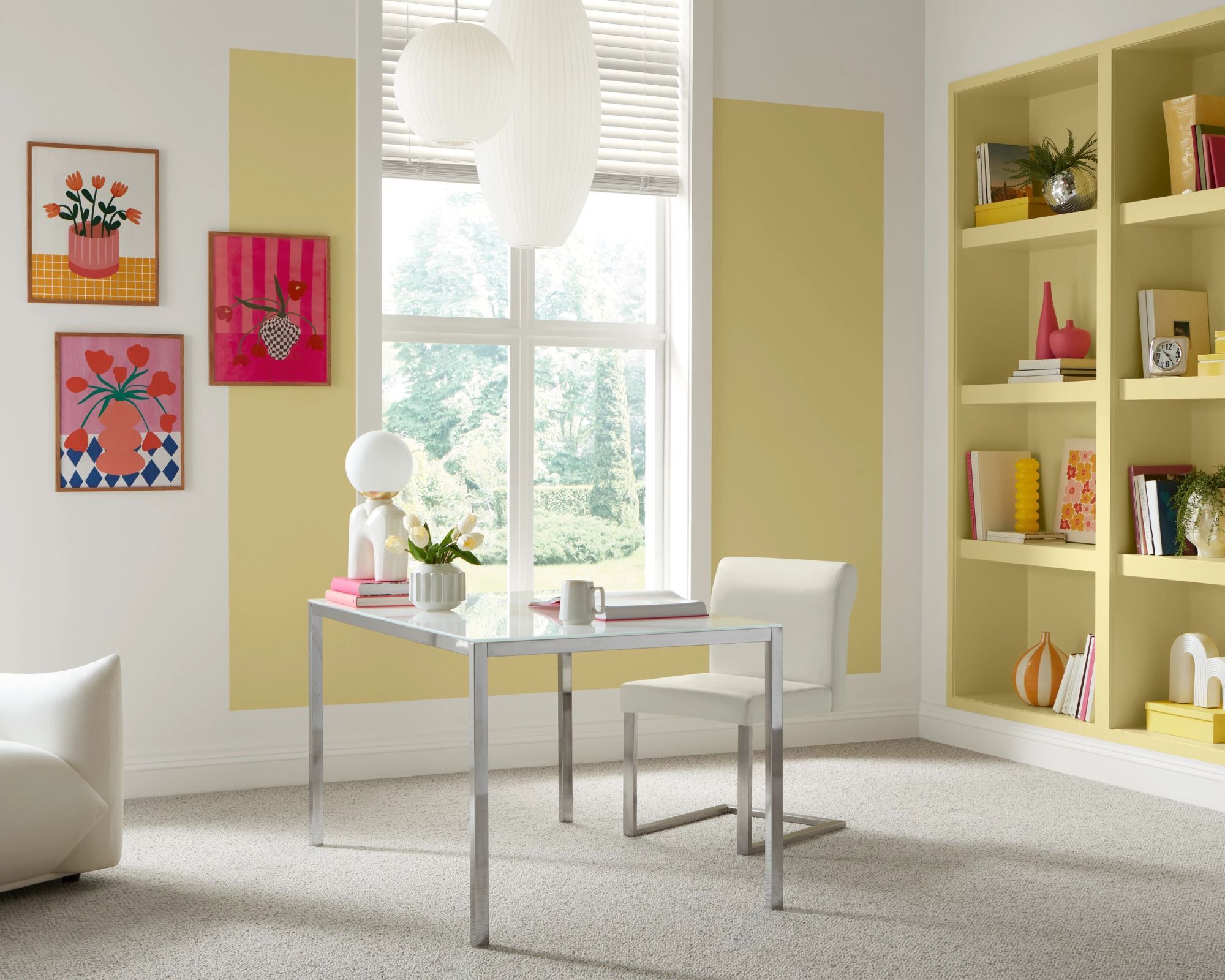
Where does Icy Lemonade work best?
Icy Lemonade shines in spaces that receive plenty of natural light. Mid-century homes, sun-filled apartments, or interiors that favor open layouts and light finishes are all good candidates for this shade. The color is especially well suited to homes in warmer regions where daylight is plentiful.
‘Known for boosting overall mood, yellow paint colors carry a subtle tonality that prioritizes productivity,’ notes Sherwin-Williams. That makes this shade a natural choice not just for residential interiors, but also for welcoming commercial settings or hybrid live-work spaces. It’s the kind of color that encourages creativity and energy without feeling overstimulating.
Designers looking to tap into the optimism of mid-century modern design will find a natural ally in this paint. ‘Capture the essence of mid-century modern design with this optimistic butter yellow,’ Sherwin-Williams suggests – a reminder that sometimes, a bit of color can do more than just dress a wall; it can shift the emotional tone of an entire space.
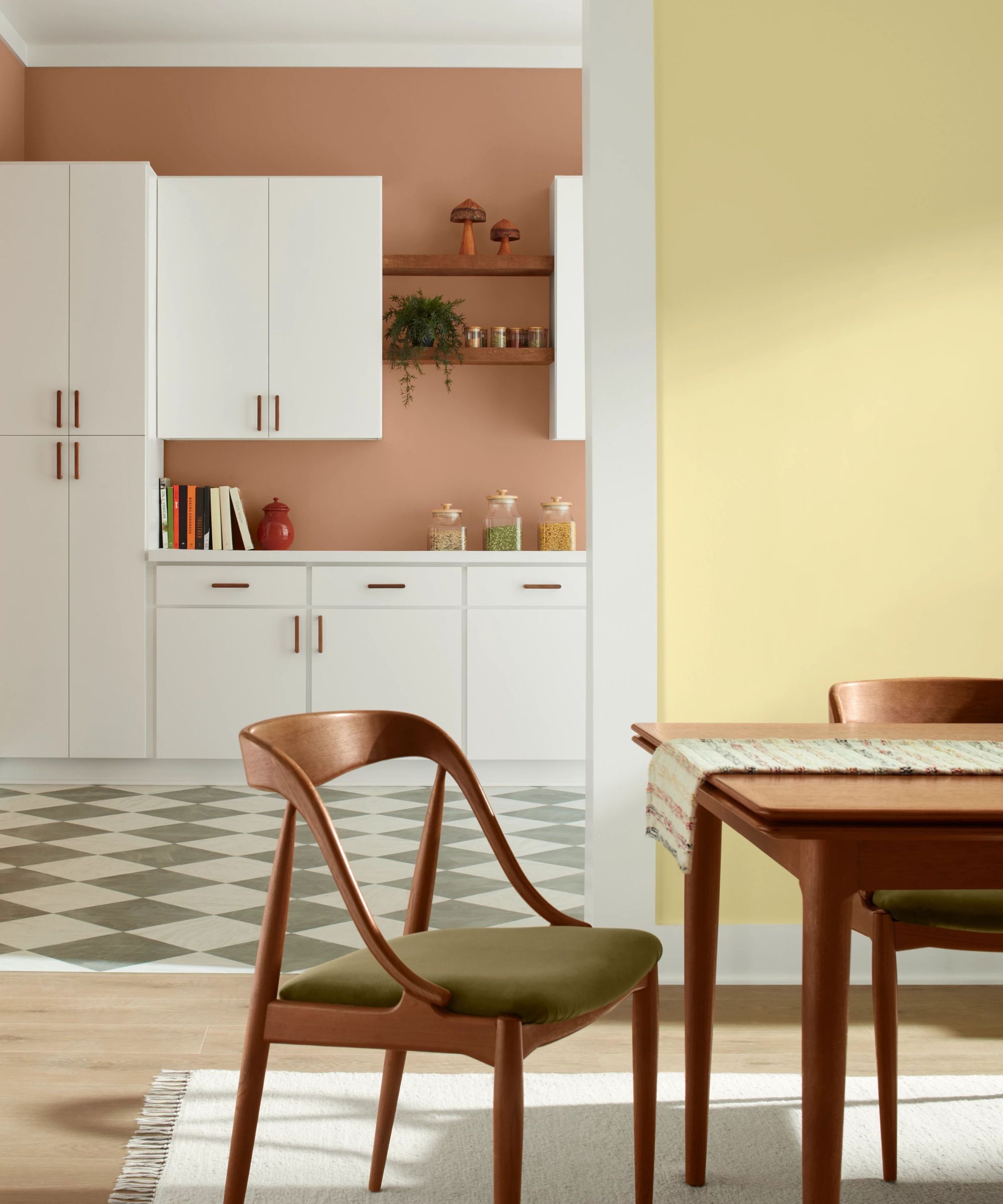
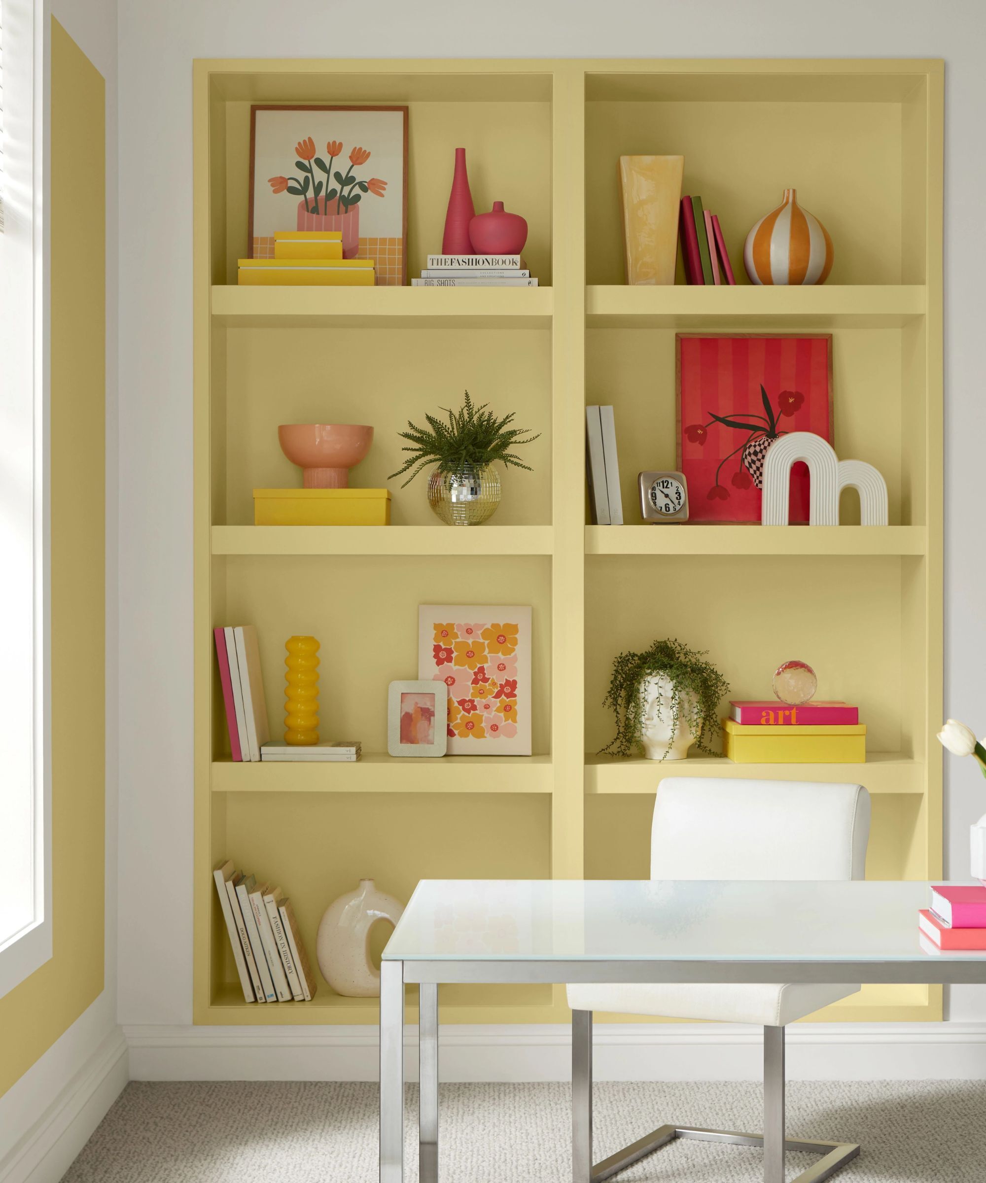
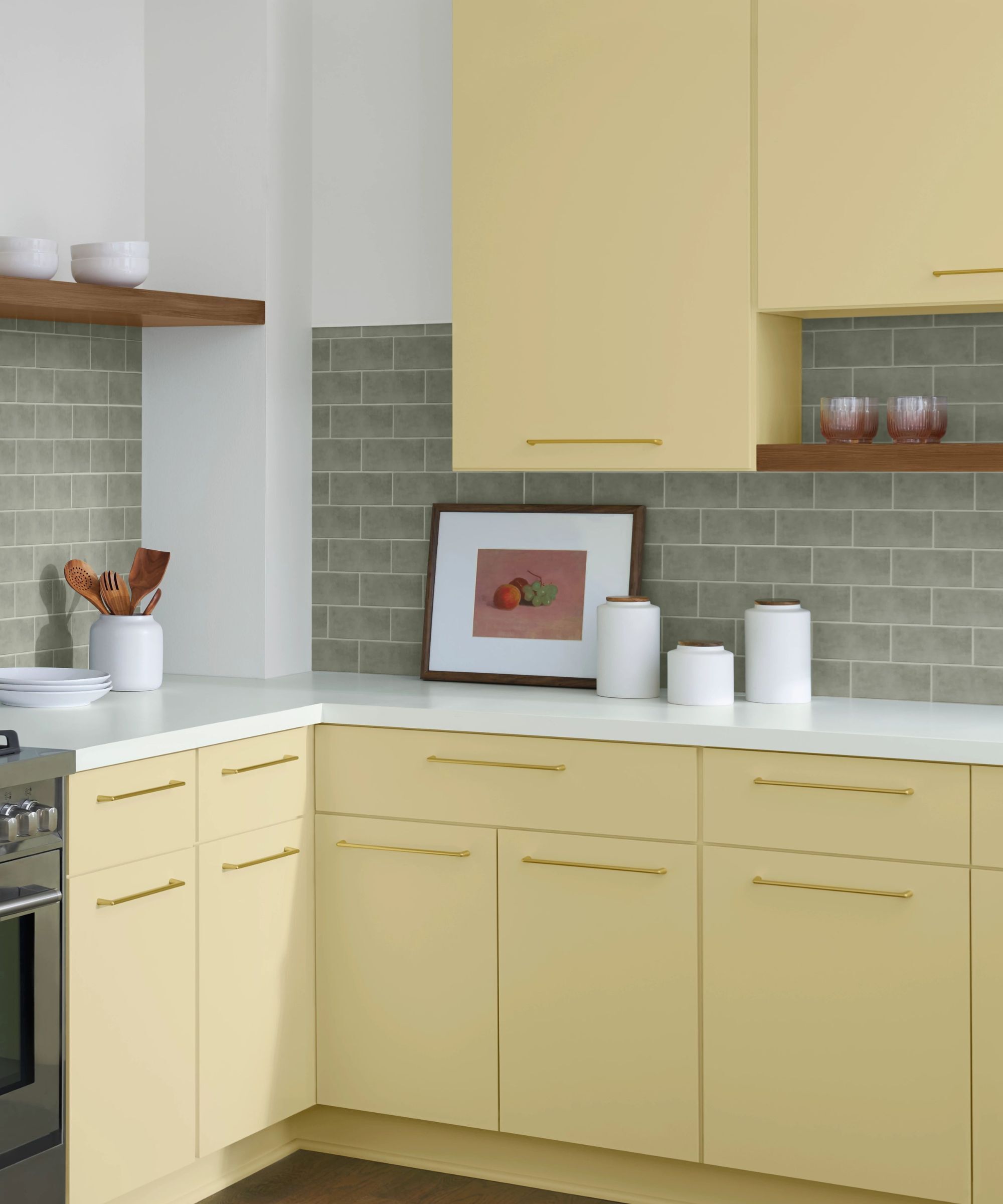
While yellow can sometimes dominate a room, Icy Lemonade brings enough softness to play well with a variety of functions and layouts. It works nicely in kitchens and dining rooms – spaces that benefit from a feeling of light and warmth - but it also lends itself well to creative or transitional zones like home offices, entryways, or powder rooms.
Because of its delicate green undertone, it has a filtered, almost sun-faded look that gives it versatility across design styles. In rooms where you want a pop of color that still feels gentle and unforced, this shade offers a considered alternative to beige or cream.
Where to avoid using Icy Lemonade
As with so many paint colors and their undertones, it’s important to sample this shade before fully committing. Its soft, green undertone can behave unpredictably in certain lighting conditions. In north-facing rooms or limited daylight, the yellow may lose its warmth and start to feel particularly jolting. It might even take on a faintly greenish cast, especially when paired with cool-toned fixtures or blue-based whites.
This might be a dealbreaker if you’re painting a poorly lit entryway, basement, or shaded room. If you’re set on using yellow paint in a low-light room but want to avoid any unexpected coolness, you might consider a similar shade with a warmer base or more golden undertones. Icy Lemonade, like any pastel, needs the right light to fully come to life.
Bring this color into your home in smaller accents
If you are a yellow addict, this Anthropologie armchair is a showstopper. This is going to bring full-throttle sunshine into your home, whatever the weather.
If you're on the hunt for retro-inspired café curtains that look like they've been plucked out of a vintage film set, you can stop your search here.
Handmade from recycled glass, these make for a perfectly judged and modestly priced gift this summer.
A pretty, dainty little bowl perfect for adding to the table this summer season, or bedside for jewellery and trinkets.
In silhouette and tone, this pale yellow vase is inspired by natural horn, but beautifully marbled by hand from resin. Add flowers, or don't, it's just as pretty and artful without.
If yellow is your thing, or the obsession of someone you know, it's worth ordering a set of four or six of these prettified pastel yellow mugs.
For those seeking something deeper or more vibrant, Sherwin-Williams offers several alternatives that lean further along the spectrum. Auric SW 6692 and Sunflower SW 6678 lean warmer and more golden, with richer depth, while Daisy SW 6910 and Decisive Yellow SW 6902 bring a powerful citrus punch.