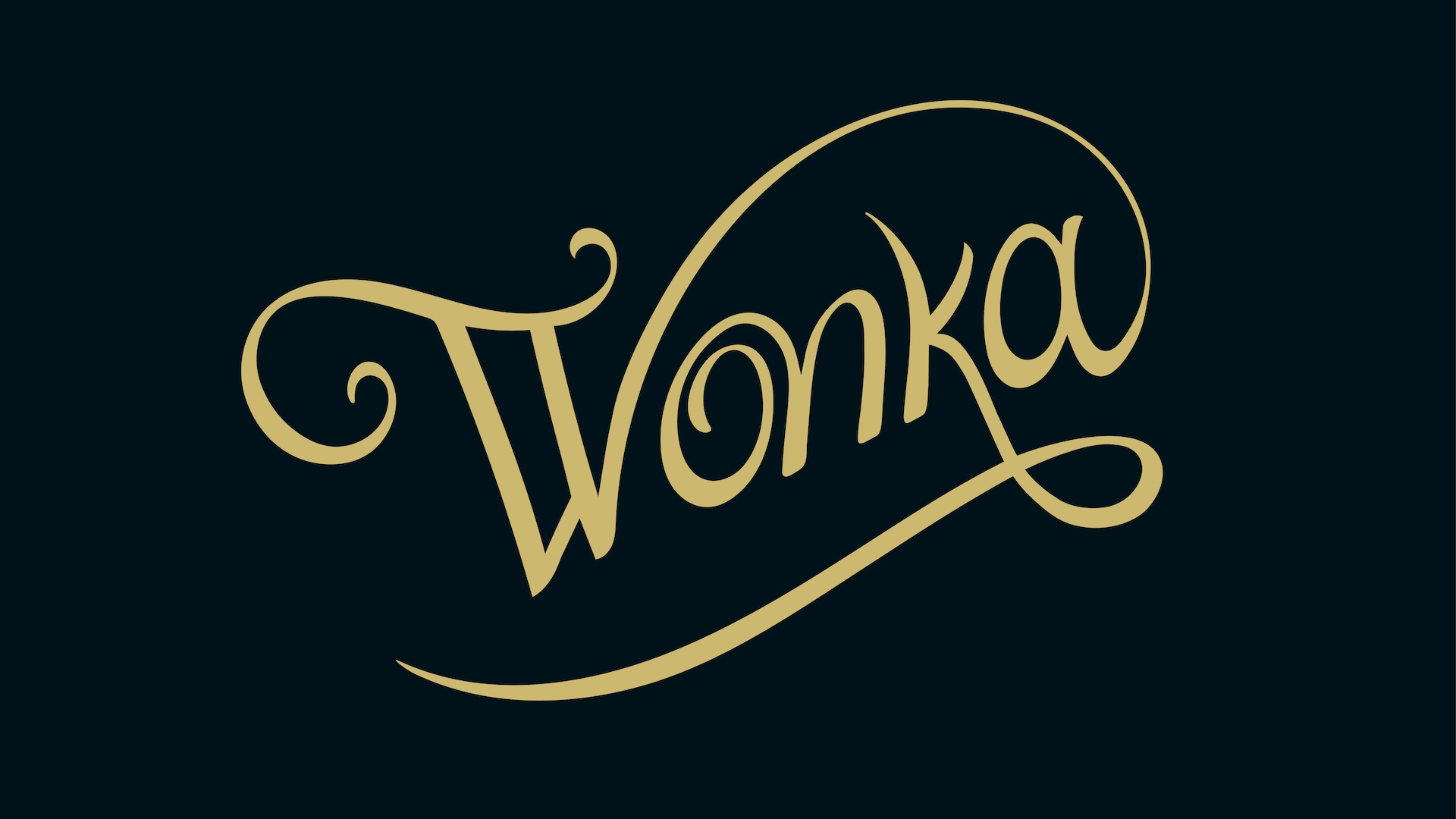
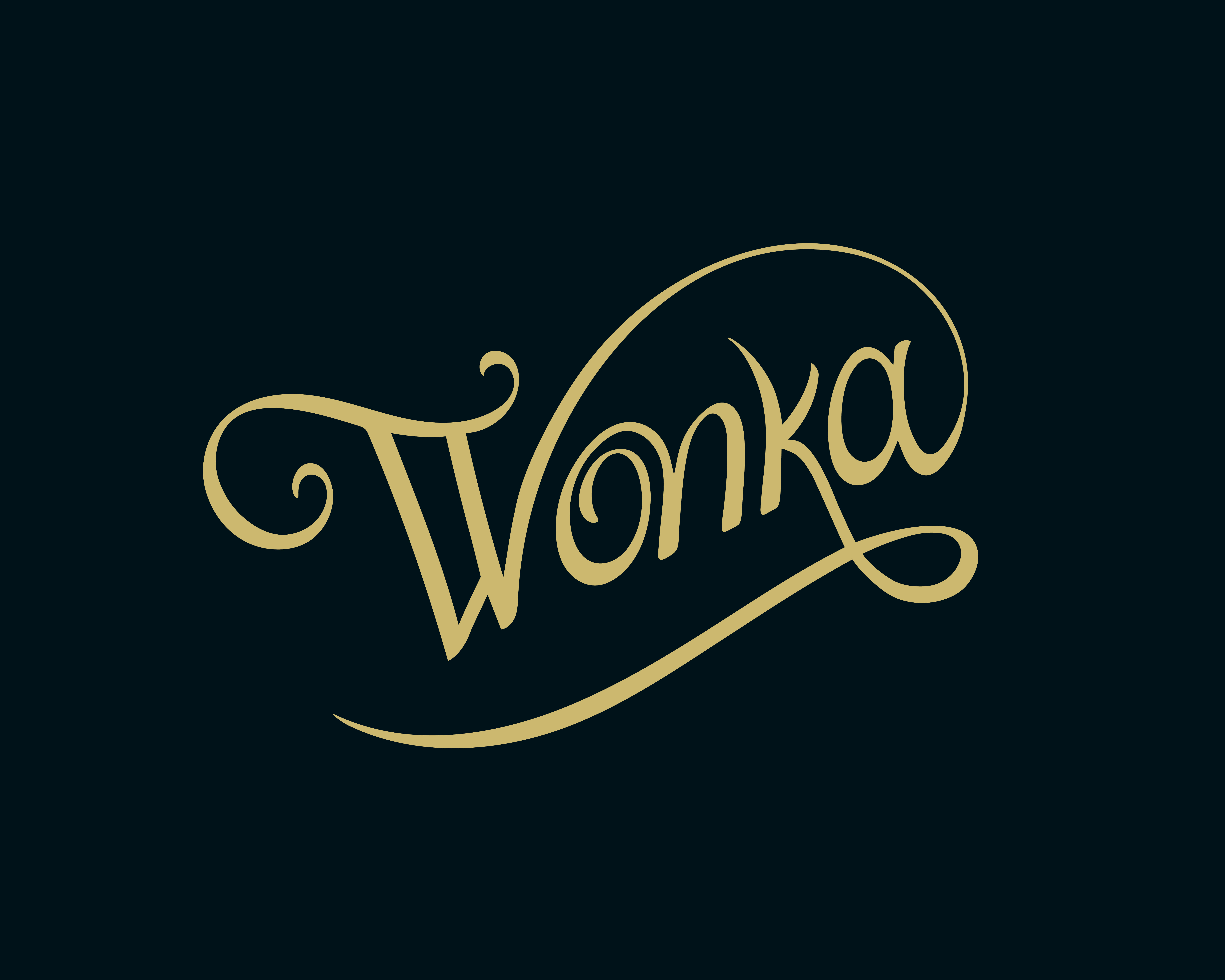
While posters and trailers often draw plenty of attention, it isn't often that a film's bespoke typography becomes the star of the show. Present throughout 2023's Wonka, Alexandria Vernon's studio logo is arguably a character in itself, and is designed both to weave into the storytelling of Wonka’s mother's handwriting, and echo the logotype used across the film's marketing materials.
We caught up with Vernon to discuss the creation of the wordmark, and how it was inspired by Victorian style typography and involved frequent collabration with the studio. For more design inspiration, take a look at the best logos of all time, and be sure to check out the rest of our How We Made series.
How did you get the gig to create the logo for the Wonka movie?
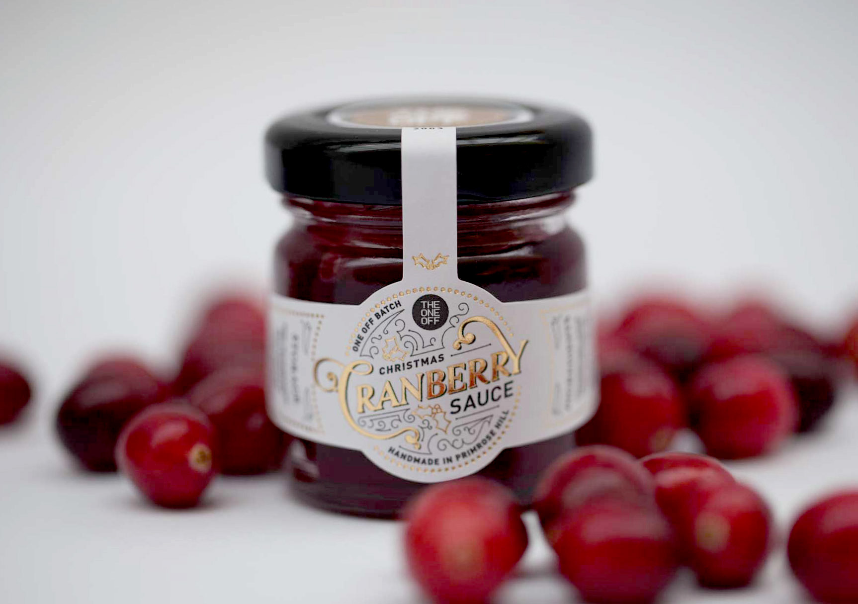
It was a previous design director of mine, Stephen Goalby, who contacted me. He had since moved on and was heading up the animation department at Framestore. Whilst we worked together at the same agency, The One Off, I often worked on projects that involved crafted typography, especially around Christmas. One of the projects I designed was label packaging for a cranberry sauce jar with calligraphic, Victorian style typography. I think it's because I demonstrated those skills, he had me in mind for the Wonka logo.
What brief were you given and what was your creative process?
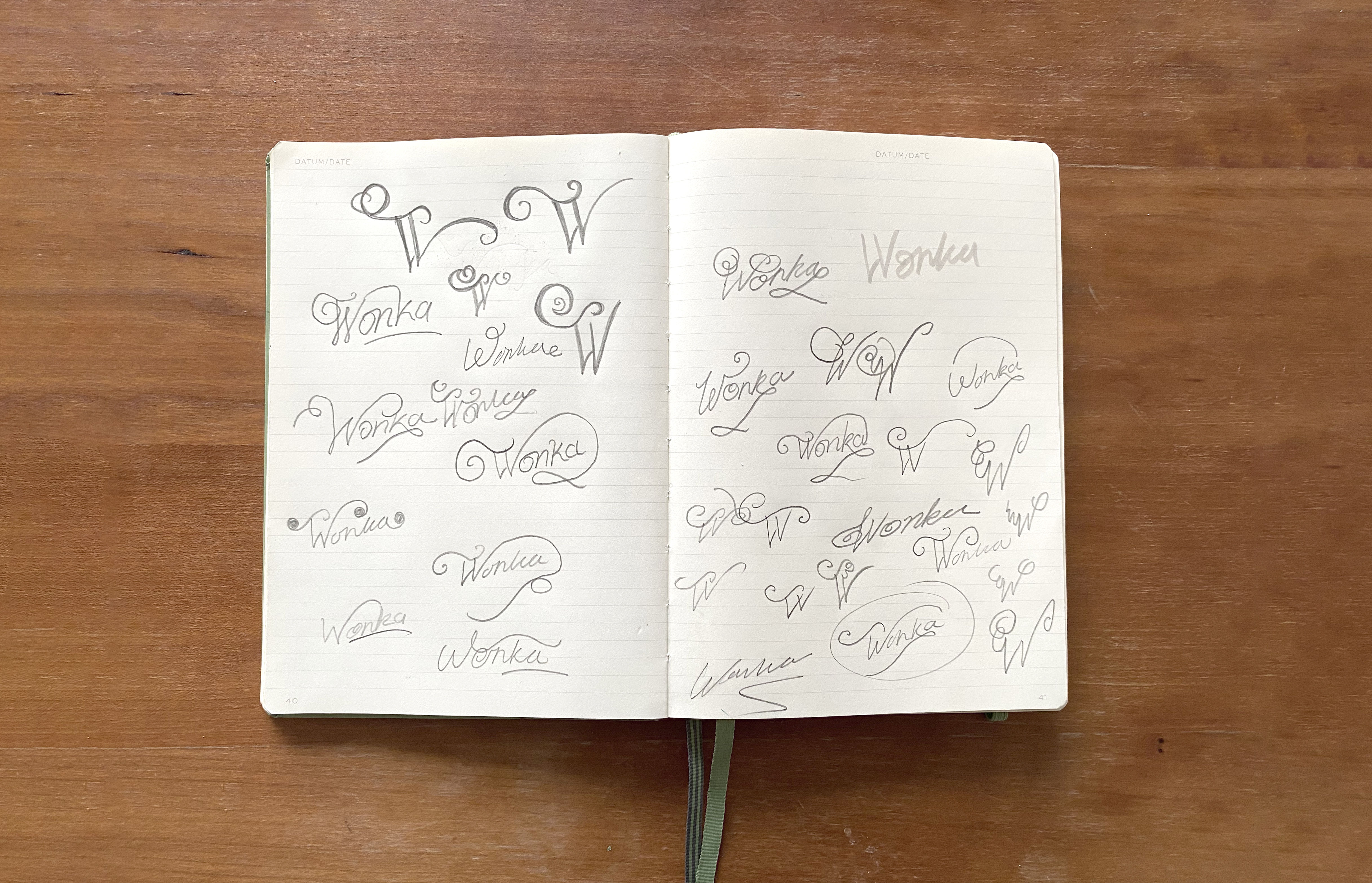
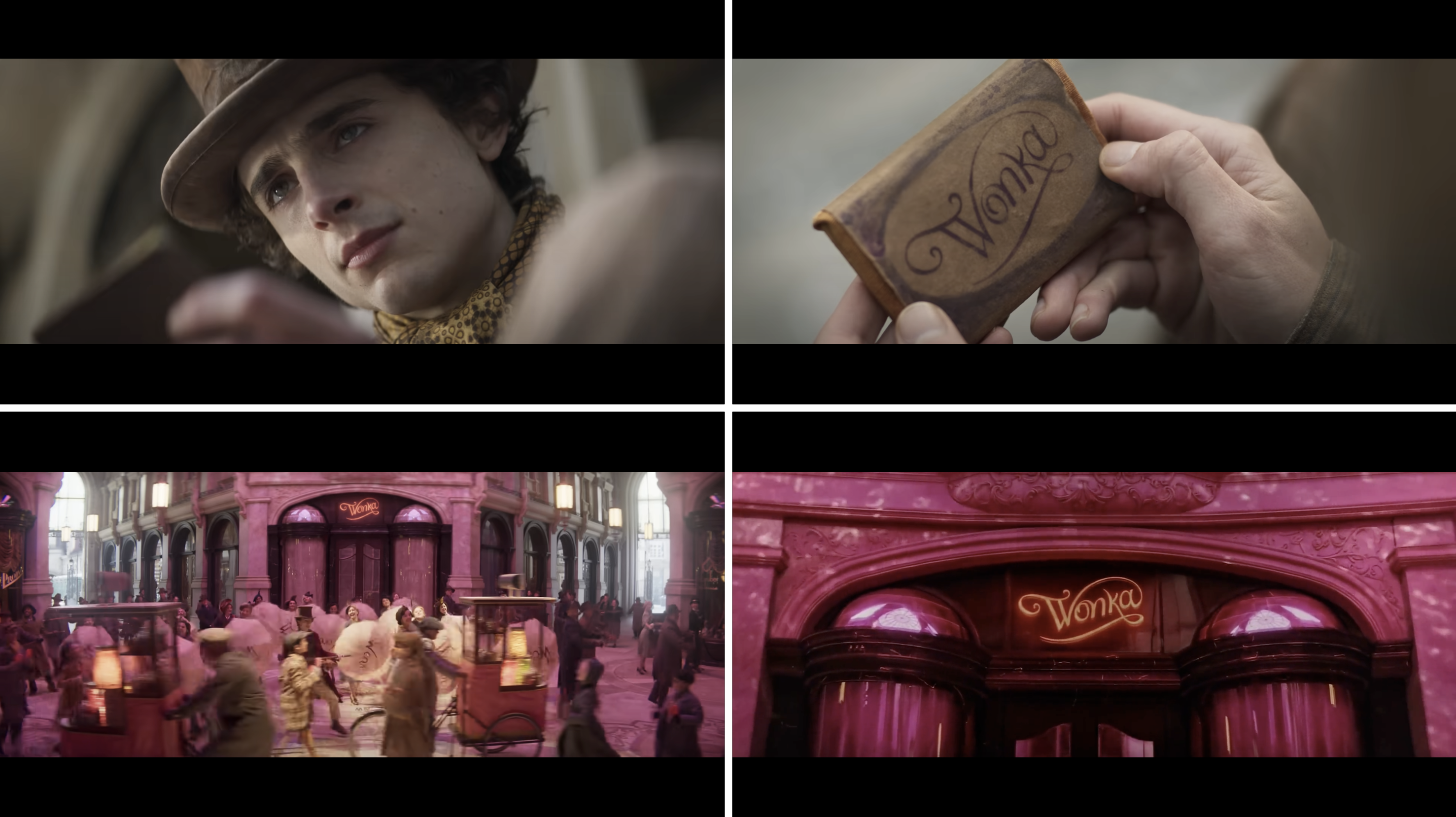
The key part of the brief was they they wanted to see lots of different versions where the 'W' of 'Wonka' was flourished and elaborate. The challenge was to combine and craft a logo from two existing sketches the studio gave to me as part of the brief. In one of the scenes Wonka's mum wraps up a piece of chocolate and signs it "Wonka." Part of the brief was to create a scripted logo that worked with the storytelling from that scene.
My process started with plenty of sketching, mostly I focused on the 'W' where I explored different flourishes, squiggles and ornaments. It's easy to get carried away and want to take an idea straight to the computer, but with typography work like this working with pencil first ensures I get the fluidity and curve right. Plus the brief was for it to be inspired by hand-handwriting, so it had to be authentic.
I worked collaboratively with the studio, sharing initial versions with them and the director, Paul King, until we landed on the final version.
What was your connection with the story? Had you read Charlie and the Chocolate factory or seen the previous films?
I connected with the story the most at the end with the message from his mum. Throughout the film you expect the secret behind her chocolate making to be something tangible, then at the end of the film when Wonka opens the wrapper of the chocolate bar you read her hidden message "It's not the chocolate that matters, it's the people you share it with." It's the perfect Christmas message of generosity and community. It's also an important message of our current time.
As for Roald Dahl – his stories were such a big part of my childhood, and were some of the first books I read. Besides reading Charlie and the Chocolate Factory, my favourites were the Twits, George's Marvellous Medicine and the Witches. I love his stories because they were always about real, relatable characters with an element of weirdness and magic to them. Quentin Blake's illustrations brought it all to life so beautifully.
Lastly, the films. Gene Wilder always has a special place in my heart. All the actors though, Gene Wilder, Jonny Depp and Timothee Chalamet, bring their own uniqueness to the character, but equally get the nuances of Wonka.
Were there any challenges while creating the logo?
The main challenge was how the flourishes from the 'W' would marry up with the rest of the type, whilst keeping it balanced.
What's your favourite part of the finished work?
Most definitely and unsurprisingly, seeing it at the cinema was magic and how present it is all throughout. Seeing people's responses to it and kind words has also been really uplifting.