Logo redesigns for sports teams are almost always going to leave some people unhappy, and the new design for the Australian rugby league team the Canberra Raiders is proving to be no exception. The change might seem subtle in comparison to many logo redesigns we see, but fans are so incensed that they've started a petition to have the revamp reversed.
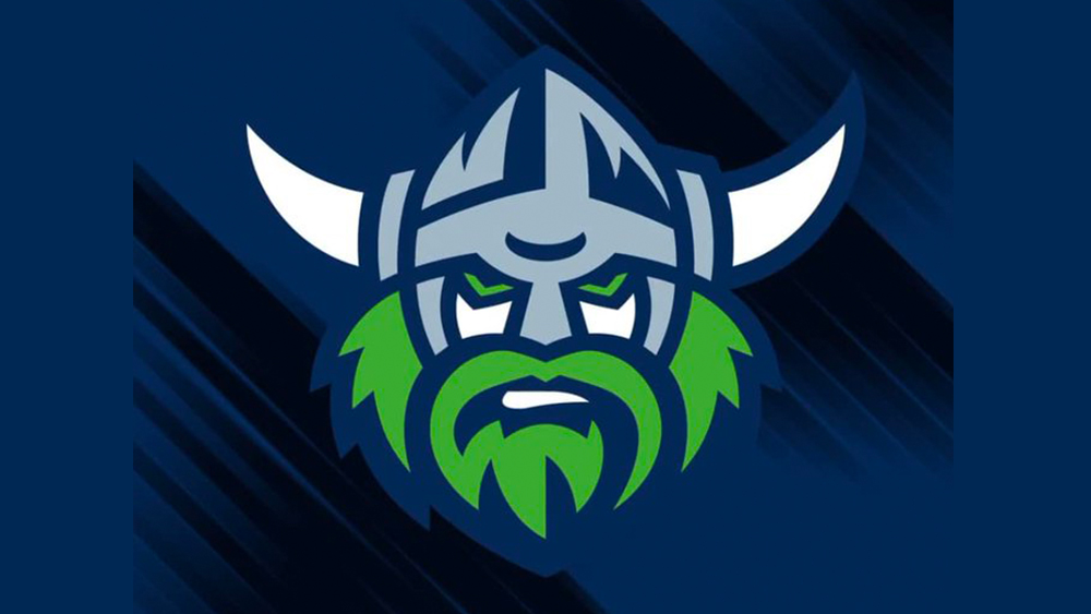
At first glance, the Raiders' new logo may look similar to the design the team has sported for the past four years, featuring the same fearsome Viking. However, the lines have been simplified for a much cleaner design that some fans say looks immature. Can you spot all the differences between the two versions? (See our pick of the best sports logos for more sporting design inspiration).
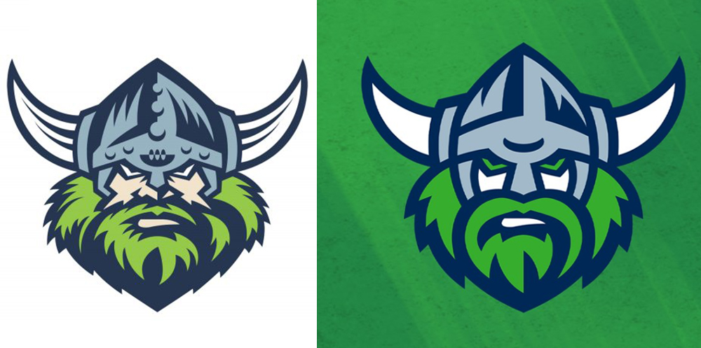
The Canberra Raiders last tweaked their logo in 2019. On that occasion, the design was tidied up, mainly by dropping a green stroke outline and changing the eponymous Viking raider's beard to a single shade of green. That seemed to make sense, creating a cleaner design. But the team has just unveiled another logo redesign for the 2024 season, and fans think that this time it's going too far.
The new design reduces the number of lines and marks in the design. The shading on the helmet has been reduced and the beard has fewer angles, making it look less bushy. The shape of a rugby ball in the centre of the Viking's helmet is now a mere curved line, which means fans alone will get the hint of the original meaning. The shade of green is darker. Oh, and the Viking's eyes are now also green to match his beard.
The changes follow a trend we've seen in logo design over the past few years, with logos getting flatter and simpler, in part to make legibility easier on small digital displays and for app icons. That seems to be at least part of the reasoning in this case too. Announcing the change on its website, the team says it "wanted a logo that works as best as it can across all applications e.g., from apparel to social media and everything in between."
It added that "As the green machine, we wanted one colour green to anchor our club to you, our fans. Instead of multiple greens, we now have just one, unifying our current off-field and on-field greens."
But fans say the simplifications make the design look too childish. “Gives under 12s Minecraft vibes," one person wrote on Facebook. “It’s a shocker – looks like a Scooby Doo Viking!” "It's too bland! The key small details that make it truly unique," was another opinion. Fans' dislike of the new logo is such that the Sydney Milk Syndicate has started a Change.org petition to have the change reversed.
For more logo design inspiration, see our pick of the best World Cup logos and the best comic logos.